Zen Interiors: A Room‑by‑Room Playbook for Stillness
A calm home isn’t empty—it’s intentional. Use this field guide to shape rooms that exhale: clear layouts, tactile materials, and light that flatters rather than glares.
What is a Zen interior—really?
Zen interior design is less a look and more a behavior. Think of it as editing and attunement: a few good pieces, generous negative space, and soft light that lets materials breathe. It draws from Japanese traditions—like ma (the meaningful pause or gap), tactile natural finishes, and quietly framed views—without turning your home into a theme.
That means fewer objects, better placement. Low furniture settles the eye; storage keeps counters clear; a single artwork can anchor a wall the way a rock anchors a garden. Done right, the result feels grounded and deeply livable rather than staged.
The three‑part framework: Space • Materials • Light
Space (and ma)
Design your circulation first. Leave breathing room around seats and tables; aim for clear sightlines across the room to a plant, a window, or an artwork. Height is part of the calm: keep silhouettes low, with wall planes largely unbroken.
Materials
Wood, stone, clay, linen, paper—surfaces that feel honest to the touch. Matte finishes are your friend; high gloss bounces light and attention. For walls, mineral‑based or lime finishes read beautifully under daylight and lamplight, with subtle, stone‑like variation. If you’re new to them, our hands‑on explainer covers the “why” and “how.” Limewash & Mineral Paint—Designer’s Guide.
Light
Calm rooms aren’t dark; they’re de‑glared. Layer a few gentle sources—shaded pendants, wall lights with diffusers, low table lamps—and keep color temperature warm (around 2700–3000K). For a simple room‑by‑room blueprint, borrow from Poul Henningsen’s glare‑free method: shield the source and bounce light onto surfaces so faces and materials look soft. Layered Light—The PH Method.
Palette & finishes that feel restful
Work from nature: warm whites, stone and sand tones, quiet greens, carbon black in tiny doses. Keep sheen low (eggshell to matte). If you love depth without drama, limewash and mineral paint create mellow gradients that keep glare down and walls interesting—especially in bedrooms and living rooms. Warm Minimalism at Home shows how a few tones can do the heavy lifting without feeling cold.

Design tip: Try a 70/25/5 balance—~70% soft neutrals (walls, big textiles), 25% warm wood/stone, 5% accent (a single art piece or ceramic).
Room‑by‑room: the Zen playbook
Entry (a threshold, not a hallway)
- Low bench (oak or ash), slim shoe tray, wall hooks behind a door or curtain.
- Small bowl or tray for keys to avoid scatter.
- Scent cue: cypress or hinoki candle (unlit by day) sets a ritual tone.
Living room (quiet envelope, one focal point)
- Keep seating low and grouped; float the sofa off the wall to improve flow.
- Choose one focal artwork; let surrounding walls stay quiet.
- Layer light: one shaded pendant, two table or floor lamps, and a dimmable wall light.
- Hide remotes and chargers in a lidded box; keep surfaces mostly clear.
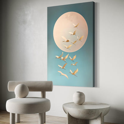
Quiet art choices (living, dining & entry)
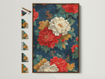
Images © Artoholica.
Kitchen (quiet efficiency)
- Fronts in wood or matte lacquer; skip handles where possible (integrated pulls).
- Show only what’s beautiful and useful: a short row of ceramics or a tea setup.
- Light in layers: under‑cabinet task + shaded pendant; keep overheads dimmable.
Bedroom (the house’s quietest sentence)
- Low platform bed, linen duvet, one small rug or tatami‑inspired mat.
- Diffused window treatment (shoji‑like effect) for privacy without heaviness.
- One art piece at calm scale (30–50% width of wall bay); warm bedside light at eye level when seated.
Bath (stone, warmth, and light)
- Honed stone, microcement, or matte tile; wood accents for warmth.
- Glare‑free light (frosted shades, indirect cove, or wall washers).
- Use a tray to gather essentials—order signals calm.
Meditation corner / workspace
- Low cushion or chair with good lumbar support; one task lamp with shade.
- Acoustic softeners (wool throw, rug) and a small plant or river stone.
- Two‑minute reset: clear the surface, return seat to position, dim lights.
Styling formulas you can copy
Formula A — “Quiet focal wall”
- Paint/finish: matte or limewash in warm white.
- Art: one vertical piece hung with 6–8 in (15–20 cm) from bench top.
- Balance: one low plant or stone object opposite the artwork.
Formula B — “Low lounge”
- Low sofa; two small tables instead of one big coffee table.
- Two lamps at seated eye height; no bare bulbs in direct view.
- Wool rug + linen throw; one accent color only.
Formula C — “Tea bay”
- Niche or shelf with a single vessel and a seasonal branch.
- Downlight set far enough forward to wash the wall, not the viewer’s eyes.
- Short stool or zaisu; tray for tea tools.
Further reading: If you enjoy the discipline of order and proportion, De Stijl’s grid thinking is a useful foil to organic Zen textures—see Neo–De Stijl at Home. For a warmer, weightier material language that still reads calm, browse Soft Brutalism at Home.
Common mistakes (and quick fixes)
- All white, all shiny: swap in matte paint and add one textured textile.
- Harsh overheads: replace with shaded fixtures and warm bulbs; add two lamps.
- Too many “Zen” objects: keep one; remove three. A single strong piece says more.
- Clutter drift: designate a tray/basket per room; reset nightly in two minutes.
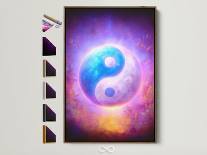
Curate a calm focal point
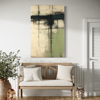
One way to anchor a room without adding bulk is to choose an artwork that carries the mood—ink landscapes, cranes, or stone‑textured abstracts all work beautifully with quiet palettes and natural materials. Explore Zen‑friendly picks in the Artoholica shop’s art selections to find a piece that completes your space. Browse art at Artoholica.
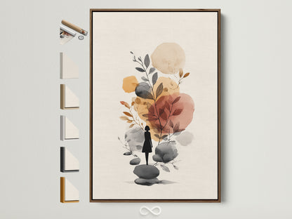
Calm artwork ideas by mood
Images © Artoholica.
FAQ: Zen interiors, answered
What’s the difference between Japandi and Zen?
Both value restraint and natural materials. Japandi blends Scandinavian and Japanese minimalism (lighter woods, cozy textiles); Zen interiors push further into stillness and negative space with fewer accents and more deliberate pauses.
Do I need tatami and shoji for a Zen interior?
No. They’re iconic elements—tatami mats and shoji screens—but the spirit comes from balance, editing, and materials. You can echo them with a low rug, diffusing drapery, or a lightweight room divider.
How should I light a Zen room?
Use multiple soft sources at different heights; avoid exposed high‑luminance bulbs. The idea is glare control and warm color temperature—principles you’ll find in classic glare‑free frameworks as well as modern practice. For a friendly deep‑dive, see our layered‑light guide and a plain‑English overview of glare from the Lighting Design Lab (glare explained).
What colors are best for a Zen bedroom?
Warm whites, sand, fawn, foggy green, carbon black accents. Keep finishes matte and lighting warm (2700–3000K). A single artwork in calm tones is enough to focus the space.
What is ma in interiors?
Ma is the intentional gap that gives form room to breathe—the pause between notes. Cultural institutions offer accessible introductions; try this quick read on spatial intervals from Japan House London (What is “Ma”?).
Which designers embody the spirit of Zen?
Plenty of modern architects explore quietness and light. For a concise overview, browse MoMA’s page on Tadao Ando and notice how concrete, light, and emptiness create presence.