Silhouette AF‑655: How Benjamin Moore’s 2026 Color of the Year Reframes Wall Art
A deep, tailored espresso with charcoal undertones is about to change how we build gallery walls, choose frames, and layer palettes.
- Silhouette (AF‑655) is Benjamin Moore’s 2026 Color of the Year—an espresso‑brown with delicate charcoal notes inspired by classic suiting.
- It arrives with a Color Trends 2026 set of eight hues: Silhouette, Raindance 1572, Swiss Coffee OC‑45, First Crush CSP‑310, Batik AF‑610, Narragansett Green HC‑157, Southwest Pottery 048, Sherwood Tan 1054.
- For wall art, think contrast + materials: warm wood or brass frames, creamy mats, and greens/terracottas that pop against the deep wall tone.
Why this brown—and why now?
Benjamin Moore describes Silhouette as a refined mix of burnt umber and charcoal—versatile enough to cocoon a room or act as a tailored accent. The choice tracks the broader swing from cool grays toward warmer, grounded neutrals and fashion‑informed finishes (think suiting, wool, and leather) that interiors have been gravitating to this year.
Design takeaway: dark doesn’t mean dour. On walls, Silhouette works like a velvet backdrop that lets lighter, textured artwork and metallic details read crisply from across the room.
Palette cheat‑sheet for art pairings
How to stage Silhouette with art (tools you can use today)
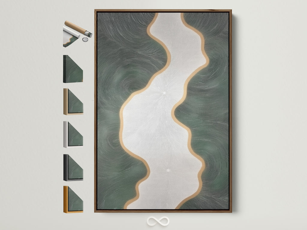
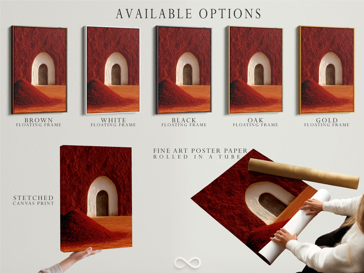
- Frame finishes: brass/antique gold reads luxe; black makes modern geometrics punchy; oak warms dusty mauves and terracottas.
- Mats & borders: Swiss Coffee‑like off‑whites (or float‑mount with a shadow gap) keep art crisp against deep brown.
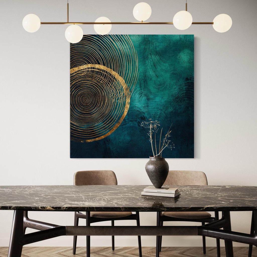
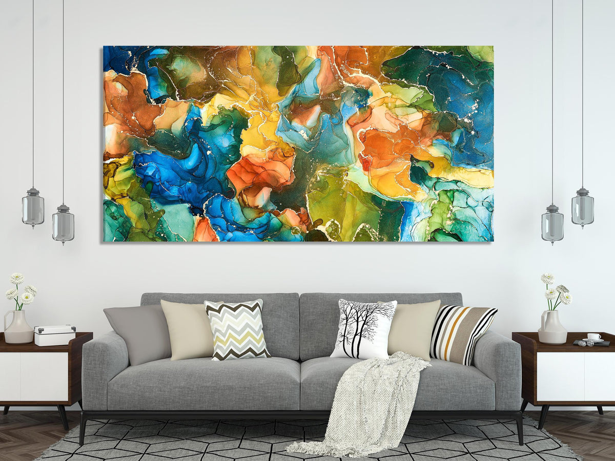
- Scale: for sofas and consoles, go confidently oversized—single canvases or tight diptychs feel intentional against dark walls.
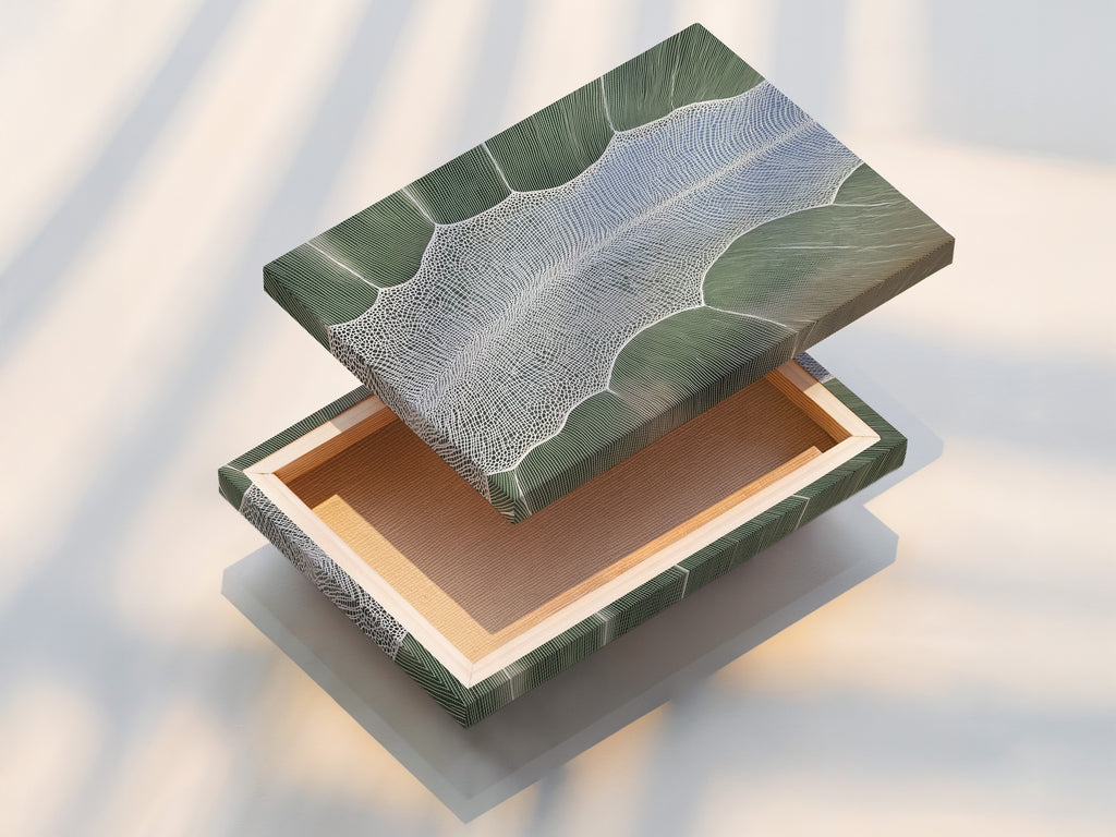
- Surface choice: matte canvas or non‑glare glazing helps fine lines and textures stay legible on moody paint.
Want a broader strategy across multiple rooms? We published a full multi‑brand roadmap here: Wall Art Playbook: What 2026 Colors of the Year Mean. Use it to coordinate Silhouette with other 2026 picks already trending in hospitality and staging kits.
Related reading
Room‑by‑room moves that work
- Living room: one oversized abstract (32–48″), brass frame, and a wide Swiss‑Coffee mat to pop against Silhouette.
- Bedroom: soften the palette with Batik‑leaning figure art or botanical prints in oak frames.
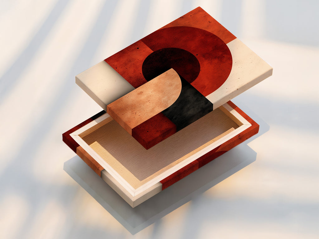
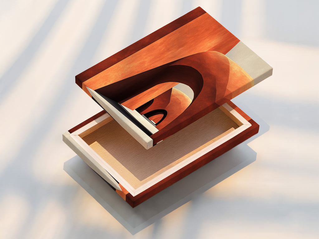
- Entry: terracotta geometrics (Southwest Pottery vibes) in a tight triptych for rhythm.
- Bath or niche: Narragansett‑Green mini gallery—greens and creams feel fresh against moody paint.
Wallpaper and the “fifth wall” (painted ceilings) are also back in rotation—pattern and tone overhead can amplify how art reads on dark shells. If you’re experimenting, start with small spaces or a single bulkhead and echo one accent from your art into the ceiling stripe.

0 comments