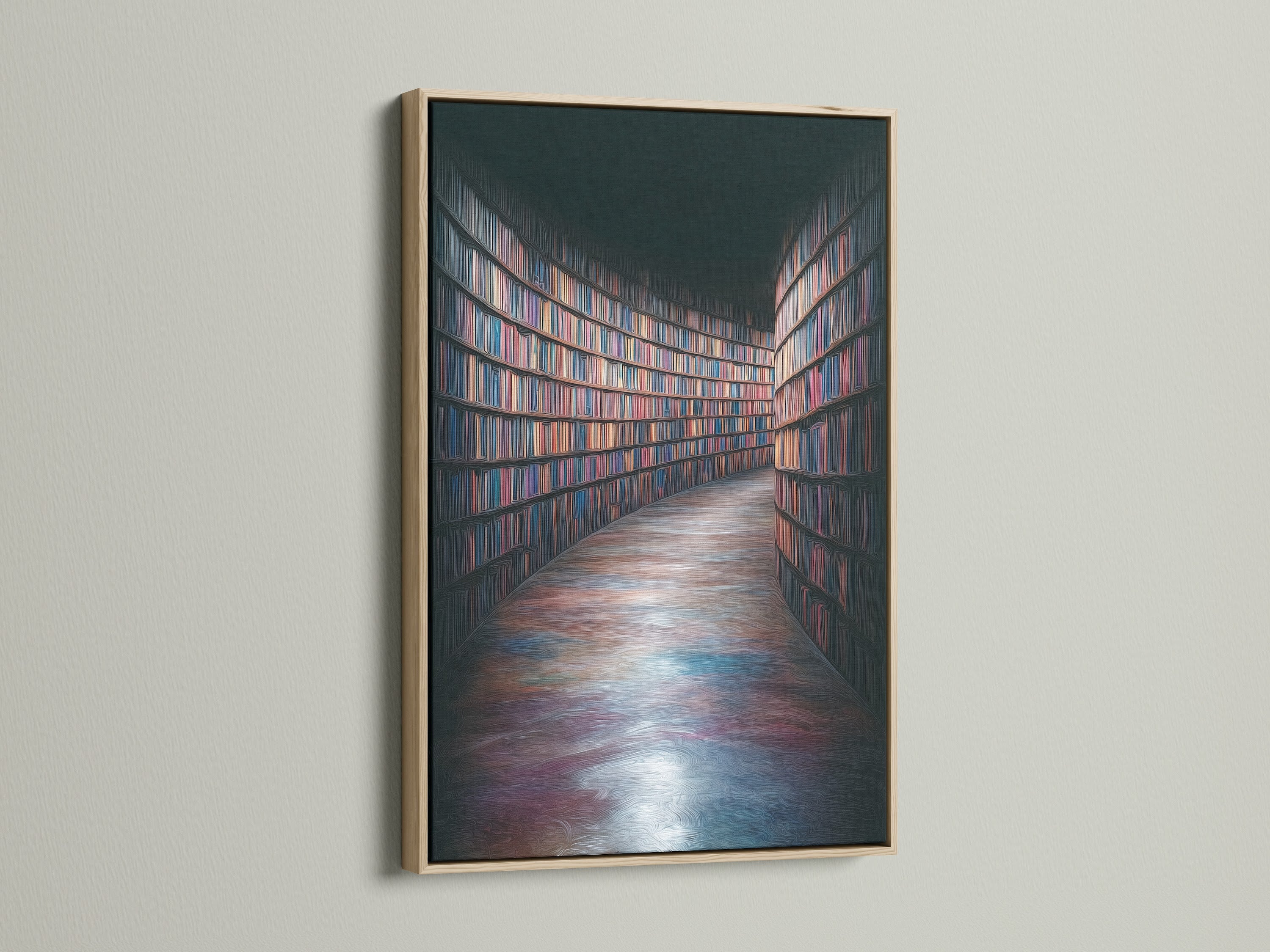
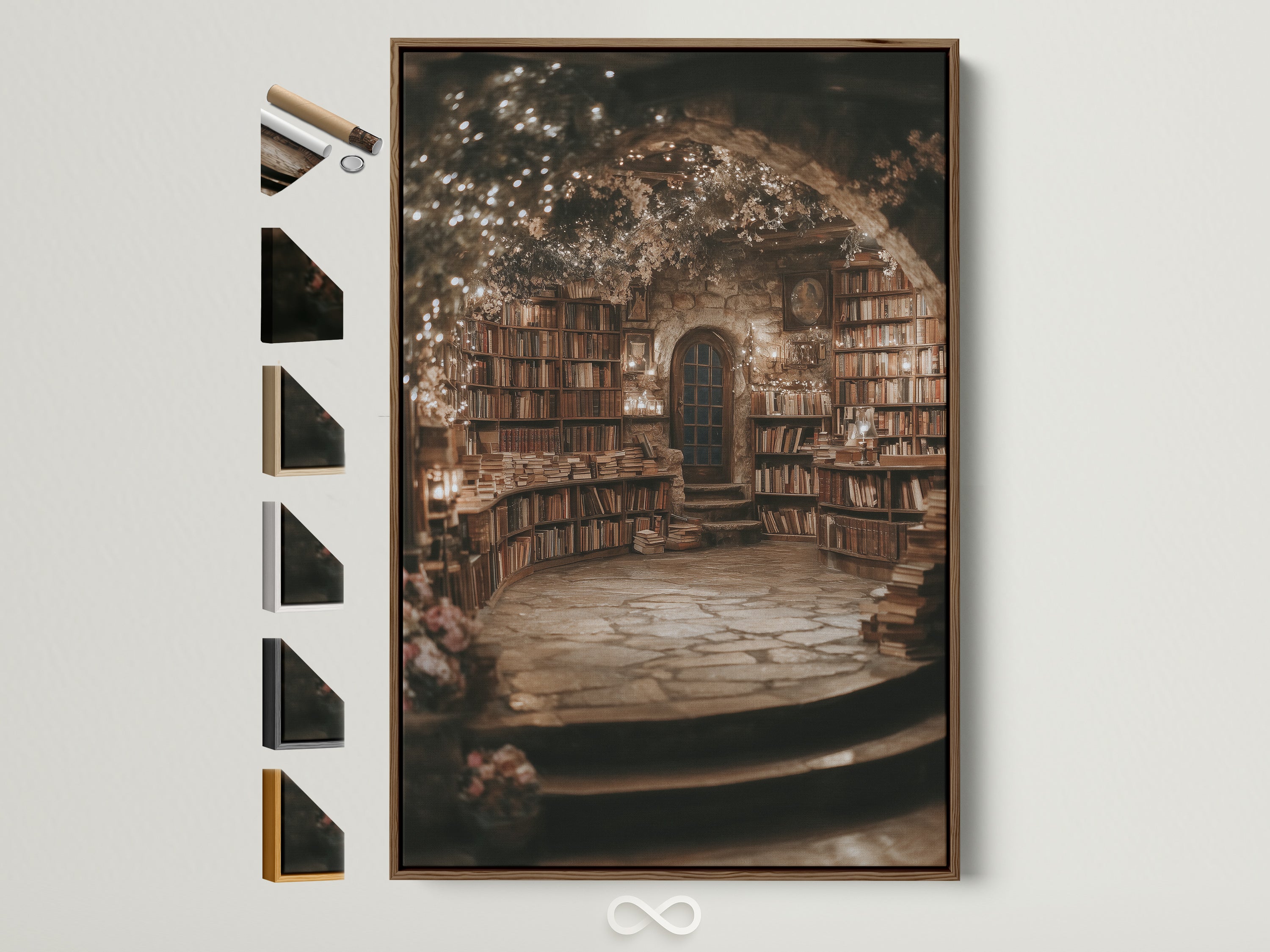
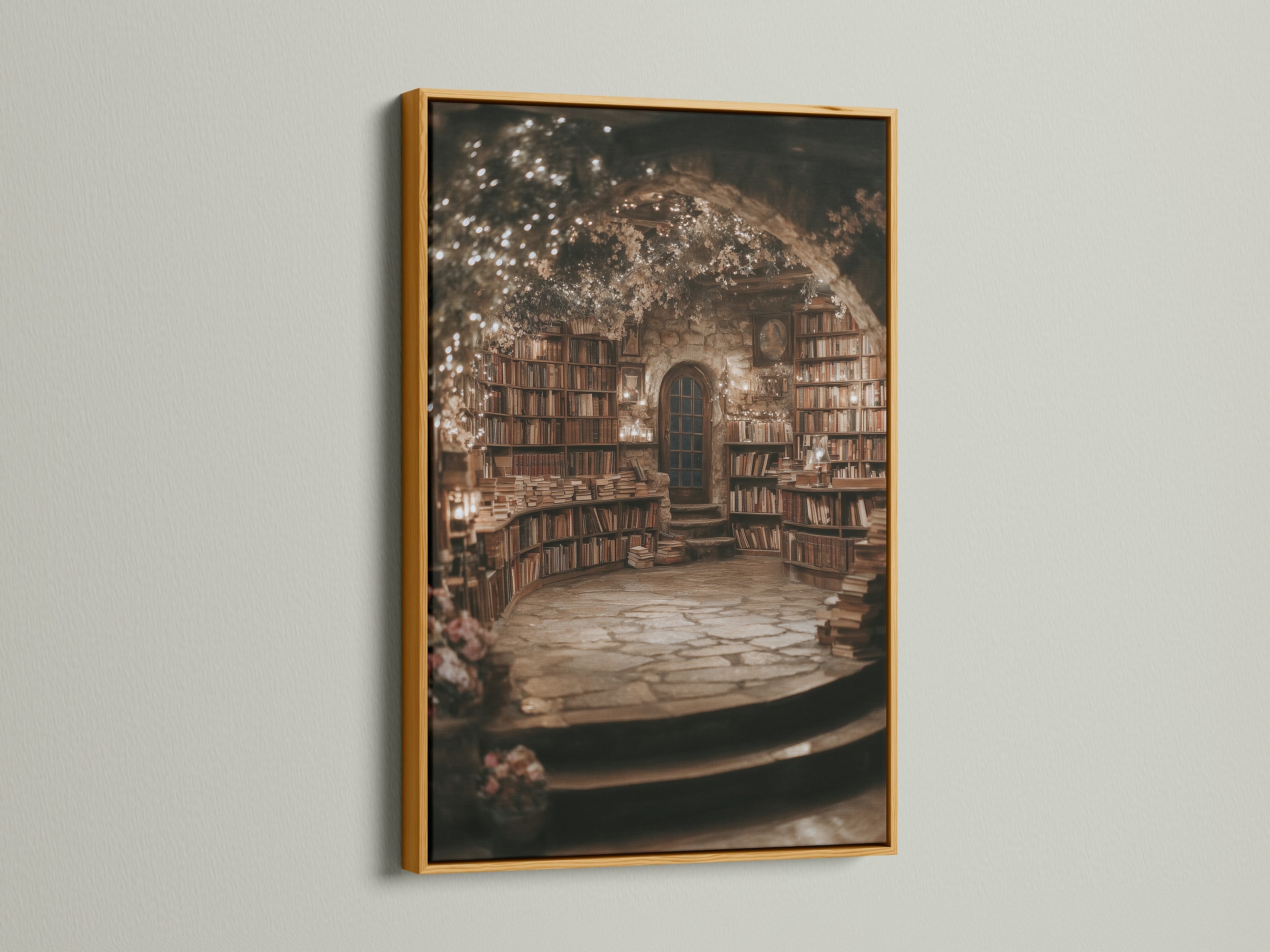
Library Books Canvas Art Print — Dark Academia Bookshelf Wall Decor
If your happy place smells faintly of old paper and polished wood, this richly detailed bookshelf print was made for you. The Library Books canvas/print brings a calm, bookish rhythm to studies, offices, and reading nooks—layering vintage spines, deep shadows, and the soft glow of brass.
Why Dark Academia Works in Real Rooms
Dark‑academia interiors reward slowness: saturated tones, tactile materials, and literary motifs that read as patina rather than trend. On a wall, those ideas come together through contrast—the density of book rows against the quiet of matte canvas, the hush of shadow against the glint of a frame. It’s a look that instantly grounds a space, even when the furniture is modern.
This bookshelf scene does the heavy lifting: its grid of varied spines creates a gentle cadence that steady‑states the eye; warm browns and oxbloods soften white walls; in low light, the darker passages keep glare in check. Style it near task lighting, a leather chair, or a writing desk and the room feels curated rather than themed.
Crucially, the subject ages gracefully. Books aren’t a fad; they are a visual shorthand for intellect and comfort. Whether your palette leans stone and charcoal or cream and caramel, this composition behaves like a neutral—subtle enough for minimalists, storied enough for maximalists.
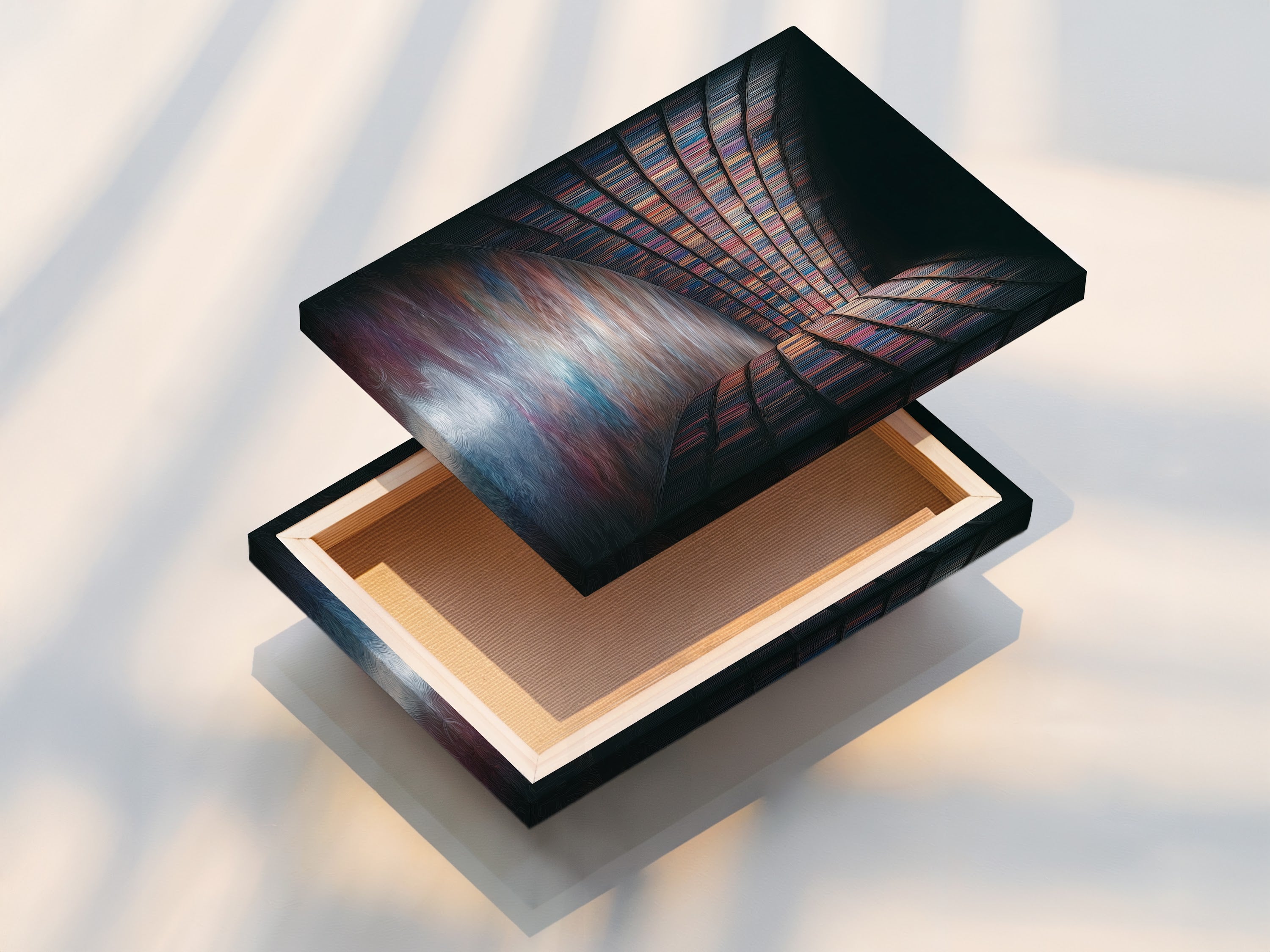
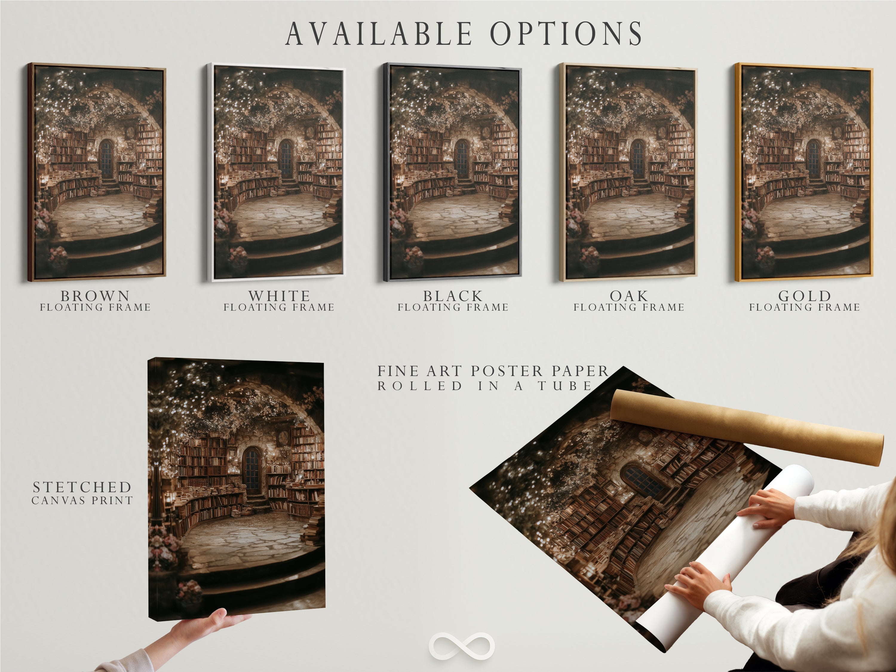
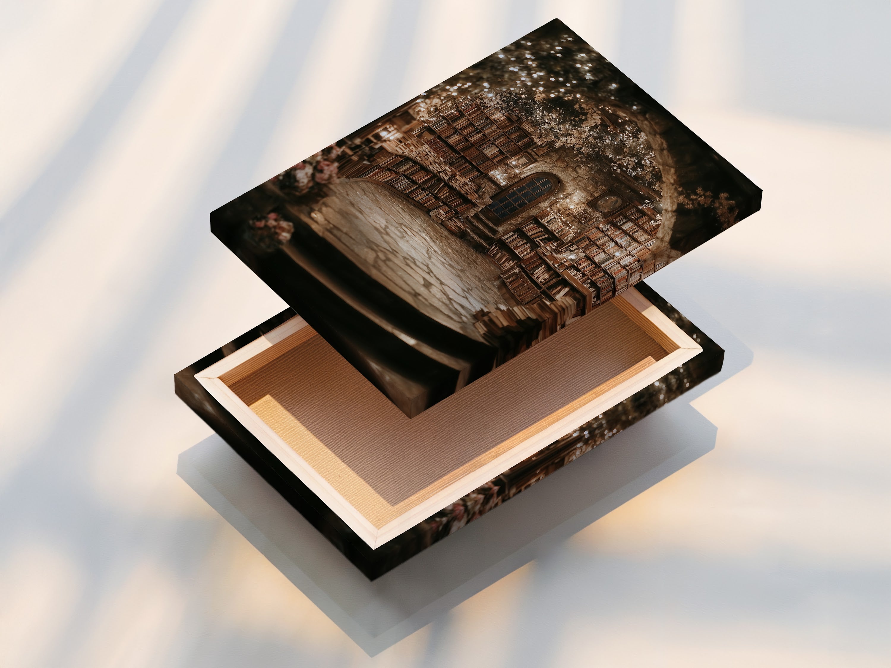
Inside the Artwork—Materials, Finish & Options
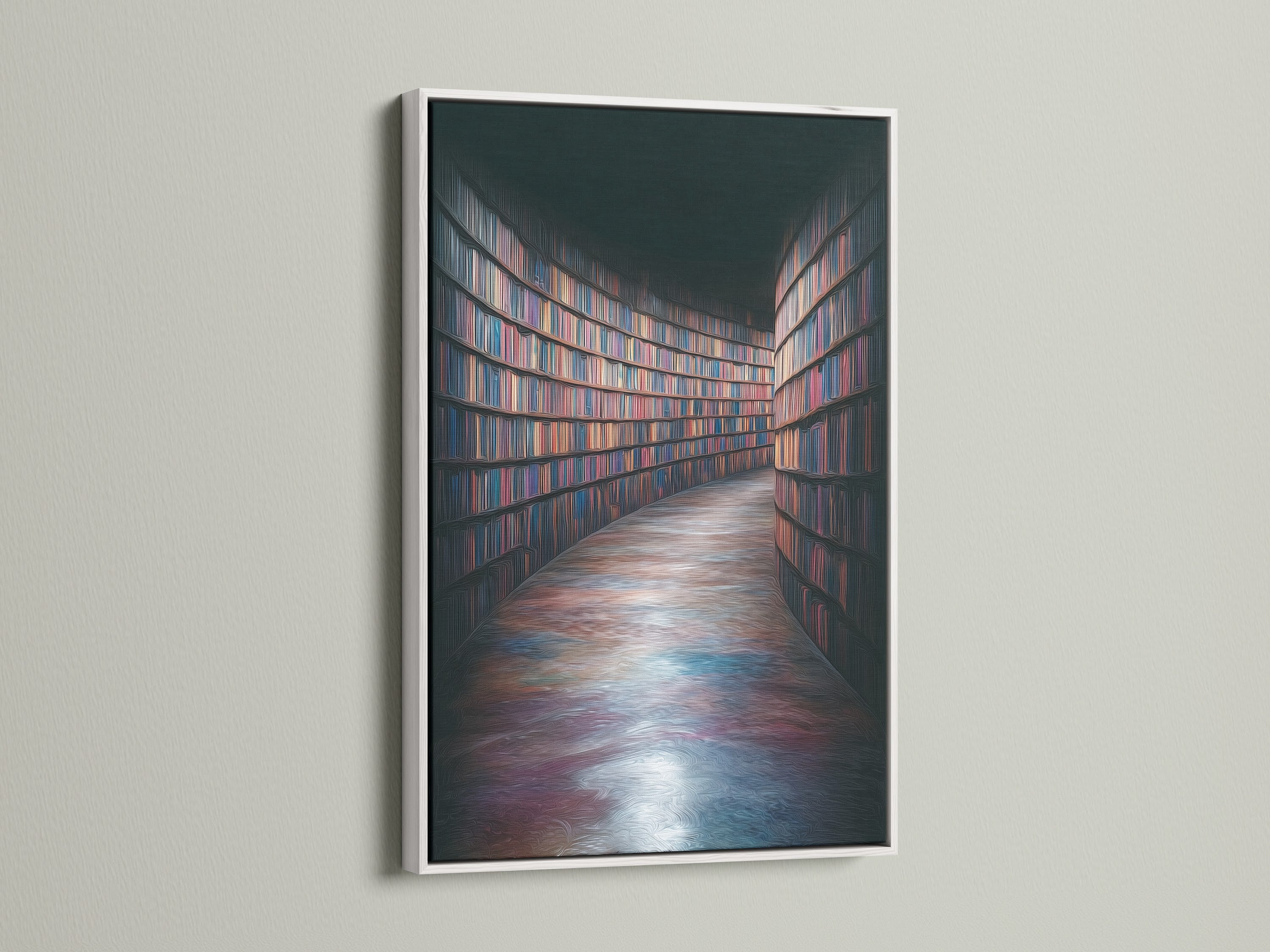
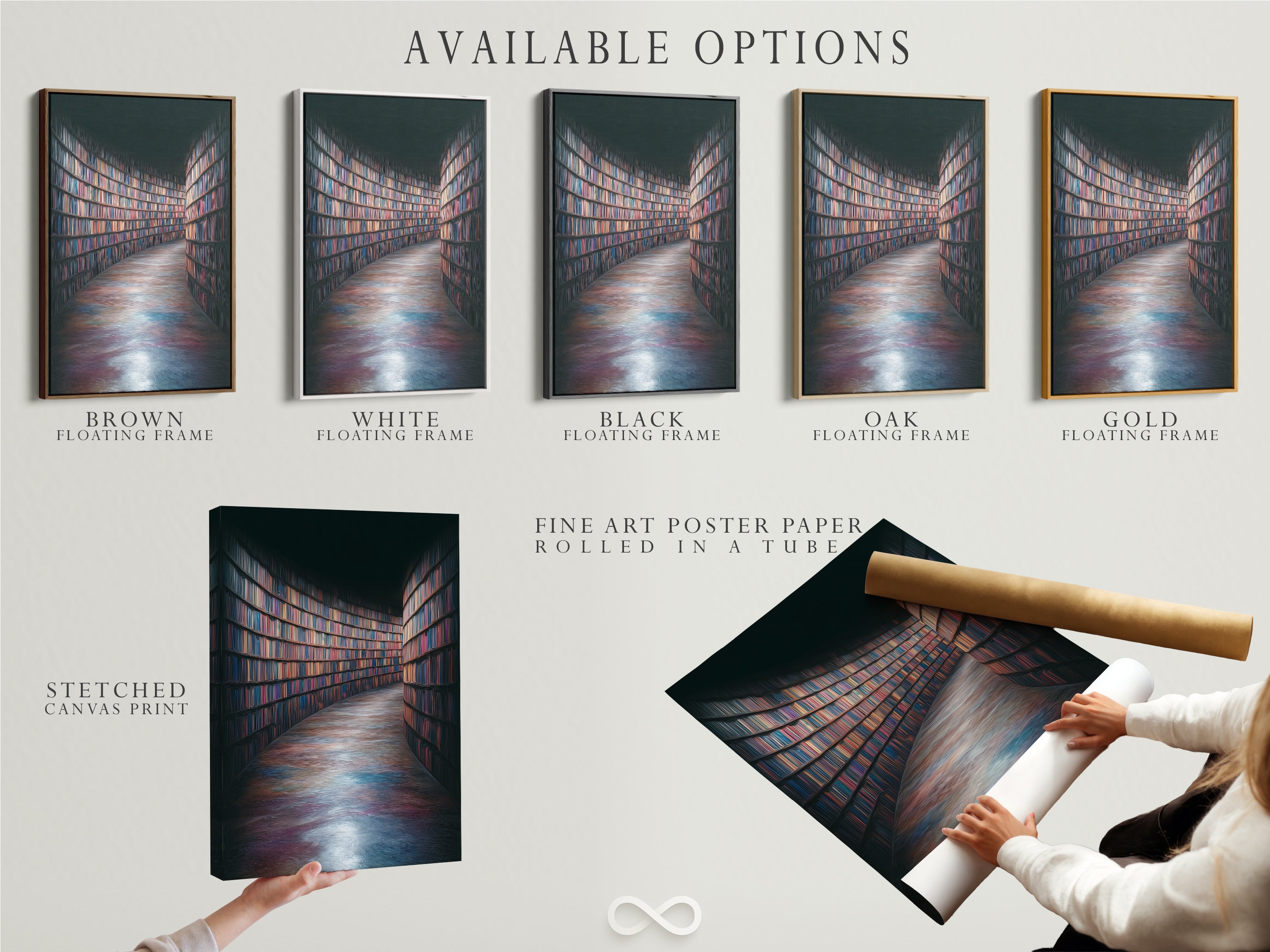
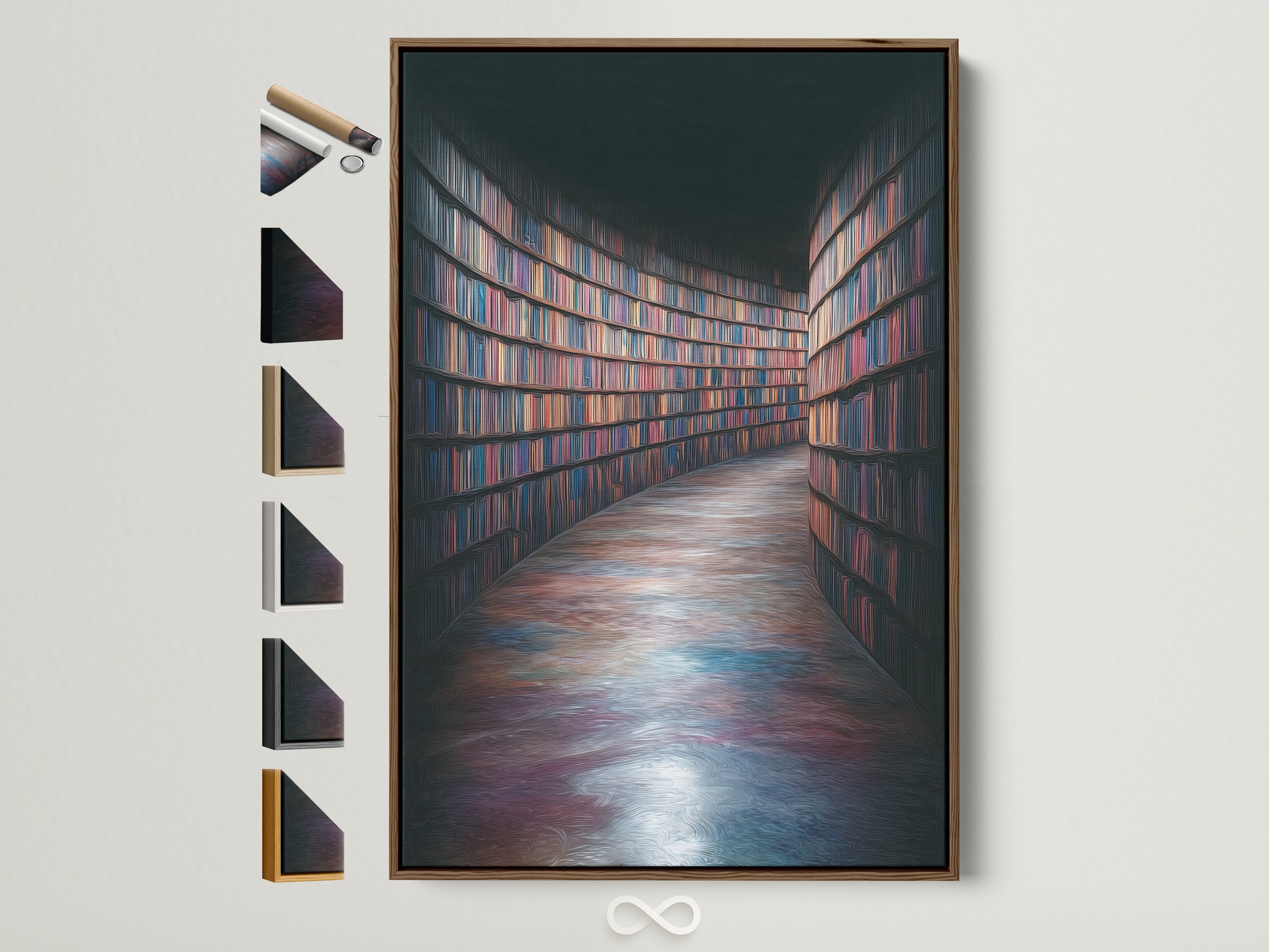
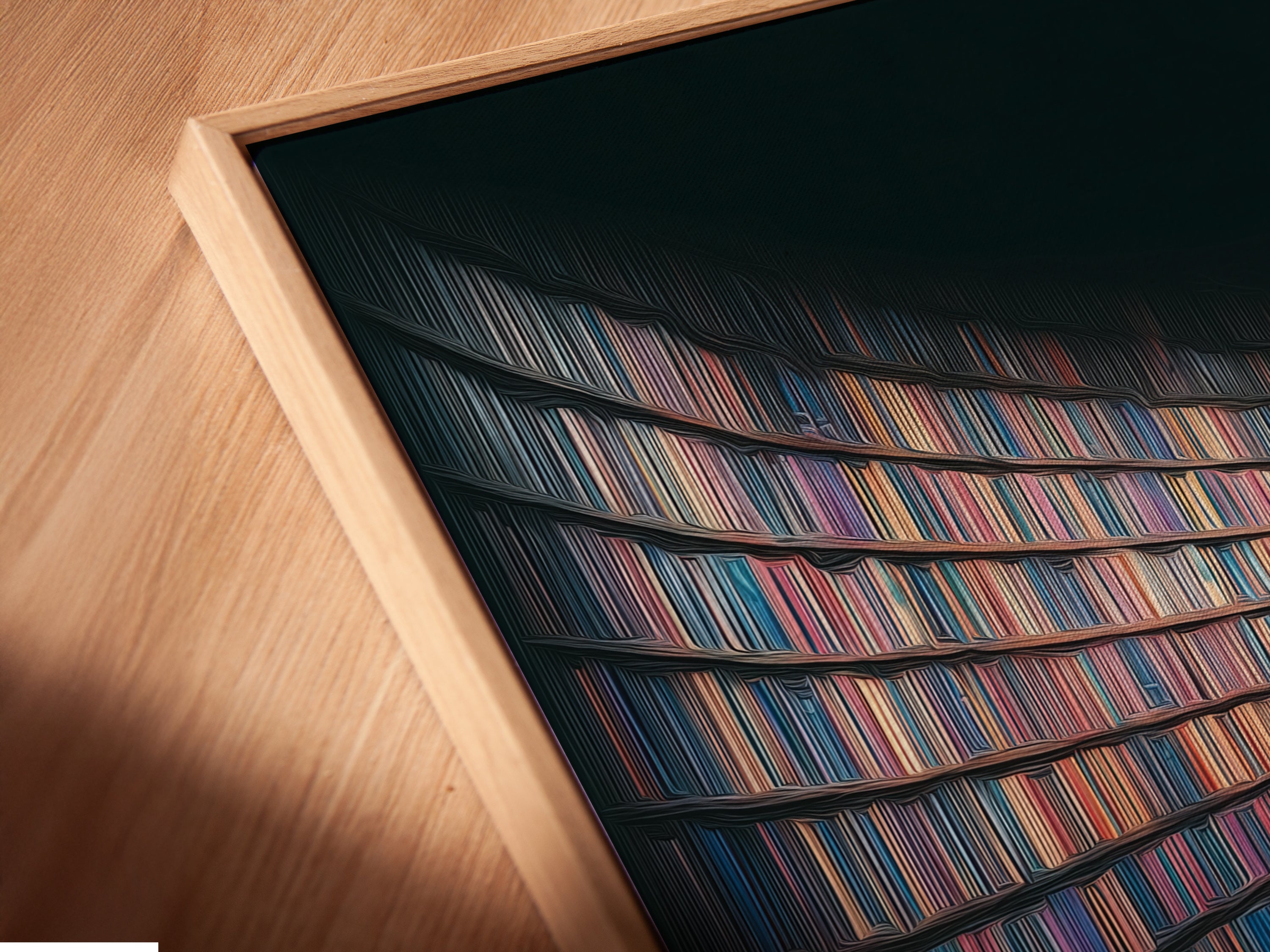
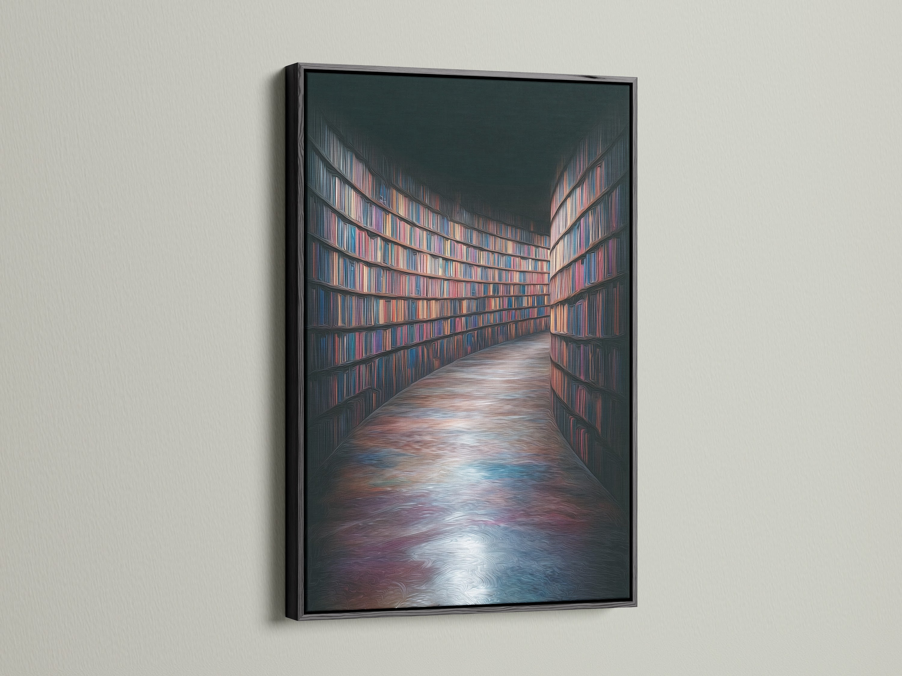
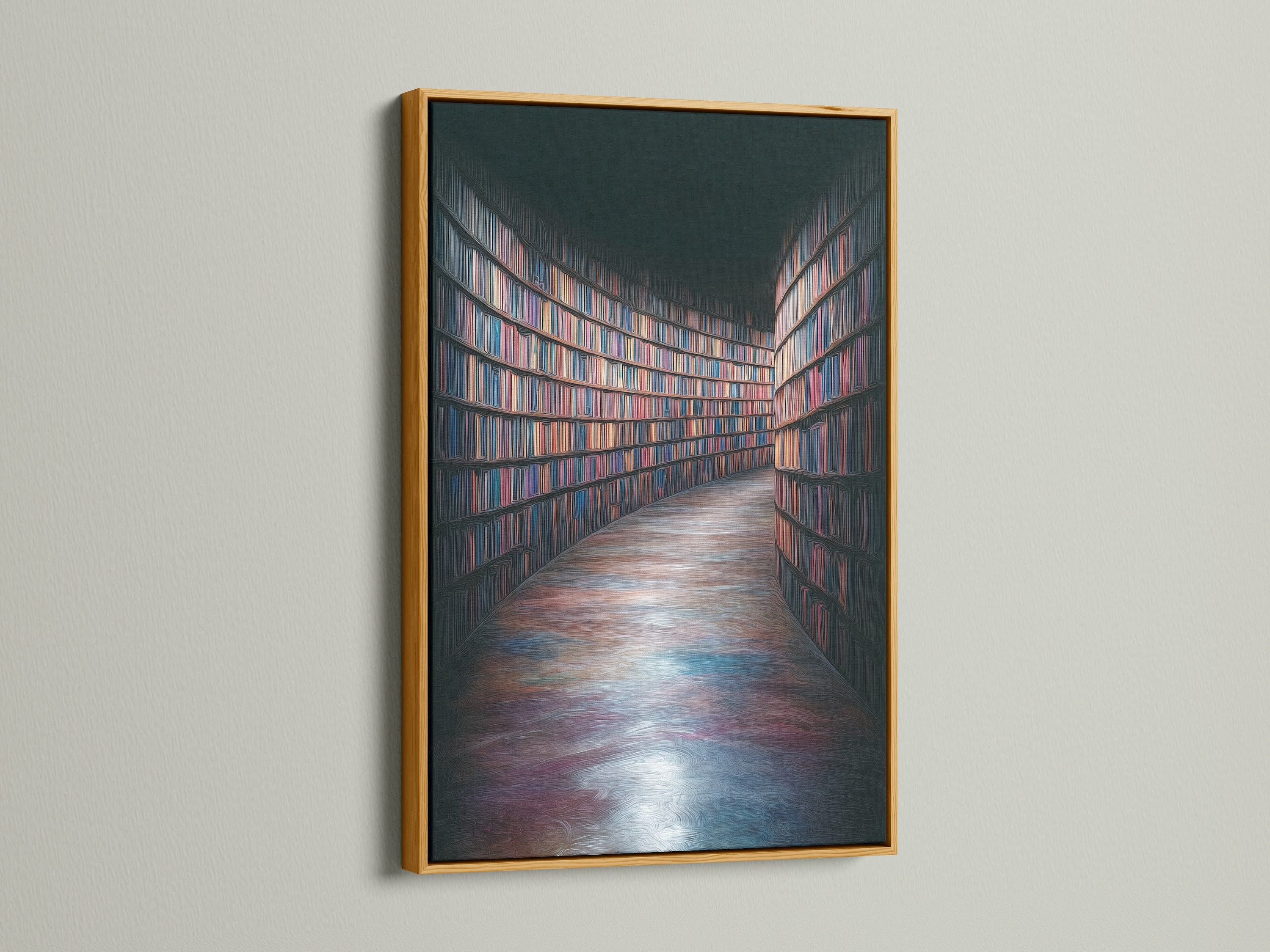
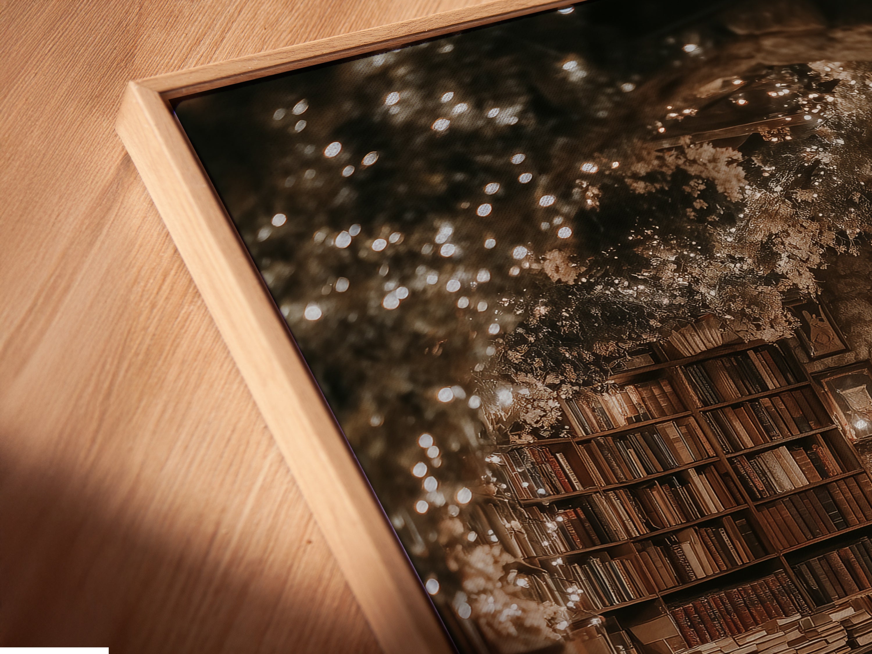
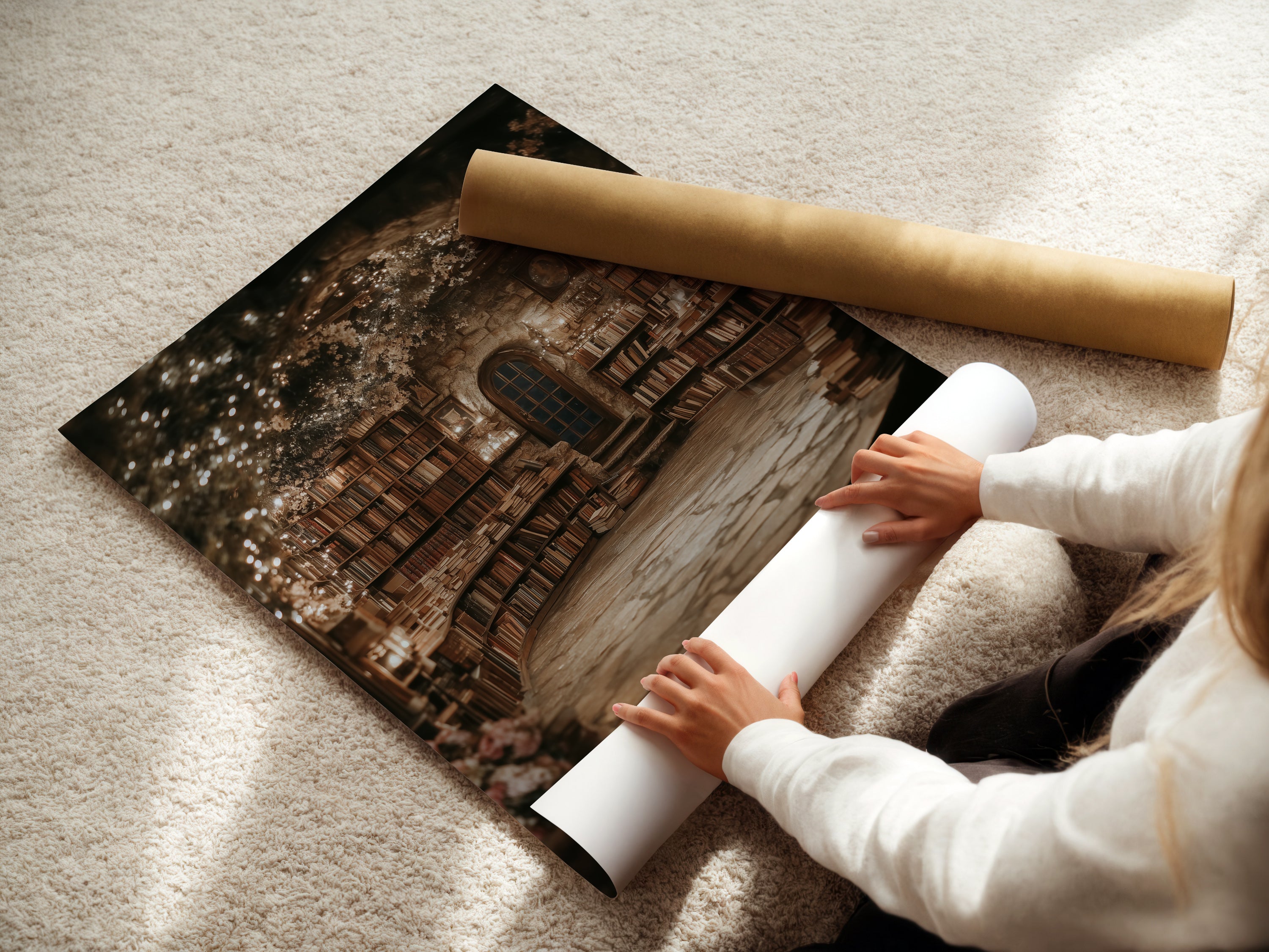
Printed using archival giclée pigments on museum‑grade substrates, the piece is available as a Fine Art Poster, a stretched canvas, or a floating‑frame canvas. The poster option offers a beautifully matte surface for glare‑sensitive spaces; the stretched canvas arrives taut and ready to hang; the floating frame adds a slim reveal around the edges—think gallery polish without fuss.
Deep, bookish hues benefit from pigment density and a low‑gloss finish, which preserve shadow detail. The result is a print that looks substantial up close and wonderfully calm from across the room.
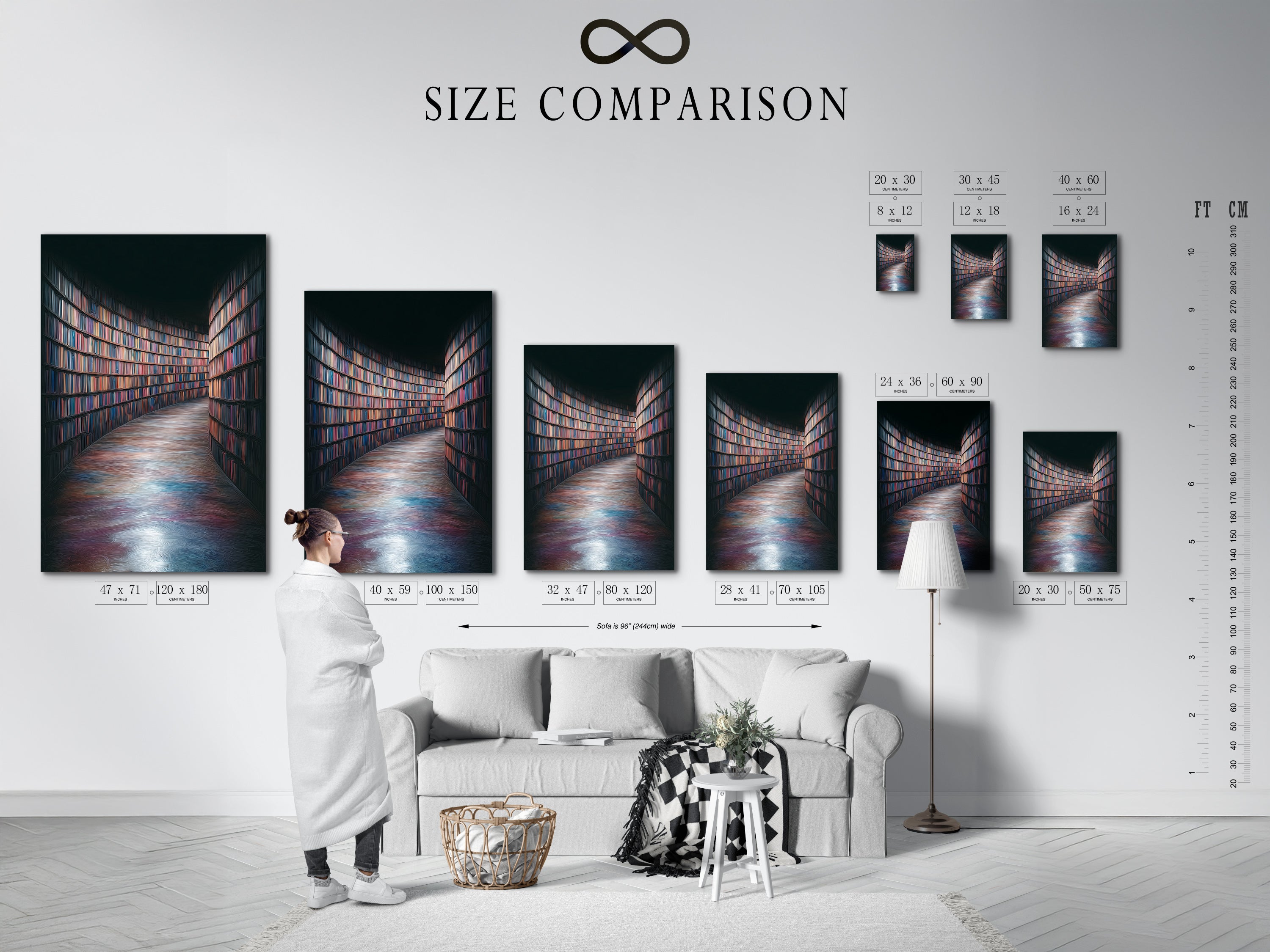
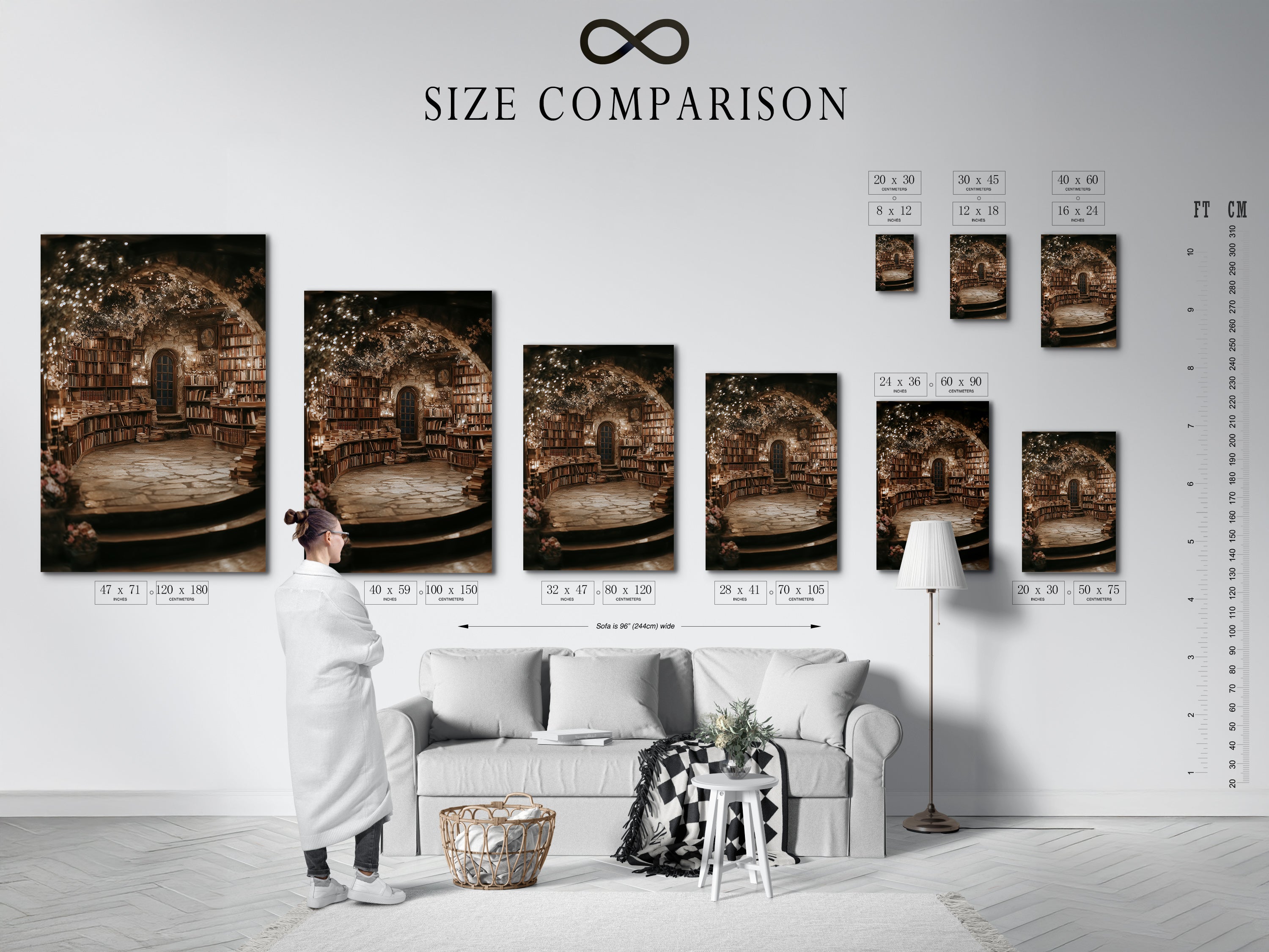
Scale Rules—Pick the Right Size for Shelves, Nooks & Walls
Getting scale right is half the magic. Use these quick formulas to take the guesswork out:
Above furniture: artwork width ≈ 60–75% of the furniture width
Centering rule: place the center of the artwork ~57–60 in (145–152 cm) from the floor
Gallery sets: keep 2–3 in (5–7.5 cm) between frames
Bookshelf styling: On shelving, pick smaller sizes and lean the print behind stacked books to layer depth. In a reading nook, pair a mid‑size canvas with a floor lamp to echo that library glow. For wide home‑office walls, go larger and anchor with a vintage rug.
Palette Play—Wood Tones, Leathers & Low‑Glare Neutrals
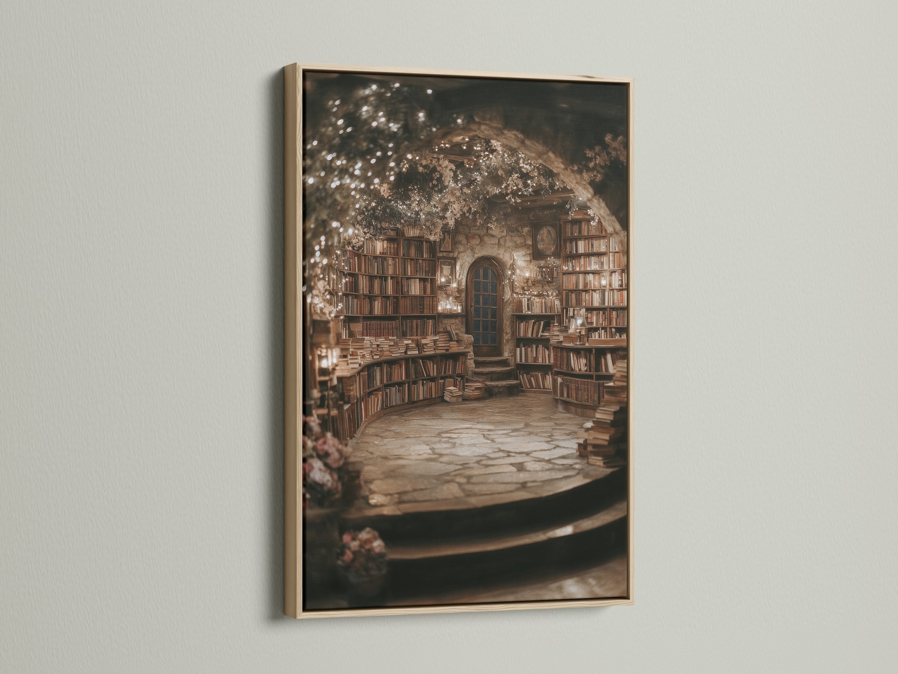
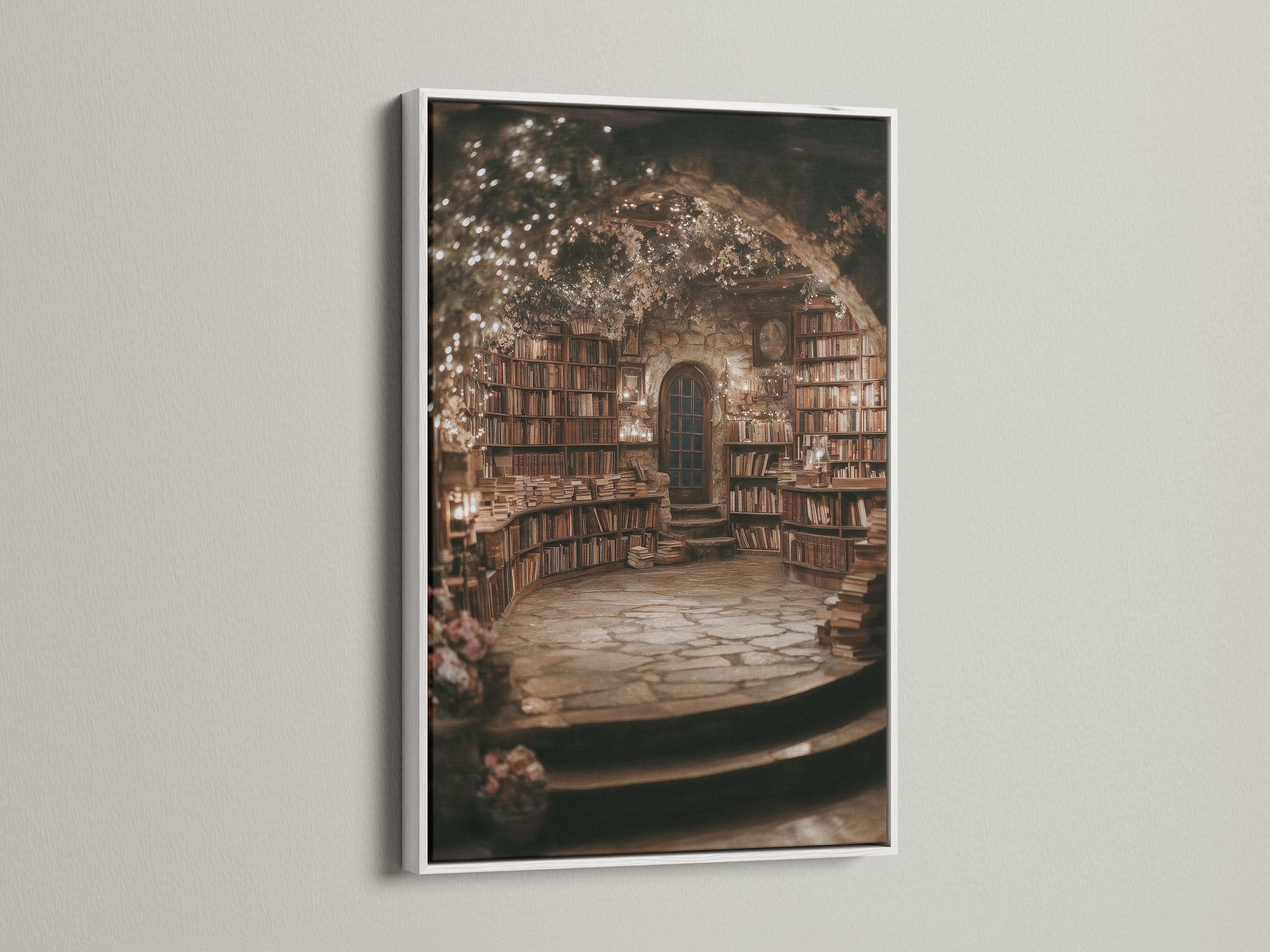
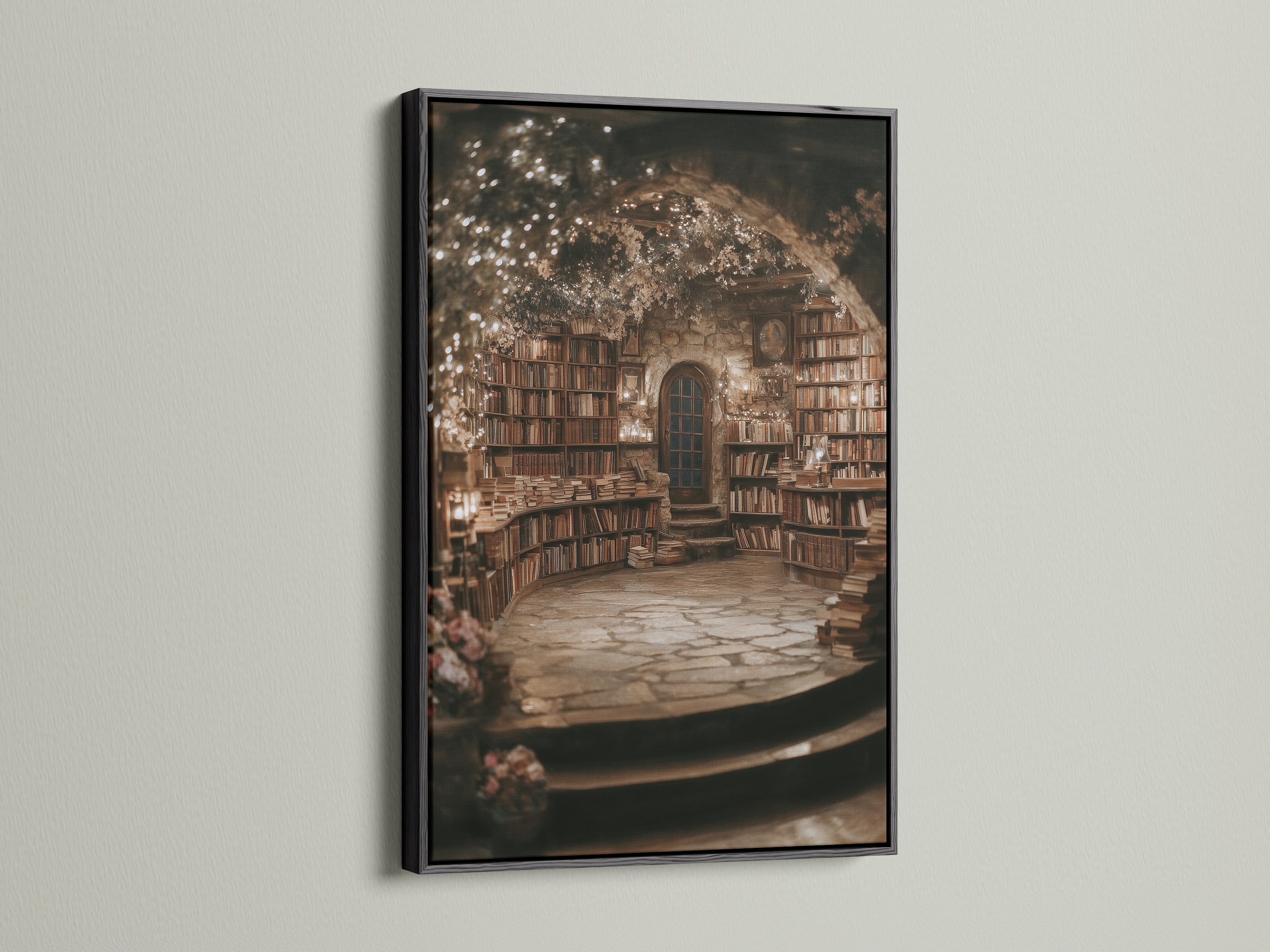
The print’s warm browns pair naturally with oak and walnut bookcases, saddle‑brown leathers, and antique brass. On pale plaster walls, a brown or oak floating frame warms the composition; on charcoal or navy walls, black sharpens the silhouette; in sunny rooms, white or gold frames brighten and keep things airy.
Shelf Styling & the Art of “Bookshelf Wealth”
“Bookshelf wealth” isn’t about having more things—it’s about rhythm and restraint. Mix vertical and horizontal stacks, tuck a small brass object to catch light, then lean this print behind the arrangement so titles and tones echo across the vignette. Keep at least one negative‑space pocket so the eye can rest.
If your shelves are deep, set the artwork at the back panel, then layer one or two objects in front; if shelves are shallow, mount the piece just above the case so the sightline stays clean. Either way, soft, indirect lighting will flatter the matte surface and the velvety ink density.
Where It Shines—Reading Nook, Study & Home Office
Reading Nook
Pair a mid‑size canvas with a swing‑arm lamp and a cable‑knit throw. Keep the lamp’s shade linen to diffuse light across the matte surface.
Study
Center the print above a console stacked with dictionaries and a bowl of fountain pens. A narrow gold frame echoes brass hardware without going glitzy.
Home Office
Go larger over a desk to rebalance the visual weight of monitors. The book grid calms the tech—and reads professional on camera for video calls.
Curated Pairings—Five In‑Store Companions for a Scholarly Gallery Wall
Build a cohesive, learned look with these five Artoholica pieces. Each complements the Library Books print by subject, palette, or mood. Tap through the galleries below; every image opens its product page.
Vintage Library Canvas Print — Cozy Book Nook
A classic stacks‑on‑stacks companion—warms white walls and deepens walnut settings.


Magical Library Canvas Art Print
A storybook whisper—introduces whimsy and softens the scholarly set.


Green Botanical Art Print — Woman Reading Book
A quiet figurative moment—sage greens and soft forms balance the bookshelf geometry.


Green Aesthetic Canvas — Woman Reading Art
Morning‑coffee serenity—soft greens and creams to lighten a moody palette.


Mark Twain Portrait Art — Geometric Writer
A literary anchor—the sepia‑toned geometry punctuates bookish textures with iconic presence.


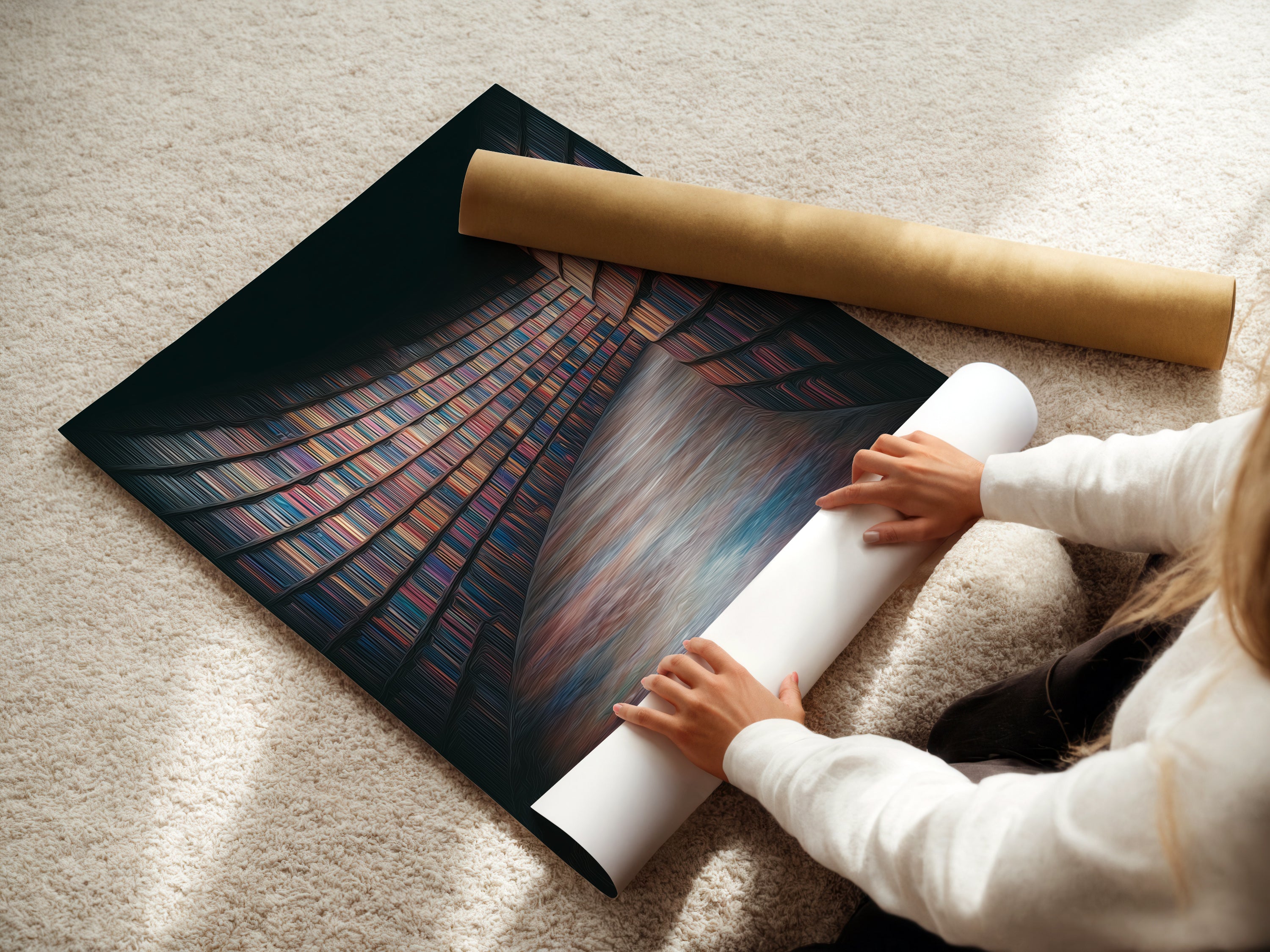
Craft, Shipping & Unboxing—What to Expect
Each print is produced to order to maintain quality control. Stretched canvases arrive with tidy, finished backs and hanging hardware; posters ship rolled in protective packaging. Frames are snug, with a slim reveal that casts a crisp shadow line around the canvas.
Orders are carefully packed to resist corner dings and abrasion. If your package takes an unexpected hit en route, customer support will assist with prompt replacements per the store’s policy.
Care & Longevity
To keep those deep browns and velvety shadows pristine, dust gently with a clean, dry microfiber cloth. Avoid prolonged direct sunlight and high‑humidity zones. If framing the poster yourself, use acid‑free mats and backing; for canvases, hang away from active heat sources and steam.
FAQs
- What sizes work best for shelves, nooks, and desks?
- For bookcases, choose smaller sizes that can lean behind stacks (think 8×10 to 12×16). For reading nooks, mid‑sizes (16×20 to 24×36) balance lamps and chairs. Above desks or consoles, use the 60–75% width rule for a grounded composition.
- Should I pick a floating frame or a stretched canvas?
- Floating frames add a thin shadow reveal for a gallery look—great with oak, brown, or black surrounds. Stretched canvas is minimal and modern, perfect when you want the image to float without trim.
- Is the Fine Art Poster archival?
- Yes—printed with archival giclée pigments on museum‑grade paper. The matte finish controls glare and keeps type on the book spines crisp.
- How do I center art above a console or desk?
- Start by placing the center of the artwork 57–60 inches from the floor. If hanging over furniture, keep 6–8 inches of space between the top of the surface and the bottom of the frame.
- Will deep colors fade near a window?
- Archival pigments resist fading, but bright, direct sun will shorten any artwork’s life. Place the piece out of direct UV, or use window treatments to soften exposure.
- Which frame color suits oak vs. walnut shelving?
- Oak frames echo lighter, honeyed woods; brown frames blend with mid‑tone leathers; black frames sharpen charcoal or navy walls; white and gold brighten airy palettes.
- Is hardware included?
- Stretched and framed canvases include hanging hardware; posters ship rolled for flexible DIY framing.
- What happens if my order arrives damaged?
- Reach out to customer support with photos of the packaging and item; they’ll arrange a replacement according to the shop’s damage‑in‑transit policy.
Related Reading