
Neutral Stone Canvas Art — Abstract Beige Wall Decor for Calm, Organic Spaces
View the product page • Browse the parent collection: Abstract & Geometric Wall Art
Earthy neutrals are back in a big way—creamy beiges, chalky taupes, and stone textures that read sophisticated yet soothing. This neutral beige canvas art anchors that look with layered rock forms in warm, organic tones. Available as a minimalist canvas print, fine-art poster, or floating-frame canvas, it slips into living rooms, bedrooms, and offices without demanding attention—then rewards a closer look with texture and depth. Ahead: why neutrals feel calm, how to style this piece in wabi-sabi and organic modern rooms, and exact sizing rules so your wall art never looks too small.
Meet the Artwork
A serene composition of stone-like forms floats over a creamy ground, with soft graphite accents that add definition without harsh contrast. The palette leans natural—beige, sand, parchment, and a hint of mineral gray—making it effortless to pair with oak, linen, jute, plaster, microcement, or travertine. The result is earth tone wall decor that feels both modern and timeless.
Finishes & Sizes
- Poster paper for flexible framing and a taut, modern look.
- Gallery-wrapped canvas for gentle texture and depth that flatters stone textures.
- Floating frames in brown, oak, white, black, or gold to fine-tune warmth or contrast.
- Standard and oversized options, including confident statements up to 40×60 where noted.

Why Neutrals Work: The Psychology
Neutrals earn their keep because they reduce visual noise and amplify texture. Beiges, creams, and soft grays create a backdrop that reads calm and sophisticated, letting natural materials and handmade finishes do the talking. Pairing beige abstract wall art with limewash, woven textiles, or raw oak adds tactility without clutter.
Curious to dive deeper? Explore thoughtful takes on neutral palettes in design: Alma de Luce: Neutral colours & elegance and Norse Interiors: Color psychology in interiors.
Wabi-Sabi & Organic Modern Styling
Wabi-sabi celebrates the beauty of the imperfect and the handmade—subtle plaster lines, a knot in the wood, a thumbprint in a ceramic glaze. This stone texture wall art complements that mood: it’s quiet, tactile, and grounded. Surround it with limewash or microcement walls, a hand-loomed rug, linen drapery, and slipcovered seating. Add a single artisanal vase or a stack of well-loved books to underline the “nothing extra” ethos.
Frame Colors That Complement
- Oak or brown warms the palette and amplifies the organic mood.
- Black adds crisp definition in light, airy rooms.
- White keeps things tone-on-tone and gallery-clean.
- Gold introduces a quiet glint that still reads neutral.
For more principles and room examples, see Houzz: Wabi-Sabi design guide and Decorilla: Wabi-Sabi interior design tips.

Size & Scale You Won’t Second-Guess
Fast Formulas
- Width target: aim for roughly 4/7 (≈57%) to 3/4 (75%) of the furniture width beneath.
- Gallery height: center the artwork at about 58" from the floor for most spaces.
Examples over common sofa sizes
- 60" sofa: art width ≈ 34"–45".
- 72" sofa: art width ≈ 41"–54".
- 84" sofa: art width ≈ 47"–63".
Gallery Height Standard
Keep the centerline near 58" in living areas; adjust 2–3" higher above tall consoles and a touch lower in cozy reading nooks.
Pro tip
In stairwells or long hallways, go vertical and larger (or consider a diptych) to keep the eye moving without adding clutter. For deeper reading on hanging and proportions, see this wall-art size guide.
Materials, Printing & Frames
This minimalist canvas print is produced as an archival giclée canvas using pigment inks for longevity and color fidelity. Canvas adds a subtle weave that flatters stone and plaster textures; posters deliver a crisp, matte finish. Floating frames (brown, oak, white, black, gold) create a clean reveal that visually “lifts” the art from the wall.
Care: Dust with a soft microfiber cloth. Avoid harsh cleaners and prolonged direct sunlight to preserve those nuanced earth tones.
Curated Complements
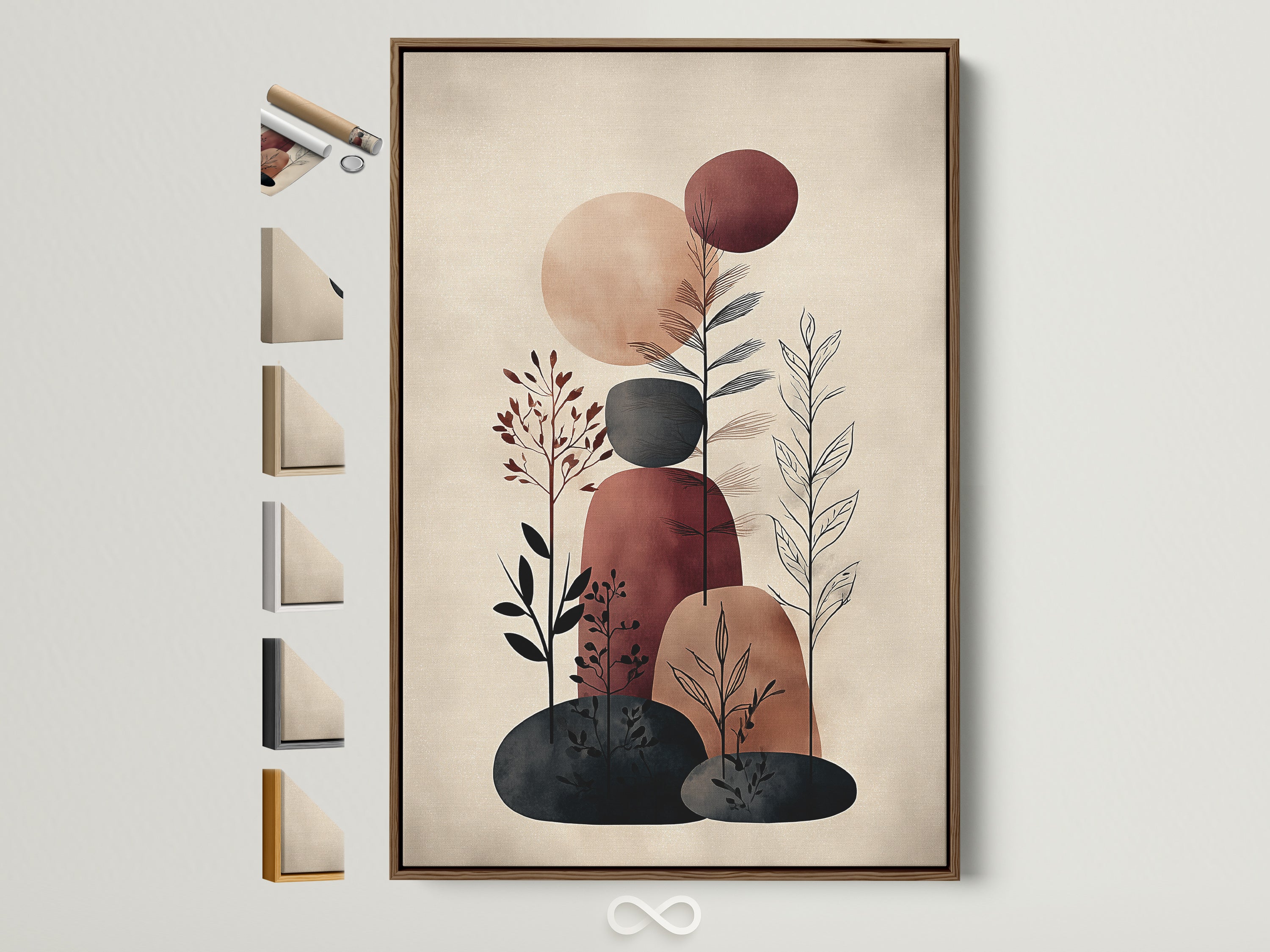
Abstract Botanical — Beige & Terracotta
Organic shapes echo the stone motif while terracotta adds a mineral warmth that still reads neutral.
Shop this complement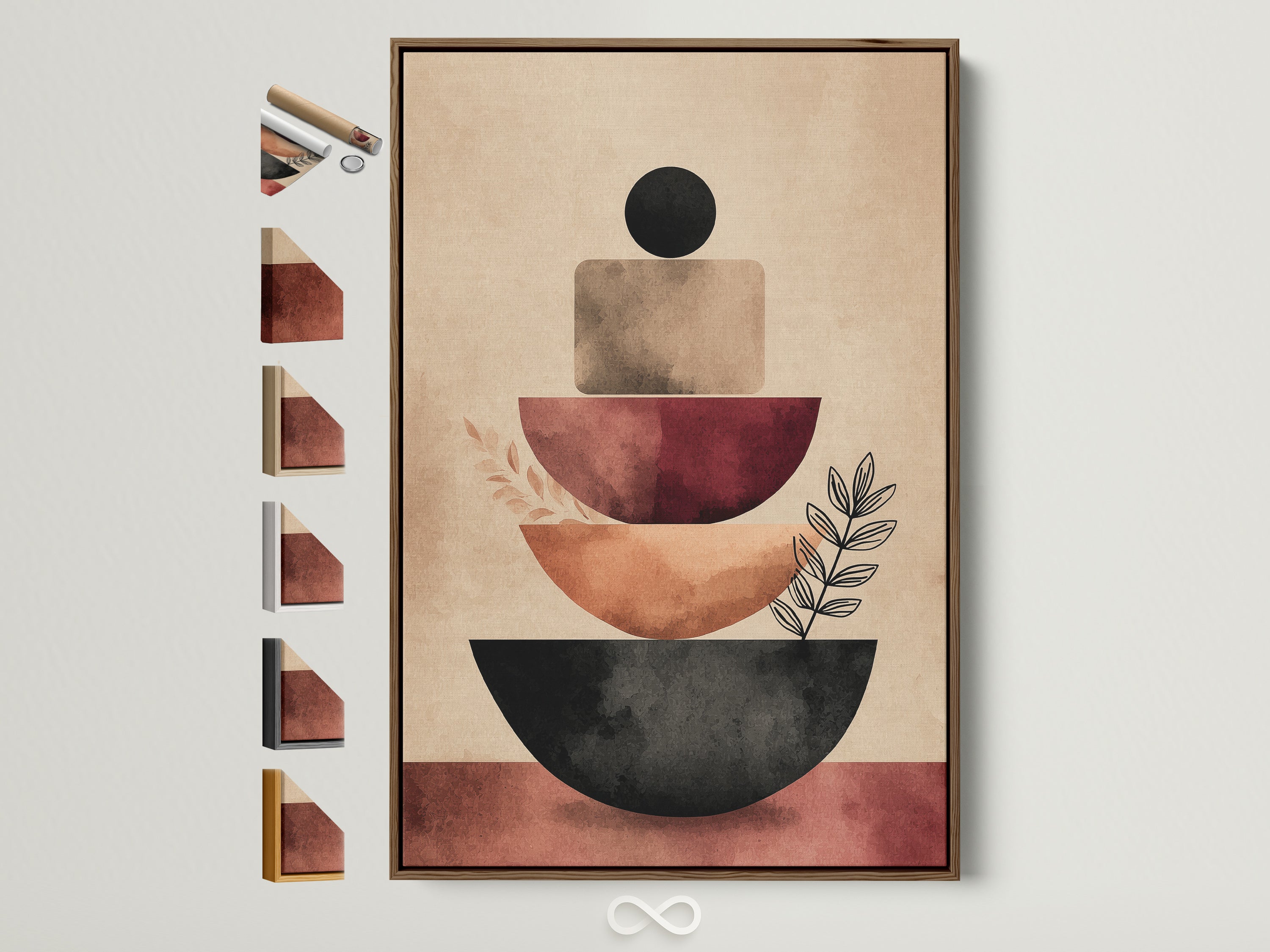
Geometric Shapes — Earth Tones
A graphic counterpoint to stone texture—pair for balance between soft tactility and structured form.
Shop this complement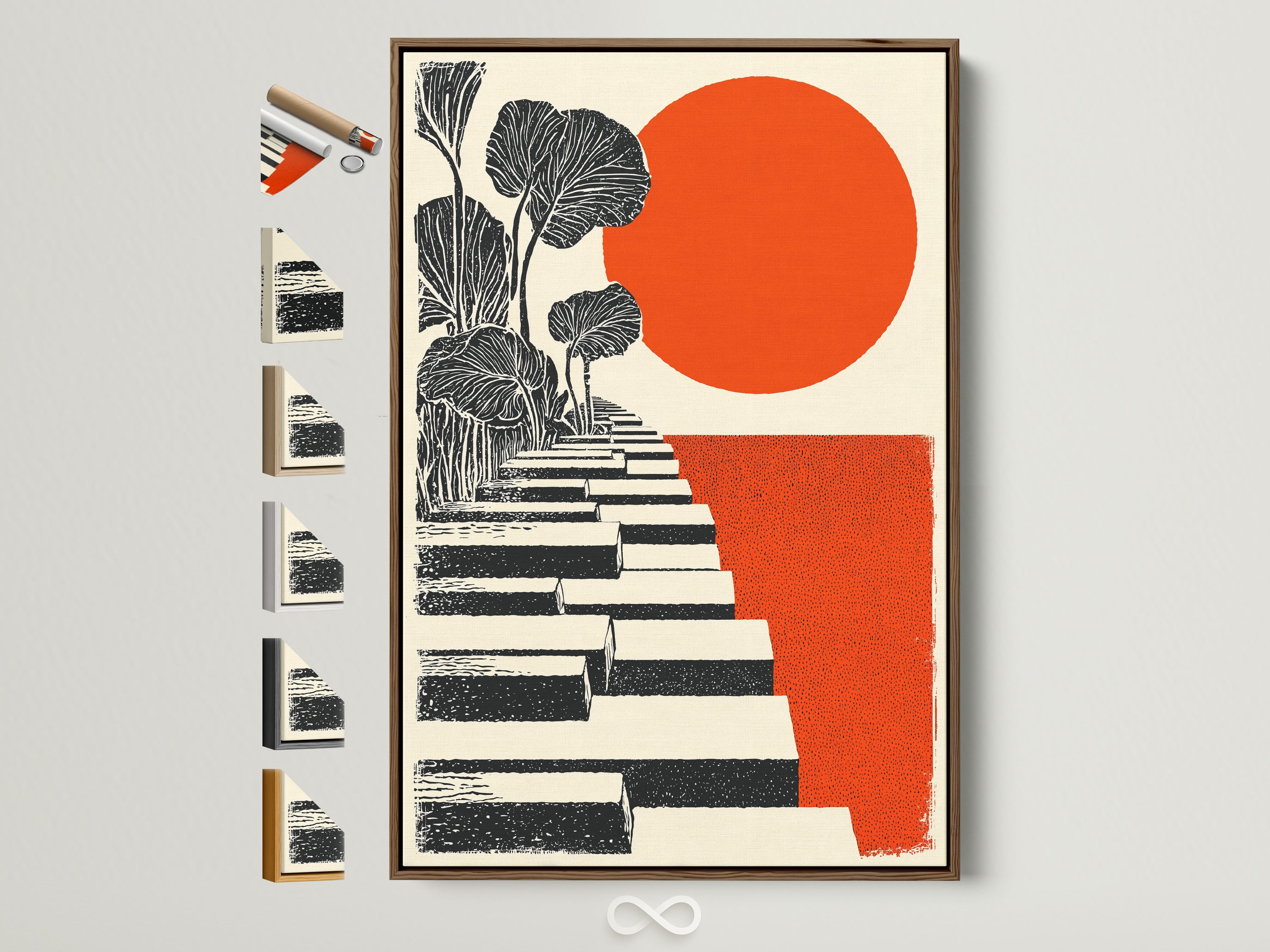
Orange Sun & Botanical Steps
Introduce a single bold note within the same warm spectrum to keep the palette cohesive.
Shop this complement
Neutral Abstract Beige — Minimalist Geometric
Pair as a calming diptych for broader walls; vary the orientation for gentle rhythm.
Shop this complement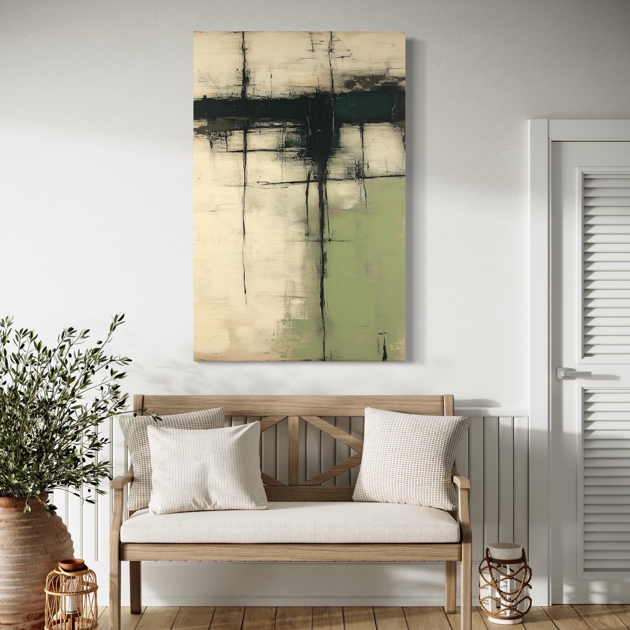
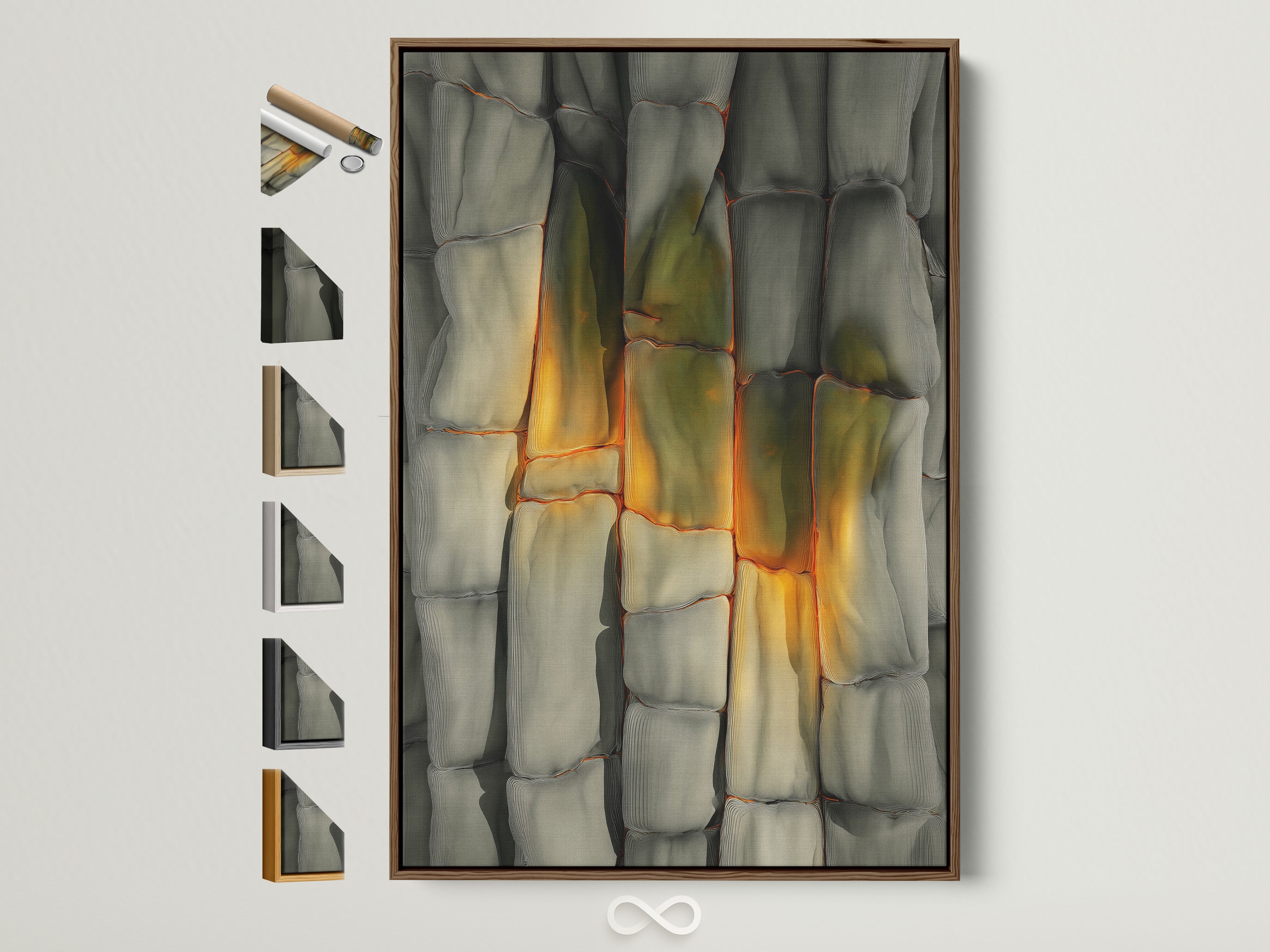
Green Abstract — Wabi-Sabi Texture
Introduce a mineral green accent without breaking the neutral story; great with oak or black frames.
Shop this complementStyle keywords to explore: neutral wall art organic modern decor wabi-sabi wall art abstract shapes art terracotta canvas print floating frame canvas
Where It Belongs: Room-by-Room Ideas
Living Room
Hang above a 3-seat sofa using the 4/7–3/4 rule; choose oak or brown frames to warm linen and jute textures.
Bedroom
Keep tones hushed over the headboard; pair with textured linen bedding and handmade ceramics for a restful, Scandinavian-neutral feel.
Office or Reception
Use a black frame for definition and pair with microcement, plaster, or white oak finishes for a polished, modern edge.
Quick Buying Guide
Choose Your Format
- Poster: best for sleek frames, tight budgets, and renters.
- Stretched canvas: soft texture; arrives ready to hang.
- Floating frame: a gallery look that elevates neutral palettes.
When to Go Oversized
Have a long sofa, tall stairwell, or entry with volume? Consider oversized wall art 40×60 for impact while keeping the palette calm.
Shipping and lead times are shown at checkout by region; production begins promptly and tracking updates follow automatically.
Care, Hanging & Light
Everyday Care
Dust gently with a microfiber cloth; avoid chemicals or abrasive pads. Keep away from persistent moisture.
Hanging Basics
Use two anchor points for level stability. Maintain the 58" centerline guideline, adjusting slightly for furniture height.
Light Considerations
Indirect light preserves nuanced beiges and parchment tones. If sunlight is strong, consider a spot that avoids prolonged direct exposure.
Long-Term Tip
If rotating art seasonally, store canvas vertical in a cool, dry place to protect the frame reveal and corners.
FAQs
Is neutral beige wall art still in style?
Yes—neutrals remain a design mainstay because they calm busy rooms and let texture take the lead. They also make layering accents effortless.
Which frame color works best with earth tones?
Oak or brown warms the palette and feels organic. Choose black for crisp definition, white for an airy gallery vibe, and gold for a subtle glow.
How big should my canvas be over an 84" sofa?
Aim for about 47"–63" wide (roughly 4/7 to 3/4 of the sofa). If your ceilings are high, scale toward the upper end.
Can I pair beige art with color?
Absolutely. Introduce a single saturated textile (a rust throw, olive cushion, or slate vase) to keep the look cohesive yet lively.