Style Playbook · Dark Academia × Botanical
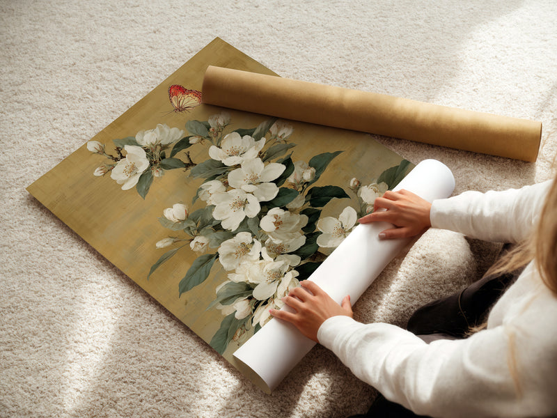
Botanical Canvas & Framed Prints for Dark Academia Home Office Decor
Create a focused, bookish workspace that feels timeless—not gloomy. Below you’ll find color maps, layout formulas, lighting that flatters art, and 12 curated botanical pieces you can drop straight into your office.

Dark Academia, defined for a home office
Nostalgic academia, but practical for daily work.
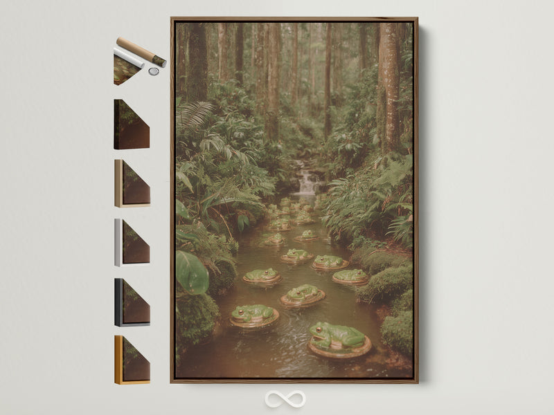
Dark Academia is an aesthetic that borrows from libraries, Oxford quads, oil paintings, and literary romance—think deep woods, candlelight, and patinated metal. In a home office, that means controlled darkness: matte walls, layered light, and warm textures that cradle your focus. Botanical artwork is the linchpin because it adds organic movement and a hint of scholarship—herbarium plates and vintage florals nod to science and art at once.
We’ll pair moody greens and oxblood with warm woods, then thread in botanicals that range from classic engravings to contemporary abstracts. The goal is romantic and productive.
Palette blueprint (greens, oxblood, ecru)
Classic dark‑academia palettes center on forest green, burgundy, ochre, ecru, and browned blacks. Start with a low‑gloss wall (matte or mineral), then layer oak, brass, and botanical inks.
For a deeper materials dive, see our guide to limewash & mineral paint, which delivers the soft, chalky movement that flatters botanical prints.
Lighting: moody, not murky
Layered light keeps a dark office crisp. Use three layers:
Ambient
- Diffuse glow from a paper or fabric pendant. (Akari‑style lamps lend sculptural calm—see our Akari lighting framework.)
- 2700–3000K bulbs to keep art and skin tones warm.
Task & Accent
- Desk lamp with a focused beam (shielded to reduce glare on glass).
- Picture light or narrow spots grazing the canvas texture.
For standards and deeper reading, the IES Lighting Library is the industry baseline for quality light in workspaces.
Compositions above the desk
Anchor your desk with one commanding piece (32–48") or a tight triptych. If you prefer a salon wall, keep a clear “horizon” line so the composition reads as one idea.
| Composition | When to use | Hanging rule |
|---|---|---|
| Single Statement | Narrow desk; video calls | Center at 57–60" from floor |
| Triptych (3) | Wide desk; want rhythm | 1.5–2" between frames |
| Grid (2×2) | Symmetry lovers; cabinetry nearby | Top row aligned to door head height |
| Salon wall | Collected look; books + objects | Keep margins equal; one visual “spine” |
Frames, finishes & glass
Dark botanicals sing in frames that echo library furniture: black, walnut/oak, or aged brass. Use off‑white or pale‑mushroom mats to separate deep inks from the wall.
- Canvas: tactile, low‑glare—great opposite windows.
- Framed print: crisp linework; spec matte (non‑glare) glazing if you face a window.
- Floating frame: adds a shadow line that reads like built‑in millwork.
Bookcases & shelves that frame your art
Dark Academia loves a backdrop of books. Let botanicals punctuate verticals: center one print per bay or layer a small canvas in front of a short stack of books. Keep spines in a tight color family so the art remains the star.
For inspiration, see our Floral & Botanical Wall Art collection to mix scales—full‑height canvases next to 12×16 studies.
Layout recipes that just work
Over‑desk single: Pick a vertical botanical (30–40" tall). Keep the center ~60" AFF (above finished floor). Add a slim picture light for punctuation.
Triptych: Choose three related botanicals (e.g., leaf studies). Keep gaps 1.5–2". Align bottoms with the desk height for a grounded horizon.
Reading corner: Place a 24–32" botanical beside a floor lamp and small table. The composition reads as a quiet vignette on video calls.
Size & scale: measure once, hang once
Measure the wall width; subtract 25–33% to get a comfortable art width for a single piece above a desk. For multi‑piece sets, make your total width equal to ~⅔ of the desk, including gaps.
Ideal frame heights for seated work: centerline ~60" AFF if you stand a lot, ~57–58" if always seated and the camera sits low.
Paint, limewash & backdrops for botanicals
Matte surfaces let botanical inks breathe. Limewash adds micro‑movement that plays beautifully with organic subjects; deep slate, olive, or oxblood make pale blossoms glow. For an airy look, keep walls ecru and let dark frames supply contrast. Explore finishes in our limewash field guide.
Need a climate‑smart variant? See the ventilated, low‑glare lessons in Tropical Modernism at Home and adapt the lighting hierarchy.
Biophilic focus: why botanicals boost work
Nature cues (plants, wood, botanical imagery) are linked to lower stress and improved cognitive function. Even representations of nature—like wall art—help a room feel more restorative and less fatiguing over long sessions.
For a research lens, skim Terrapin Bright Green’s 14 Patterns of Biophilic Design and Economics of Biophilia. Green hues, in particular, are often associated with calm focus—use them in paints, textiles, and foliage to “soften” visual workload.
Seasonal switch‑outs & budget tips
- Autumn/Winter: oxblood mats, dark frames, deeper greens.
- Spring/Summer: lean into white blossoms and lighter woods.
- Budget: build a two‑frame kit (black + oak) in your main size; rotate prints seasonally.
Hunting a statement under five minutes? Browse the Floral & Botanical collection and filter by size first—then frame.
Three complete room “recipes”
Scholar’s Green
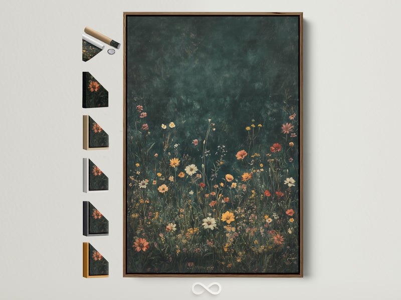
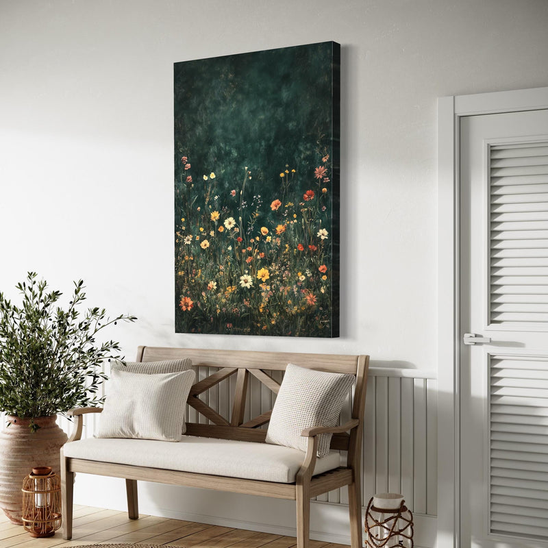
Forest wall, oak desk, linen chair. Over‑desk art: Wildflower Field. Picture light in aged brass; cotton rug in mushroom.
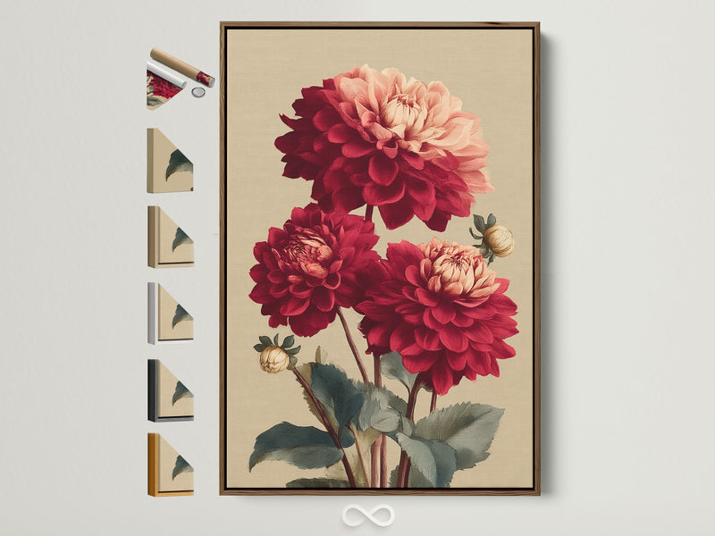
Oxblood & Ivory
Oxblood built‑ins, ecru wall. Anchor with Burgundy Red Dahlia. Add a task lamp in burnished bronze and a leather blotter.
Monk’s Black
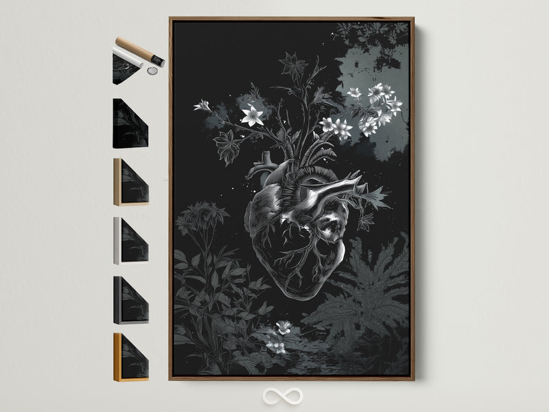
Ink‑black wall, walnut desk, brass hardware. Choose Botanical Heart for drama; balance with a pale linen shade and paper pendant.
Keep exploring
For a softer, textural cousin to Dark Academia, see Warm Minimalism. Pair its low‑glare lighting guidance with the botanicals above for study‑calm rooms.
FAQs
What colors suit a Dark Academia home office?
Forest green, oxblood, ink black, ochre, and ecru. Keep contrasts medium: dark wall + light mats or pale wall + black frames.
Is green paint good for productivity?
Green is widely associated with balance and reduced eye strain in work settings; pair a muted green wall with warm task lighting for sustained focus.
Canvas vs. framed print—what should I choose?
Canvas: tactile, low‑glare, great opposite windows. Framed print: sharper linework; specify matte glazing if facing a light source.
How high should I hang art above my desk?
Centerline around 57–60" above the floor. If your camera sits low, drop toward 57" to keep the artwork background centered on video calls.
How do I avoid glare on glass?
Use matte glazing and indirect lighting. Aim picture lights to graze the surface, not bounce into the lens.
What frame colors work best?
Black (graphic), oak/walnut (warm), or aged brass (glow). Match hardware to lighting for cohesion.
Can I mix vintage botanicals with abstract plant art?
Yes—tie pieces together by palette (e.g., forest + oxblood + ecru) and keep mat widths consistent.
What if my desk wall is narrow?
Choose one vertical piece 30–36" tall, or a stacked pair of 12×16 studies. Keep gaps tight (1.5").
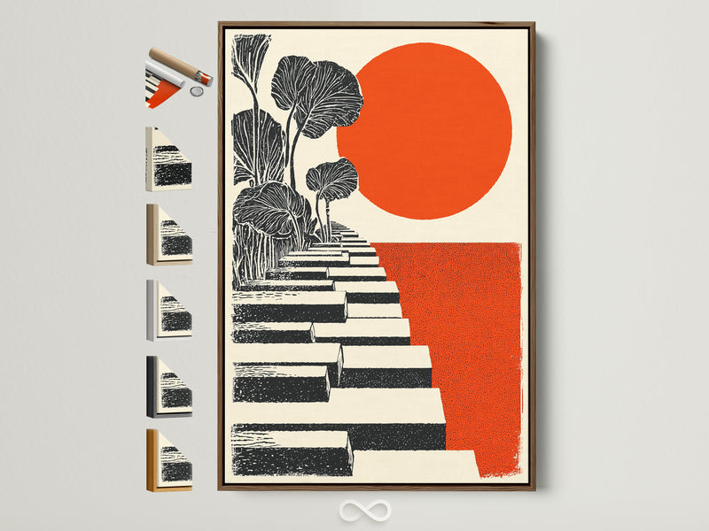
Are botanicals appropriate for modern offices?
Absolutely. Try graphic takes like Orange & Black Steps or Modern Abstract Plant.
0 Kommentare