Nautical Wall Art for Coastal Entryway Décor: Navy, Brass & Seagrass
Your foyer is the handshake of your home. Let it say “ocean breeze, right this way.”

Coastal Entryways 101: the look & the mood
Coastal style is less “pirate ship” and more “sunlit charter.” In entryways, we aim for breezy color, clean lines, and meaningful nautical references—art that sets a calm pace the moment the door opens.
- Palette: navy, seafoam, sand, driftwood, bright whites, with brass or matte black for definition.
- Subject matter: lighthouses, sailboats, charts & compasses, dunes & grasses, abstract seascapes, and sea life studies.
- Scale: on a 36–48" console, a 24–36" tall piece hits that “hello, but not shouty” vibe.
Pro move: begin with your art, then echo its accent hue in a rug or a woven tray. If you want a curated browse, start with our Nautical & Coastal Wall Art collection—it’s organized by subject and color so pulling a foyer story is fast.
Color & material palette: navy, whites & natural texture
Navy pairs beautifully with white walls, warm oak, and seagrass. Layer a runner in jute or sisal, add a rattan basket for keys and mail, and bring in a hint of polished brass in lamps or hooks. Your wall art then becomes the clear hero.
Quick coastal pairings
- Navy + brass + oak: smart, maritime, timeless.
- Sea-glass greens + matte black frame: crisp, modern coastal.
- Warm sand + white frame: airy Hamptons feel.
Iconic subjects for a foyer focal point
Lighthouses signal “guidance and arrival,” anchors feel steady, octopi add wit, and abstract seascapes give you mood without a literal theme. Choose one subject and commit—your entry will read confident and composed.
Geometric Lighthouse Canvas Print
Navy skies, golden beacons—anchoring energy for a foyer.

Anchor Canvas Print — Coral & Teal
A playful anchor motif with beach‑house colors.

Abstract Anchor — Modern Nautical
Graphic, cheerful, and great with brass hardware.

Octopus Canvas Print
Detailed linework; instant conversation starter by the door.
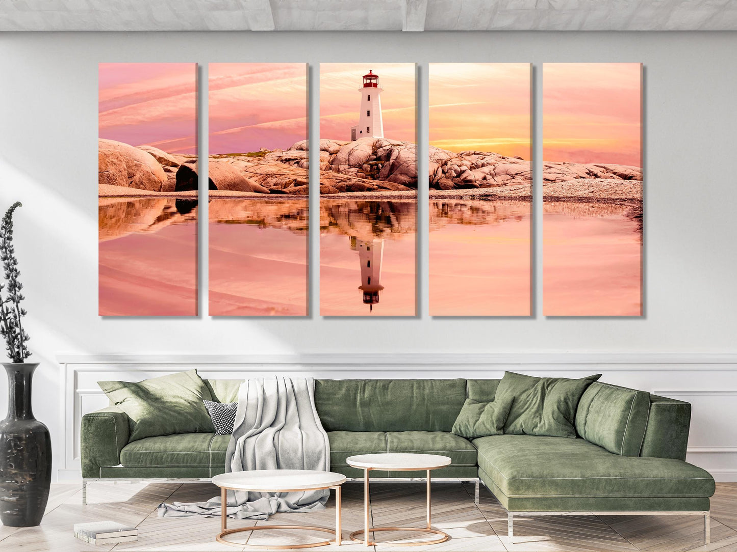
Peggy’s Cove Lighthouse — Sunset
Serene pink skies; looks refined above a slim console.
Sizing art for narrow halls (and what never to do)
Entryways are usually compact, so scale is your secret sauce. Vertical formats (e.g., 20×40") keep sightlines clean, while landscapes (e.g., 24×36") suit wider foyers with a bench or console.
Good size rules of thumb
- For 30–42" wide consoles, pick artwork 24–32" wide (about ⅔ the width of the furniture).
- In tight hallways, choose vertical formats 20–30" wide to avoid crowding.
- Over a bench or shoe cabinet, art should be 6–10" above the surface so it doesn’t “float.”
Frames & finishes that feel coastal
Pick frames the way boat builders pick hardware—functional and unfussy. Oak frames introduce warmth, white frames amplify light, and matte black lends sharp definition for graphic pieces like charts and compasses.
- Oak: natural, beachy, forgiving with kids/pets.
- White: brightest and most gallery-like; ideal for small foyers.
- Black: crisp with navy and sea-glass palettes; great with maps.
Layouts for small entryways
Compose your “welcome moment.” For a classic console vignette: lamp + tray + art. Or try a diptych to widen a short wall. In super narrow corridors, a single tall piece keeps the rhythm calm.

Blue Gold Foil Abstract
Swirls of teal & gold echo sea‑glass and sunlight.

Teal Blue & Gold — Fluid Ink
A luxurious shimmer that loves brass hooks & lamps.

Aqua & Gold Abstract Landscape
Soft currents of mint‑teal for spa‑calm entries.

Abstract Beach — Beige & Teal
Light background = brighter foyer, instant.

Minimalist Beach Seascape
Neutral dunes & soft grays—pairs well with white frames.
Light, glare & placement: make it glow, not glare
Sunlight, glass doors, and glossy floors can cause reflections. If your foyer faces a bright exposure, pick matte canvas or non‑glare glazing and mount a small wall sconce or table lamp to graze the artwork from above or the side.
- Angle lighting: avoid direct aim from across the hall.
- Mind the mirror: position so the mirror doesn’t bounce glare back at your art.
- Night glow: warm 2700–3000K bulbs keep maritime hues cozy.
Seasonal swaps without a full redesign
Keep a secondary print in your closet to swap by season: sailboat photography for summer, abstract navy & brass for fall, black‑and‑white coastlines for winter, dune grasses for spring. If you follow micro‑trends, “Sardinecore” (fish‑inspired whimsy) is a fun accent—just keep it smart with elevated frames.
For inspiration on keeping coastal looks chic (not cliché), Homes & Gardens has a great rundown (see References). A light touch wins.
Function + beauty: hooks, trays & “drop zone” smarts
An entryway works hardest in ten square feet. Use a shallow console (12–14"), a lipped tray for keys, and wall hooks for bags or leashes. Let art provide the vertical “pause” that keeps the space feeling finished.
Blue Fish School — Minimalist Sea Life
Graphic repetition; calming movement for small halls.
Neutral Abstract Seascape
Sand + navy harmony that loves woven textures.
Compass & Seascape — Nautical Accent
Touches of red/gold add warmth to navy entries.
Sailboat at Sunset — Scenic Seascape
Bring a golden-hour welcome to your foyer.
Mosaic Lighthouse — Mediterranean Vibe
A sunny island mood, great with palm fronds & linen.
Explore the full Nautical & Coastal Wall Art collection for more lighthouses, charts, sailboats & sea life—all in custom sizes with fast shipping.
Hanging rules that save time (and walls)
Hanging once beats patching twice. Start with painter’s tape to mark the artwork’s width, then apply one of these designer‑approved rules:
- 57–60" on‑center: Most homes feel balanced when the artwork’s center lands about 57" from the floor (see Apartment Therapy; The Spruce).
- Above furniture: keep the bottom of the frame 6–10" above consoles or benches (Real Simple offers a great primer).
- Anchor well: use appropriate anchors for drywall, plaster, brick; BHG has method‑by‑wall tips.
Textiles, scent & sound: finishing touches
A runner softens steps, a bowl collects keys, and a gentle coastal fragrance (sea salt, vetiver, citrus) completes the sensory welcome. Avoid overly sweet candles; go clean and airy.
Easy entry styling recipe
- Low‑profile jute or sisal runner (door clearance friendly)
- Latched tray for keys + mail
- One coastal sprig (olive, eucalyptus, or dried sea grass)
Care & climate: entryways near sun, sand or snow
Foyers see fluctuating humidity and shifting temperatures. Canvas is resilient and wipe‑friendly; framed paper prints do best with non‑glare acrylic in bright entries. Dust lightly with a dry cloth; avoid aerosols near the artwork.
Budget‑savvy ideas & quick wins
- Statement first: invest in one hero print, keep accessories minimal.
- Swap seasonally: rotate two prints using the same hardware.
- Group smalls: if you own small frames, cluster them—don’t scatter.
Want to try a playful trend? Fish motifs are back in a chic way—think a single sardine print rather than a themed explosion. See the “Sardinecore” explainer in References for a tasteful take.
FAQs
What size wall art suits a small entryway?
For consoles 30–42" wide, choose art 24–32" wide. In super narrow halls, go vertical (20–30" wide) to preserve flow.
How high should I hang entryway art?
Use the 57–60" on‑center rule for most walls. Above a console or bench, leave 6–10" between furniture and frame.
Canvas or framed print for sunny foyers?
Canvas is forgiving under light; framed paper looks best with non‑glare acrylic to reduce reflections.
Which frame finish is the most “coastal”?
Oak for warmth, white for brightness, black for crisp contrast with charts and graphics.
Can nautical art work year‑round?
Yes. Keep the palette calm (navy, sand, white) and avoid gimmicks. Rotate in sea‑life or lighthouse pieces seasonally if you like.
What about mirrors in the entry?
Pair one mirror and one artwork, but avoid facing them directly if glare is an issue. Offset the mirror or use non‑glare glazing.
How do I stop art from looking “floaty” over furniture?
Mind the gap: 6–10" above the console, and try to span roughly ⅔ the console width.
Any quick styling formula?
Lamp + tray + art + one organic element (branch, sea grass). It reads styled, not staged.
Can I lean art instead of hanging?
Yes—lean a framed piece on the console for ultra‑low‑commitment styling (great for renters).
References
Ready to style your welcome moment? Browse Nautical & Coastal Wall Art and pick your hero piece—custom sizes ship fast.
0 Kommentare