Terracotta & Sage Kitchen Wall Art for Boho Breakfast Nooks
Two colors—terracotta and sage—can transform a kitchen corner into a slow‑mornings sanctuary. Below you’ll find palettes that sing with ceramics and linens, layout rules that actually fit small nooks, lighting that keeps art vivid near daylight and pendants, and a hand‑picked set of 15 Artoholica art prints you can shop as you read.

Terracotta + Sage: the modern kitchen palette
Terracotta brings warmth (think clay, toast, honey), while sage calms (think eucalyptus, olive leaves). Together they read earthy, fresh, and appetizing—ideal for the most sociable room in the house. Use terracotta as your cozy base, then thread sage through plants, textiles, and—yes—art.
If you already have stainless steel or cool grays, lean into deeper clay tones (burnt orange, paprika) and a smokier grey‑sage to bridge cool appliances with warm decor.
Subjects that suit kitchens (and this palette)
Botanicals & herbs
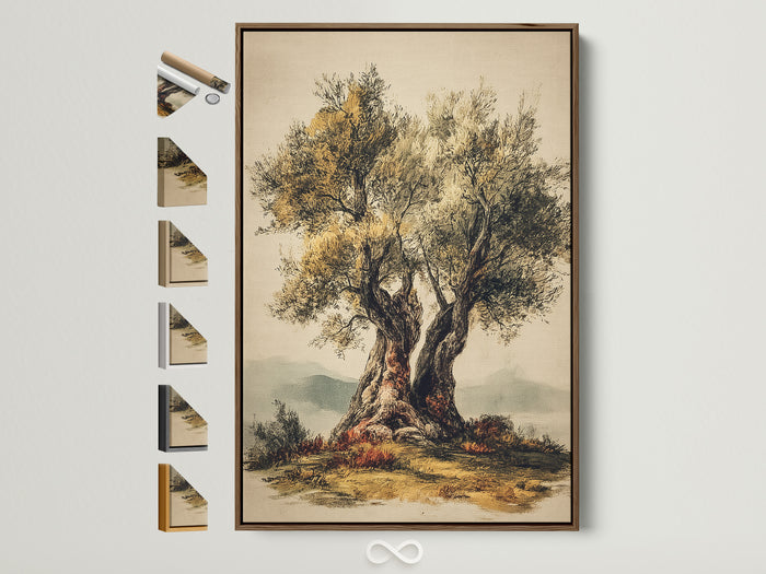
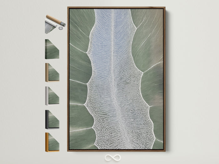
Leaf studies, olive trees, and modern leaf abstracts echo the sage side of the palette while staying timeless.
Citrus & fruit still lifes
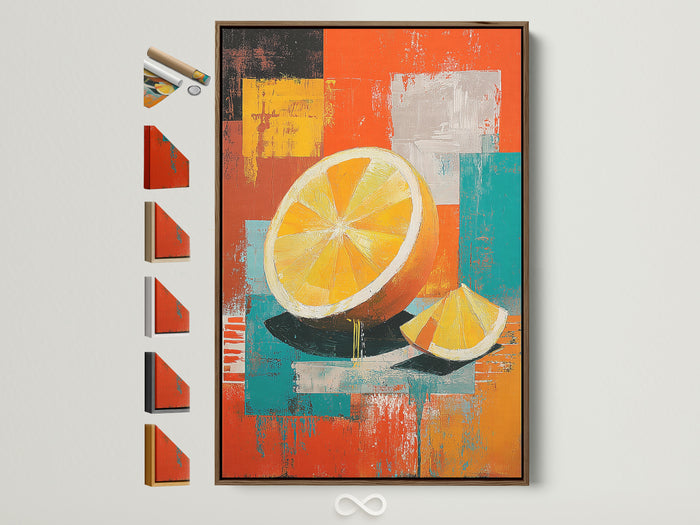
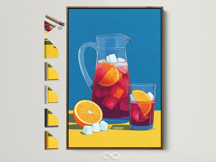
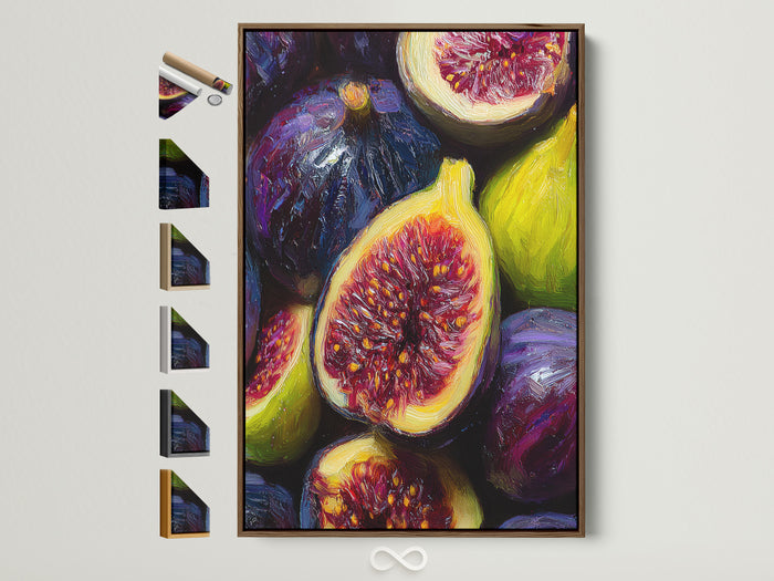
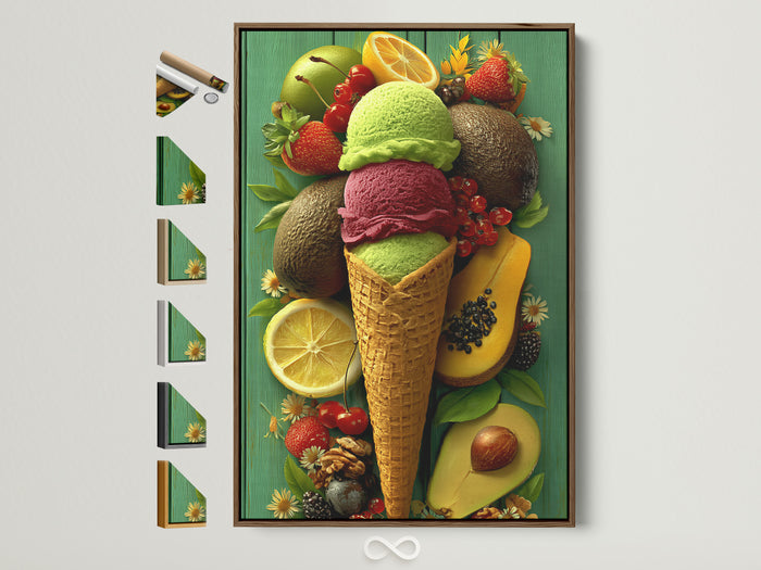
Orange slices, figs, and seasonal fruit cue freshness and appetite—great over breakfast benches.
Café culture
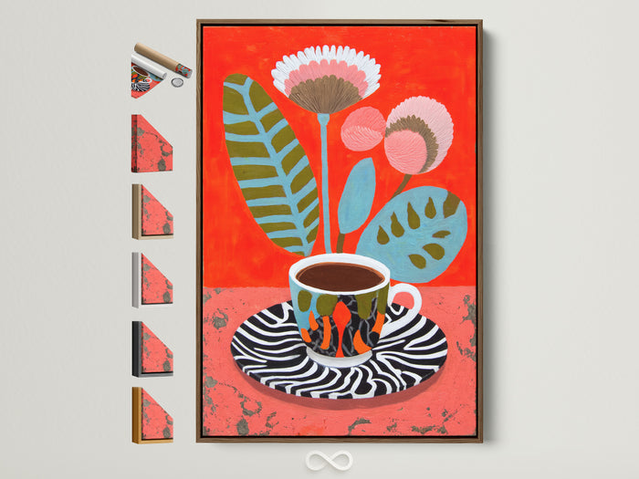
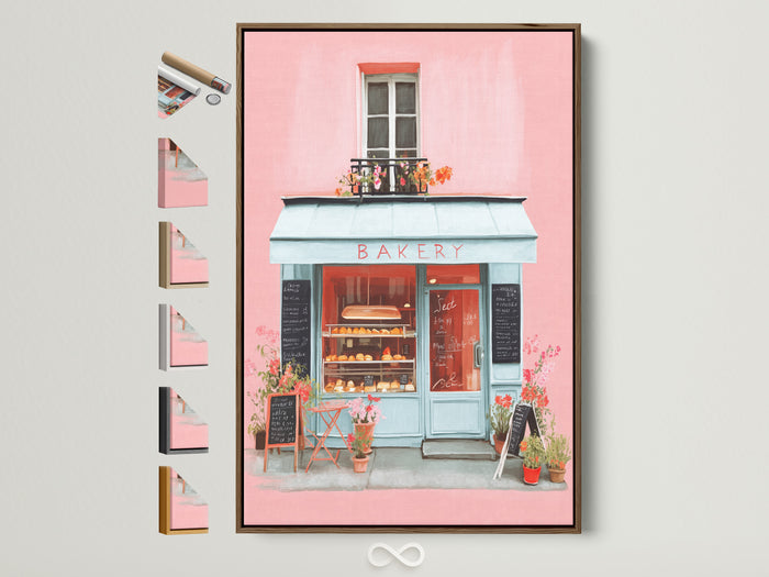
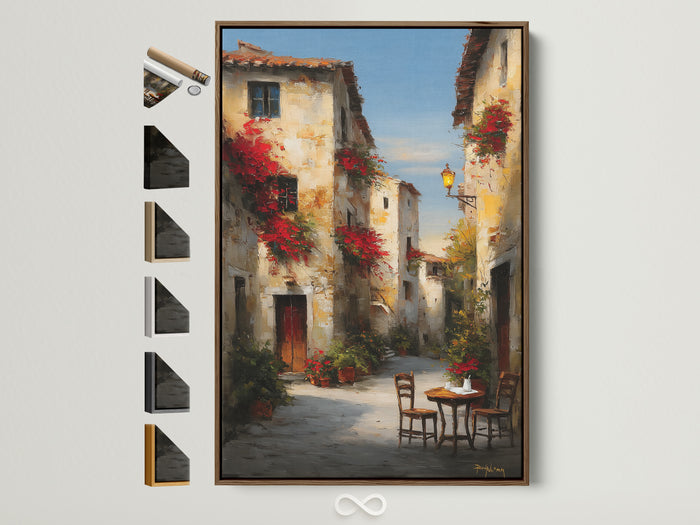
Barista vibes (cups, menus) and European street cafés add storytelling and warmth—perfect for boho nooks.
Picking sizes for breakfast‑nook walls
Measure bench width (or table width) and aim for art that’s two‑thirds the span. Over banquettes, keep the bottom edge 8–10" above the seat so shoulders don’t rub frames. For small walls, a pair of 50×70 cm (20×28") prints stacked or side‑by‑side keeps sightlines open.
If your nook is narrow, try a diptych or triptych to stretch the scene without one oversized piece overwhelming the space.
Shop the look: Warm terracotta + fresh greens
See more in Botanical Wall Art.Frames & finishes that actually work in kitchens
Kitchens see steam, splashes, and bright light. That doesn’t mean you’re stuck with metal signs; it just changes the finish you pick. A sealed canvas (matte) or a framed print with non‑glare acrylic keeps reflections and cleanup under control. Choose oak or light brown frames to echo butcher block and terracotta, or white for a crisp café feel.
Hanging near a range? Keep artworks at least 24" away from active cooking zones and use a wipe‑friendly finish. Over a coffee bar or shelf, shallow floating‑frame canvases look purposeful without protruding too much.
Layouts that fit: single, pairs, diptychs & ledges
- Solo statement (best for narrow walls): 60×90 cm or 70×100 cm portrait.
- Balanced pair: two 50×70 cm with 4–6 cm spacing; align top edges with cabinet lines.
- Diptych/triptych: stretches a scene around lighting or windows without losing breathing room.
- Picture ledge: one 90–120 cm ledge holds rotating minis (recipes, postcards, small prints).
Three fast mini‑makeovers for a boho breakfast nook
1) Coffee corner, but make it gallery
Combine a cup‑themed canvas with a small herb print and a narrow picture ledge for mugs. Repeat a zebra‑stripe, terrazzo, or checker pattern in a tray to echo the art’s graphics.
2) Citrus duo for sunny mornings
Anchor with an orange‑forward print; add a sage‑green linen cushion or placemat. A rattan pendant keeps things breezy.
3) Mediterranean café story
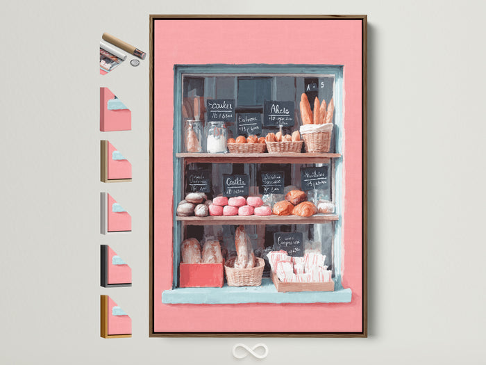
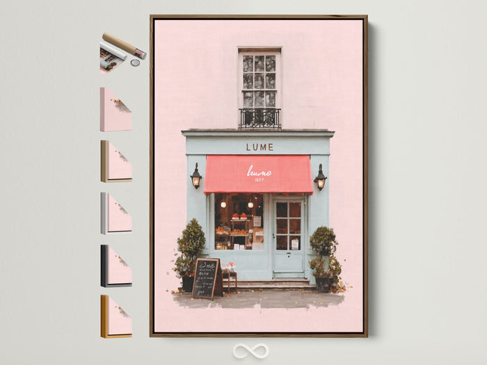
Mix an olive‑tree print with a Parisian storefront or Italian street scene. The narrative feels cozy, well‑traveled, and dinner‑party ready.
Shop the look: Fresh greens & café vibes
Light that flatters art (and food)
For cozy kitchens, pendants and sconces in the 2700–3000K range keep terracotta warm while leaving sage fresh, not gray. Look for a high CRI (90+) bulb so fruit and foliage look true to life. Add a small puck or picture light only if glare is controlled—non‑glare glazing and matte canvas help.
Care & placement near steam
Keep art at least a couple feet from kettles and coffee machines. For wipe‑downs, use a soft dry cloth (avoid chemical cleaners). If humidity spikes after cooking, crack a window or run the hood—consistent airflow protects canvas and paper fibers. For framed works in splash zones, choose acrylic glazing over glass.
Mount heavier pieces with strong anchors into studs; kitchens see more vibration than you’d expect.
Layout recipes you’ll reuse everywhere
- The Café Pair: one botanical + one food still life, aligned at the top. Simple and chic.
- The Story Stack: storefront over coffee cup; connect them with a wall hook for mugs.
- The Quiet Trio: sage leaf abstract + two small citruses in slim frames.
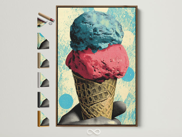
Shop the look: Sweet & fresh
Shopping checklist: get it right first time
| Thing | Why it matters | Target |
|---|---|---|
| Artwork width vs. bench | Reads balanced; avoids crowding diners | ~65–70% of bench width |
| Hanging height | Comfortable sightline while seated | Center ~145 cm / 57" |
| Finish | Controls glare & cleanup | Matte canvas / non‑glare acrylic |
| CRI of bulbs | True color for food & art | 90+ CRI, 2700–3000K |
| Spacing | Looks intentional | 4–6 cm between frames |
Budget moves with big impact
- Scale smart: choose one larger canvas + one small print instead of three mediums.
- Neutral mats: a thin off‑white mat around sage imagery adds air without new colors.
- Rotate seasonally: keep two extra prints in a drawer; swap with the seasons for instant refresh.
Want more neutral, nature‑forward inspo? Try our read on Neutral Botanical Abstracts for Japandi Living Rooms.
Shop the look: Storybook cafés
Advanced styling: mix motifs like a designer
Blend one literal subject (coffee, fruit) with one botanical (leaf, olive) and one place (bakery, street). Keep a common thread—frame color or background tone—so the trio reads cohesive. If your kitchen runs modern, add a single hand‑drawn or vintage‑etched piece for texture and age.
How to hang with confidence
- Map the centerline (57" from floor) with painter’s tape.
- Mark width: two‑thirds the bench width; keep 4–6 cm between frames.
- Use two hooks per piece to keep frames level on vibration‑prone walls.
Over tile or plaster, use appropriate anchors—and measure twice so you’re not patching grout lines later.
Where to place what
- Above banquette: portrait botanicals or a storefront scene.
- By coffee bar: cup art + mini herb study.
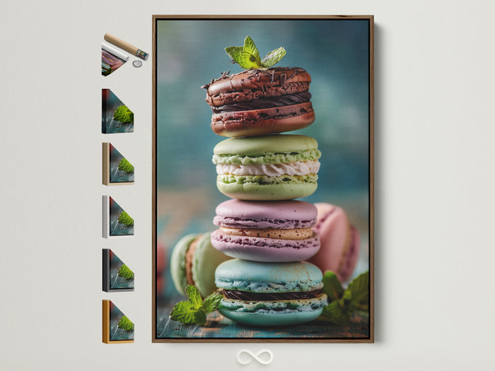
- Near open shelves: citrus or pastry still lifes—light, bright, joyful.
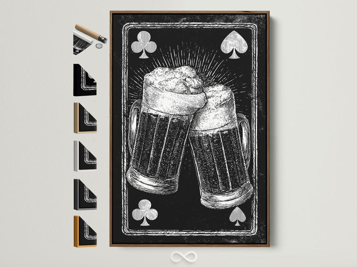
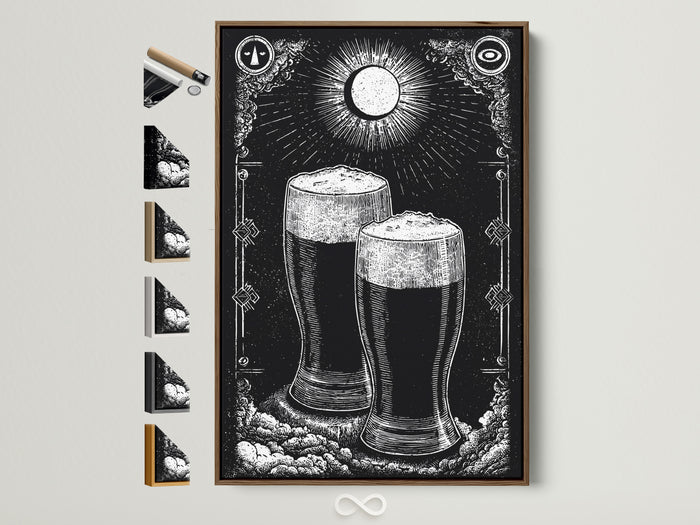
Want black‑and‑white contrast by the bar cart? Try a duo of vintage‑style brewery prints—graphic, witty, and splash‑friendly when framed with acrylic.

0 Kommentare