Mid‑Century Modern, Now: A Room‑by‑Room Playbook for Lighting, Materials & Flow
Mid‑century modern isn’t about nostalgia—it’s about easy elegance built from honest materials, generous light, and furniture that invites you to actually live in your rooms. Use this guide to get the mood right, piece by piece, without turning your space into a film set.

What “mid‑century modern” means—today
Born in the optimistic post‑war years, mid‑century modern (MCM) mixed factory‑age innovation with human‑scaled craft. In the U.S., West Coast experiments like the Case Study Houses showed how steel, glass, and modular parts could make everyday living feel open and easy. In Scandinavia, Danish modern softened the same ideas in warm woods and supple curves. Across the Atlantic, museums tracked the shift from austerity to optimistic design—see the V&A’s post‑war collection notes here.
Quick ID: the mid‑century checklist
- Low‑slung silhouettes with airy legs.
- Warm woods—especially teak and walnut—plus painted steel and molded plywood.
- Open‑plan flow and an indoor–outdoor mindset.
- Graphic color used sparingly but decisively.
- Layered lighting: soft ambient + focused task + sparkle accents.
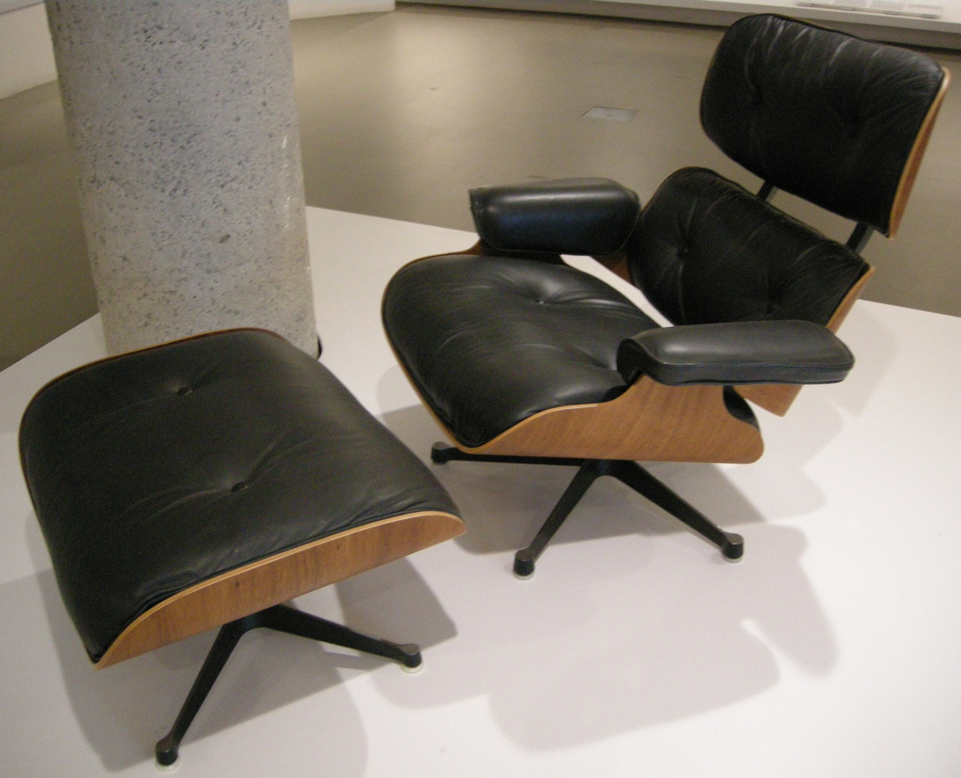
- A few friendly icons—think Eames Lounge (670/671), PH 5, Bubble Lamps, Egg Chair. Tip Read the Eames Office note on the lounge chair here.
Color & finishes that read mid‑century—without a time capsule
Start with sun‑warmed neutrals—camel, oat, tobacco—and add confident notes of teal, mustard, or coral. Pair real materials with soft‑hand finishes: limewash over crisp drywall, terrazzo‑flecked composite counters, linen and bouclé on seating. For a tactile wall that flatters wood grain, see our take on limewash walls. For concrete without the chill, see soft brutalism.
Mid‑century’s graphic streak still feels fresh when edited. A single geometric panel across closet doors or a color‑blocked headboard nods to De Stijl without shouting—our Neo–De Stijl guide shows clean ways to do it. Want a bolder moment? Consider a measured burst of supergraphics in a hallway or mudroom and keep adjacent planes quiet.
The lighting framework (ambient, task, accent)
Ambient: globe and saucer forms (like the Nelson Bubble family) cast soft, even light that flatters wood and textiles. Task: an articulated floor or desk lamp by the sofa or lounge keeps reading pools bright without glare—PH‑style shades are classics because they shield the eye. Accent: a slim picture light or a low pedestal lamp adds sparkle to art and objects.
Color of light: lean warm for living and sleeping (around 2700–3000K) and slightly crisper for worktops (around 3000–3500K). Period pendants look best hung so the lower edge clears eye level when seated; use one large saucer or a tight trio over a dining table. For an at‑a‑glance shape/size refresher, see Nelson pendant dimensions on Dimensions.com, and a short Bubble Lamp origin story here.
Room‑by‑room playbook
Living room
Float a low sofa on a generous rug to create a soft “island,” then place a lounge chair and ottoman at a friendly angle (never banish it to a corner). Add a warm wood coffee table with softly radiused edges and one sculptural floor lamp. Art can be a neat grid (mid‑century loves order) or one expressive large‑scale piece.
Dining
Choose a round or boat‑shaped table to keep flow between kitchen and living areas. Hang a single large saucer pendant or a pair of smaller globes ~28–34″ above the tabletop (adjust to sightlines). Mix bentwood or wishbone chairs with one upholstered captain’s chair for comfort.
Kitchen
Keep cabinetry calm—slab fronts, finger pulls—and invest in great task light: under‑cabinet strips and a dimmable central fixture. A terrazzo‑speckled counter and ribbed glass for upper doors add texture without clutter.
Bedroom
Think upholstered headboard, floating side tables, and saucer pendants in lieu of bulky lamps. Use a coral or mustard throw to warm a teak or walnut frame and a low bench at the foot of the bed for proportion.
Entry & hall
A narrow bench, peg rail, and one graphic art splash set the tone. If you want a stronger statement, borrow a move from supergraphics and wrap color around a doorway—then keep the next room quiet and tactile.


Icons you can use (lightly)
A smart way to keep balance: pair one recognizable icon with three humble, tactile moves—say, a PH 5 over a simple oak table, plus linen curtains and a jute rug. The room still whispers “mid‑century,” but it’s your life that leads.
Photography gave mid‑century its cinematic glow. Julius Shulman’s images—especially of the Case Study houses—taught the world what casual modern living looked like. His own words on that era are a quick, delightful read here.
Micro‑moves that make it sing
- Plants with sculptural leaves (rubber plant, monstera) to soften edges.
- Books + records for lived‑in texture—store in low credenzas.
- Neutral curtains that filter light; let wood grain take the stage.
- One bold color block or art moment; keep the next wall quiet.
Want more ideas across styles? Explore our Design archive for fresh pairings and finish recipes.
FAQ
- What defines mid‑century modern interiors?
- Human‑scaled proportions, open flow, warm woods (teak/walnut), honest construction, and layered lighting. It’s modernism with warmth and craft.
- How do I mix mid‑century with contemporary pieces?
- Keep the silhouette language consistent (low and light), match wood tones, and let one iconic piece lead while newer items stay quiet and tactile.
- Which colors work best?
- Base neutrals (oat, camel, tobacco) with edited accents—teal, mustard, coral, or brick—applied as artwork, a rug, or one color‑blocked plane.
- What lighting color temperature should I choose?
- Warm ambient light (roughly 2700–3000K) in living/sleep spaces, a little crisper (around 3000–3500K) for task‑heavy zones like kitchens. Dimming is your best friend for mood control.
- How do I avoid a theme‑park look?
- Use era references sparingly (one icon, one bold color move) and ground the rest in natural textures and simple forms.
Bring the look home—art that completes the room
Mid‑century rooms love graphic clarity. Abstract geometry and clean silhouettes echo the period’s clocks, lamps, and cabinetry—and they’re the easiest way to lock your palette. Browse a focused edit in our Abstract & Geometric Wall Art section.


