Bookshelf Wealth 2.0: How to Layer Wall Art, Frames & Color for 2025–26
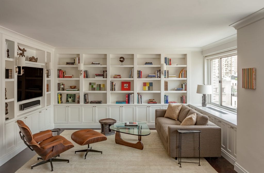
The viral “bookshelf wealth” aesthetic—cozy, collected, and quietly luxurious—has matured this year. Designers are mixing lived‑in shelves with leaning art, small portraits hung over stacks, and richer, room‑wrapping color. Here’s how to make the look sing on your walls.
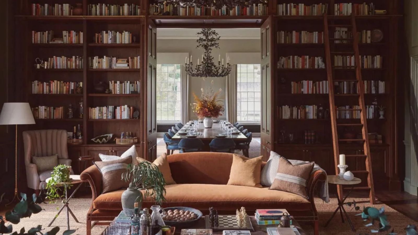
First coined by designers behind House of Hive and amplified by editors this spring, “bookshelf wealth” favors curated books you actually read, personal objects, and fine artwork displayed in surprising ways. ELLE DECOR’s trend guide framed it as a modern status symbol—less about labels, more about literate, layered rooms—while Decorilla’s round‑up showed the look working beyond studies, from kitchens to entryways.

What’s new for 2025–26 (and why it matters for walls)
- Art on the shelves, not just above them. Small portraits, sketches, and botanical studies are leaned or hung over the stacks using removable hooks—bringing depth and a hint of salon energy without clutter.
- Color that cocoons. Moody, tonal paint—think smoky greens, indigo, walnut, and cordovan—makes books and frames glow. Color‑drenching walls, trim, and even cabinetry is a defining move for the look.
- Collected, not staged. The most persuasive rooms feel assembled over years: a few heirlooms, a favorite map, a quirky objet—plus readable spines. Imperfection is part of the charm.
Quick art formulas that never miss
- Leaning Layer 12×16 portrait in a thin oak frame, leaned behind a 6–8 book horizontal stack—add one brass object.
- Over‑Shelf Hang 16×20 artwork hung on the face of a shelf stile with removable hooks; keep the shelf contents minimal to let the piece read.
- Micro Gallery Three postcard or 5×7 pieces in mixed finishes (black, oak, gold) in front of larger books—kept to one shelf only.
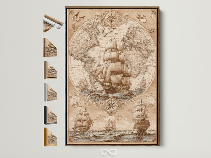
- Map Moment One antique map or nautical chart (18×24) above a low bookcase—anchors the vignette and introduces warm neutrals.
Frame & size cheat sheet for shelves
- Leaning art: 8×10, 11×14, 12×16, 16×20.
- Hanging over shelves: 16×20–18×24 (keep frames slim & light; use two anchors).
- Object‑scale art: 5×7–8×10 for layering in front of stacks or inside cubbies.
Palette plays that flatter books
Old‑world warmth: tobacco, cordovan, khaki, cream + gilt frames.
Library blues & greens: indigo, petrol, smoky jade + oak/black frames.
Soft modern: sage, putty, stone + matte maple/white frames.
Lighting: the secret sauce
Picture lights and small pin spots make spines and frames shimmer. For built‑ins, add warm (2700–3000K) LED strips at the underside of shelves; in freestanding bookcases, use a low‑glare table lamp so art and objects read without glare.
Styling checklist
- Start with books you love. Group by height or subject; avoid full rainbow order unless that’s your signature.
- Edit for air. Use negative space so one special frame or sculpture can “breathe.”
- Mix frame finishes intentionally: two the same, one contrasting, repeated once.
- Keep a refresh box—rotate a few books and art pieces seasonally to keep the shelf alive.
Shop the Look · Artoholica Picks
Further reading
- What is “bookshelf wealth”? — House Beautiful’s explainer.
- Why this look endures — Veranda on the collected, heirloom angle.
- No shelves? Try book stacks — BHG’s guide to styling safe, sturdy piles.
References
- ELLE DECOR — “How Bookshelf Wealth Became the Ultimate Status Symbol,” Mar 14, 2025.
- Homes & Gardens — “What to know about the ‘bookshelf wealth’ trend,” Apr 15, 2025.
- Decorilla — “Bookshelf Wealth: The Design Trend That’s Curating Personalized Interiors,” May 26, 2025.
- The World of Interiors — “Spines that Shine,” Jul 29, 2025.
- Better Homes & Gardens — “Forget Shelves—Stack Your Books,” Oct 23, 2025.
0 Kommentare