Brown Floating Frames Explained: Woods, Finishes & Where They Shine
Chocolate, walnut and smoked woods are having a real moment in interiors, and floating frames in those tones deliver a warm, tailored edge around artwork. Here’s how to choose the right species and finish—and where brown frames outperform black, white or brass.
First, what a “floating frame” really is
A canvas floater (aka shadow‑gap) frame is a tray-like moulding that surrounds a stretched canvas with a slim gap all around. That gap creates the “floating” effect and protects canvas edges. For works on paper, the similar look is achieved via float mounting inside a regular frame—your art sits on top of the mat or spacer so edges remain visible. The terms sound alike, but the hardware and use cases are different.
Anatomy of a Canvas Floater
Woods & brown finishes: what each does for the art
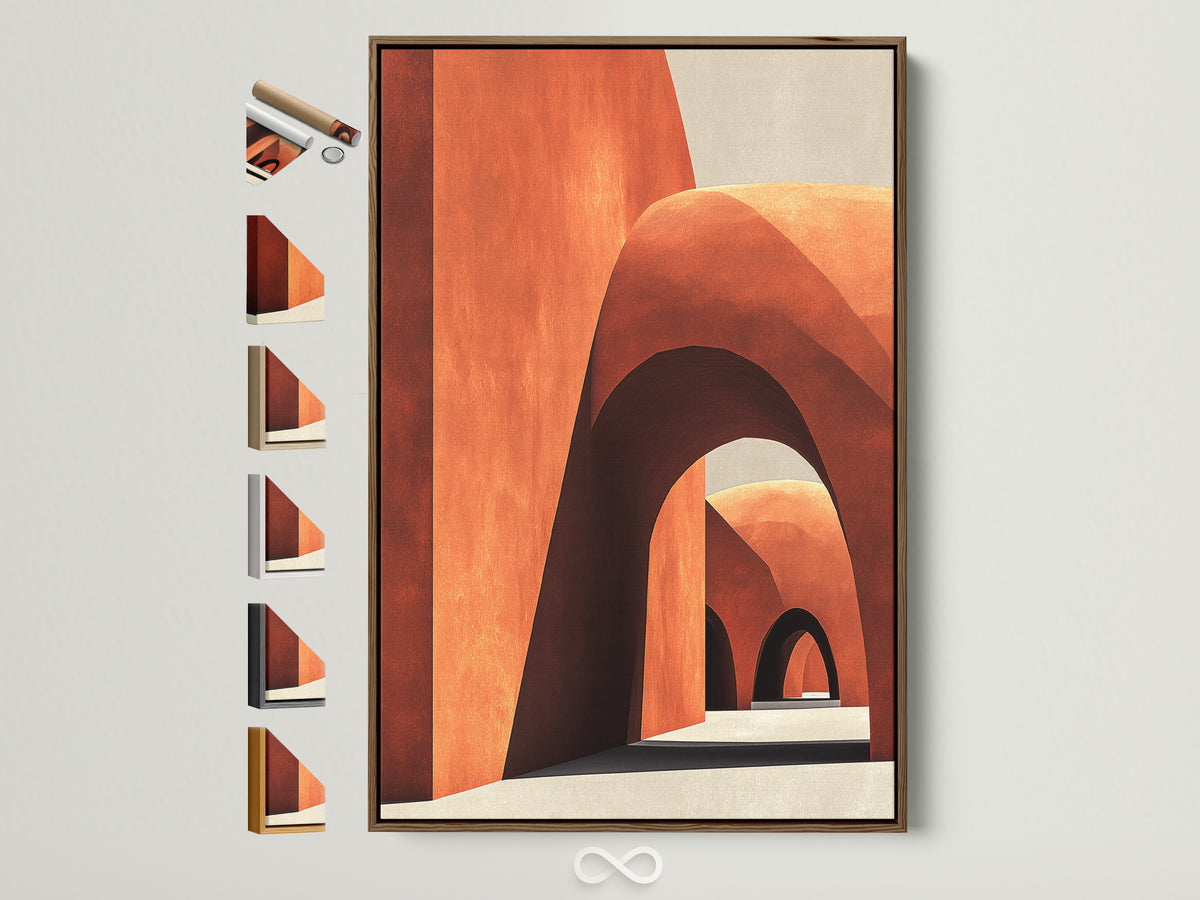
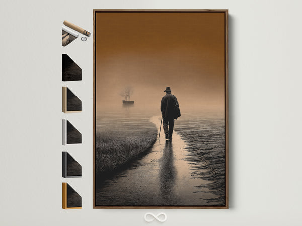
American Walnut (clear or dark stain)
Look: Rich chocolate to coffee tones with active grain. Effect: Adds depth and polish to landscapes, portraits, sepia or desaturated photography; warms cool palettes (blues/greens).
White/Red Oak (natural, smoked or fumed)
Look: From honey‑blonde to smoked umber; straight, visible grain. Effect: Natural oak softens bold graphics; smoked/fumed oak reads heritage and grounds maximal prints without going full black.
Espresso (walnut‑like stain)
Look: Deep coffee brown, semi‑modern. Effect: Crisp outline for abstracts and typography where matte black feels too stark.
Teak / Mid‑century browns
Look: Amber‑brown with vintage glow. Effect: Perfect for retro posters, Bauhaus geometry and coastal palettes with sun‑warmed woods.
Finish & sheen choices that change the read
Matte oil/wax emphasizes grain and gives a quietly luxurious, touchable look—great for “warm minimal” spaces. Satin poly is a tad glossier and more wipeable for busy areas. Ebonized oak (reactive dye/ink) keeps visible grain but pushes near‑black for high contrast without the clinical feel of painted black. Smoked/fumed oak shifts tannins for deeper brown‑gray tones that pair beautifully with earth‑tone artwork.
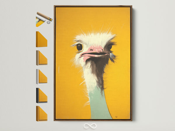
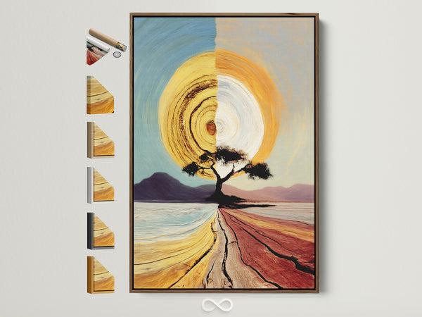
Shop the Look: Warm Minimal + Earth Tones

Where brown frames shine
- “Warm minimal.” If you love pared‑back rooms but want more soul than black frames give, reach for matte walnut or smoked oak. They outline the art while keeping the palette cozy.
- Bookshelf wealth. Eclectic libraries and collected rooms benefit from brown wood frames that relate to cabinetry and vintage finds; they look “grown‑in” rather than newly installed.
- Coastal updates. Sun‑washed sands, sea‑glass greens and driftwood textures get a sophisticated lift from medium‑brown oak or espresso—especially on botanicals and horizons.
- Color‑drenched walls. Deep wall colors (plum, oxblood, forest) pair beautifully with dark walnut; the tone‑on‑tone effect reads rich and considered.
Reading picks to complement this guide: See why dark woods are roaring back, how designers are embracing “dirty neutrals”, and a clear primer on float‑mounting vs. floater frames.
Glazing & spacers: make it museum‑smart
For paper works, consider UV‑blocking glazing. Optically coated glass and museum‑grade acrylic cut reflections to ~<1% while blocking up to about 99% of UV to help reduce fading. Acrylic is lighter and shatter‑resistant—often the safer choice for high‑traffic or large pieces—while premium glass has that satisfying “glass” feel and is more scratch‑resistant.
Sizing & profile quick rules
- Gap: aim for ~5–7 mm visible on each side of a canvas.
- Profile thickness: Slim (⅜–½″ face) for busy wallpapers or gallery walls; medium (¾–1¼″) for stand‑alone statements 24×36″ and up.
- Paper art: Float‑mount with spacers; choose 4–8 ply mats in bone or natural linen if you want extra breathing room.
Pairing cheats
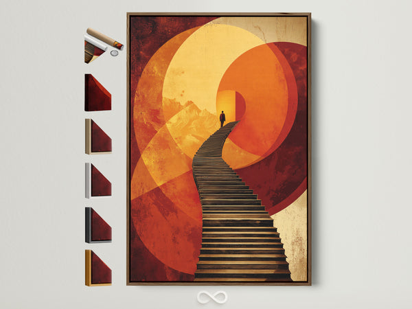
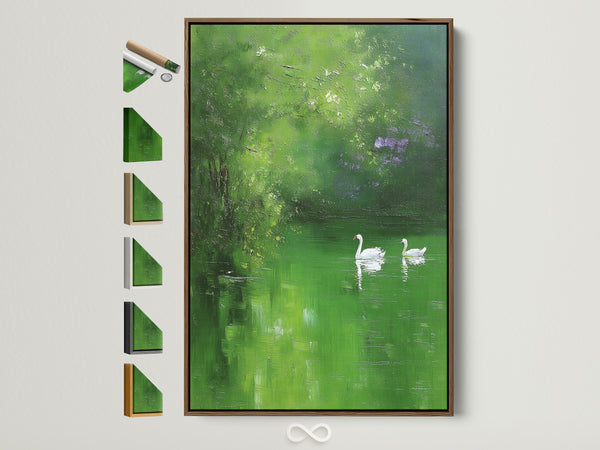
- Walnut → classic landscapes, sepia photography, portraits, moody abstracts.
- Natural oak → Scandinavian graphics, botanicals, children’s art, light coastal palettes.
- Smoked/fumed oak → maximal prints, vintage posters, anything on deep wall colors.
- Espresso → line drawings, typography, modern black‑and‑white where matte black feels too sharp.
- Teak → mid‑century posters, Bauhaus and beach‑house art.
Planning a deep, saturated feature wall this season? We’ve covered frame and mat pairings for dramatic palettes in our recent color coverage—start with Graham & Brown’s 2026 Picks for “what this means for your walls” and frame choices.
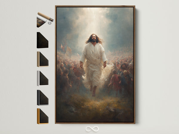
Shop the Look: Heritage + Statement
In brief: choosing your brown floating frame
- Want warmth without heaviness? Medium walnut or smoked oak, matte finish.
- Need a crisp outline? Espresso on a slim profile.
- Going coastal or mid‑century? Honey/smoked oak or teak‑like tones.
- Preservation matters? Add UV‑blocking, anti‑reflective glazing for paper works; canvases can skip glazing unless in high‑touch zones.
References
- Float mounting vs. floater frames explained — Frame Destination
- What it means to float your artwork — Level Frames
- What is a floating (shadow‑gap) frame? — My‑Picture
- Tray/float gaps & mounting tips — Jackson’s Art Blog
- American hardwood frame species — American Frame
- Walnut frame profile example — American Frame
- Woods used in picture frames — Logan Graphic
- Museum Glass specs (UV up to ~99%, low reflection) — Tru Vue
- Glass vs. acrylic for frames — American Frame
- Are dark woods making a comeback? — Architectural Digest
- Designers’ shift to “dirty neutrals” — House Beautiful
- Guide to ebonizing wood — AWI Network
FAQ
What’s the difference between a floating frame and float mounting?
A floating (floater) frame is a tray that surrounds a stretched canvas with a small gap. Float mounting is a technique for paper art inside a standard frame using spacers so the edges are visible and the glazing never touches the artwork.
Which brown is most versatile—walnut, oak, or espresso?
Walnut is the all‑rounder for landscapes and portraits; natural/smoked oak suits graphics and coastal looks; espresso gives a modern outline when black is too stark.
Do canvases need glass or acrylic?
Usually no—canvases are typically unglazed. Consider acrylic in high‑touch areas (kids’ rooms, hallways) or if you want wipeable protection; paper works should use UV‑blocking glazing.
How wide should the gap be in a floater frame?
Approximately 5–7 mm on each side (about 10–14 mm total). That’s enough to read as a deliberate shadow line without appearing gappy.
What sheen should I choose?
Matte oil/wax feels natural and premium; satin is slightly glossier and easier to maintain. Match sheen to room traffic and the mood you want.
0 Kommentare