Color Watch 2026: Browns & Khaki Take the Lead — Pairing Wall Art with Benjamin Moore “Silhouette”, Sherwin‑Williams “Universal Khaki” & Graham & Brown “Divine Damson”
Three heavyweight announcements just rewired the wall‑color conversation: Benjamin Moore chose Silhouette AF‑655, a deep espresso with charcoal softness; Sherwin‑Williams named Universal Khaki SW 6150, a tailored mid‑tone neutral; and Graham & Brown introduced Divine Damson, a plummy red‑violet that adds mood and luxury. Below, we translate those hues into room‑ready art pairings, sizes, and frames—so your walls look curated, not just painted.

Why these colors (and why now)
The 2026 picks share a through‑line: warmth, craftsmanship, and longevity. Silhouette’s espresso depth leans into fashion‑inflected luxury (think tailored wool and burnished leather), Universal Khaki restores the calm, connective tissue neutrals once provided, and Divine Damson injects a jewel‑tone counterpoint for accents, powder rooms, and moody dens. Together they signal an interiors shift from high‑chroma novelty to slow, layered sophistication.
Read the brand announcements for the full palettes and styling notes.
Quick color chips
Screen color varies—sample before you commit.
Art Pairing Playbook
1) Silhouette AF‑655 → “Gallery‑cocoon” with subtle contrast
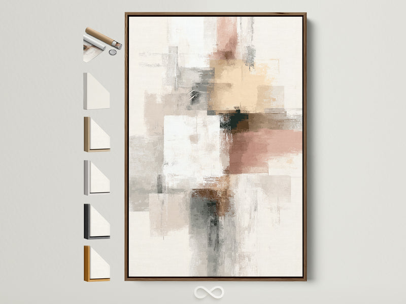
Silhouette’s brown‑black presence makes rooms feel like quiet galleries. Textural abstracts, sepia photography, earthy botanicals, and black‑line drawings sit beautifully here. Keep contrast soft: ecru mats, warm oak or black frames, and linen textures.
- Frame: Oak or matte black; narrow profile (12–16 mm).
- Mat: Natural or bone white; 5–8 cm reveal.
- Scale: One large anchor (80–120 cm wide) or a tight triptych for longer walls.
2) Universal Khaki → “Tailored neutral” that loves layers
Khaki is a unifier. It embraces beige‑to‑brown abstracts, sandy landscapes, graphite linework—and it’s a gorgeous backdrop for smoky greens (pairing nicely with 2026’s green picks across other brands).
- Frame: Natural oak or antiqued brass to warm; black to sharpen.
- Mat: Cream or warm white; consider tone‑on‑tone for calm.
- Scale: 2/3 the width of furniture below; diptychs shine over sofas.
3) Divine Damson → “Statement vignette” with luxe contrast
Plummy, saturated, and romantic, Divine Damson begs for graphic silhouettes, botanical line art, and gilt accents. Keep mats light and frames either black for drama or oak for warmth.
- Frame: Black or warm oak; slim brass works in foyers.
- Mat: Off‑white to lift the composition.
- Scale: Go vertical (50×100 cm) in corridors; single 70×100 cm in nooks.
Palette Briefs (3 hero hues → 6 “SKUs” each)
Use these size & frame “recipes” to build carts fast—each list balances proportion, presence, and shipping ease.
Silhouette AF‑655 (espresso)
- 90×120 cm canvas, float frame in black.
- 60×90 cm canvas, oak float frame (texture abstract).
- 50×70 cm fine‑art print + oak frame, 6 cm mat.
- 70×100 cm black‑&‑white photograph + black frame, no mat.
- 2× (60×90 cm) diptych, oak frames.
- 40×60 cm line drawing series, black frames (set of 3).
Universal Khaki SW 6150 (tailored neutral)
- 80×120 cm canvas landscape, oak float frame.
- 60×90 cm abstract in beige/terracotta, oak frame.
- 50×70 cm botanical print, natural wood frame + cream mat.
- 70×100 cm geometric neutral, black frame for definition.
- 2× (50×70 cm) stacked over console, oak frames.
- 100×150 cm canvas for stair landing, oak float frame.
Divine Damson (plum accent)
- 60×90 cm minimal botanical, black frame, off‑white mat.
- 50×70 cm figurative silhouette, brass frame.
- 70×100 cm charcoal sketch, oak frame for warmth.
- 40×60 cm geometric print with oxblood notes, black frame.
- 30×40 cm trio (grid), oak frames.
- 90×120 cm tapestry‑scale canvas in neutral texture, black float frame.


Frames, mats & hanging—small choices, big payoff
- Match undertones: On khaki walls, choose frames that echo the wall’s warm undertone (oak, brass). On Silhouette, black or walnut frames sharpen the outline.
- Mind the mat: Cream/bone mats soften high‑contrast art on dark walls; skip mats for bold, graphic pieces.
- Hang by proportion: As a rule of thumb, art (or a grouping) should be ~2/3 the width of the furniture beneath. Center at eye level unless ceilings are unusually low/high.
Want to go all‑in on immersion? Our take on the ceiling trend shows how “color drenching” and pattern overhead change how art reads in a room. Read: The ceiling is the new accent wall →
Editor’s Picks: Warm Neutrals & Soft Greens (Shop Wall Art)
Buttons use an outline style for clarity; images shown for scale and palette reference.
Pro moves: make it feel curated
- Create a tonal trip: If you’re drenching in Silhouette, choose art with linen grounds, plaster textures, or graphite to echo the wall.
- Harness khaki’s diplomacy: Mix old and new—vintage sepia photos with modern geometry—Universal Khaki keeps the collection cohesive.
- Use damson as punctuation: A single saturated wall (or vestibule) + three light‑matted pieces reads luxe, not heavy.
Keep exploring
Want deeper cuts on palettes and styling? These reads complement today’s news:
0 Kommentare