Farrow & Ball’s 2025 Palette Adds 12 Grounded Hues — What It Means for Walls & Art

Farrow & Ball has refreshed its signature palette with 12 colours—nine new and three archived favorites—described by the brand as “grounded shades” that celebrate the everyday. The update leans into the calm, craft‑first mood we’re seeing across interiors, and it has clear implications for the art you choose and how you frame it for a polished, room‑ready look.
What’s new (and why it matters)
Rather than neon “trend” shades, this drop favors quiet, characterful pigments: dusty blues, olive and sap greens, warm browns and terracottas, and one delicate neutral (Scallop) designers are calling a next‑gen “It” beige. The palette reads tailored but easy—ideal for enveloping spaces, color‑drenched trim, or nuanced two‑tone schemes that let artwork carry texture and story.
All 12 colours, decoded fast
- Scallop 311 — soft, creamy neutral; a fresher alternative to stark white.
- Dibber 312 — deep garden green with earthy calm (hero above).
- Reduced Green 313 — toned olive‑sage, elegant on cabinetry and trims.
- Sizing 314 — cool, “laundry‑day” blue with a starch‑clean clarity.
- Naperon 315 — textile‑inspired warm neutral; think linen meets stone.
- Marmelo 316 — brown‑terracotta warmth; cozy without going orange.
- Kakelugn 317 — pale, Swedish‑tile blue; serene and historical.
- Douter 318 — sooty green‑gray for moody dens and libraries.
- Duster 319 — golden ochre accent for sunlit nooks.
- Etruscan Red 56 (archive) — earthy red‑brown; museum‑grade classicism.
- Broccoli Brown 198 (archive) — dark stone brown with gravitas.
- Sap Green 199 (archive) — heritage olive; works across styles.
How to pair the new paints with wall art
1) The Green Family (Dibber, Reduced Green, Sap Green)
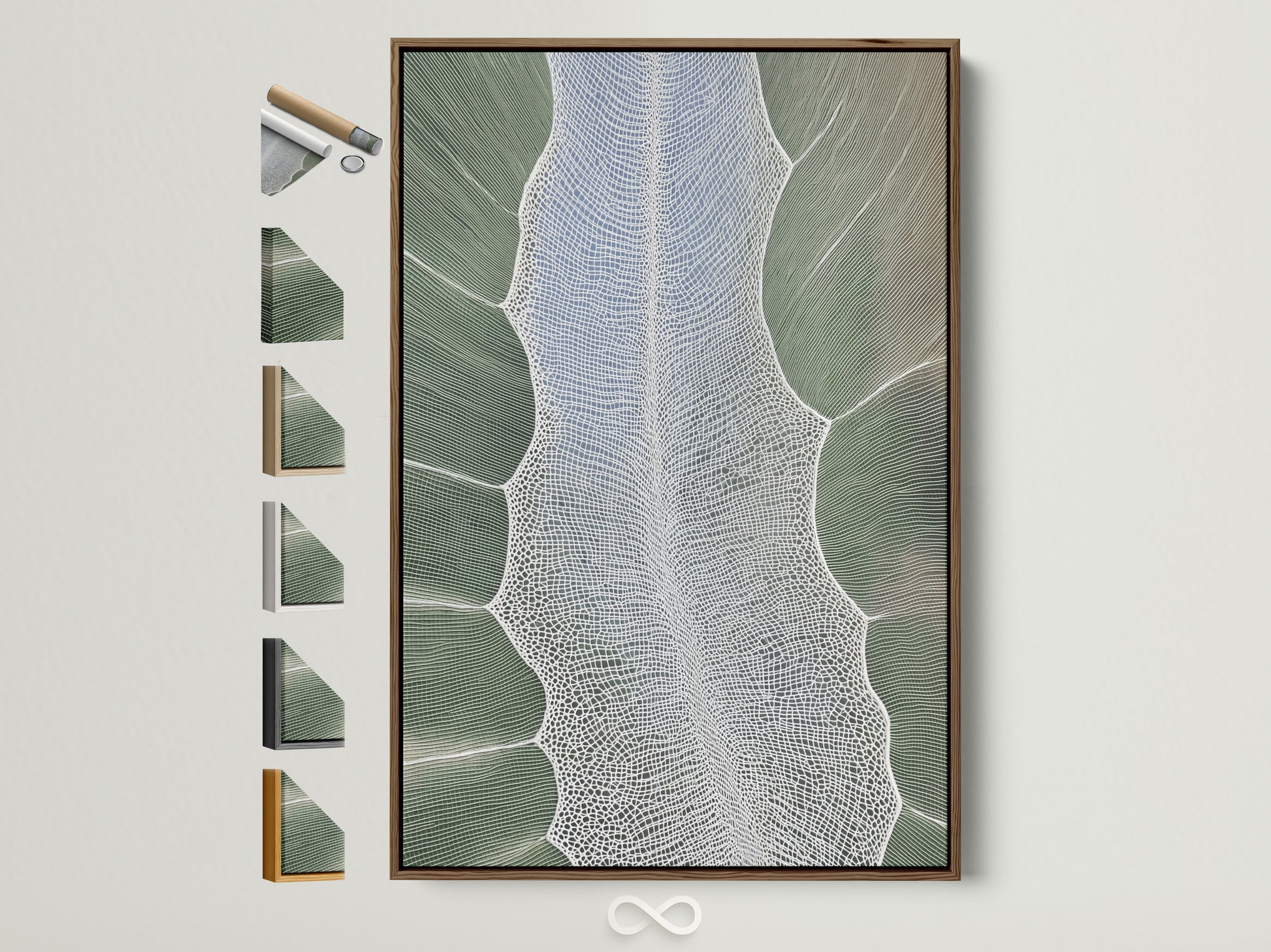
Greens reward texture. Reach for botanical macro prints, woven‑looking abstracts, or landscape fragments with sage, silvery gray, and chalk white highs and lows. Frames: oak walnut brass. Mats: off‑white or warm gray to keep things fresh.
2) Browns & Ochres (Marmelo, Douter, Duster, Broccoli Brown, Etruscan Red)
These tones love contrast with cool blues and ink blacks. Think Bauhaus‑leaning geometry, modern graphic botanicals, or monochrome photography. Frames: black or dark bronze for crispness; or deep oak for a collector vibe.
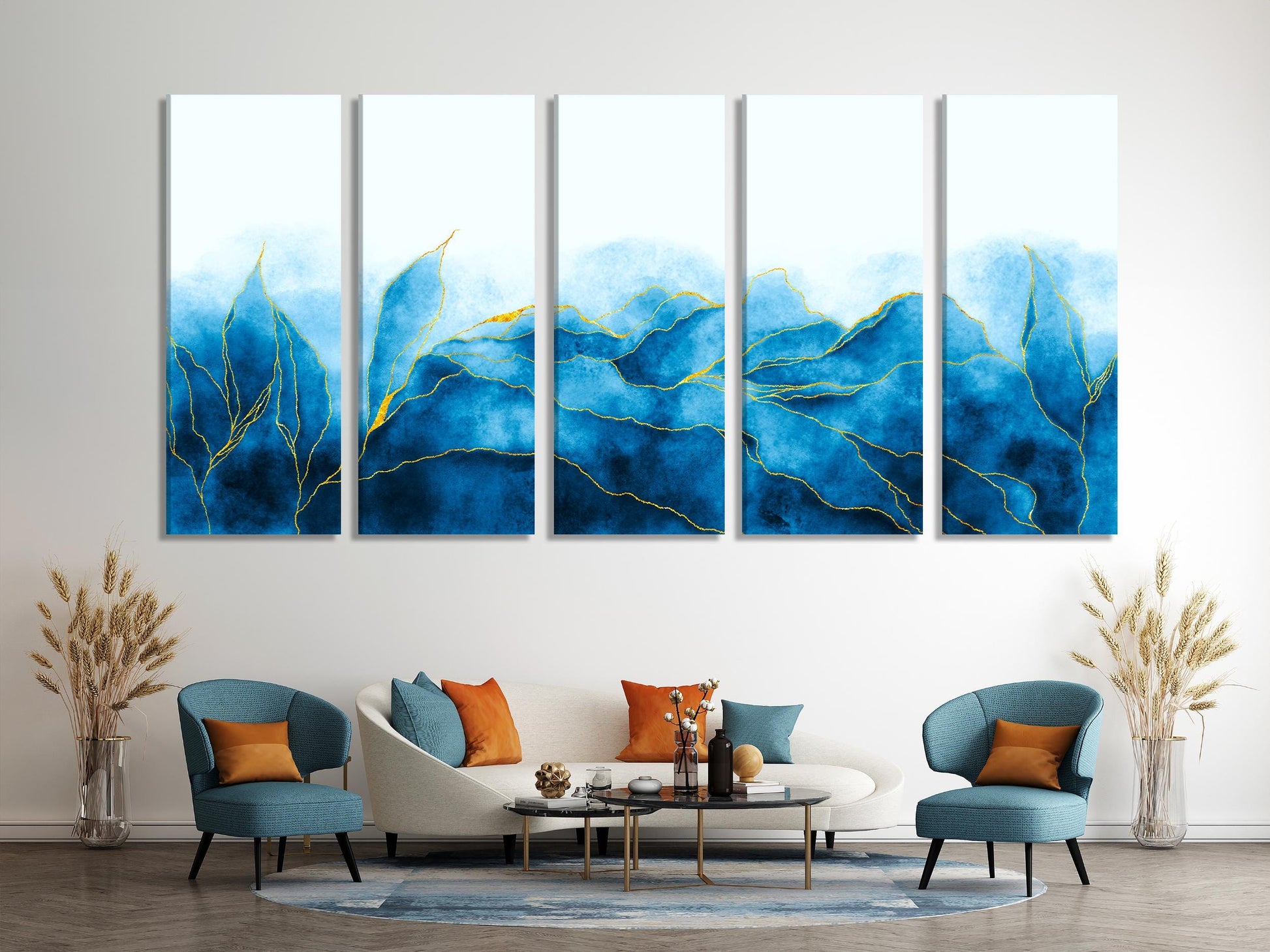
3) Dusty Blues & Neutrals (Kakelugn, Sizing, Scallop, Naperon)
Work in soft‑edge abstraction—watercolor gestures, coastal blues, and clouded indigo. On Scallop walls, try a two‑frame diptych over a sofa in white or pale oak to keep it airy.
Design moves to try
- Color‑drenching: wrap walls, trim, even doors in one tone (Scallop or Reduced Green are forgiving). Use large art (24"–40" wide) with a slim floating frame for depth.
- Split‑tone wainscot: Kakelugn on top, Marmelo below the chair rail—hang a single oversized abstract to bridge the line.
- Frame as finish: On Dibber, choose brass‑lined floaters; on Sizing, pick warm white with a deep bevel.
Want to push the look further? We’ve covered why the ceiling is the new accent wall—and how to choose art that holds its own overhead. Read our guide: The Ceiling Is the New Accent Wall.
Quick size guide for freshly painted walls
Sofas & sectionals
Target ~60–75% of sofa width. For an 84" sofa, that’s a 50–64" total span—one statement piece or a tidy diptych.
Beds & headboards
Queen headboards pair well with 36–48" wide art; keep the bottom of the frame 6–10" above the headboard.
Shop the Look — Art that Loves the New F&B Palette


Further reading & related trend pieces
- Architectural Digest — Farrow & Ball just dropped its new (and returning) colors for 2025
- Better Homes & Gardens — Farrow & Ball adds 12 earthy colors to its palette
- Houzz — 8 color trends spotted at Maison & Objet (September)
0 Kommentare