Newsroom+ • Design & Color
Wall Art Playbook: What 2026 “Colors of the Year” Mean for Your Frames, Sizes & Palettes
Paint brands just set the mood for 2026—and it’s a vibe you can actually live with. Sherwin‑Williams crowned Universal Khaki (a grounded, mid‑tone tan), Benjamin Moore chose Silhouette 2116‑40 (an espresso‑meets‑charcoal neutral with warmth), Behr introduced Hidden Gem (a smoky jade green), and Dulux built a whole story—Rhythm of Blues—around layered, atmospheric blues.
Translation for your walls: earthier “dirty neutrals,” deeper browns, and complex cool tones are in. The right art + frame moves will make them feel tailored rather than timid.
Palette Play: Four Ways to Pair Art Like a Pro
1) Sherwin‑Williams Universal Khaki — the “tailored tan”
Khaki is back, but cut like suiting: structured, textural, quietly confident. On khaki walls, reach for plaster‑look abstracts, earth‑tone geometrics, or sepia/black‑and‑white photography. For frames, oak, walnut, or bronze read warm and intentional.
- Scale: above sofas/bed walls, think 36×54″, 40×60″, or a 3‑piece set of 24×36″ each.
- Mats: warm white or flax linen. Avoid stark optic whites that fight khaki’s softness.
- Pair with: blush, terracotta, and charcoal accents for a modern‑heritage mix.
2) Benjamin Moore Silhouette 2116‑40 — espresso with edge
Silhouette reads like a refined coffee bean with a bit of charcoal. It’s a natural foil for burnt‑sienna abstracts, graphic portraits, and ink drawings. Use walnut/black frames or even oil‑rubbed bronze; add a warm white mat to lift darker art off the wall.
- Scale: one statement canvas (40×60″) or a tight salon wall (mix of 12×18″ to 24×36″).
- Texture: pair with velvety textiles and aged brass lamps for “bookshelf‑wealth” warmth.
3) Behr Hidden Gem — the smoky jade
Hidden Gem is a complex green that behaves like a neutral. It loves moody botanicals, charcoal sketches, and mineral/agate textures. Frames in black or antique gold underline the sophistication.
- Scale: in dining or entries, 31×47″ or 36×54″ keeps sightlines clean.
- Contrast: introduce off‑white mats to keep greens from going too heavy.
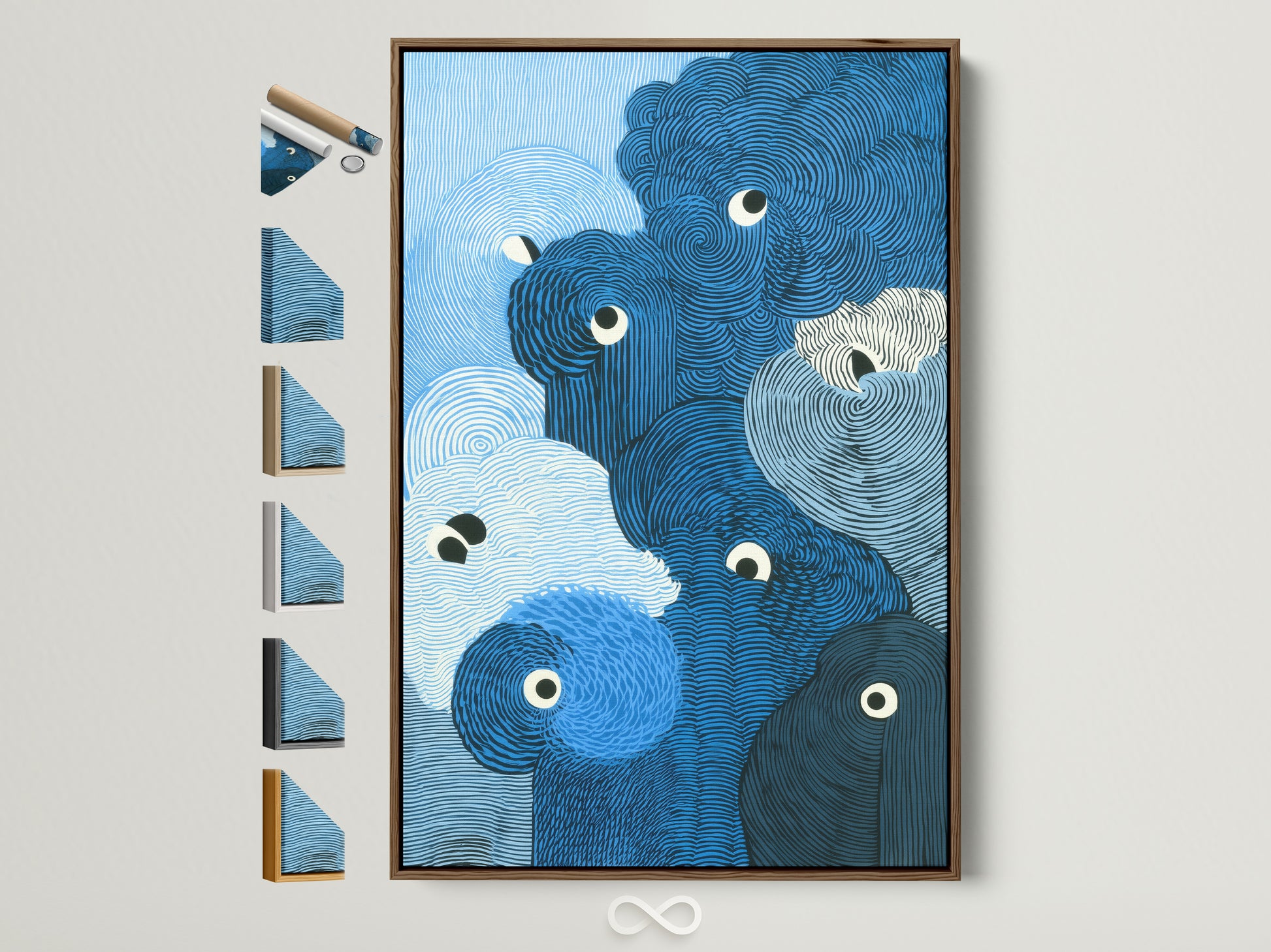
4) Dulux Rhythm of Blues — layered indigos
Dulux’s 2026 story spans inky, denim, and airy blues. That range is perfect for watercolor waves, geode‑style abstracts, and graphic linework. Natural oak or crisp white frames keep blues bright; black drives drama.
Shop the Look: Neutrals & Browns (Khaki + Silhouette)
Five editor picks—frames read warm, textures stay calm.


Wallpaper or Canvas? A quick 2025–26 reality check
Peel‑and‑stick has grown up—adhesives are kinder to walls, and print quality has stepped up. Spoonflower even rolled out new wallpaper sizes for tighter fits and easier ordering; and editors continue to weigh when peel‑and‑stick is worth it versus traditional paste‑the‑wall papers.
Curious what designers consider before choosing removable paper? See Veranda’s balanced take on the pros and cons (read more). For format updates, Spoonflower’s announcement video is a good primer (watch here).
Mini Palette Recipes (Rooms You Can Install this Weekend)
If you’re leaning into these richer neutrals, our room‑by‑room guide to Warm Minimalism shows how to layer texture and light so art feels calm—not flat. It pairs beautifully with Universal Khaki and Silhouette.
Shop the Look: Blues & Jade (Rhythm of Blues + Hidden Gem)
Five cool‑tone picks that stay sophisticated.

Why this matters now
Between color houses and the editorial mood, the direction is clear: interiors are skewing warmer, richer, and more tactile—yet not maximal. That’s great news for wall décor: fewer poster‑brights, more nuanced fields that read collected and calm. Curate art the way you’d build a wardrobe: strong base tones (khaki, espresso), a couple of elevated cools (jade, indigo), and textures that add depth (plaster, linen, mineral).
References
- Sherwin‑Williams — Universal Khaki, Color of the Year 2026
- Benjamin Moore — Silhouette 2116‑40, Color of the Year 2026
- Behr — Hidden Gem, Color of the Year 2026
- Dulux (UK) — Rhythm of Blues, Colour of the Year 2026
- House Beautiful — “Dirty Neutrals” trend explainer (2025)
- Veranda — Peel‑and‑stick wallpaper: is it worth it?
- Spoonflower — Introducing new wallpaper sizes (video)
All in‑article product images © Artoholica (used for editorial illustration).
FAQs
What wall‑art colors work best with Sherwin‑Williams Universal Khaki?
Think textured neutrals (beige, plaster white, taupe), muted terracottas, and charcoal linework. These create low‑contrast depth so khaki reads warm and tailored. Frames in oak or bronze keep it classic.
How do I keep Benjamin Moore Silhouette from making a room feel dark?
Float art on warm white 8‑ply mats, choose reflective finishes (antique brass, glass with low‑glare coating), and keep scale generous (31×47″+). Layer task lighting so the wall tone glows.
Hidden Gem vs. indigo blues—can they live in the same space?
Yes—treat Hidden Gem (smoky jade) as a “neutral green” and let indigo be the accent. Use black frames for cohesion; bring both together in a mineral or watercolor abstract.
When should I choose a mural instead of framed art?
Go mural for immersive pattern or landscape (small rooms, entries, powder rooms). Choose framed art when flexibility matters, or when you want one strong focal point above furniture.
What sizes are safe above a standard 84–90″ sofa?
One 40×60″ statement canvas; or a pair of 24×36″; or a triptych of three 20×30″. Keep total width to ~60–75% of the sofa width and center at 57–60″ eye height.
0 Kommentare