
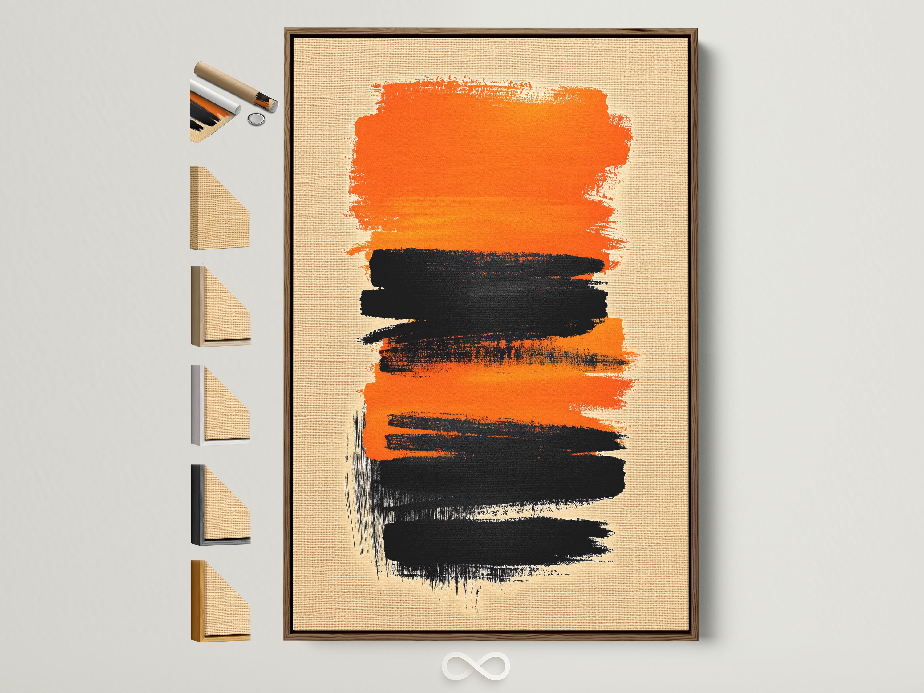
Product Spotlight: Orange & Black Brushstroke Canvas — Minimalist Contrast, Maximum Impact
Bold orange and deep black brushstrokes meet calming neutrals in a piece that brings instant focus to modern rooms. It’s the kind of statement that plays beautifully with today’s warm materials, from oak woods to stone textures.
Hooked at first glance — why this piece works
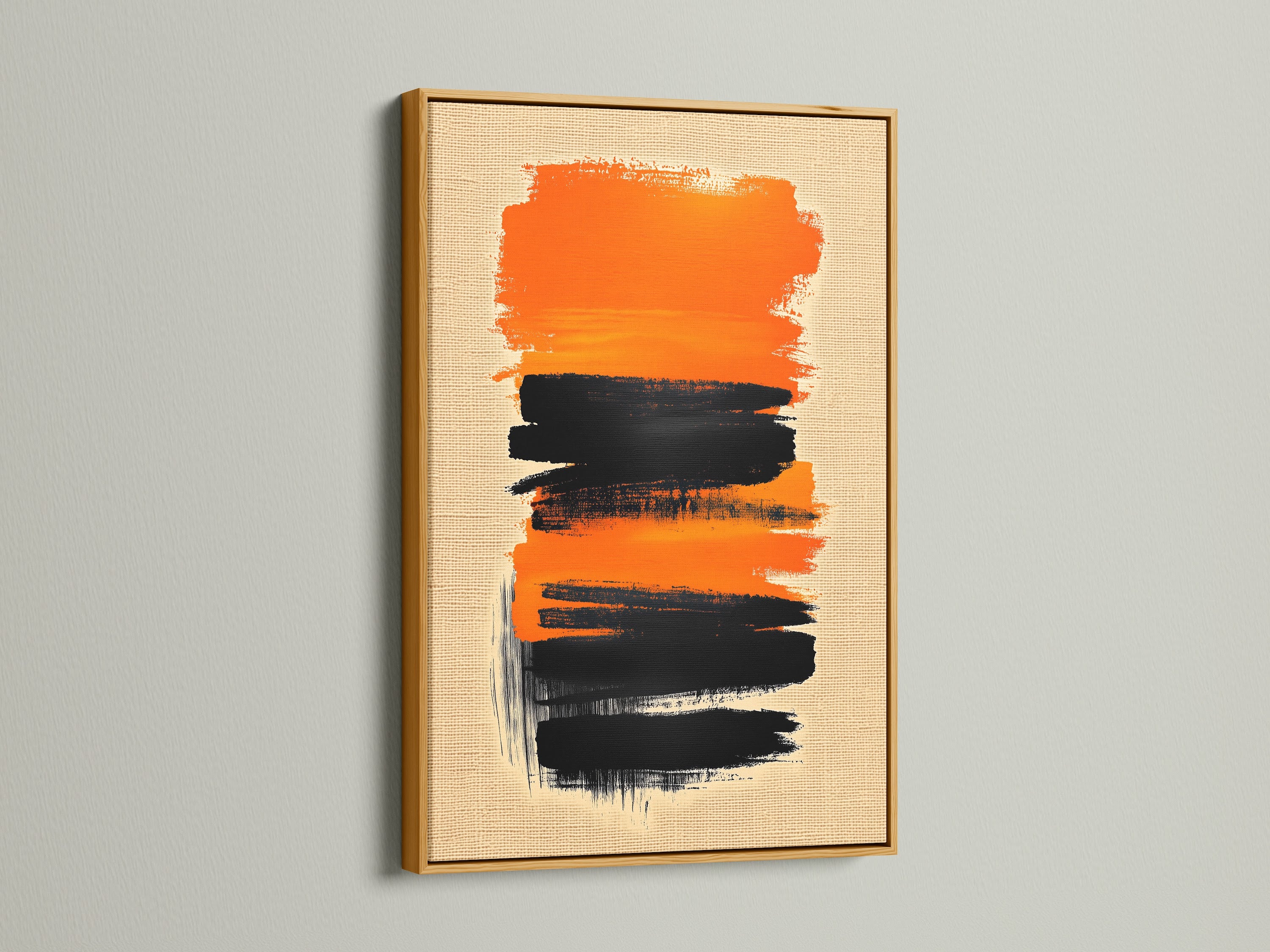
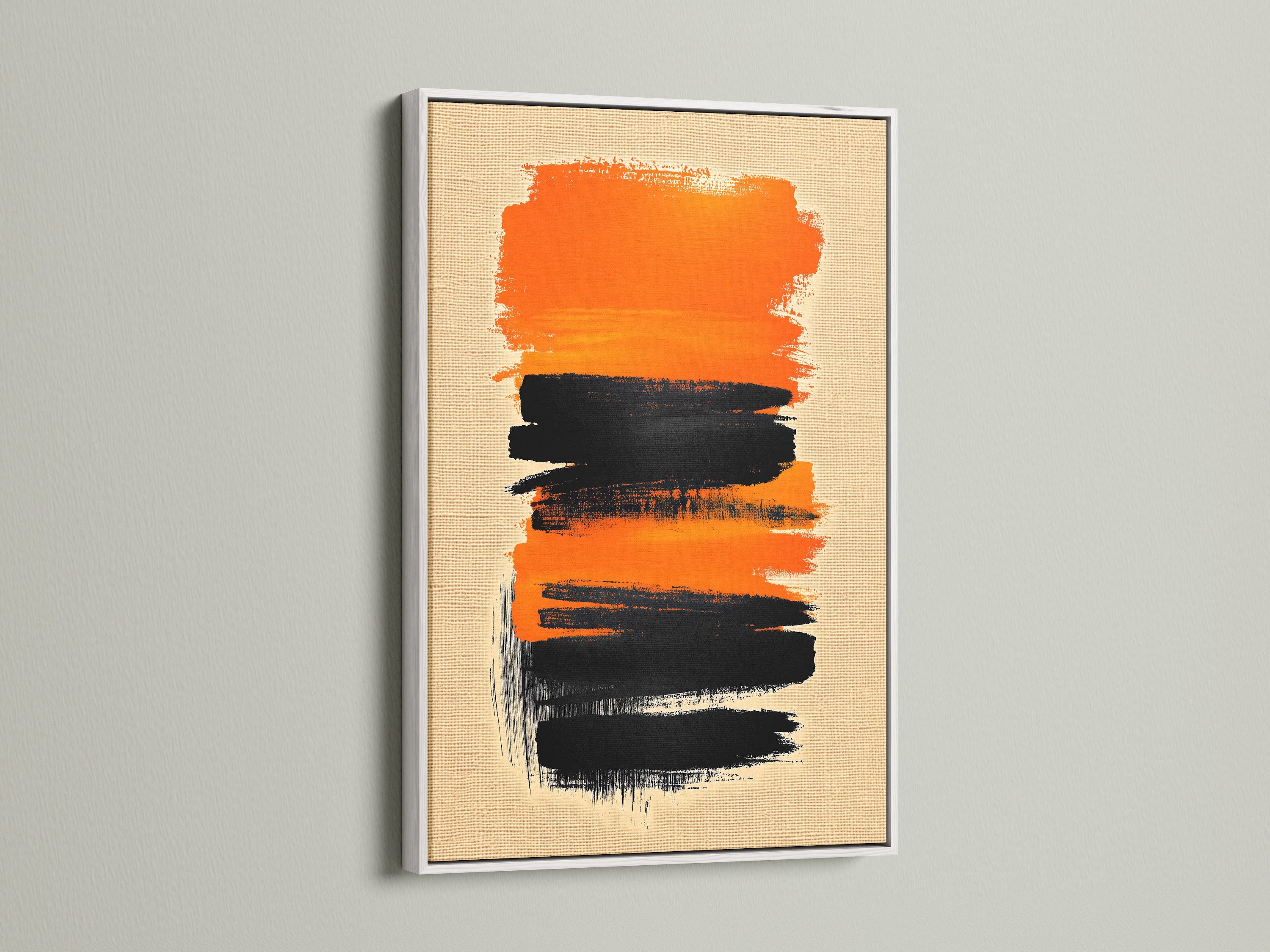
Balanced tension is the magic trick here. Saturated orange rides just above rich black, with soft texture in between to keep your eye moving. The composition feels spontaneous yet intentional, making it a quick win for elevating a neutral room. Style it over a linen-blend sofa, opposite a matte-black media console, or as a strong welcome in an entry. The palette is versatile: think oak, white, and black frames; boucle, leather, or stone accessories; and warm terracotta textiles.
Because the strokes are bold and directional, the artwork reads with impact from across the room while still rewarding a closer look at the texture and rhythm of the paint. It’s a confident focal point that doesn’t overwhelm the space.
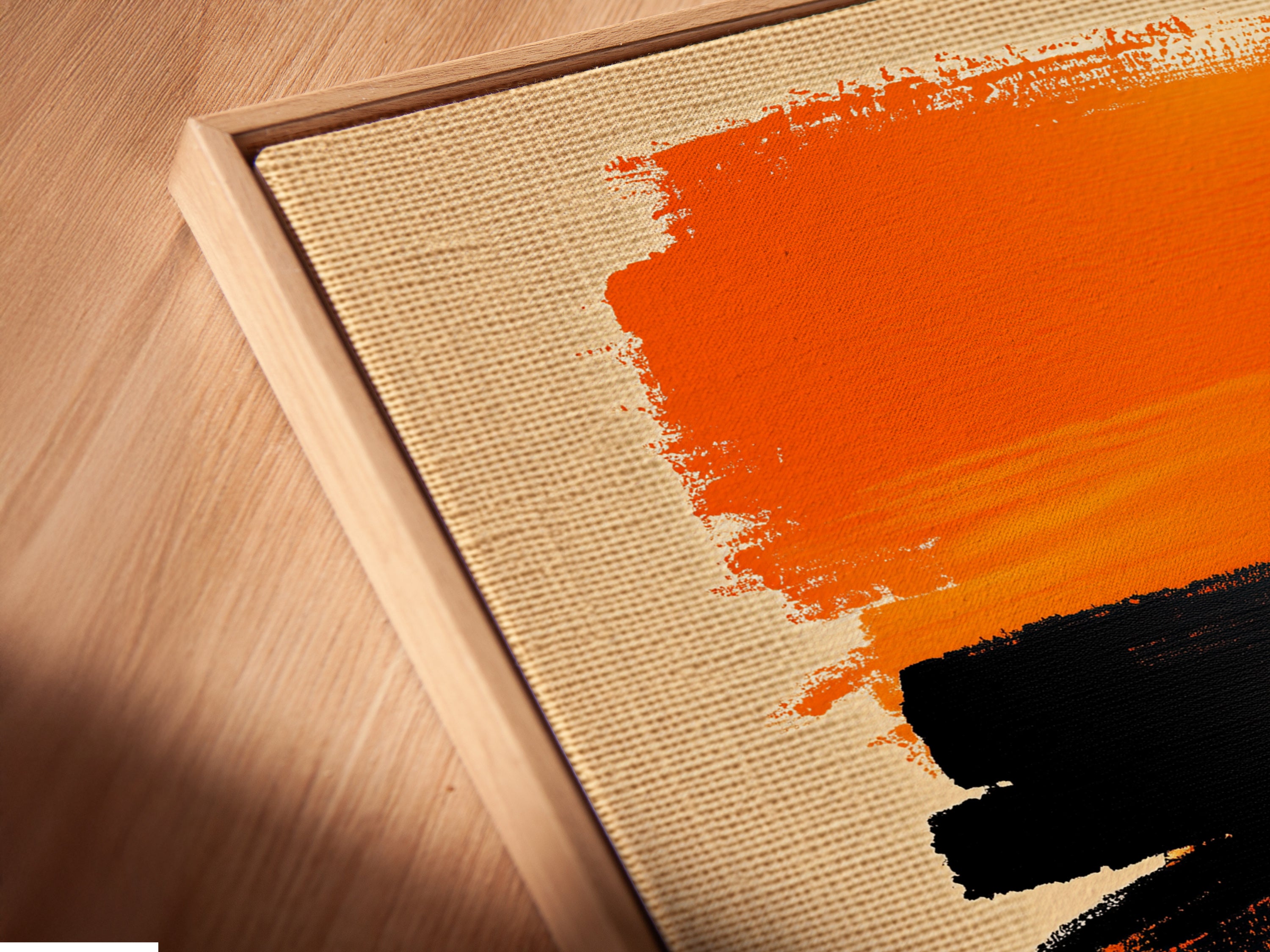
The art, up close — color, texture, movement
Up close, the orange reads like a sun-warmed terracotta—earthy rather than neon—so it pairs easily with oat, clay pink, and natural wood. The black is deep and grounding, adding the sort of contrast designers use to give rooms structure. The brushwork has a left-to-right drift that suggests motion; mount it in landscape to widen a wall or rotate to portrait for vertical lift above a console.
Materials & build — what you’re actually getting
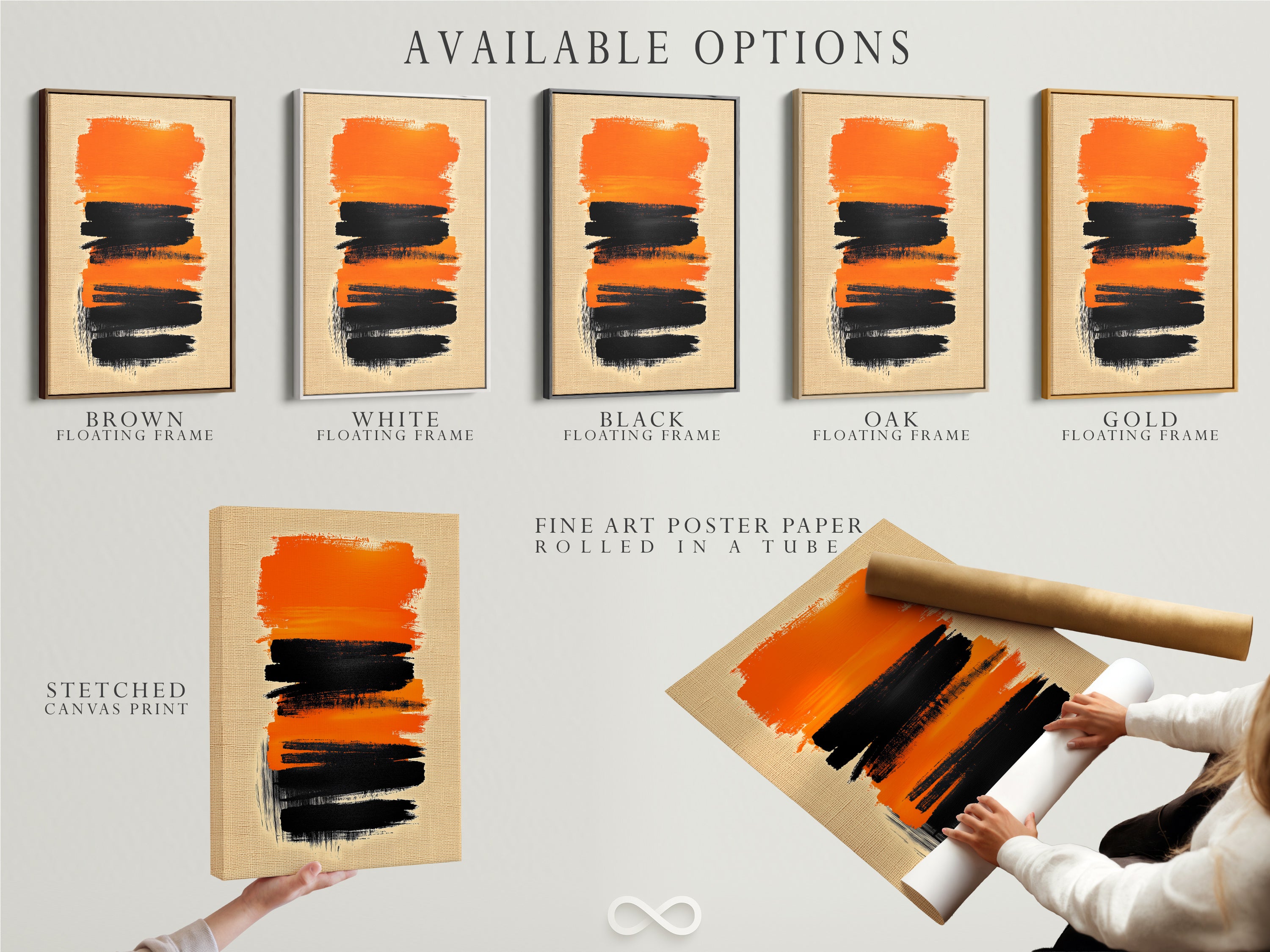
Choose your finish to match the space: a premium poster print for a sleek, frame-your-way presentation; a gallery-wrapped canvas that arrives ready to hang; or a canvas with a floating frame for a museum-style edge reveal. The print surface uses archival, fade-resistant pigments for longevity, with carefully managed color so the orange remains rich and the blacks stay crisp for years. Production and dispatch are EU-based with tracked shipping and support for custom sizes and trade requests.
Style playbook — where it sings
Living room
Center the canvas 6–8″ above the sofa back. Pair with a low-slung oak coffee table, boucle throw pillows, and a clay-colored wool rug. A single matte-black floor lamp on the opposite side will echo the artwork’s contrast.
Office
Mount it behind the desk to create presence on video calls. Temper with a black metal task light, a stoneware pen cup, and a minimal bookshelf vignette in oat and beige.
Entry
Go vertical above a console to draw the eye upward. A dish in oxidized brass and a terracotta vase will pull out the warm tones without competing.
“Let the art choose your accents, not the other way around.”
Color intelligence — using orange the smart way
Warm orange accents enliven moody rooms and balance cooler greys. Design editors continue to highlight terracotta, ochre, and clay pink among the big color moves in 2025, while reports note earthy shades of terracotta gaining ground as a refined neutral in homes (Homes & Gardens). Color-psychology explainers add that orange can boost energy and creativity, especially as a focused accent (Stoneside).
Palette pairings that always click
CharcoalOatClay pinkWalnutIvoryAged brass
Pro tip
Repeat the orange once elsewhere (a cushion, a book spine, or ceramic) to create a cohesive story without over-saturating the room.
Sizing & framing made simple
Pick the right width
Over a sofa or credenza, aim for artwork spanning ~60–75% of the furniture width. Common winners: 80–120 cm (32–48″). For tall, narrow walls, a 50×100 cm (20×40″) portrait makes a strong line.
Choose the frame
- Floating frame: Crisp, gallery look; adds a thin reveal that suits modern spaces.
- Black frame: Maximizes contrast; best with cooler greys and black hardware.
- Oak frame: Warms the palette; ideal with terracotta textiles and beige walls.
- White frame: Airy and minimal; great for small spaces and light walls.
- Gold frame: Adds a touch of luxe; pair with brass accents and stone surfaces.
Select size & finish — want a room mockup? Message us for a free visualization.
Curated pairings from our catalog
Build a cohesive wall by riffing on tone and shape. Here are five pieces that play beautifully with orange-and-black brushwork — mix one or two for an effortless gallery.
Use-cases & mini scenarios
Minimalist living room
Neutral sectional, low oak table, one terracotta cushion, black floor lamp. Recommended sizes: 100–120 cm landscape; floating frame in oak or black.
Modern office
Dark desk, stone pencil tray, linen drapery. Size 80–100 cm landscape; black frame for high contrast on camera.
Hallway or entry
Narrow console, ceramic catchall, runner rug in rust tones. Size 50×100 cm portrait; white or oak frame to keep it light.
Care, hanging & longevity tips
- Unbox carefully and let the print acclimate to room temperature before hanging.
- Use a two-point hanging method and a level for perfect alignment.
- Dust with a soft, dry cloth; avoid harsh cleaners.
- Keep out of direct UV where possible; low-glare finishes help in bright rooms.
Quick compare — which piece is right for you?
Orange & Black Brushstroke (Feature)
Bold contrast, modern energy, reads strongly at distance; best for focal walls and creative workspaces.
Pairings at a glance
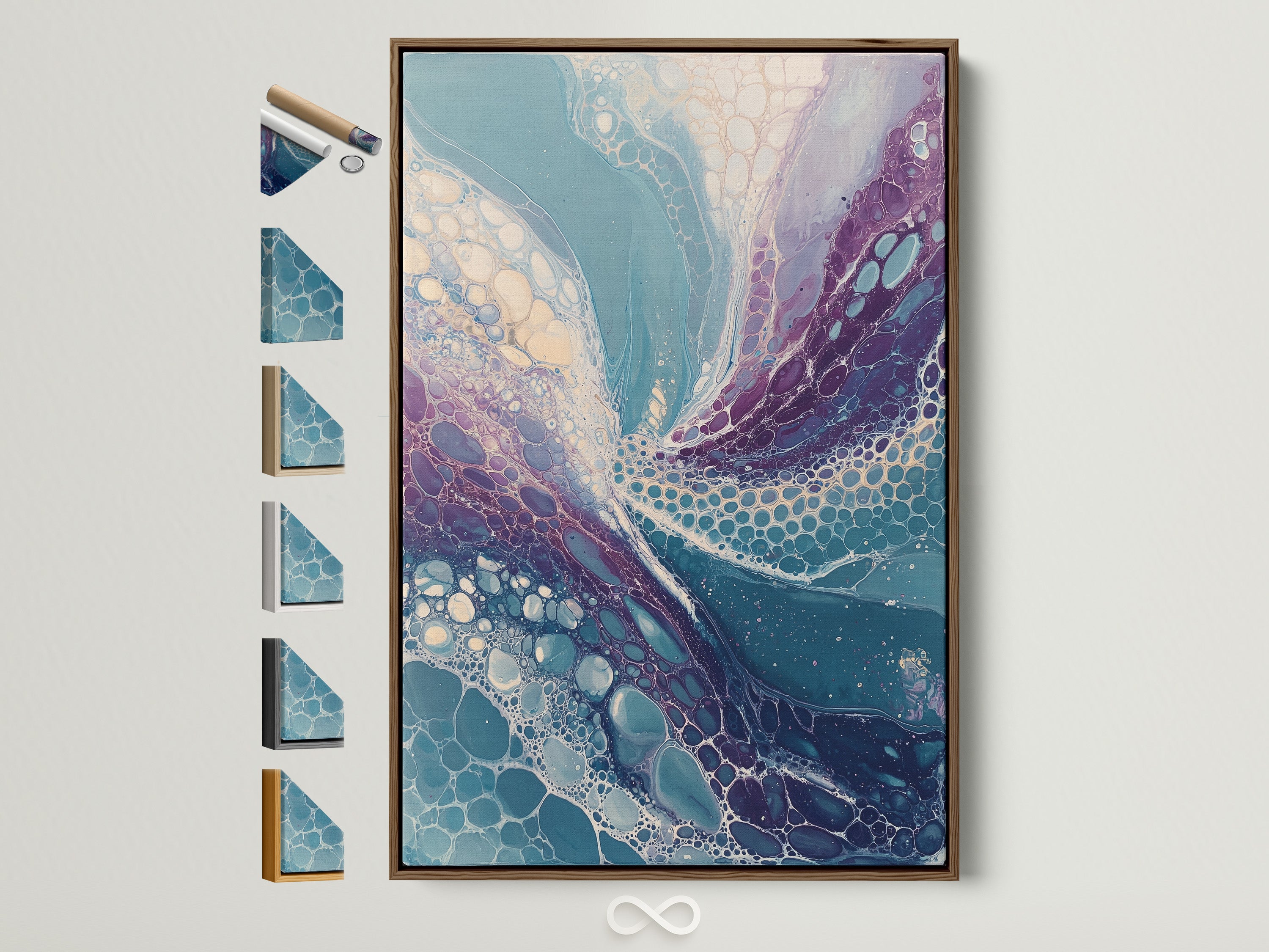
- Teal, Purple & Beige Abstract: Adds cool-warm balance; great with light woods.
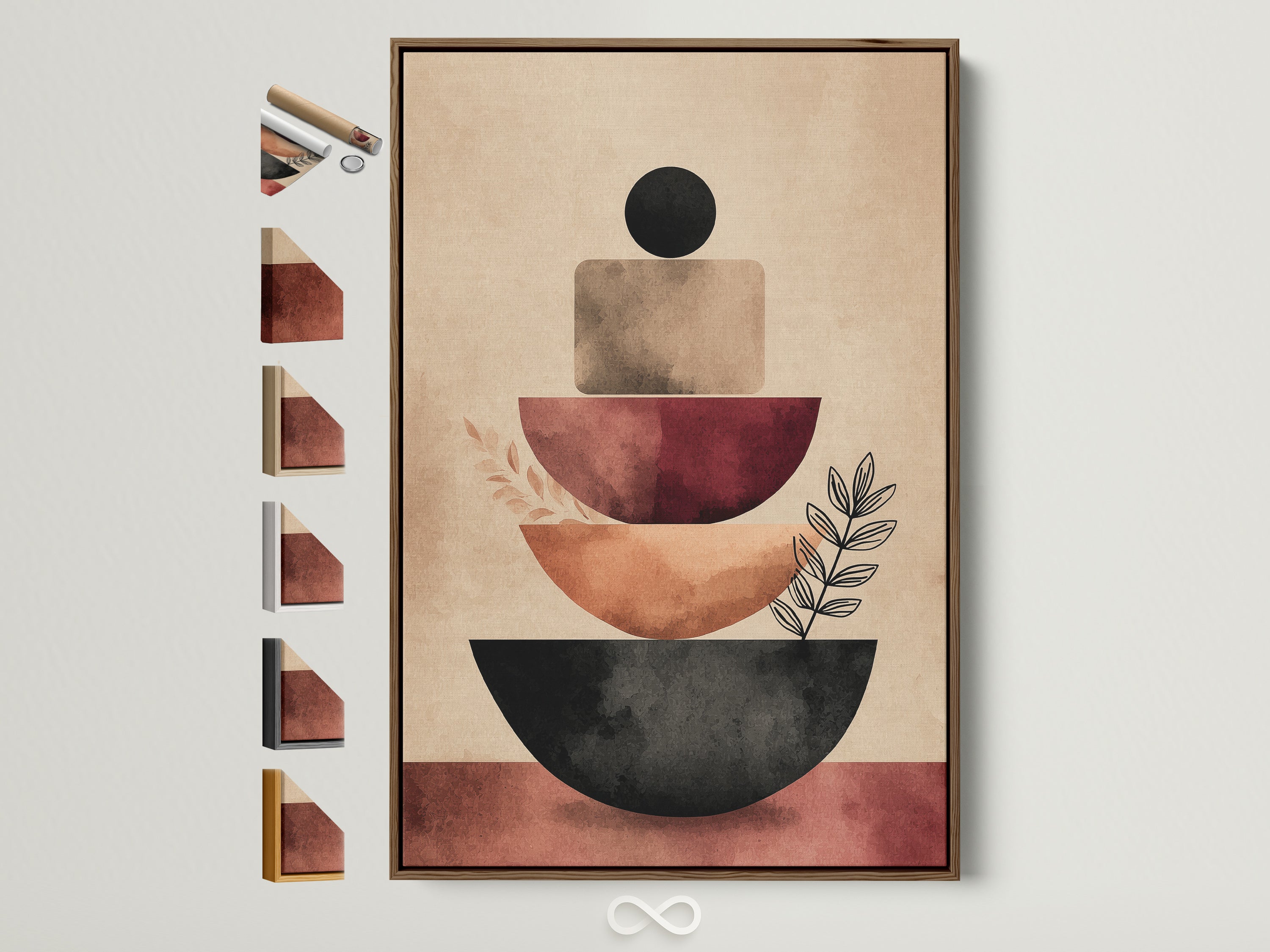
- Geometric — Earth Tones: Softer shapes; ideal if you prefer neutral stacking forms.
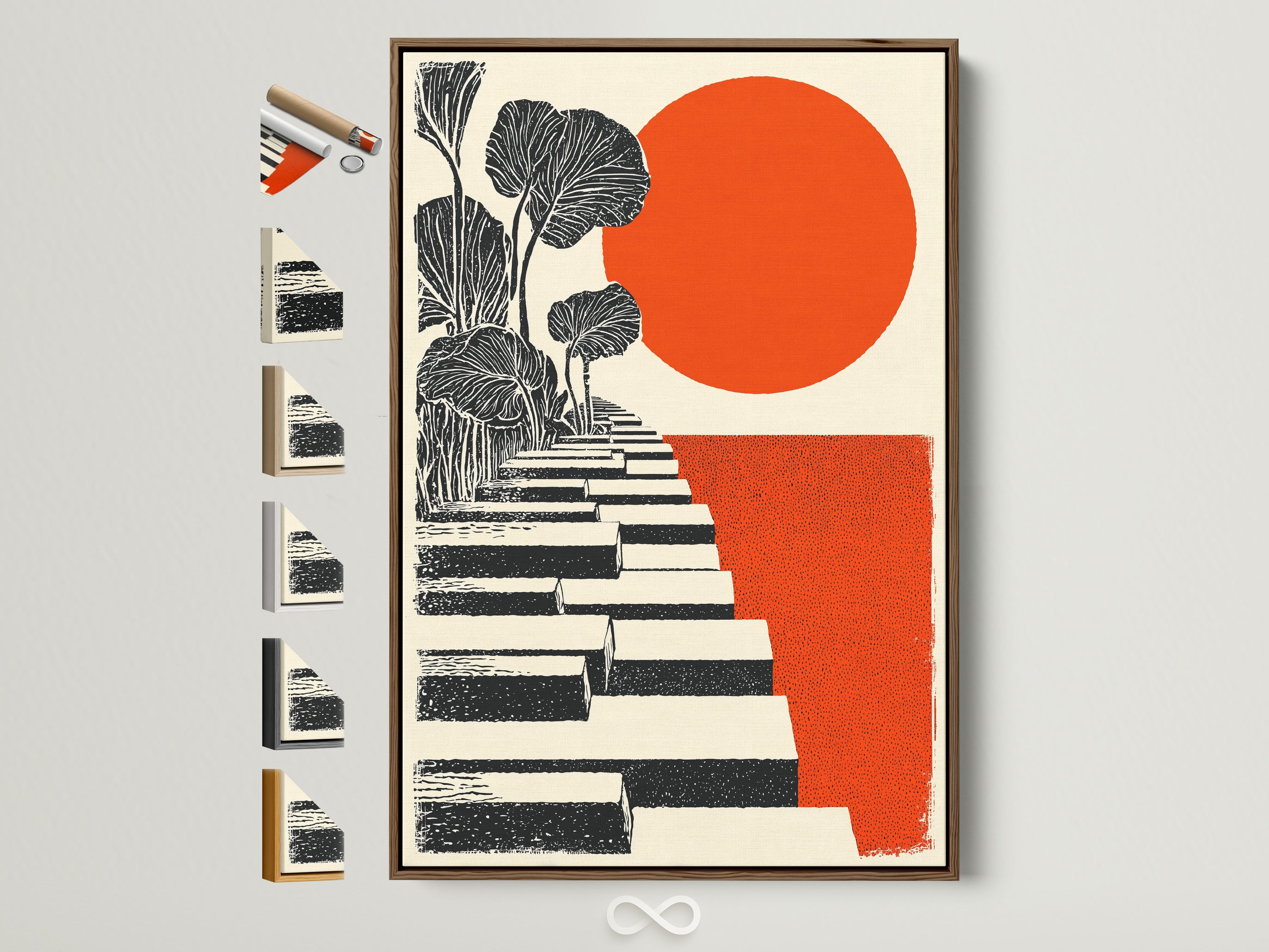
- Orange Sun & Steps: Graphic echo of orange; mid-century vibe for compact spaces.
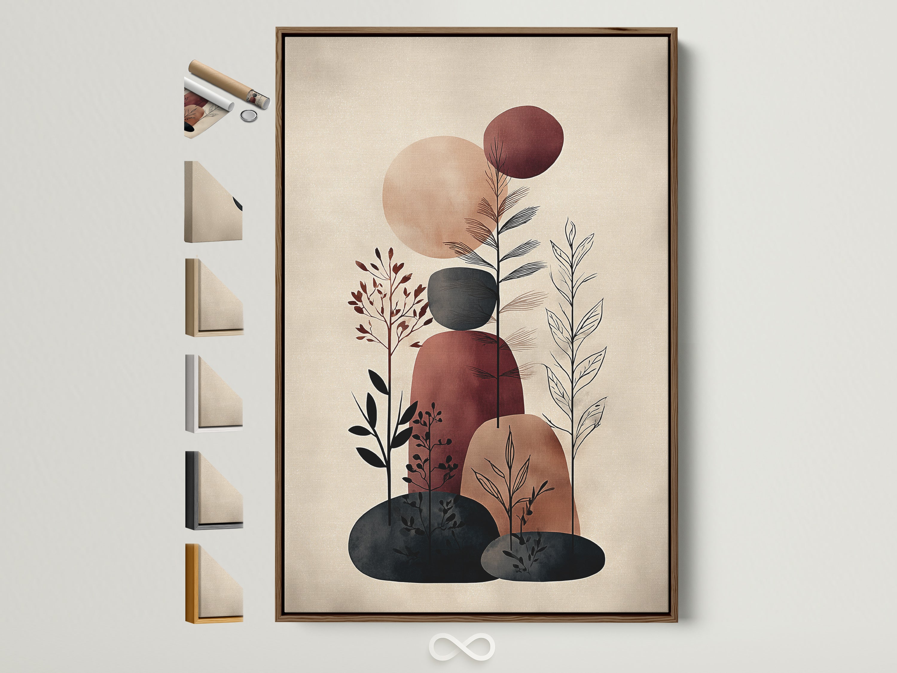
- Abstract Botanical — Beige/Terracotta: Gentle, organic counterpoint to bold brushwork.
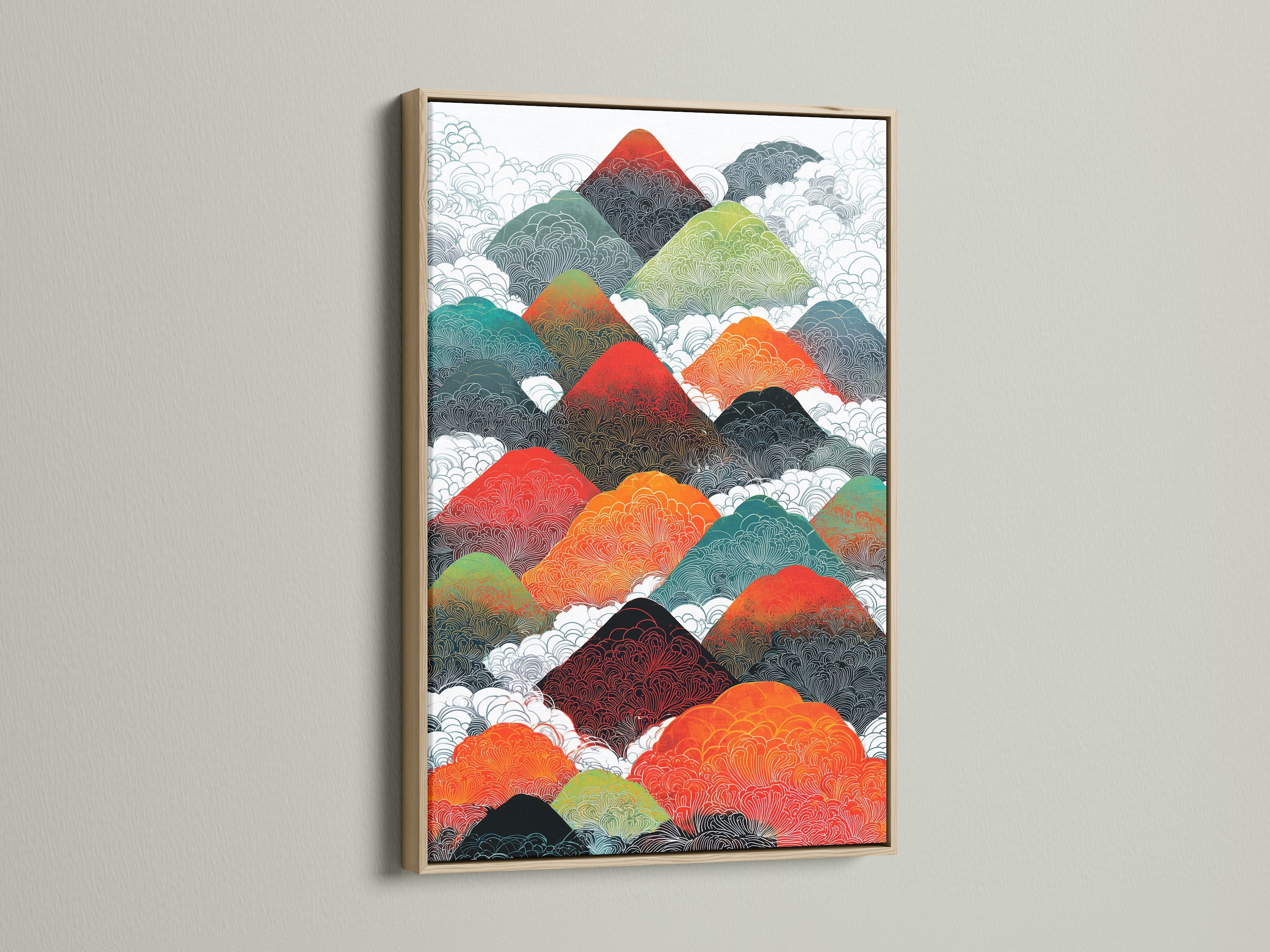
- Mountain Range — Red-Orange & Teal: Energetic color story if you want a bolder series.
Further reading
How to style with abstract art
10 Ways to Style With Abstract Art — Houzz: placement ideas, scale guidelines, and mixing with other pieces.
Terracotta & warm tones in 2025 interiors
The biggest color trends of 2025 — Homes & Gardens: why earthy terracotta continues to rise as a modern neutral.
Interiors Color Trends 2025 — Vogue: editors highlight rich, warm shades that pair beautifully with natural materials.
Color psychology & orange
Understanding the Psychology of Color in Spaces — Stoneside: how orange accents can support creativity and energy.