Swiss Style (International Typographic Style), 1940s–1960s: The Mid-Century Typographic Revolution
The International Typographic Style—better known as Swiss Style—is the mid-century method that put grids, sans-serif type, and objective photography at the center of modern communication. Emerging in Switzerland in the late 1940s and codified by the 1950s–60s, it shaped posters, wayfinding, corporate identity, and today’s UI kits. This guide explains the timeline, principles, classic posters, and the teachers who made it global.
Swiss Style at a Glance: A Mid-Century Timeline
From early European modernism to global corporate systems, here’s how the movement consolidates and spreads.
- 1919–1933: Bauhaus and New Typography establish functional type, photography, and workshop-based design education.
- Late 1940s: In neutral Switzerland, designers coalesce around clarity, legibility, and economy—foundations of the International Typographic Style.
- 1950–1956: Basel and Zürich schools formalize teaching methods; asymmetric layouts, grid systems, and sans-serifs become standard practice.
- 1957: Neue Haas Grotesk is released in Switzerland—renamed Helvetica c. 1960–61—and quickly becomes a global default for modern branding.
- 1960s: Corporations adopt grid-based identity systems; Swiss Style becomes a lingua franca for posters, signage, transport maps, and manuals.
- Look for short line lengths, clear hierarchy, and optical balance rather than decoration.
- Notice photographic structure—images align to the same grid as the type.
Further reading: Poster House — The Swiss Grid, MoMA — 50 Years of Helvetica.
What Is the International Typographic Style?
The International Typographic Style (Swiss Style) is a design methodology that uses a modular grid to organize information, favors asymmetric alignment for active balance, and relies on sans-serif hierarchies paired with objective photography. The goal is not austerity for its own sake but readable, reproducible, and scalable communication across media.
In this approach, “less” is not minimalism alone—it is a system. The grid reduces errors, accelerates iteration, and lets complex content scale across formats without reinventing the layout each time. Typefaces with even color and unobtrusive details support that neutrality.
- Look for consistent spacing (baselines and gutters) and left-aligned ragged-right text.
- Search the page for a clear typographic rhythm: headings → subheads → body → captions.
Context: Cooper Hewitt — Armin Hofmann’s teaching and principles, History of Visual Communication — International Typographic Style.
Bauhaus Typography Examples That Seeded Swiss Style
Before Swiss Style, the Bauhaus revolutionized typography through workshops that treated type, photography, and printing as integrated design. Figures such as Herbert Bayer and László Moholy-Nagy experimented with sans-serifs, lowercase systems, photomontage, and exhibition graphics that communicated function first.


What carries forward into Swiss Style? Economy of means, typographic hierarchy, and photography as structure—not merely as illustration. For a broader primer, read our Bauhaus typography primer.
The Method: Grid, Type, Image
Grid Systems in Graphic Design
The grid is a repeatable plan—columns, rows, gutters, and a baseline—that turns multi-page or multi-format work into a coherent series. It speeds layout decisions, enforces rhythm, and makes revision predictable.
- Count the columns: posters often use 3–6; manuals and UI kits use more.
- Track the baseline: captions and images align to the same invisible rhythm.
Classic reference: Josef Müller-Brockmann, Grid Systems in Graphic Design (1981).
Sans-Serifs and Neutral Hierarchies
Early adopters favored Akzidenz-Grotesk. In 1957, Neue Haas Grotesk emerged in Switzerland; renamed Helvetica c. 1960–61, it spread through identity programs because its even texture and unobtrusive details scale from labels to billboards.
- Notice the hierarchy: weight and size changes replace ornament.
- Observe generous spacing; tracking and leading carry clarity at distance.
Background: MoMA — 50 Years of Helvetica, and type history nuance via TypeOff — Notes on Akzidenz-Grotesk.
Photography & Objectivity
Swiss Style treats photography as an informational element—cropped, scaled, and aligned to the same grid as type. The result is clarity with visual energy, not propaganda flourish.
- Look for images cropped to column edges or baseline steps.
- Black-and-white or high-contrast imagery supports legibility at poster scale.
Further context: Poster House — The Swiss Grid, Cooper Hewitt — Hofmann’s pedagogy.
Case Studies: How to Read Three Swiss Posters
Josef Müller-Brockmann, Beethoven (1955)
 1
2
3
1
2
3
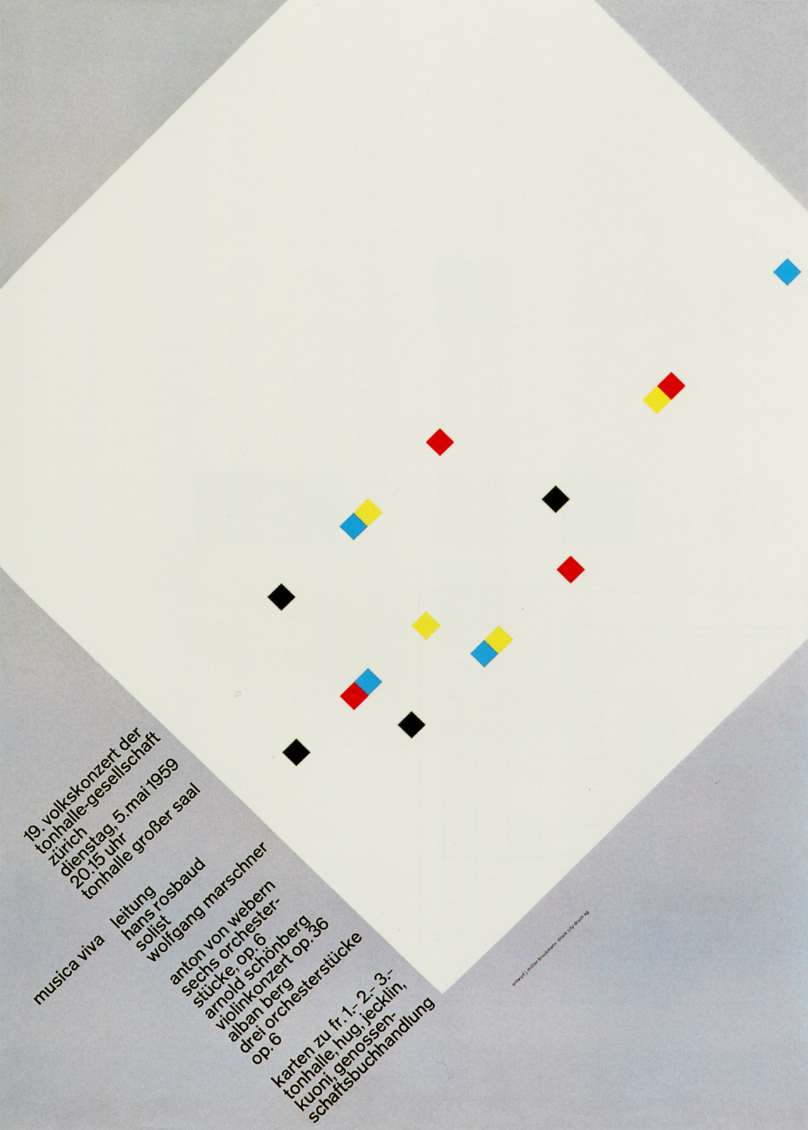
Josef Müller-Brockmann, Musica Viva series (1957–59)
Reduction to circles, lines, and modular counterpoint—each poster varies the composition while maintaining a fixed typographic system. The series reads like a visual rhythm exercise.
Armin Hofmann, Kunsthalle Basel — 4 Bildhauer (1959)

Primary collection context: Museum für Gestaltung Zürich — Graphic Design Collection.
The Teachers & the Schools: Basel and Zürich
Armin Hofmann (Basel School)
Renowned for a precise but exploratory pedagogy, Hofmann’s classes emphasized contrast, economy, and typographic discipline. His teaching at Yale helped bring Swiss methods into U.S. programs.
Profiles and artefacts: Design Reviewed — Armin Hofmann.
Emil Ruder (Typography & Spacing)
Ruder formalized spacing, alignment, and the expressive possibilities of restriction. His approach sharpened how students read counterforms and rags at scale.
Josef Müller-Brockmann (Zürich)
Designer, theorist, and teacher whose practice and writing codified the grid as an instrument for clarity; his posters double as lessons in hierarchy.

Legacy in Brands, Standards & Today’s UI
Helvetica became the emblem of Swiss neutrality, adopted by transport systems, corporations, and cultural institutions. The grid’s portability—print to screen—made it a natural ancestor to component-based design systems and responsive layouts.
Open any UI kit and you’ll recognize the logic: column systems, baseline tokens, typographic scales, and media that lock to a shared rhythm. That is the International Typographic Style, translated for pixels.
Competitor-Beating Extras
How to Read a Swiss Poster (Quick Overlay)
Use this numbered key on any poster: identify columns, baseline, primary type, counter-type, image crop, and caption logic.
Vocabulary Pop-outs
Downloadable: Design a Swiss-Style A4 Poster in 8 Steps
- Define content hierarchy first (title → subhead → body → caption).
- Choose a two- or three-column grid with generous gutters.
- Set body in a neutral sans-serif; build sizes on a scale (e.g., 8/12/18/24).
- Use asymmetry; align left; maintain a clean rag.
- Place imagery on the grid; crop to edges/baselines.
- Establish consistent spacing tokens (e.g., 4, 8, 12 units).
- Limit color; let contrast and scale do the work.
- Proof at distance; adjust spacing before ornament.
Further Reading on Artoholica
Prefer to see geometric clarity in action? Browse the curated selection in Abstract & Geometric Wall Art and compare how contemporary prints translate Swiss-style alignment, spacing, and hierarchy.
FAQ: International Typographic Style (Swiss Style)
What is the International Typographic Style (Swiss Style)?
It’s a mid-century design method from Switzerland that uses modular grids, asymmetric alignment, neutral sans-serifs, and objective photography to communicate clearly at scale.
What time period does Swiss Style cover?
It consolidates after World War II and is codified in the 1950s–1960s, with roots in earlier European modernism.
Why did Helvetica become the emblematic Swiss Style typeface?
Designed in 1957 as Neue Haas Grotesk and renamed Helvetica c. 1960–61, its even color, neutral details, and wide availability suited identity systems and signage.
How did Bauhaus typography influence Swiss Style?
Through functional sans-serifs, typographic hierarchy, and photomontage—see 1923 exhibition posters by Joost Schmidt, Moholy-Nagy, and Farkas Molnár. For context, read our Bauhaus movement overview.
Swiss Style vs. De Stijl vs. Constructivism—what’s the difference?
De Stijl pursues universal order with perpendiculars and primaries; Constructivism uses diagonals and photomontage for social urgency; Swiss Style systematizes communication with grids, sans-serifs, and photographic clarity.
Who are the key designers?
Armin Hofmann (Basel pedagogy), Emil Ruder (typography/spacing), and Josef Müller-Brockmann (grid theory and practice).
Is Swiss Style still relevant for UI design today?
Yes. Responsive grids, typographic scales, and component logic in design systems extend Swiss principles to screens.
0 comentarios