Pantone 2026 Watch: Early Signals, Palette Tests & Wall‑Art Pairings
As of October 29, 2025, Pantone hasn’t announced its 2026 Color of the Year. But three major paint players already have—giving strong clues about the direction of color for interiors and, crucially, the art that hangs on your walls.
What’s signaling Pantone’s 2026 mood?
While Pantone’s pick is still under wraps, the market is lining up behind grounded greens, complex khakis and dressy browns:
- Behr – “Hidden Gem”: a smoky jade green positioned as both serene and crisp indoors/outdoors.
- Sherwin‑Williams – “Universal Khaki”: a chameleon khaki that warms neutrals without reading beige.
- Benjamin Moore – “Silhouette AF‑655”: a deep espresso‑brown with charcoal undertones that reads tailored and luxe.
Add context from last year’s Pantone call—2025’s “Mocha Mousse”—and the picture sharpens: comforting neutrals are getting earthier, more characterful, and more wardrobe‑like. Pinterest’s 2025 patterns also pushed warm desert notes and saturated reds/pinks, which pair naturally with olive and khaki accents.
Quick palette tests (approximate swatches)
Note: On‑screen swatches are visual approximations to guide pairings, not manufacturer‑matched formulas.
Wall‑art pairings that make these colors sing
Smoky Jade + Bone + Brass
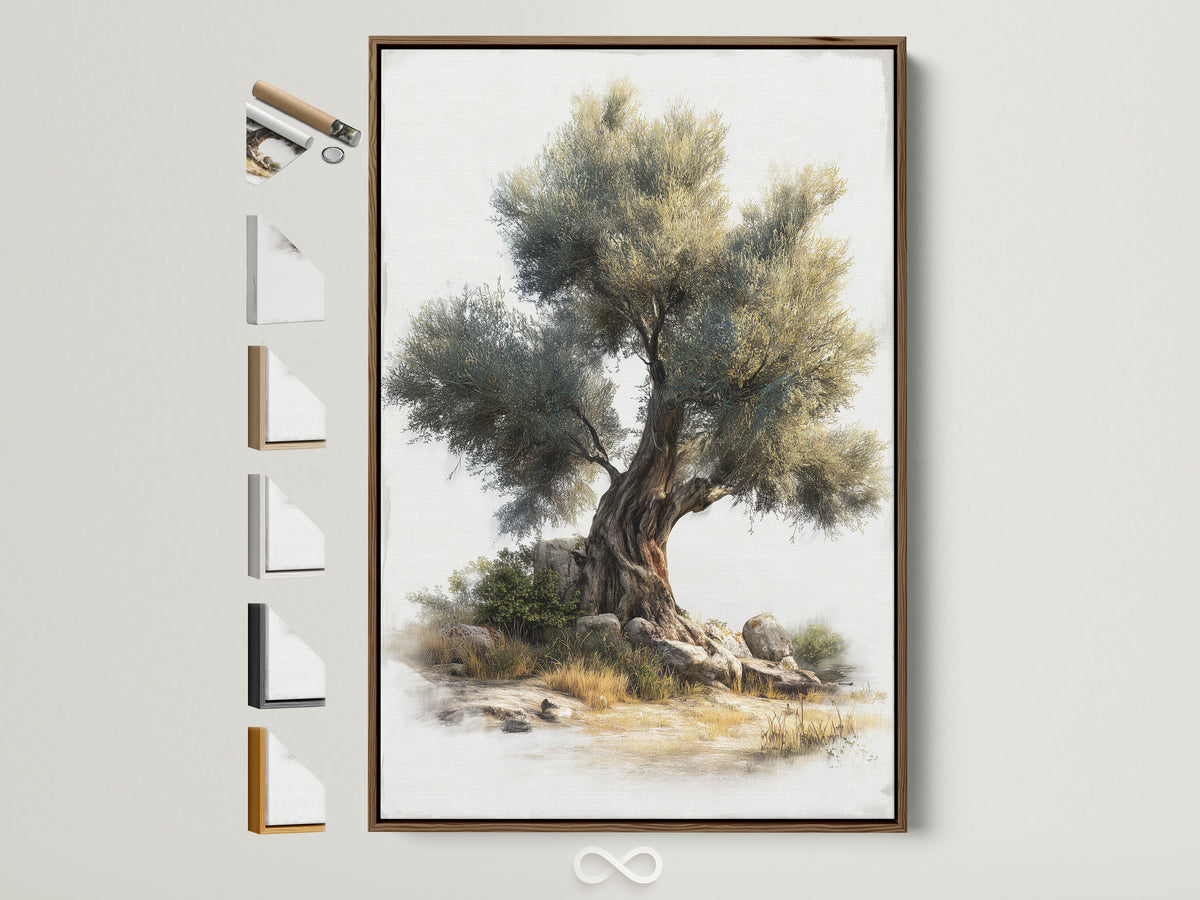
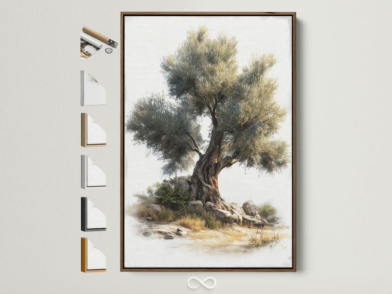
A smoky jade wall loves matte bone mats and antique‑brass accents. Choose botanical or abstract linework with hinted gold to echo warmth without glare.
Universal Khaki + Black Frame + Ecru
Khaki reads richer against black shadow‑gap frames. Use ecru textiles and black hardware for modern “warm minimal.” Great with graphic geometrics or topographic studies.
Silhouette Brown + Plum + Linen
Dressy espresso can carry plum accents (prints or florals) and natural linen. Think “bookshelf wealth”: museum‑grade paper, wider borders, and picture lights.
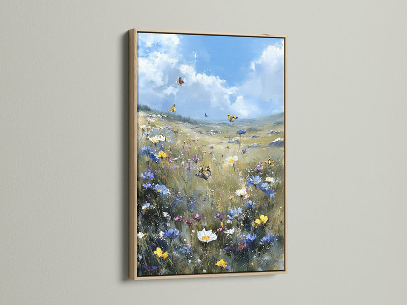
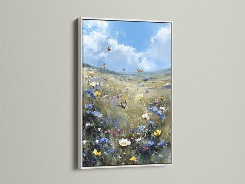
Coastal Updates: Olive + Powder Blue
Swap seafoam for olive. Add a single powder‑blue print or mat to keep the scheme airy.
Want a deep dive on green? Our team unpacked Behr’s call in this analysis of “Hidden Gem”—including frame finishes, print sizes, and mural vs. canvas choices for renters vs. owners.
Shop the look: Greens & Khakis (2026‑ready)
Where this lands in rooms
Warm minimal. Universal Khaki reads calm with plaster‑texture abstracts and black shadow‑gap frames. Add one plum or teal print for contrast without breaking serenity.
Eclectic heritage (“bookshelf wealth”). Silhouette brown is made for linen‑matted photographs, botanical plates, and antique brass. Mix a dark‑floral canvas to soften the grid.
Coastal updates. Trade seafoam for olive; pair with powder‑blue skies or navy geometrics so it feels fresh, not rustic.
Complementary reads
Mid‑stream readers often ask for related coverage. Try these to round out your palette planning:
• House Beautiful: 2026 Colors of the Year (brand round‑up)
• Pinterest Predicts 2025: Desert, Reds & Pinks, and mood‑forward aesthetics
• Sherwin‑Williams: Universal Khaki—2026 Color of the Year
Why we think Pantone will skew earthy again
Pantone’s Mocha Mousse (2025) confirmed a wider appetite for tactile, grounded comfort. With 2026 paint leaders calling smoky greens, khakis and deep browns, wall decor that echoes forest, botanical and textured‑neutral stories will age well—even if Pantone zigs slightly brighter.
Shop the look: Earth & Plum Accents
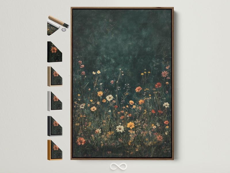
Framing notes & sizes
- Frames: Black for khaki/olive modernity; oak or walnut for Silhouette/coffee browns; gold/brass when you want a dressier read on greens.
- Glazing: Low‑glare acrylic keeps olive/khaki from flattening in bright rooms.
- Scale: If ceilings are 8'–9', anchor with 24×36" or 31×47" single statement; pair with one 12×18" to stagger heights.
- Murals vs. prints: Use murals for texture fields behind minimal furniture; prints for “pause points” over consoles and reading nooks.
References
- Behr: “Hidden Gem” named 2026 Color of the Year
- Sherwin‑Williams: “Universal Khaki” 2026 Color of the Year
- Benjamin Moore: “Silhouette AF‑655” 2026 Color of the Year
- Pantone Color of the Year 2025: Mocha Mousse 17‑1230
- CNN: Pantone names “Mocha Mousse” as the 2025 Color of the Year
- Pinterest Predicts 2025 (desert notes, reds, pinks)
- House Beautiful roundup: 2026 Colors of the Year
FAQ
Has Pantone announced the 2026 Color of the Year?
Not yet. As of October 29, 2025, Pantone has not announced it. The reveal typically arrives in early December for the following year.
How reliable are paint‑brand Colors of the Year for predicting Pantone?
They’re not 1:1 predictors, but they do reflect what clients and designers are buying. The 2026 slate—smoky jade, khaki, espresso brown—suggests earthy, tailored comfort will remain strong.
What wall‑art styles work best with olive and khaki?
Botanicals, topographic/linework studies, and textured neutrals. Use black or walnut frames for definition; add a single plum, powder‑blue, or brass accent for lift.
Should I switch to murals or stay with framed prints?
Murals excel on long, low‑furniture walls or media rooms; framed prints suit tighter plans and rental spaces. If unsure, start with one large (24×36" or 31×47") canvas and layer smaller pieces.
Will these colors date quickly?
Earthy greens/khakis age well. Keep frames classic (black, oak, walnut) and avoid over‑matching accessories so you can pivot when the next palette hits.
End of article
0 commentaire