Emerald Botanical Wall Art for Dark Academia Home Office Decor
The fastest way to turn a plain workspace into a moody, bookish sanctuary? Dress the walls in deep greens and scholarly botanicals, then layer warm lighting and timeworn textures. This guide shows you how—step‑by‑step—with color science, layout rules, styling recipes, and a curated set of Artoholica prints that nail the look.
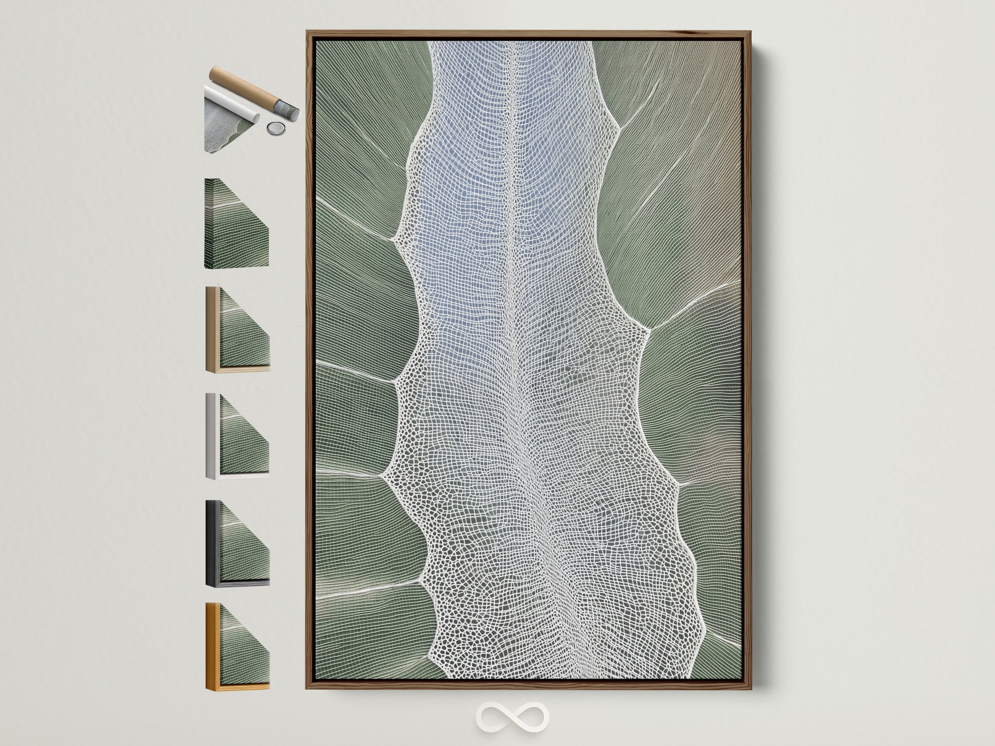
Shop the hero: Emerald Tree‑Ring Canvas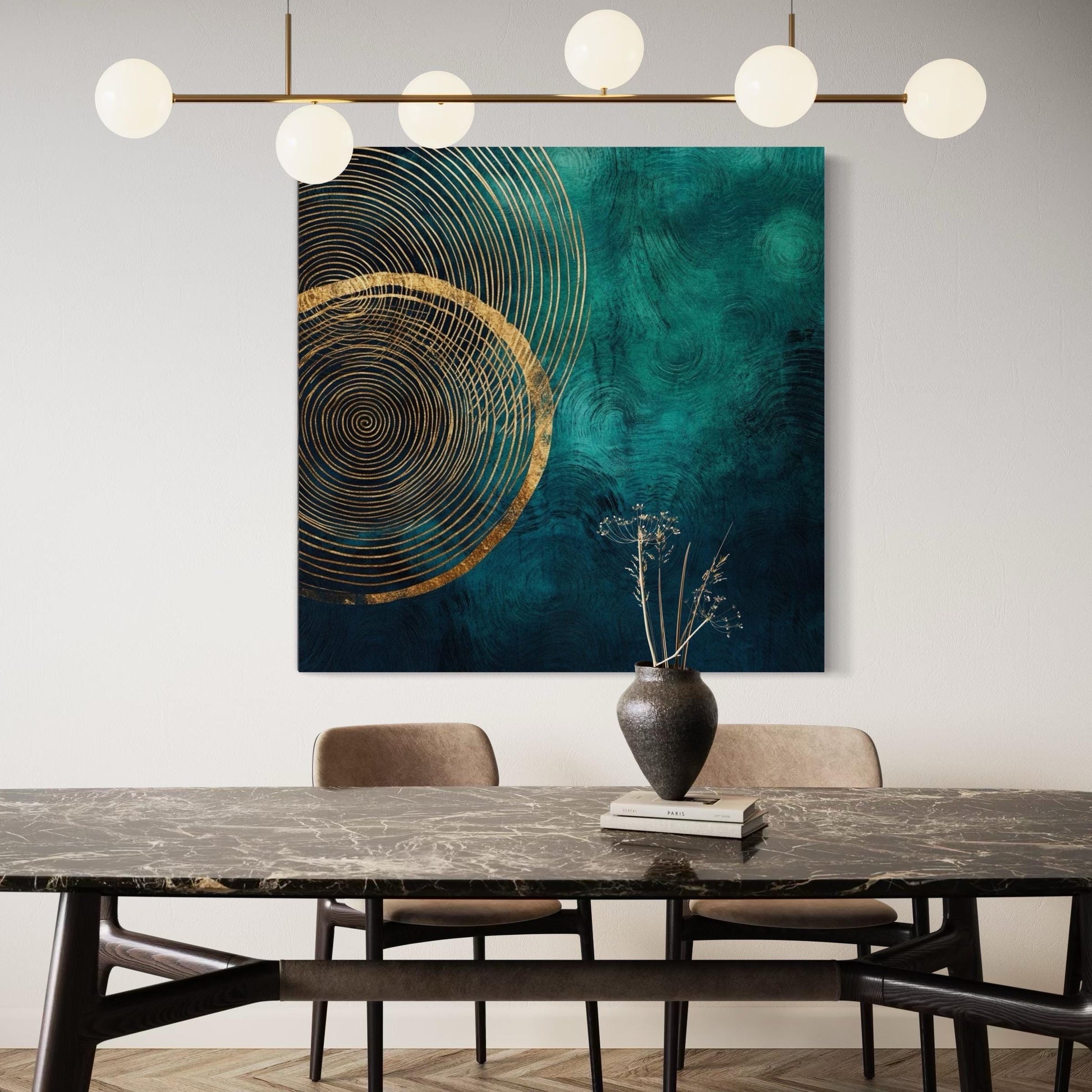
What Makes Dark Academia… Dark?
Dark Academia interiors are essentially library chic: vintage woods, brass accents, and a palette that runs through ink, espresso, oxblood, and—our star—emerald. Designers describe it as “rich, deep maximalism” with cozy reading light and collected art layered salon‑style on the walls.
Think of an old university study: timber shelves, patinated frames, botanical plates, and a pool of warm lamplight. Now pair it with modern ergonomics and good wiring.
For a quick primer, see overviews from The Spruce and trend explainers from Better Homes & Gardens and Real Homes.
Core ingredients
- Moody base colors + one jewel tone (emerald is ideal).
- Natural textures: wood, linen, wool, leather, brass.
- Scholarly iconography: herbariums, etchings, classic landscapes.
- Layered, warm lighting (no overhead glare).
Style twin: Not quite goth, not quite cottagecore—Dark Academia equals elegant maximalism with a bookish spine.
Why Emerald Works: Color & Focus
Green is psychologically associated with calm, balance, and restoration, which can help during long focus sessions. Reviews of color research suggest environmental greens are perceived as less taxing, while workplace studies link “nature‑rich” spaces to measurable uplifts in productivity and creativity. See summaries and studies via Verywell Mind, Corporate Environments, Gensler, and peer‑reviewed work on color and biophilia (Elliot 2015 review; Aristizabal 2021).
Starter Palettes & Material Kits
Palette: Emerald & Walnut
Anchor the room with one substantial emerald piece—canvas or framed print—then echo the hue once more in a velvet pillow or desk mat. Walnut adds heritage, brass adds glint, parchment off‑whites keep things legible.
Material short‑list
- Walnut/mahogany desk (vintage or vintage‑look).
- Linen or wool drapery to soften acoustics.
- Matte black task lamp + brass library lamp.
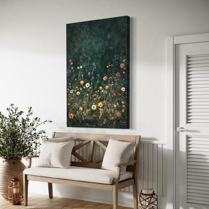
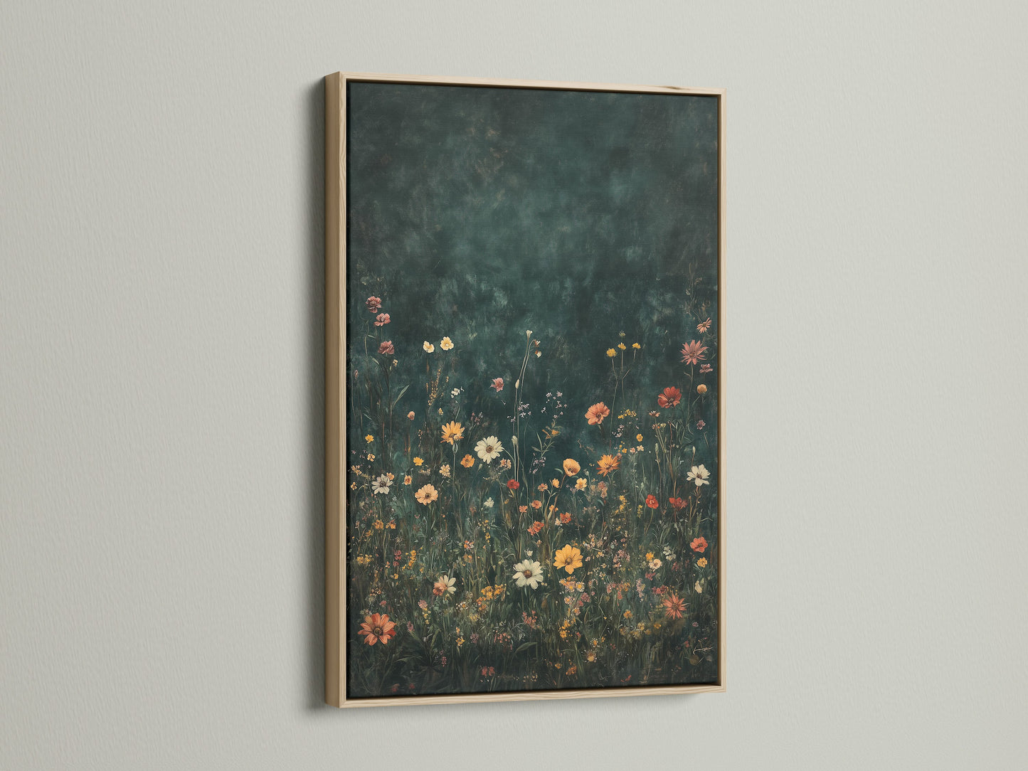
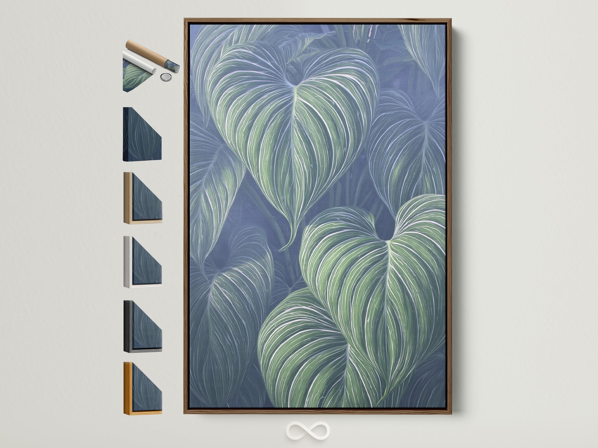
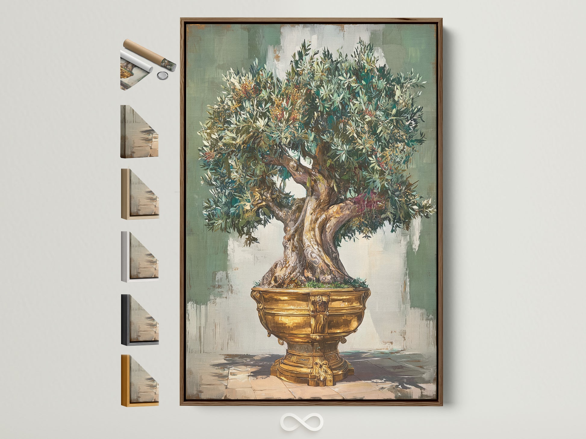
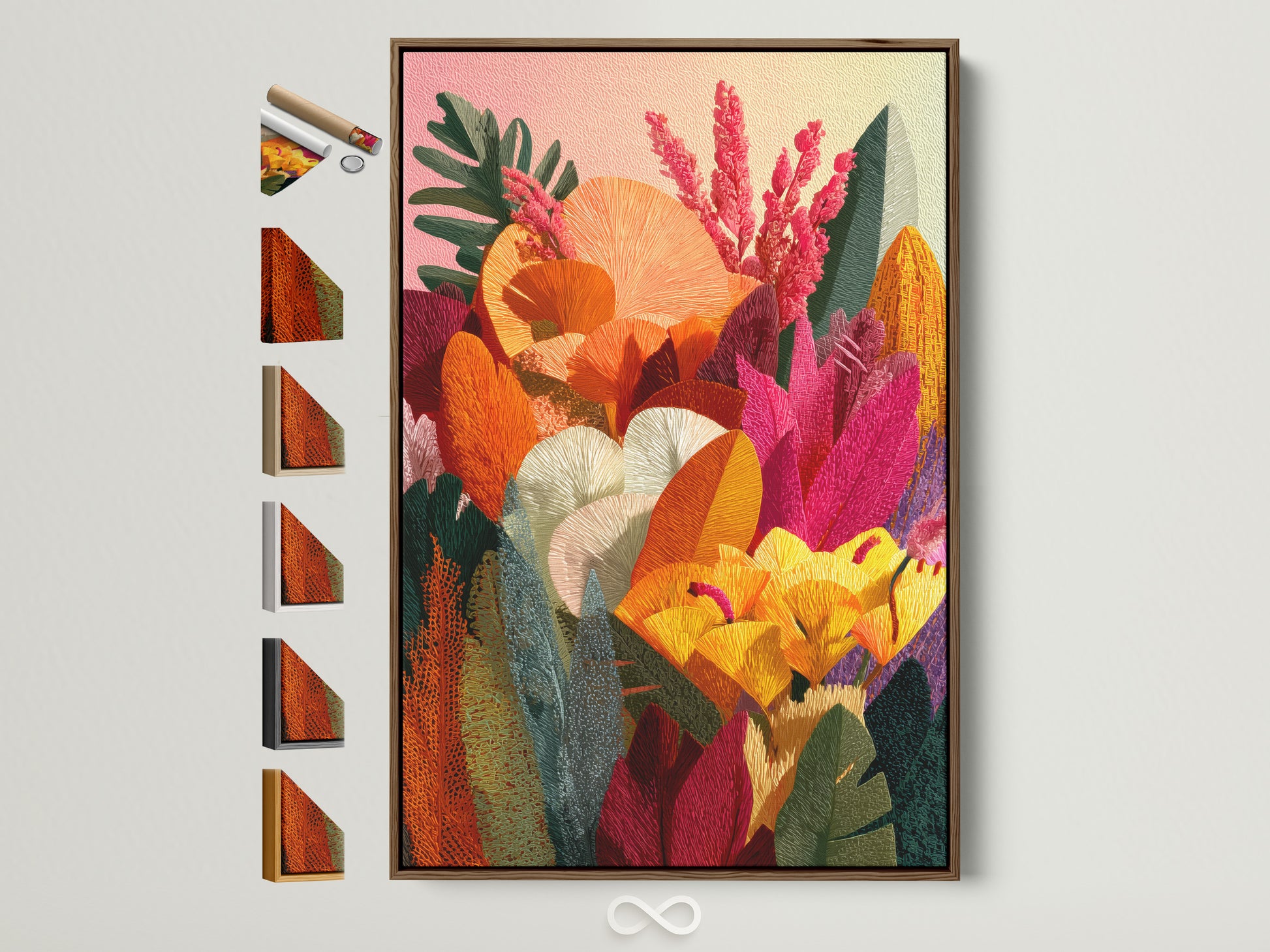
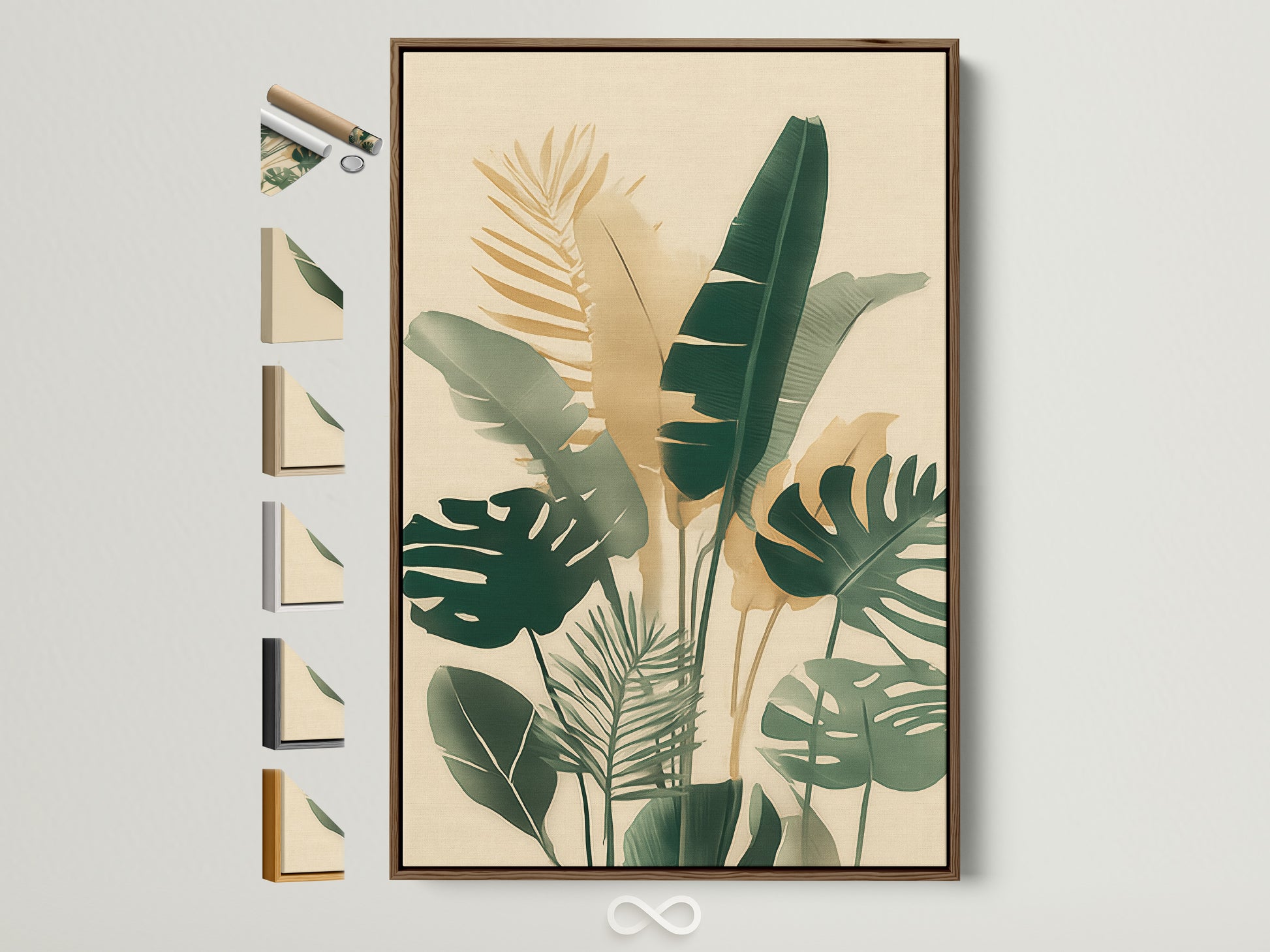
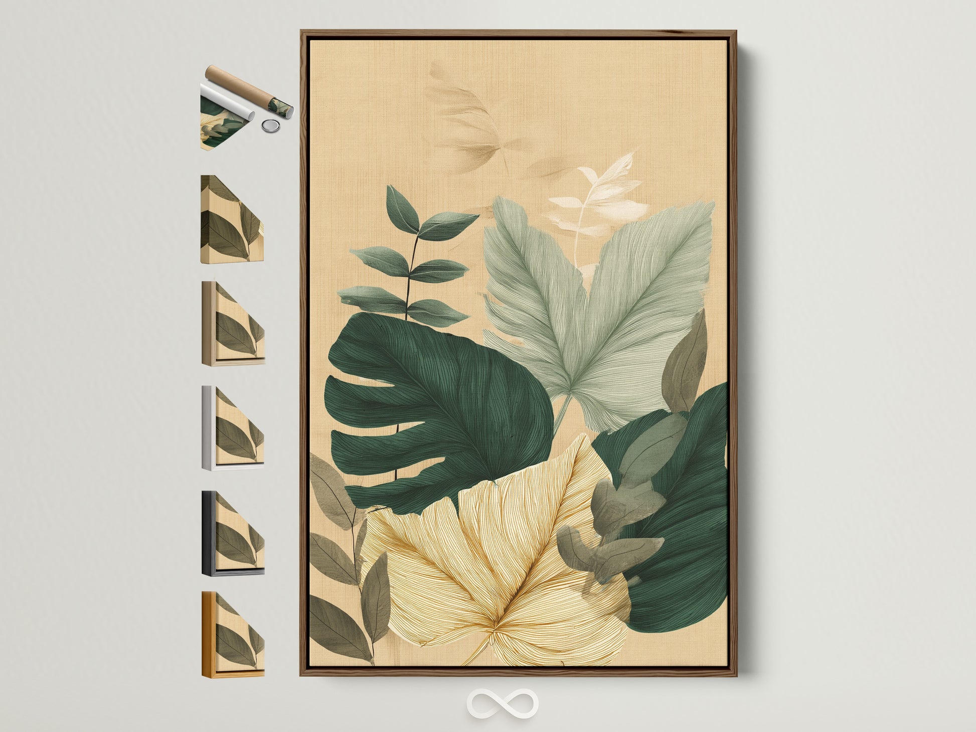
- Botanical wall art: emerald leaves, herbarium plates, moody florals.
Want neutral botanicals for quieter rooms? See our Neutral Botanical Abstract guide for Japandi‑leaning spaces.
Light Like a Library (Not a Lab)
Libraries use layered, warm light: ambient (dim), task (precise), and accent (poetic). Mix a diffuse ceiling source on a dimmer with two lamps—one at the desk (2700–3000K) and one behind you to light bookcases or art. Ditch bare overheads and fluorescents; lower, warmer light looks cleaner on camera and kinder to eyes.
Design joke: If you can just barely see your keyboard—perfect. If you can’t see the pile of papers— even better.
Art Placement: Above Monitors & Behind You
Front wall (you see it)
- Anchor height: Center ~145 cm / 57 in from floor for the main piece.
- Over a desk: Leave 15–20 cm (6–8 in) between desktop and frame bottom.
Back wall (your Zoom backdrop)
- Go salon (cluster of botanicals) or single statement (one moody canvas).
- Keep horizon lines roughly aligned; odd numbers read more relaxed.
For real‑world inspiration, see makeover case studies from Apartment Therapy.
Best Subjects for the Scholarly Look
Botanical art signals “study” without feeling stiff. Herbarium‑style leaves, moody florals, and natural textures read timeless—and pair perfectly with walnut shelves and brass lamps. Mix one large emerald‑dominant piece with two to three supporting works (neutral or parchment‑toned) for balance. For a deeper history dive, peek at our Pre‑Raphaelite art history note—a rich reference for flora‑forward, romantic imagery.
Frames, Finishes & Glare Control
- Floater frames add depth—great for canvases with texture.
- Wood tones (oak, walnut) keep it academic; black frames sharpen silhouettes.
- Glass: choose matte/anti‑glare if facing a window; glossy if wall is shaded.
Sizing & Layout Rules (So It Looks Intentional)
Big statement vs. salon wall
A single 60–90 cm wide canvas above the desk reads confident. A salon wall? Start with one “anchor” piece and orbit smaller prints around it, keeping 5–8 cm gaps. Lay it out on the floor first; snap a phone pic; then hang.
Math you’ll actually use
- Center at 145 cm from floor for seated viewing.
- Leave 6–8 cm between frames in a group.
- Top of the tallest frame should sit under door height for calm sightlines.
Micro‑Zones: Reading Nook & Zoom Wall
Reading nook
One comfortable chair, a library lamp, a side table, and a botanical study within arm’s length. Add a small throw in a deep neutral (ink, charcoal) so the emerald stays in charge.
Zoom wall
Choose art with clear subject and mid‑contrast so webcams don’t crush detail. Botanicals with parchment grounds read beautifully. Keep glare low with side lighting at eye height.
Renter‑Friendly Moves
- Use removable hooks for frames; keep weight under spec.
- Lean larger canvases on a console or shelf—instant gallery feel.
- Swap lamp shades to fabric or pleated styles for library glow.
Want more style playbooks? Browse our Design archive.
Care & Longevity
Artoholica canvases use archival pigments on museum‑grade cotton for rich color; dust with a soft dry cloth and avoid high humidity or direct, harsh sunlight. Frames prefer a light touch—no chemical glass cleaners on matte glazing.
Single Feature: A Little Whimsy Still Counts

Frog Pond Canvas—a fairy‑tale wink that still reads green and grounded. Perfect for a back wall so your video calls get a touch of storybook charm. Shop it.
Where to Splurge vs. Save
- Splurge: The main emerald statement piece (largest canvas or framed print). It carries the room.
- Save: Supporting prints (botanical studies) and found objects—antique books, brass frames.
- Invest smart: Good dimmers and a task lamp you love—usable every single day.
Watch: A Moody Office Makeover
Prefer to see the layering happen? Here’s a quick makeover video that walks through paint, lighting, and art placement for a moody, bookish workspace.
FAQs
What colors pair best with emerald in a Dark Academia office?
Walnut/mahogany, brass, parchment off‑whites, ink black, and small notes of oxblood or burgundy. Keep the palette tight (2–3 main hues) for cohesion.
Is green actually good for productivity?
Evidence suggests nature cues (including greens) support calm focus and creativity. See summaries from Gensler and reviews in color psychology literature.
How big should art be above a desk?
Common sweet spot: 60–90 cm wide, centered around 145 cm (57") from the floor. Leave 6–8 cm between grouped frames.
Glossy or matte?
Matte and anti‑glare glass for bright rooms; glossy for darker walls. Canvases look great in floater frames to add depth without shine.
How do I light the wall without glare?
Use lamps at eye height, 2700–3000K, and bounce light off walls. Dim overheads; aim lights slightly off‑axis to the art.
What subjects feel most “academic”?
Botanical studies, herbarium plates, moody florals, classical landscapes, and historic illustration. Keep at least one emerald‑dominant piece.
Can I do Dark Academia in a small, bright room?
Yes—keep walls lighter (parchment/stone), and add emerald via art, textiles, and accessories. It still reads bookish without shrinking the space.
Canvas or framed print for the main piece?
Canvas = subtle texture and gallery depth; framed paper prints = crisp detail and glare control with matte glazing. Both work—choose by lighting.
Any renter‑safe hanging tips?
Use damage‑free hooks within weight limits, or lean larger canvases on furniture. Map layouts on painter’s tape first.
References
- The Spruce — Dark Academia Interior Design
- Better Homes & Gardens — Dark & Light Academia
- Real Homes — What is Dark Academia?
- Gensler — Biophilic Workplace & Productivity
- Elliot, A. J. (2015) — Color & Psychological Functioning (Review)
- Aristizabal et al. (2021) — Multisensory Biophilic Office (Study)
For more Artoholica reading, see the Tree‑Ring Canvas Spotlight and our broader Floral & Botanical Wall Art collection.



0 comments