Dental Clinic Decor: The Calm, Clean & Trust‑Building Playbook
A practical, research‑backed guide to colors, layouts, infection‑smart materials, glare‑free lighting, acoustics, and art—so your practice feels gentle, efficient, and unmistakably professional.

What great dental clinic decor actually does
Good looks are only the beginning. The best dental interiors lower anxiety, make cleanliness legible, and choreograph an easy visit—from first step at reception to the moment patients leave. Research confirms the waiting area can elevate stress; positive distractions (nature references, art, soft sound, views) consistently help. [oai_citation:0‡MDPI](https://www.mdpi.com/2075-5309/14/10/3160?utm_source=chatgpt.com)
Design also has clinical stakes. Clear sightlines, hygienic finishes, and well‑planned work zones support safety and speed. Public‑facing surfaces and flows should make your infection‑control standards feel obvious, not hidden in the back‑of‑house. [oai_citation:1‡CDC](https://www.cdc.gov/dental-infection-control/hcp/summary/index.html?utm_source=chatgpt.com)
Palette & materials: calm first, clinical second
Start with a gentle palette anchored in nature (sage, olive, mist, sand, stone). Warm neutrals communicate care; restrained contrast reduces visual noise. For an approachable aesthetic, see our guide to Warm Minimalism. It’s a helpful foundation for medical spaces when you keep finishes wipeable and seams minimal. [oai_citation:2‡artoholica.com](https://artoholica.com/blogs/design/warm-minimalism-the-room-by-room-playbook-for-quiet-cozy-interiors)
- Walls: Use scrubbable low‑sheen coatings; add depth with subtle texture (micro‑troweled mineral looks) but avoid dust‑catching relief. Keep corners protected with cleanable trims.
- Floors: Seam‑smart, non‑slip vinyl or sheet goods in warm grays or muted stone. Limit grout lines.
- Counters: Compact surface or solid surface with soft radii at edges for easy disinfection.
- Metals: Brushed, not mirror‑polished—fewer fingerprints, less glare.
Tip: In open areas, a two‑tone wall (mid‑level darker band) hides scuffs from bags and carts while keeping the room bright.
Layout & flow: from reception to chair without friction
Many clinics are moving toward self‑rooming models that reduce waiting time and crowding. Signage and intuitive pathways guide patients directly to exam rooms; apps or kiosks handle intake. Result: less bottleneck, more privacy, and a clear sense of progress. [oai_citation:3‡HCD Magazine](https://healthcaredesignmagazine.com/trends/should-healthcare-say-goodbye-to-waiting-rooms/60520/?utm_source=chatgpt.com)
Still using a conventional waiting room? Upgrade it for shorter, better waiting: clear sightlines, daylight, zoning for quiet and family, and layered lighting (more below). Design the space to educate and soothe rather than stall—this shift is a recognized opportunity in healthcare design. [oai_citation:4‡HFM Magazine](https://www.hfmmagazine.com/articles/4481-health-care-design-for-the-waiting-experience?utm_source=chatgpt.com)
For calm, choreographed movement, borrow cues from Zen Interiors: generous negative space, concealed storage, and a few good focal points—never clutter. [oai_citation:5‡artoholica.com](https://artoholica.com/blogs/design/zen-interiors-a-room-by-room-playbook-for-stillness)
Waiting area: make time feel shorter
Zone it. Create a quiet reading corner, a perching bar for quick stops, and a soft “conversation” cluster. Keep lines of sight to reception, restrooms, and exits. Include one universally accessible seat with extra clearance.
Choose textures that signal cleanliness. Tight‑weave upholstery, wipeable end tables, and rounded corners read hygienic at a glance. Finish a feature wall with a matte, softly tactile look (and keep it cleanable).
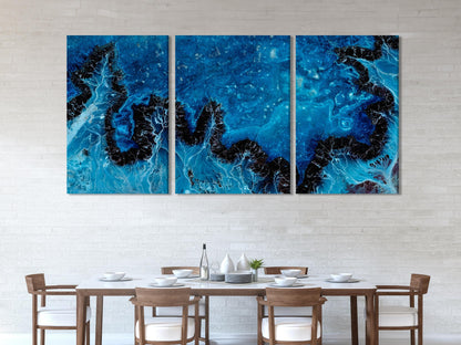
Add positive distraction with art and nature references. Use a single large canvas or a tidy series—calm compositions, blues and greens, and soft movement tend to lower perceived wait time and anxiety. [oai_citation:6‡MDPI](https://www.mdpi.com/2075-5309/14/10/3160?utm_source=chatgpt.com)
Curated art picks for a calming waiting room
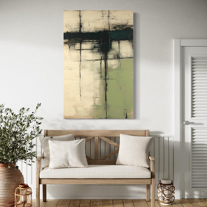 Wabi‑Sabi Green Texture — canvas art
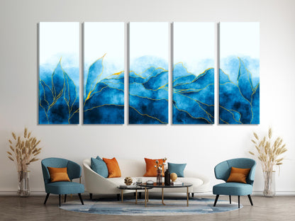 Navy Watercolor Abstract — canvas art
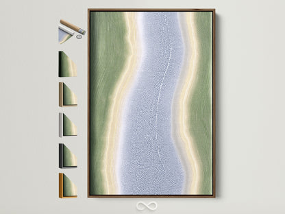 Coastal River Abstract — canvas print
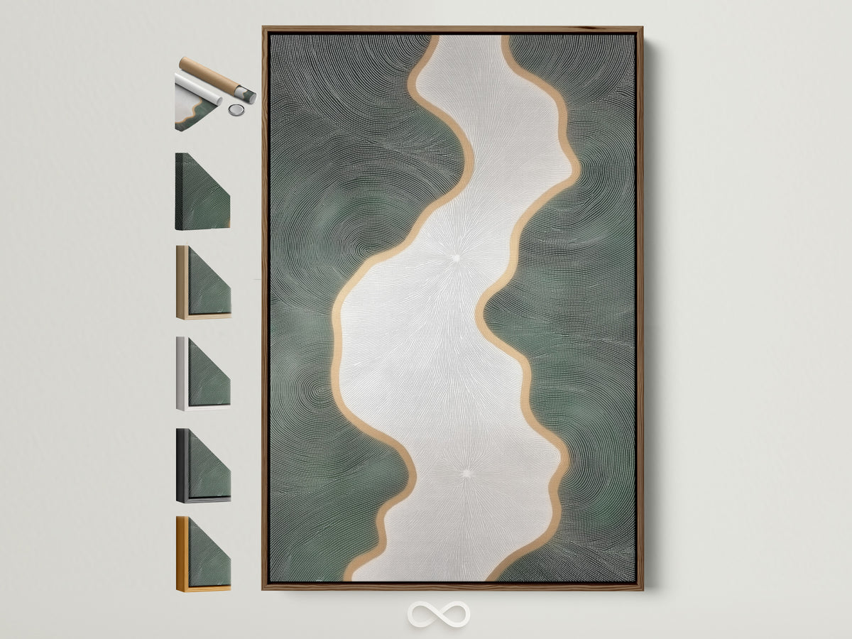
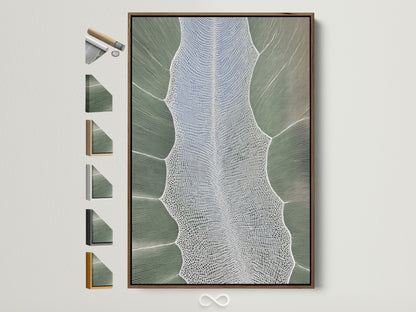 Botanical Sage Abstract — canvas art
 Deep Blue Geode — canvas art
Tip: hang 60–66 in (152–168 cm) to the artwork’s centerline so seated eye‑height feels natural.
Light like a pro: the five‑plane framework
Don’t rely on a single overhead. Layer five “planes” of light—ceiling, wall, task, feature, floor—to make rooms feel larger, brighter, and kinder on eyes. Our at‑home explainer, Layered Lighting, Made Easy, translates perfectly to clinics. [oai_citation:7‡artoholica.com](https://artoholica.com/blogs/design/layered-lighting-made-easy-a-five-plane-framework-for-real-homes)
- Ceiling wash: uplight coves or wall‑grazers to remove harsh contrast.
- Wall softeners: sconces or low‑glare panels at 3000–3500K for welcome areas.
- Task: high‑CRI, shadow‑managed fixtures at chairs and benches.
- Feature: highlight art or signage (10–20 fc above ambient).
- Floor glow: nightlights and toe‑kick strips for safe wayfinding.
To keep light comfortable, borrow from Poul Henningsen’s glare‑free philosophy—shaded, diffused, and layered. See our room‑by‑room take in The Poul Henningsen Method. [oai_citation:8‡artoholica.com](https://artoholica.com/blogs/design/layered-light-scandinavian-calm-the-poul-henningsen-method-for-every-room)
Need a softer focal glow? Noguchi’s Akari paper lamps offer sculptural, low‑glare light that reads friendly at reception and consult zones. [oai_citation:9‡artoholica.com](https://artoholica.com/blogs/design/noguchi-s-akari-at-home-a-lighting-framework-for-soft-sculptural-rooms)
Acoustics: lower noise, raise privacy
Dental sounds (handpieces, suction, sterilizers) spike anxiety. Treat ceilings and select walls with absorptive panels; mix in some diffusion to keep rooms lively but controlled. Vendors explain the practical blend of absorption and diffusion for clinics; reading up helps you specify intelligently. [oai_citation:10‡Acoustic Geometry](https://acousticgeometry.com/dental-office-soundproofing-increase-comfort-and-privacy/?srsltid=AfmBOoplUh_JFu4B-flkwNI7LmM12tcq33IPo4j9j6af4QmMfIp6MByV&utm_source=chatgpt.com)
Know your metrics: NRC gauges how much sound a finish absorbs; STC indicates how much a partition blocks sound between rooms. Use both when planning walls, doors, and glazing. [oai_citation:11‡ddsacoustical.com](https://ddsacoustical.com/news/full-article/differences-between-stc-and-nrc-ratings?utm_source=chatgpt.com)
Materials that make cleanliness obvious
Design around visible hygiene: cleanable finishes, minimal joints, and closed storage for supplies. The CDC summarizes core precautions—hand hygiene, PPE, environmental cleaning, and sterilization workflows—that your space should visually support. Specify wipeable surfaces at every patient touchpoint, smooth corners, and generously sized hand‑wash stations. [oai_citation:12‡CDC](https://www.cdc.gov/dental-infection-control/hcp/summary/index.html?utm_source=chatgpt.com)
Case pattern to emulate (and adapt)
i29’s Dentista Amsterdam blends medical clarity with a verdant palette—natural wood, saturated greens, and crisp lines—to produce a surprisingly serene clinic. Borrow the idea of one confident color story, consistent millwork language, and a few sculptural lights rather than many small fixtures. [oai_citation:13‡ArchDaily](https://www.archdaily.com/974488/dentista-amsterdam-dental-clinic-i29-interior-architects?utm_source=chatgpt.com)
Room‑by‑room playbook (copy‑and‑apply)
Reception & check‑in
- Low counter segment for accessible service; clear QR or kiosk for self check‑in. [oai_citation:14‡HCD Magazine](https://healthcaredesignmagazine.com/trends/should-healthcare-say-goodbye-to-waiting-rooms/60520/?utm_source=chatgpt.com)
- Warm woods, softly textured wall behind the desk, and one large calm artwork.
- Ceiling wash + wall sconces; avoid direct downlights in staff eyes.
Waiting area
- Three seating modes: lounge, perching bar, child‑friendly corner.
- Plants with tidy silhouettes (olive, ficus microcarpa); easy‑clean planters.
- Acoustic ceiling tiles (NRC ≥ 0.80) + a felt baffle or two near hard corners. [oai_citation:15‡ddsacoustical.com](https://ddsacoustical.com/news/full-article/differences-between-stc-and-nrc-ratings?utm_source=chatgpt.com)
Operatories
- Task lighting with high CRI; ambient at 3000–3500K; dimmable for comfort.
- Closed storage for consumables; easy‑wipe counter backsplashes.
- Frosted glazing or solid doors with seals to bump STC and privacy. [oai_citation:16‡ddsacoustical.com](https://ddsacoustical.com/news/full-article/differences-between-stc-and-nrc-ratings?utm_source=chatgpt.com)
Consult rooms
- Seating at equal height (no “doctor behind a desk” dynamic).
- One framed anatomy print or softly abstract art; wall grazer for accent.
Pediatric & family area
- Color accents at floor toys, not walls; avoid high‑chroma chaos.
- Rounded corners, wipeable bins, low shelving, and one cheerful artwork.
Restrooms
- Seam‑smart surfaces, hands‑free fixtures, and easy‑clean base details.
- Nightlight‑level floor wash for safety after dilation or procedures.
Staff break
- Soft seating, acoustic wall, dimmable ambient; a nature print for decompression.
- Lockers concealed in millwork; finishes that hide scuffs.
How to choose (and place) art in a clinic
1) Pick a mood. For dentistry, non‑literal, nature‑adjacent abstracts work beautifully—blues and greens, or warm stone neutrals.
2) Scale up. One large piece feels intentional and reduces clutter versus many small frames.
3) Light softly. No glare. Use wall grazers or sconces; avoid hotspots. For a deeper primer on glare‑free layering, skim our five‑plane guide and Poul Henningsen framework. [oai_citation:17‡artoholica.com](https://artoholica.com/blogs/design/layered-lighting-made-easy-a-five-plane-framework-for-real-homes)
More calming art options for consult rooms & hallways

Branding that feels like care, not advertising
- Typography: friendly sans for signs; high contrast for legibility.
- Color accents: use brand color sparingly (door edge, bench cushion, a stripe in artwork) to avoid pediatric‑only vibes.
- Wayfinding: consistent icons, arrows, and room IDs with tactile contrast.
Budget & phasing: upgrade without upheaval
- Phase 1 — Weekend refresh: paint, a single lighting layer, two large artworks, greenery, declutter, and clean signage.
- Phase 2 — Systems: acoustic ceiling tiles and wall baffles; task lighting at chairs; reception millwork with concealed storage. [oai_citation:18‡ddsacoustical.com](https://ddsacoustical.com/news/full-article/differences-between-stc-and-nrc-ratings?utm_source=chatgpt.com)
- Phase 3 — Future‑proof: self‑rooming layout, integrated kiosks, and private operatory entries. [oai_citation:19‡HCD Magazine](https://healthcaredesignmagazine.com/trends/should-healthcare-say-goodbye-to-waiting-rooms/60520/?utm_source=chatgpt.com)
Further reading from our Design series
- Zen Interiors: a room‑by‑room playbook. [oai_citation:20‡artoholica.com](https://artoholica.com/blogs/design/zen-interiors-a-room-by-room-playbook-for-stillness)
- Noguchi’s Akari at home. [oai_citation:21‡artoholica.com](https://artoholica.com/blogs/design/noguchi-s-akari-at-home-a-lighting-framework-for-soft-sculptural-rooms)
- Layered Lighting: five planes. [oai_citation:22‡artoholica.com](https://artoholica.com/blogs/design/layered-lighting-made-easy-a-five-plane-framework-for-real-homes)
- Warm Minimalism guide. [oai_citation:23‡artoholica.com](https://artoholica.com/blogs/design/warm-minimalism-the-room-by-room-playbook-for-quiet-cozy-interiors)
- The Poul Henningsen method. [oai_citation:24‡artoholica.com](https://artoholica.com/blogs/design/layered-light-scandinavian-calm-the-poul-henningsen-method-for-every-room)
Shop the look
Ready to curate a calm, professional mood? Browse our full range of sizes and finishes in the Artoholica collection—then place one confident piece in each zone you’ve just planned.