Conference Room Wall Art: A Practical Playbook for Better Meetings
Meetings ask a lot from a room: clarity, focus, comfort, a professional backdrop for video, and a clear sense of your brand. The right conference room wall art can quietly solve for all four—if you size it correctly, light it well, and choose finishes that won’t glare on camera or echo across the table.
Why art belongs in meeting rooms
Beyond aesthetics, art supports mood, sense of belonging, and perceived quality—useful in high‑stakes conversations. Recent workplace research highlights the role of environment in boosting experience and performance; when rooms are designed for the task, teams collaborate better and feel better doing it (Gensler Global Workplace Survey 2024). Curated visual elements can also humanize hybrid calls, giving cameras something intentional to see rather than blank drywall (Art Plus Artisans).
Plan around constraints (A/V, glare, and echo)
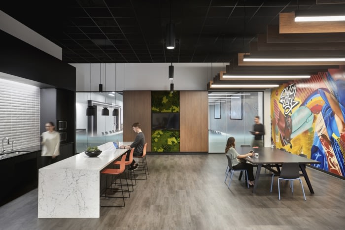
A/V and sightlines
Keep art out of the direct camera path behind participants’ heads unless it reads cleanly at a distance. Avoid high‑contrast micro‑patterns that moiré on video. If you’re flanking a screen, leave 6–10 inches of breathing room between frame edge and display edge.
Glare control
Use non‑glare acrylic on framed pieces and avoid glossy glass—especially across from windows. A helpful rule: position accent lights so their reflection angles don’t bounce to the seated eye line; shallow wall grazers at 30–45° often work best. WELL v2’s lighting guidance emphasizes visual comfort and circadian support—translate that as “soft, controllable, non‑glary light scenes” that respect human comfort (IWBI, WELL v2 addenda).
Acoustics baseline
Meeting rooms perform well when background sound sits around NC 25–30 (quiet but not dead); soft finishes and acoustic art panels help reduce flutter and sharpen speech intelligibility (Archtoolbox).
Scale & placement that always looks right
Use these quick rules to size conference room wall art confidently:
- Center height: 57–60 inches above finished floor (AFF) for the visual midpoint of the piece.
- Width: target ~57–75% of the available wall span (subtract door/glazing and switches first).
- Pairs or grids: keep 2–3 inches between frames; align midlines rather than tops when seating is low.
- Behind a screen: keep art simple and tonal; flanking art should sit slightly lower than the screen center.
- Long walls: break with a triptych or a linear series to guide sightlines toward the head of table.
Light the art—and the people—without glare
Start with a simple framework: ambient, task, vertical (walls), accent, and decorative. If this sounds familiar, it’s because it mirrors the Five‑Plane Lighting Framework you can apply to any room. For meetings, that translates to:
- Ambient: soft, uniform level for the whole room.
- Task: the table needs clarity without hotspots.
- Vertical: lift walls (and art) so faces read naturally on video.
- Accent: gentle grazers or aimable spots for depth.
- Decorative: pendants for hierarchy, kept dimmable.
Many standards suggest around 30 footcandles at the conference table for comfort; think of that as “bright enough to read notes, not studio bright” (Lighting Design Lab). Give your room a few dimming scenes (“pitch,” “collaborate,” “video call”) and mind flicker when dimming—quality drivers and protocols matter (GSA P100).
For glare‑free comfort, study how Poul Henningsen layered shades to diffuse light and hide the source; the principles port well to contemporary fixtures and conference rooms (The PH Method).
Editor’s picks: High‑impact art for meeting rooms

Abstract Anchor — bold, graphic focus
Strong shape language for brand‑forward rooms.
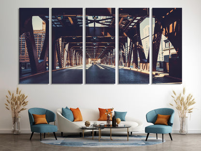
Urban Chicago Bridge — urban energy
Cityscapes add momentum to client‑facing spaces.
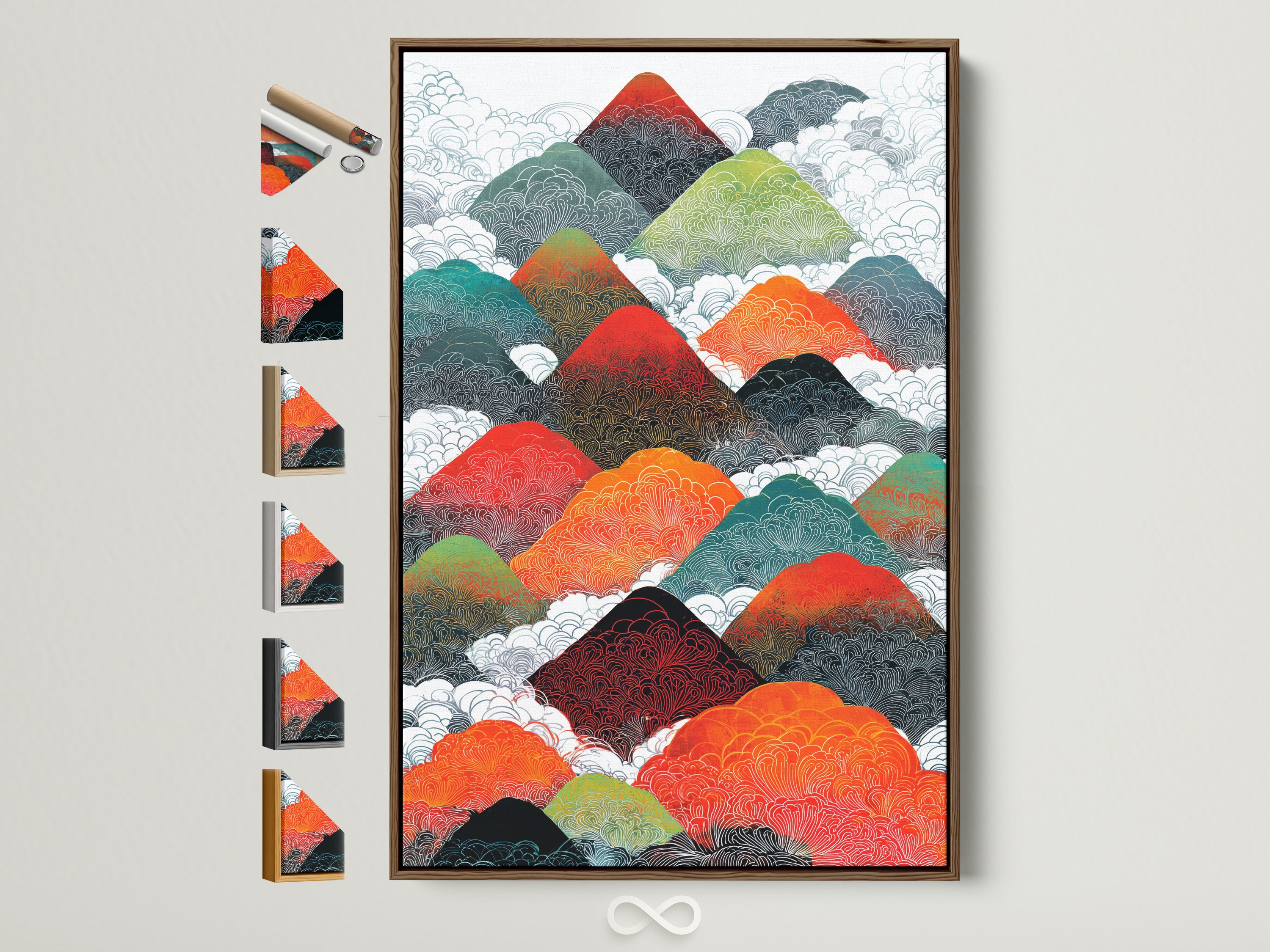
Asian Mountains — biophilic calm
Color‑rich yet soothing for focus and long sessions.

Abstract Geometric Shapes — modern balance
Neutral forms keep the backdrop intentional—not busy.
Style playbook: Match the art to the meeting
Warm Minimal boardroom
Oak, wool, and plaster textures with simplified abstract art. It feels executive without feeling cold. See our primer on Warm Minimalism for palette discipline.
Brand supergraphics for workshops
Use a single wall for an oversized graphic to energize design sprints. Keep adjacent walls calmer so cameras don’t fight the pattern. Learn how to scale graphics smartly in Supergraphics: Paint the Space.
Hybrid‑first neutrals
Stick to matte finishes and gentle contrast so faces stay the hero on camera. Layer glare‑free light per the PH method.
City energy & biophilic calm
Cityscapes give sales rooms momentum; nature studies or abstract botanicals take pressure down in huddle rooms—both photograph well and feel intentional.
Materials & finishes that behave on camera
- Canvas prints: inherently matte, great for glare control and scale.
- Framed prints with non‑glare acrylic: crisp edge + protection without mirror‑like reflections.
- Metal prints: use satin/matte; avoid mirror aluminum in video‑heavy rooms.
- Acoustic art panels: fabric‑wrapped or micro‑perforated faces add absorption where you need it most.
- Color rendering: aim high (CRI ≥90) so art and skin tones read naturally (GSA P100).
Editor’s picks: Calm & Neutral set
Stacked Forms — quiet focus
Soft geometry that won’t distract on video calls.
Contour Peaks — serene rhythm
Organic movement that keeps the room grounded.
Urban Bridge — subtle grit
Warm neutrals + structure for client rooms.
Anchor Form — steady presence
Graphic, grounded, easy to light without glare.
Process & checklist
Before you buy
- Measure: clear wall spans (net), table size, and camera view.
- Plan sizes: use the 0.57–0.75× rule; mock up with painter’s tape or a printout.
- Finish choice: matte canvas or non‑glare acrylic for hybrid rooms.
- Lighting scenes: set “pitch,” “collab,” and “video” presets.
- Acoustics: target NC 25–30; add soft surfaces opposite glass (reference).
Install day
- Center height 57–60" AFF; verify with seated sightlines.
- Check reflections from fixtures/screens; adjust aim/beam.
- Use secure hardware and anti‑tilt bumpers; level precisely.
- Wipe with lens‑safe, non‑ammonia cleaners; log frame finish.
Quick lighting cheat sheet
- Target ~30 fc at table; provide dimming scenes (Lighting Design Lab).
- Favor low‑glare optics and good color rendering; mind flicker on dim (GSA P100).
- Glare control and visual balance are wellness wins (WELL v2).
Make it yours
When in doubt, start with versatile geometric abstractions: they photograph cleanly, scale well, and sit comfortably behind brand colors. Browse our curated picks in Abstract & Geometric Wall Art to build a confident palette and size plan for your meeting rooms.
FAQ: Conference room wall art
- What size should conference room wall art be?
- As a rule, choose artwork that’s roughly 57–75% of the clear wall width. Keep the midpoint at 57–60" above the floor, and leave 6–10" breathing room near a display.
- Which finishes reduce glare on camera?
- Matte canvas and non‑glare acrylic. Position accent lights so their reflection angles don’t point toward seated eye lines; use dimming scenes to balance exposure.
- How do I choose art that won’t distract during hybrid calls?
- Favor calm, mid‑contrast compositions and cohesive color families. Avoid tight stripes or fine grids that moiré on video. Place complex pieces off the main camera axis.
- Can wall art help acoustics?
- Yes—fabric‑wrapped acoustic art panels add absorption. Pair with a soft rug or upholstered seating to help meet NC 25–30 for conference rooms.
- What lighting levels work best?
- Plan for ~30 footcandles at the table with dimming. Use layered lighting—ambient for comfort, vertical light for faces/art, and selective accents for depth.