Go Coastal, But Warmer: Sand‑Washed Blues, Rattan Frames & Linen Mats
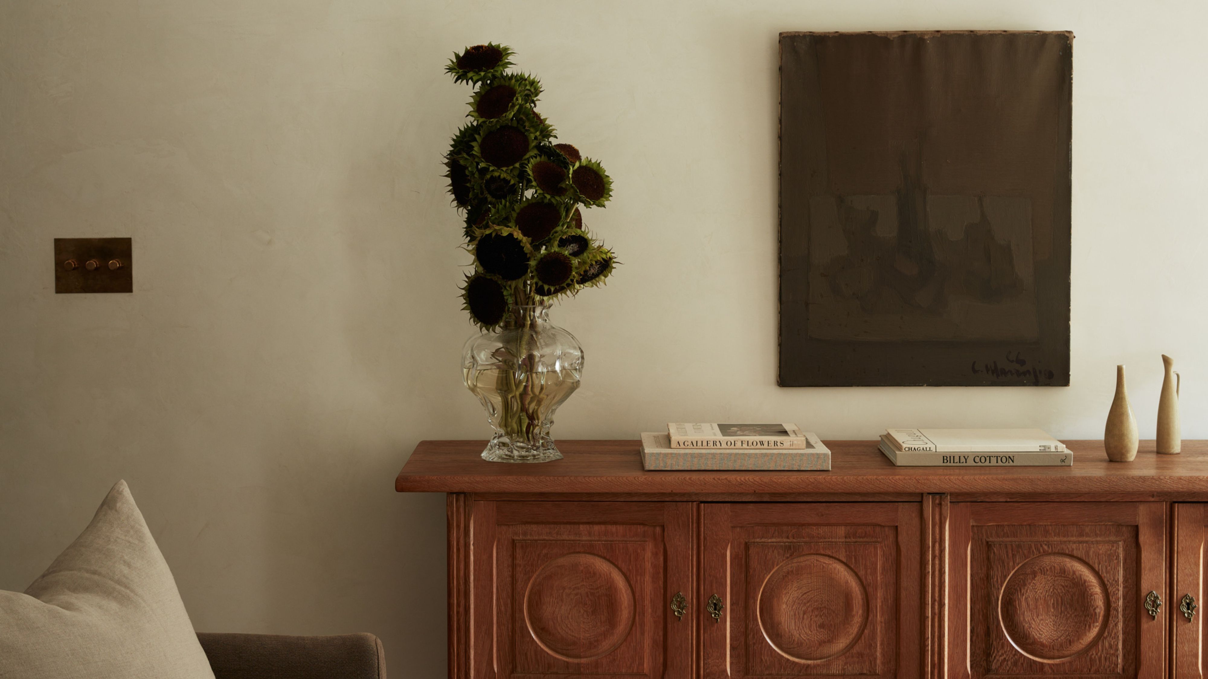
This season’s coastal aesthetic trades crisp navy‑and‑white for stonewashed blues, honey rattan, and linen‑matted frames—still breezy, just softer and more lived‑in. Texture is the driver (not theme), echoing the “warm minimalism” wave designers have been pushing: fewer objects, more tactility.
Design media and retailers point to texture and warmth—linen, rattan, and low‑saturation blues—shaping the 2025 palette for walls and frames.
Palette: “Sand‑Washed” Blues Meet Honey Neutrals
Instead of nautical brights, reach for desaturated, sun‑bleached blues—think stonewashed denim translated for walls. Paint libraries back this shift with approachable blue‑greys (see Dutch Boy’s “Stonewash Blue” and Dulux “Stonewashed Blue”) and broader ranges of inviting neutrals (Sherwin‑Williams’ 2025 capsule). For chip‑to‑room accuracy, always sample in your light.
Why it works: low‑contrast, slightly greyed blues mimic sky haze over sand; rattan adds warmth; linen introduces matte texture that photographs beautifully and cuts glare.
Frames & Mats: The 2025 Gallery‑Wall Formula

- Go natural with rattan/cane frames. Designers call rattan “as timeless as a white button‑down.” Use it sparingly—one or two frames in a mixed wall—to introduce warmth and negative‑space texture without going boho‑themed.
- Swap in linen mats. Fabric‑wrapped mats (linen, silk, even subtle stripes) are surging—adding depth and a soft edge around prints. Weighted or off‑center windows feel editorial and help petite pieces hold their own.
- Keep the palette tonal. Stonewashed blues pair best with oak, walnut, brass, and warm whites. Avoid stark bright white mats; reach for “linen” or “almond.”
- Edit for texture over quantity. Warm minimalism is about tactile surfaces—plaster, raw wood, nubby linens—so let a few great pieces breathe.
Related reading: texture‑first warm minimalism and why rattan reads “classic,” not trendy.
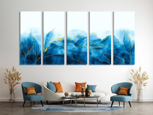
A Quick “Warm Coastal” Build
- Start with walls: one sand‑washed blue or linen‑warm neutral. Sample two depths of the same hue to match your light (coastal blues and 2025 neutrals are solid starting points).
- Anchor one oversized piece (36–60" wide), then layer smaller works around it using linen mats to create breathing room.
- Mix frame profiles: 60–70% clean oak/walnut, 20–30% rattan/cane, 10% brass or black for contrast.
- Add a stripe (sparingly): a pin‑striped mat nods coastal cabanas without tipping into theme.
- Finish with texture: a linen shade, woven tray, or raw‑ceramic vase repeats the frame’s natural fiber story.
Deep dive complements: colorful and patterned photo mats and looser 2025 gallery walls.
Leaning warmer overall? Pair this palette with espresso‑browns for a quietly luxe twist. Our breakdown of Benjamin Moore’s Silhouette AF‑655 shows how deep neutrals sharpen artwork and linen mats—see: Silhouette (2026) & the wall‑art playbook.
When to Choose Mats, Floating Frames, or Canvas
Linen or colored mats
Best for photography, drawings, and small prints that need visual “air.” Linen reads quieter than bright white and absorbs glare. Patterned or striped mats add subtle coastal DNA without seashell motifs.
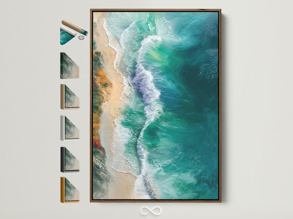
Floating frames
Use for canvases or when you want a modern gap around the edge—clean and gallery‑ish. In warm coastal rooms, choose oak or light walnut floaters to keep things sunny.
Save for Later — Complementary Reads
- How colorful & patterned mats change the art
- Rattan’s 2025 comeback (and why it never left)
- 29 best blue paint colors (updated 2025)
FAQ
What exactly is a “sand‑washed blue” for walls?
Are rattan frames durable enough for main living areas?
Why linen mats over bright white?
How many frame finishes can I mix in one gallery?
Canvas, framed print, or poster—what prints best at large sizes?
References
- Homes & Gardens — Warm minimalism, texture‑first (Oct 23, 2025)
- Veranda — Rattan is trending (Jul 1, 2025)
- Architectural Digest — Photo‑mat trend (Jul 30, 2025)
- Homes & Gardens — Gallery walls stay fresh (Oct 2025)
- Better Homes & Gardens — Add personality with mats (Jun 25, 2025)
- Dulux — Stonewashed Blue (accessed Oct 2025)
- Dutch Boy — Stonewash Blue 432‑3DB
- Behr — Sandwashed Driftwood 770D‑6
- Sherwin‑Williams — Color of the Year & 2025 Capsule
- BHG — Best blue paint colors (Oct 13, 2025)
0 reacties