Bauhaus Typography Examples (1919–1933): A Visual Guide
Bauhaus typography fused asymmetric layouts, sans‑serif clarity, photography, and daring lowercase experiments into a disciplined language of modern print. This guide argues that Bauhaus typography was less about inventing one “Bauhaus typeface” and more about using available grotesks in radical ways—while Herbert Bayer’s “Universal” alphabet pushed a lowercase‑only research agenda. If you want the broader story of the school’s workshops and timeline, see our Bauhaus movement overview.
A quick timeline (what changed, when)
- 1919–1922, Weimar: No on‑site letterpress workshop; posters, catalogs, and notices were printed externally, so early Bauhaus typography varied widely by printer and budget. This matters because it explains the mix of types before a “house” style emerged.
- 1923 pivot—“Art to Industry”: With László Moholy‑Nagy’s arrival, typography gained rules of clarity and function. Diagonals, photograms, and type–image experiments intensified, setting up the graphic standards that would define Bauhaus typography.
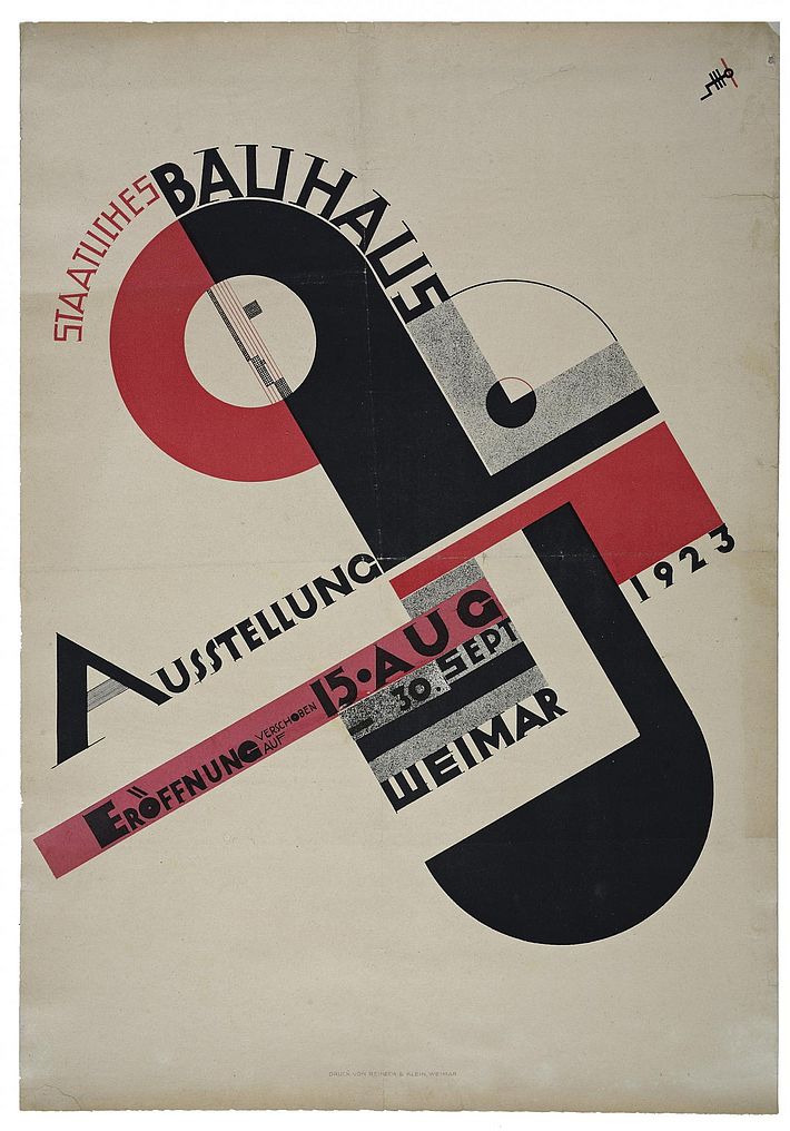
- 1923 Schmidt poster: The rotated cross of circles and bars announced a new graphic grammar backed by sans‑serif type and modular spacing. It broadcast the school’s ambitions to the public (and the rail stations).
- 1925, move to Dessau: A letterpress/printing and advertising workshop was established, creating the conditions for consistent Bauhaus typography across publications and signage.
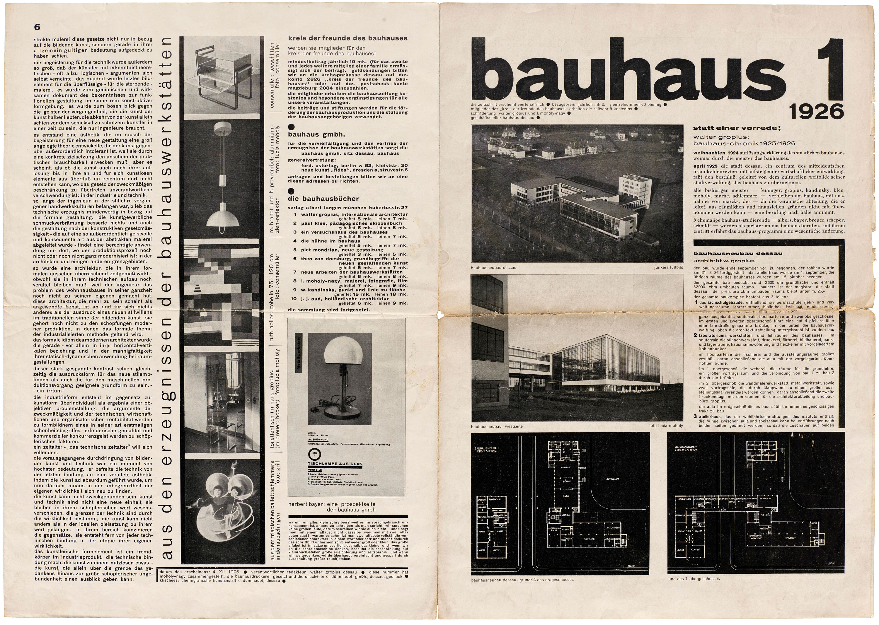
- 1926, bauhaus magazine launches: The editorial grid, grotesk headings, and flush‑left, ragged‑right setting consolidated into a recognizable “Bauhaus typography” program across issues.
- 1925–1928, Herbert Bayer’s “Universal” research: Lowercase‑only alphabets, compass‑and‑ruler forms, and systematic curves—largely lettering studies rather than foundry type—challenged habit and hierarchy.
- 1933, closure and diaspora: Teachers and students carried Bauhaus typography to new contexts, from publishing and advertising to American schools and corporate identity programs.
That diagonal energy and type–image fusion found a political counterpart in Russian posters; for context on diagonal composition and photomontage, read our primer on Constructivism (1913–1930s).
What makes Bauhaus typography “Bauhaus”? (with examples)
Lowercase & “Universal” experiments
How to spot it
- Lowercase‑only alphabets with uniform stroke weight and open counters.
- Geometric construction (radii, chords, straight joins) and minimized ascender/descender contrast.
- Lettering (drawn) rather than foundry type; used on covers, exhibition graphics, and identity work.
Herbert Bayer’s “Universal” alphabet reduced the Latin script to modular forms to improve speed and standardization. It is a cornerstone in any set of Bauhaus typography examples, but it remained primarily a research and lettering system during the Bauhaus years. For object‑level context, see Harvard’s record of Bayer’s Research in Development of Universal Type (1927), which documents the lowercase‑only approach and compass‑built geometry.
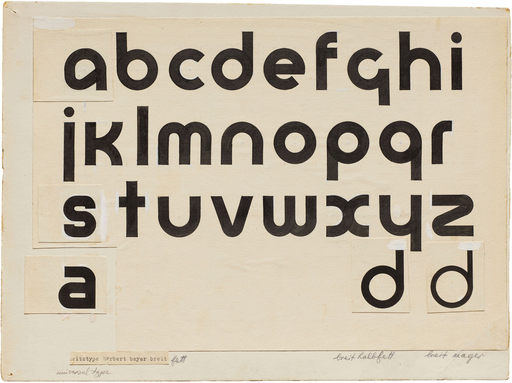
Functionally, abandoning capitals simplified composition and signmaking, and it collapsed social emphasis coded into capital letters; visually, the consistent x‑height and uniform stroke weight produced even color on the page—useful for long reproduction runs.
Sans‑serif pragmatism (Breite Grotesk, Aurora‑Grotesk, Venus)
How to spot it
- Workhorse grotesks with slightly condensed proportions and sturdy stems.
- Headlines in heavy weights; body in lighter cuts; minimal letterspacing for blocky rhythm.
- No single “Bauhaus font”—instead, a pragmatic mix of commercially available sans‑serifs.
In official publications, the “Bauhaus typeface” was rarely a bespoke design. Printers set headlines and running text in widely available grotesks such as Breite Grotesk, Aurora‑Grotesk, and Venus. This house pragmatism—rather than a single signature font—defines much of Bauhaus typography in practice. For a concise survey, see Letterform Archive’s guide to typefaces used by the Bauhaus.
Asymmetry & modular grids
How to spot it
- Flush‑left, ragged‑right text; generous gutters and white space as active elements.
- Scale, weight, and position—rather than ornaments—build hierarchy.
- Orthogonal blocks, clear baselines, and rhythmic column structures.
The 1926 bauhaus magazine codified the grid. Headlines march vertically, captions align to invisible modules, and images sit in measured fields. The result is legible, repeatable, and economical—aligned with workshop realities. This is Bauhaus typography at its most reproducible.
Type–image fusion (photograms, photomontage)
How to spot it
- Photos as structural components (not mere illustrations) interlocking with type.
- Diagonal vectors and tonal blocks guiding reading order (especially in posters).
- High‑contrast reproductions optimized for letterpress or offset.
László Moholy‑Nagy championed photography and montage as engines of “simultaneous communication.” In Bauhaus typography, images align to grids, share baselines with headlines, and set pacing across spreads. For the photographic foundation of this shift, see The Met’s essay “Photography at the Bauhaus.”
Five canonical Bauhaus typography case studies
Joost Schmidt, Poster for the 1923 Bauhaus Exhibition (Weimar)
Geometry is the structure here: a tilted cross made of circles and bars gives the layout tension and order. Sans‑serif letterforms in bands deliver dates and venue with billboard clarity, and Oskar Schlemmer’s emblem locks the school’s identity into the composition. The poster is an early public statement of Bauhaus typography—bold, asymmetric, and modular.
Spot it: Look for the rotated cross, stacked headline bands, and an assertive grotesk with tight spacing.
Staatliches Bauhaus in Weimar 1919–1923 (exhibition catalog)
Edited in the wake of the 1923 pivot, this catalog shows Moholy‑Nagy and Herbert Bayer thinking like systems designers: square format, modular titles, and a sober typographic palette that toggles between grotesk display and readable text. Lithography and letterpress sit side by side, anticipating “New Typography” principles.
Spot it: Title pages with strong left edges, grid‑true captions, and minimal rules replacing ornament.
bauhaus 1 (1926) magazine
The first issue codifies a house style: asymmetric column structures, generous margins, and cuts of Venus/Aurora‑Grotesk for headlines and navigational scaffolding. Photography integrates at equal status with type. This is among the most teachable Bauhaus typography examples for understanding hierarchy through scale and alignment.
Spot it: Big “bauhaus 1” masthead; images and plans locked to a common grid; rag‑right text blocks.
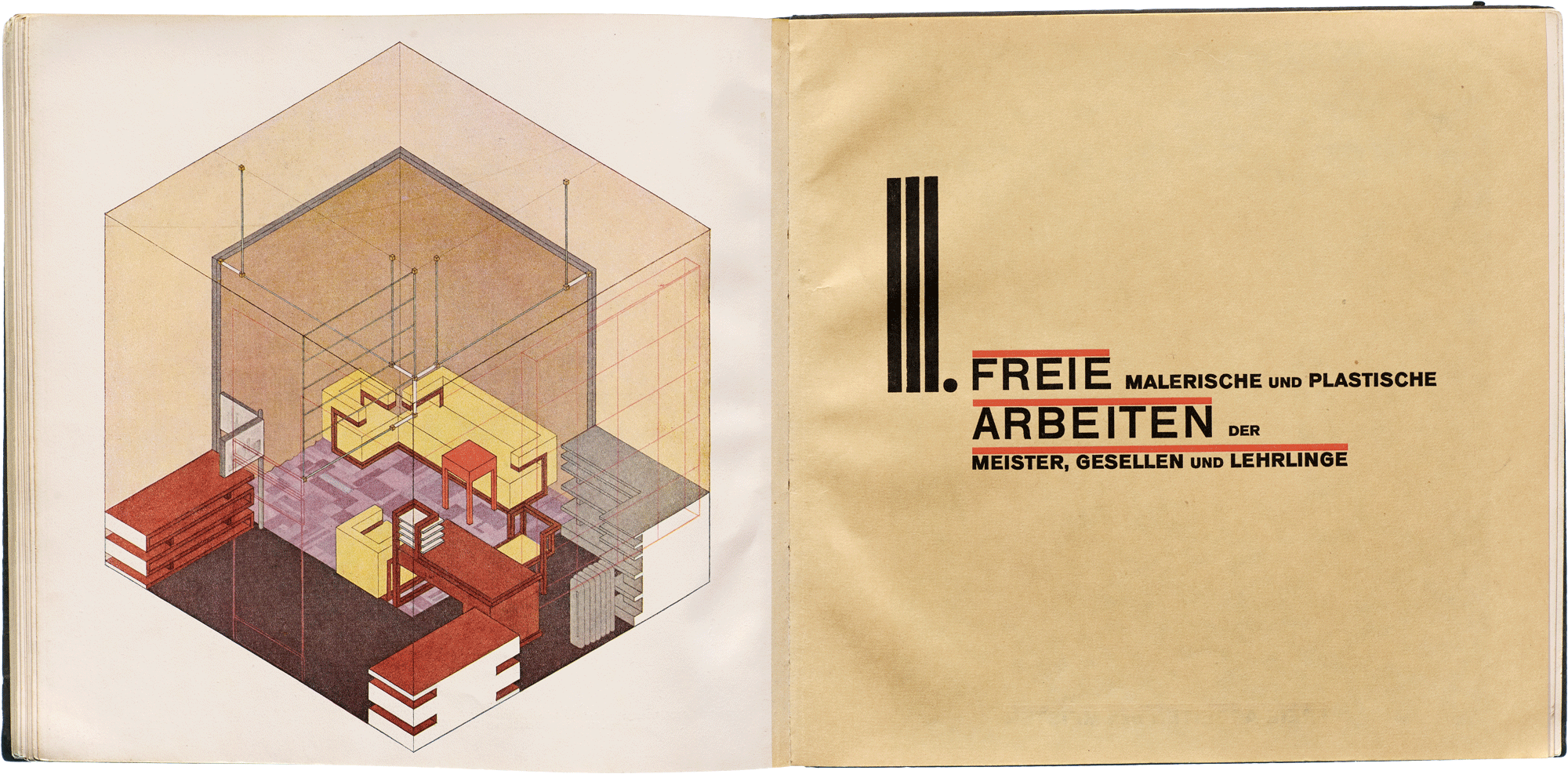
Bauhausbücher series (1925–1930)
Under Moholy‑Nagy’s program, fourteen Bauhausbücher volumes balanced modern layout with practical reading. Covers deploy stark geometry and sans‑serif titling; interiors often use readable serif text (e.g., Genzsch‑Antiqua) with grotesk display—a pairing that grounds the avant‑garde look. For a visual sampling of covers, see this focused installation view roundup.
Spot it: Consistent title bars, primary‑color accents, and a quiet text serif inside.
Dessau signage (1926)
Bayer’s campus signage replaced blackletter with clear, industrial grotesks and a lowercase identity across building labeling, wayfinding, and letterheads. This is Bauhaus typography applied at architectural scale: standardized strokes, even spacing, and modular proportions for readability at distance.
Spot it: Lowercase forms, uniform stroke weight, and generous letterspacing on façades and directional signs.
Common myths (and quick fixes)
- “There is a single ‘Bauhaus font.’” No—official outputs typically used commercial grotesks (Breite/Aurora/Venus). Bayer’s “Universal” was mostly lettering research, not a widely cast foundry face.
- “Futura is the Bauhaus font.” Paul Renner wasn’t Bauhaus faculty. Futura (1927) shares geometric ideals and later appears near Bauhaus contexts, but it is an independent design aligned with the broader “New Typography.”
- “Bauhaus typography = red + black only.” While red/black is common in posters and headings, magazines and books deploy neutral grays, earthy papers, and occasional primary accents—color is purposeful, not dogma.
- “Universal” equals everything Bauhaus printed. Universal type is central to study but rarely the setting of long texts during the school years; pragmatic grotesks did the work.
Quick compare: Bauhaus vs Constructivism vs Swiss Style
| Aspect | Bauhaus | Constructivism | Swiss Style |
|---|---|---|---|
| Goal | Integrate art, craft, and industry; clear communication for workshops, products, and education. | Agitate and inform; design as social instrument for the street and factory. | International clarity; neutrality and legibility across languages and media. |
| Layout logic | Asymmetric grids and modular blocks tuned to production. | Dynamic diagonals and forceful axes that cut across fields. | Strict baseline grids and optical alignment; mathematical spacing. |
| Type choices | Commercial grotesks (Breite/Aurora/Venus) + experiments like Universal. | Bold grotesks with condensed impact; heavy weights for slogans. | Neo‑grotesks (e.g., later Helvetica/Univers) with measured contrast. |
| Image strategy | Photography as structure; technical drawings and plans. | Photomontage and propaganda photos fused with type. | High‑contrast, grid‑fitted images with generous margins. |
| Signature move | Lowercase emphasis; rigorous spacing; workshop pragmatism. | Diagonal energy; slashed bars; mega‑scale numerals. | Calibrated whitespace; micro‑typographic discipline. |
| Typical use | Magazines, books, product catalogs, campus signage. | Posters, broadsides, exhibition graphics in public space. | Corporate systems, transit graphics, international publishing. |
If the modular clarity of grids interests you, compare it with De Stijl grid logic in our Dutch movement guide.
How to “read” a Bauhaus layout (checklist for students)
- Hierarchy via scale and weight: Headlines get size; captions and notes rely on weight and position rather than decorative rules.
- Flush‑left, ragged‑right: The rag breathes; avoid full justification unless the grid demands it.
- Whitespace is active: Margins, gutters, and inter‑column spacing carry rhythm—respect the grid.
- Lowercase preference: Expect lowercase‑first headings; capitals appear sparingly for abbreviations or emphasis.
- Typeface pairing: Robust grotesk for display; a readable serif can set long text (common in Bauhausbücher), keeping pages comfortable.
- Photography as structure: Align image edges to modules; share baselines where possible to integrate text and picture.
- Letterspacing: Tighten large grotesk headlines slightly; keep text tracking neutral for even color.
- Reproduction reality: Design for the press—coarse screens and paper tones influence contrast, so plan accordingly.
Key terms you’ll meet
Grid system, x‑height, rag, grotesk, photomontage, modular alignment, baseline.
Try this:
Create a two‑column spread with a three‑unit baseline grid; set a grotesk headline flush‑left, drop in one photograph aligned to the grid, and annotate how scale—not ornament—drives your hierarchy.
Where to see it (and what to look for in person)
Letterform Archive (San Francisco): An unparalleled collection of Bauhaus magazines, books, posters, and specimens—ideal for studying paper tone, ink gain, and real‑world letterspacing. Their exhibition writings on typefaces and publications offer solid springboards for research.
Bauhaus‑Archiv / Dessau / Weimar: Between these institutions, you’ll find posters (including Schmidt’s), workshop ephemera, and campus materials that articulate the evolution of Bauhaus typography across phases.
New York (MoMA & The Met): Seek out posters, exhibition catalogs, and Bauhausbücher volumes; read collection labels for printing methods and type choices. Check online records and PDFs before visiting to spot relevant objects on view.
Short internal bridge for readers
For the full arc—from Weimar workshops to the glass‑walled Dessau campus—jump to our Bauhaus movement guide. If the poster‑to‑street energy of diagonal layouts and photomontage interests you, read our Constructivism guide. And if grid logic is your thing, explore De Stijl for the Dutch roots of modular clarity.
Like the look? If Bauhaus typography’s bold grotesks, geometric shapes, and crisp grids speak to you, browse our Abstract & Geometric Wall Art to see these principles adapted in contemporary prints.
FAQ
- What fonts did the Bauhaus actually use?
- Bauhaus typography in practice relied on commercial grotesks, especially Breite Grotesk, Aurora‑Grotesk, and Venus, chosen for availability and legibility across sizes. Herbert Bayer’s “Universal” alphabet was a research and lettering system explored in posters, mastheads, and signage rather than a widely cast foundry type during the school years.
- Is Futura a Bauhaus typeface?
- No. Paul Renner designed Futura in 1927 outside the Bauhaus. It shares geometric ideals—clean circles, triangles, and straight stems—that align with Bauhaus typography, but historically it is independent of the school.
- Why did some Bauhaus designers prefer all‑lowercase?
- Lowercase‑only systems promised standardization and speed by removing the capital/lowercase distinction. Bayer’s Universal type pursued modular, compass‑drawn forms to reduce complexity and produce even page color—useful for long runs and signage.
- When did Bauhaus typography feel decisively “modern”?
- The 1923 shift toward industry, followed by the Dessau letterpress workshop (1925) and the launch of bauhaus magazine (1926), created consistent asymmetric grids, integrated photography, and a functional grotesk palette—marking the consolidation of a recognizably modern approach.
- What’s the difference between Bauhaus typography and Constructivist posters?
- Both love sans‑serifs and bold geometry, but Constructivism favors diagonal propulsion and agit‑prop clarity for the street, while Bauhaus typography tends toward grid‑driven order for books, magazines, and institutional identity—with notable overlaps through photomontage.
- Where can I find “Bauhaus‑style” fonts to try?
- Before downloading digital “Bauhaus fonts,” study period specimens and publications to understand spacing, scale, and hierarchy. Start with authoritative histories and archives; then test a workhorse grotesk and apply grid discipline rather than relying on a novelty face.
Sources & further study (select)
- Letterform Archive: Typefaces used by the Bauhaus
- Bauhaus Kooperation: Schmidt’s 1923 poster
- Harvard Art Museums: Bayer’s “Research in Development of Universal Type” (1927)
- The Met: “The Bauhaus, 1919–1933”
- The Met: “Photography at the Bauhaus”
- artblart: Covers for the Bauhaus books (1925–1930)
- dessaubauhaus.wordpress.com: Early Herbert Bayer advertising
0 条评论