Op Art (Optical Art): How Artists Turned Vision into Vibration (1955–1975)
Shop a related geometric portrait (product) · Browse parent categories (Collections)

The Op Art movement—short for “optical art”—uses precise geometry, high-contrast pattern, and color calibration to trigger illusions of movement, vibration, and depth on a flat surface. In the 1960s these effects jumped from studios to headlines, fueled by landmark exhibitions and dazzling black-and-white canvases that seemed to pulse in real time.
A 60-Second Snapshot
- When & where: Mid-1950s roots in Paris; peak visibility in the 1960s across Europe and the U.S. Pivotal shows include Le Mouvement (1955, Galerie Denise René) and MoMA’s The Responsive Eye (1965).
- What makes it “Op”: Figure–ground reversals, moiré interference, afterimages, chromatic tension, and “vibrating” lines engineered to agitate visual perception.
- Why it matters: It fused art with perceptual science, influenced graphics and fashion, and reframed how viewers participate—your vision completes the work.
Origins: From Paris Experiments to Global Spectacle
In postwar Paris, artists clustered around Galerie Denise René explored geometry, movement, and viewer participation. The 1955 group exhibition Le Mouvement connected optical experimentation with kinetic ideas and set the stage for the op art movement’s rise in the next decade.
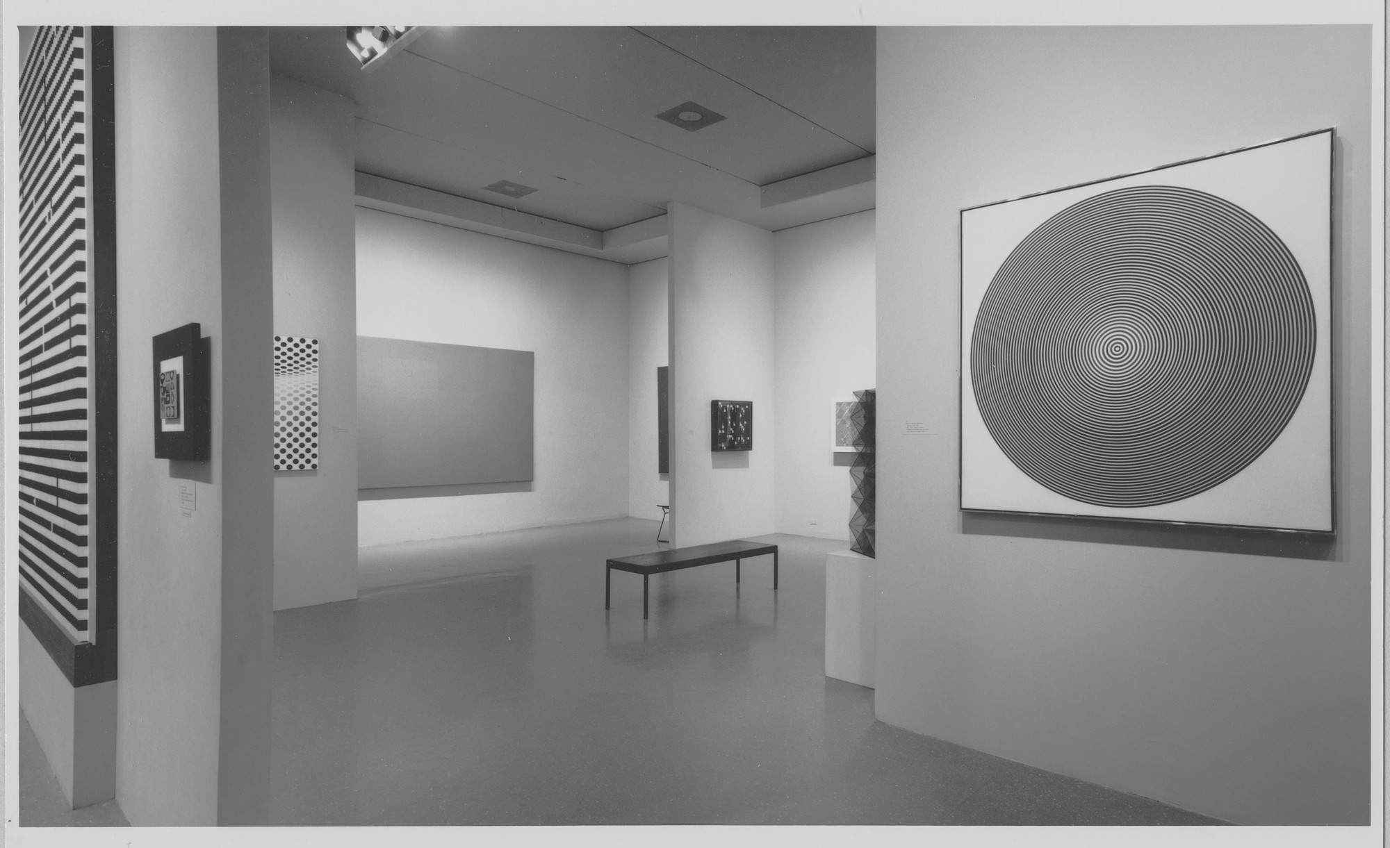
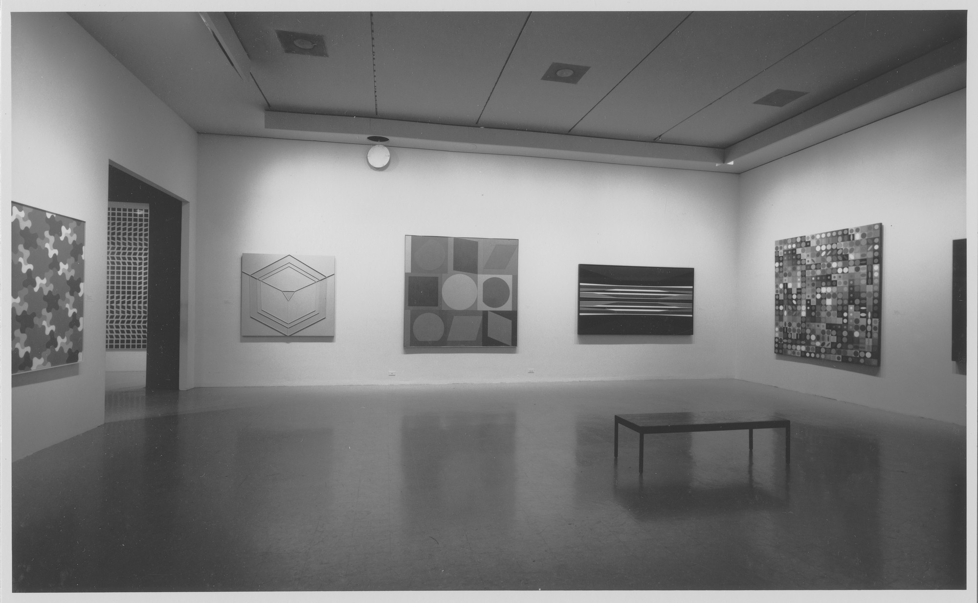
Ten years later, MoMA’s The Responsive Eye (1965) gathered nearly a hundred artists and more than a hundred works, framing optical painting as a powerful new direction. The show’s installations, press buzz, and public fascination helped launch “optical art” into mainstream culture, from magazine spreads to fashion prints.

How the Illusions Work: The Science of Seeing
Contrast & Figure–Ground
High-contrast edges—often stark black-and-white—force the eye to constantly renegotiate what is figure and what is ground. Repetitions and edge proximities can produce “vibration,” a flicker sensation that feels like motion even though the surface is still.
Pattern, Grids & Moiré
Regular modules (stripes, checks, dots) can be offset or warped to create interference patterns (moiré). Small shifts in spacing set up competing signals in the visual cortex; your brain resolves the conflict as undulation, shimmer, or a “gliding” effect across the plane.
Color, Afterimage & Chromatic Depth
Color Op uses complementary contrasts and precise temperature shifts (warm vs. cool) to make hues advance or recede. Prolonged looking can trigger afterimages—ghost colors generated by retinal fatigue—intensifying a sense of motion and atmospheric depth.
Depth on a Flat Plane
By mapping curves across a rigid grid, artists made the surface appear to bulge or dip, turning the picture plane into a visual “lens.” Stripes and waveforms can also suggest spatial drift, as parallel lines “lean” into apparent movement.
Key Artists & Works
Victor Vasarely (1906–1997)
Frequently called the “father of Op Art,” Victor Vasarely developed a language of modular units and color-coded systems that could generate complex illusions at varying scales. His celebrated Vega series uses spherical distortions across a grid to make the surface swell outward, as if space itself were pressing through the canvas.
Work to know — Vega-Nor (1969): a measured matrix that appears to protrude off the wall. Stand back and the swell intensifies; step closer and the units flatten into disciplined geometry.
Bridget Riley (b. 1931)
Bridget Riley’s early black-and-white period distilled the movement’s power: meticulous stripes and checks that seem to wave, tilt, or ripple as you look. With color she expanded these effects, using calibrated palettes to make forms hover and drift without any physical motion.
Work to know — Movement in Squares (1961): narrowing columns compress into a visual “squeeze,” making the surface buckle and slide. It’s a lesson in figure–ground tension using only rectangles.
Beyond Painting: Jesús Rafael Soto & Carlos Cruz-Diez
Op Art often overlaps with kinetic and participatory practices. Soto’s Pénétrables surround viewers with curtains of suspended strands that flicker as you walk through; Cruz-Diez’s Physichromies change as you shift position, turning color into an active event in space.
Op Art vs. Kinetic Art vs. Hard-Edge
- Op Art: virtual motion created by optical means—no motors, no moving parts required.
- Kinetic Art: real movement (mechanical, viewer-activated, or environmental). The two often shared exhibitions and audiences in the 1950s–60s.
- Hard-Edge Painting: crisply bounded areas of flat color; some Op painters also worked within hard-edge methods, but not all hard-edge art is optical.
Legacy & Where to See It Now
The op art movement shaped graphic design, fashion prints, exhibition making, and even today’s UI grid thinking. You can encounter seminal works and installations in museums around the world, including New York, London, Paris, and Buffalo—where Vasarely’s bulging grids remain a masterclass in optical depth.
Viewing Tips at Home
- Give optical works space. A few feet of breathing room lets patterns “activate.”
- Use even lighting and reduce glare; glass reflections fight against fine interference effects.
- Scale up when possible. Larger formats amplify vibration and afterimage play.
- Let geometry lead. Keep nearby textiles or wallpapers calmer so patterns don’t compete.
Explore Related Art
Love crisp geometry and optical play? Explore clean, grid-driven compositions in our shop. Start with Collections and look for Abstract & Geometric-leaning designs that deliver motion without clutter.
Key Terms Glossary
- moiré
- An interference pattern created when similar grids or stripes overlap at slight angles or offsets.
- afterimage
- A lingering “ghost” color or shape perceived after you look away, caused by retinal fatigue.
- figure–ground
- The shifting relationship between the form you focus on (figure) and its background (ground).
- chromatic contrast
- Interaction of hues—often complements or warm vs. cool—that creates push-pull depth.
- spherical distortion
- A grid warped so it appears to bulge or recede like a lens on the flat picture plane.
- Gestalt principles
- Perceptual rules (similarity, proximity, closure) the brain uses to group and complete patterns.
FAQ
What is the Op Art movement?
Op Art (optical art) is a 1960s movement that engineers illusions—vibration, flicker, apparent motion—through precise patterns and color. It grew out of European geometric abstraction and became widely visible in the decade’s exhibitions and media.
Who started Op Art?
Victor Vasarely is often credited as the movement’s foundational figure for his systematic, grid-based approach. Bridget Riley became a leading voice whose black-and-white canvases defined the public image of Op Art in the mid-1960s.
What’s the difference between Op Art and Kinetic Art?
Op Art creates virtual motion with optics alone; Kinetic Art incorporates actual movement via motors, airflow, or viewer interaction. The two overlapped historically but use different means.
Why does Op Art look like it’s moving?
Edge contrasts, repeating modules, and small offsets create interference in how we process patterns. Add high-key color and afterimages, and the brain reads shifting depth and motion on a still surface.
Where can I see famous Op Art today?
Major museums in New York, London, Paris, and Buffalo hold important works and archives. Look for installations and paintings that let you test the effects in person.
Conclusion
Op Art is a paradox: meticulously rational systems that yield subjective sensation. In a screen-based world, its engineered vibrations feel newly contemporary—reminding us that vision is active, not passive. The op art movement still teaches how geometry and color can set sight itself in motion.
1955 → 1975: Key Dates
1955 Le Mouvement 1961 Riley’s B/W breakthrough 1965 MoMA’s Responsive Eye
Article notes
Images are used for educational context. For similar visual energy at home, browse our Collections and look for abstract, grid-driven designs.

0件のコメント