
Sage‑Green Botanical Abstract Canvas Prints for Japandi Home Office Decor
Quiet color. Natural texture. Less, but better. In this guide, we’ll build a serene, high‑function workspace using sage‑green botanical abstracts—complete with palettes, hanging rules, and 15 shoppable art picks.
Japandi, in 90 seconds
Japandi blends Scandinavian warmth with Japanese restraint: clean lines, low silhouettes, natural materials, and a neutral‑to‑earthy palette. That recipe is perfect for home offices—visually quiet, tactile, and easy to keep tidy. Designers often anchor Japandi rooms with one calm, oversized artwork and a few supporting textures (linen, oak, stone). See approachable tips in this designer guide on bringing Japandi home and keeping the palette neutral and natural.
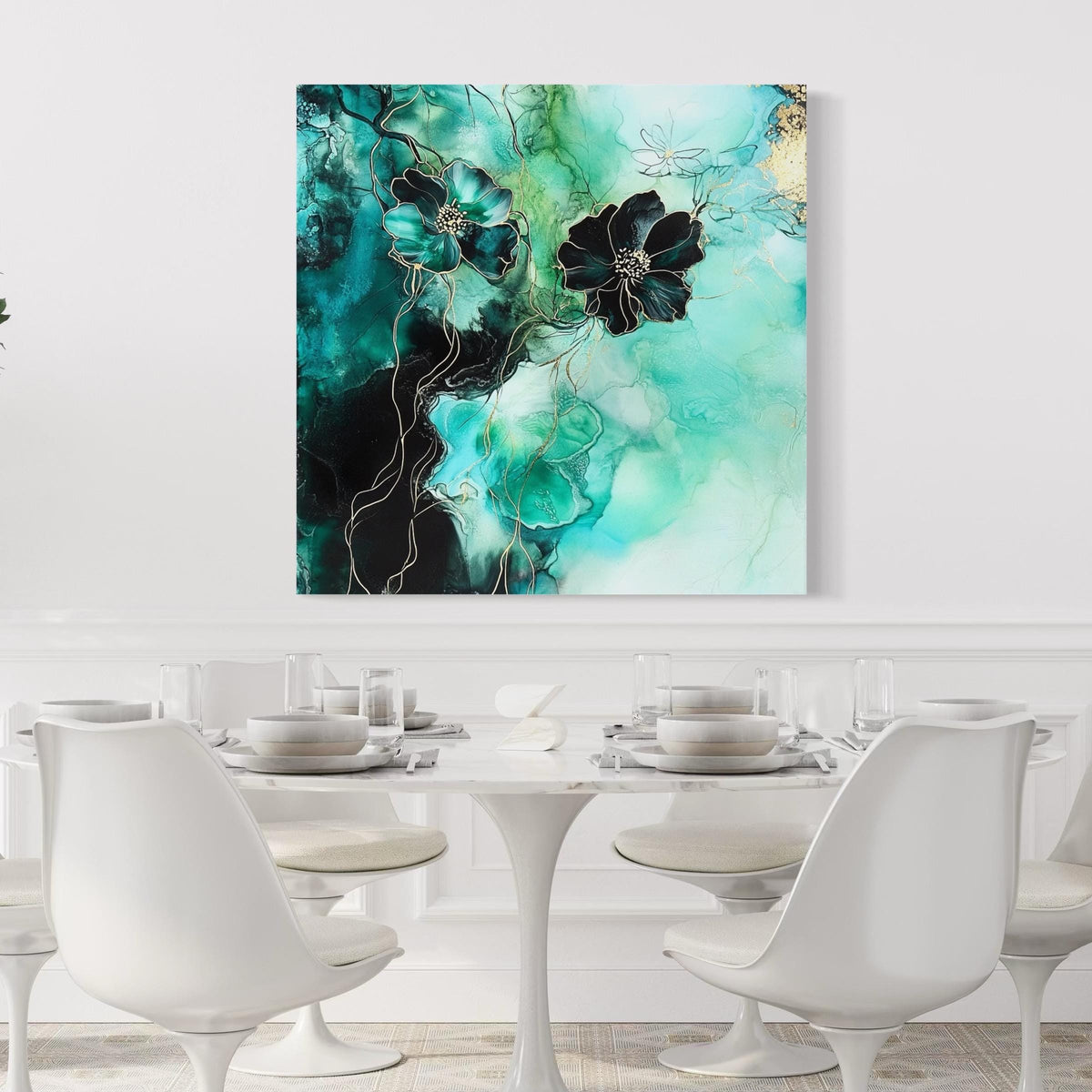
Explore our Floral & Botanical Wall Art for nature‑first options that pair beautifully with oak furniture and linen drapery.
Why sage green calms (and focuses)
Green sits at the center of the spectrum and is widely associated with balance, restoration, and harmony. Sage—green softened with gray—reads especially gentle in workspaces, reducing visual noise while keeping the mind alert. Color experts note that green tones promote equilibrium and a sense of sanctuary, a helpful counterweight to digital busyness. Aim sage for art & textiles and ground with oak / ash woods.
Keep the saturation low and textures natural (matte canvas, un‑glossed frames) so your desk doesn’t mirror glare back at you.
Shop the starter edit — Calm green abstracts
Three effortless choices to set the tone. Start with one large focal, then layer a small study opposite your light source.
Picking the right subjects
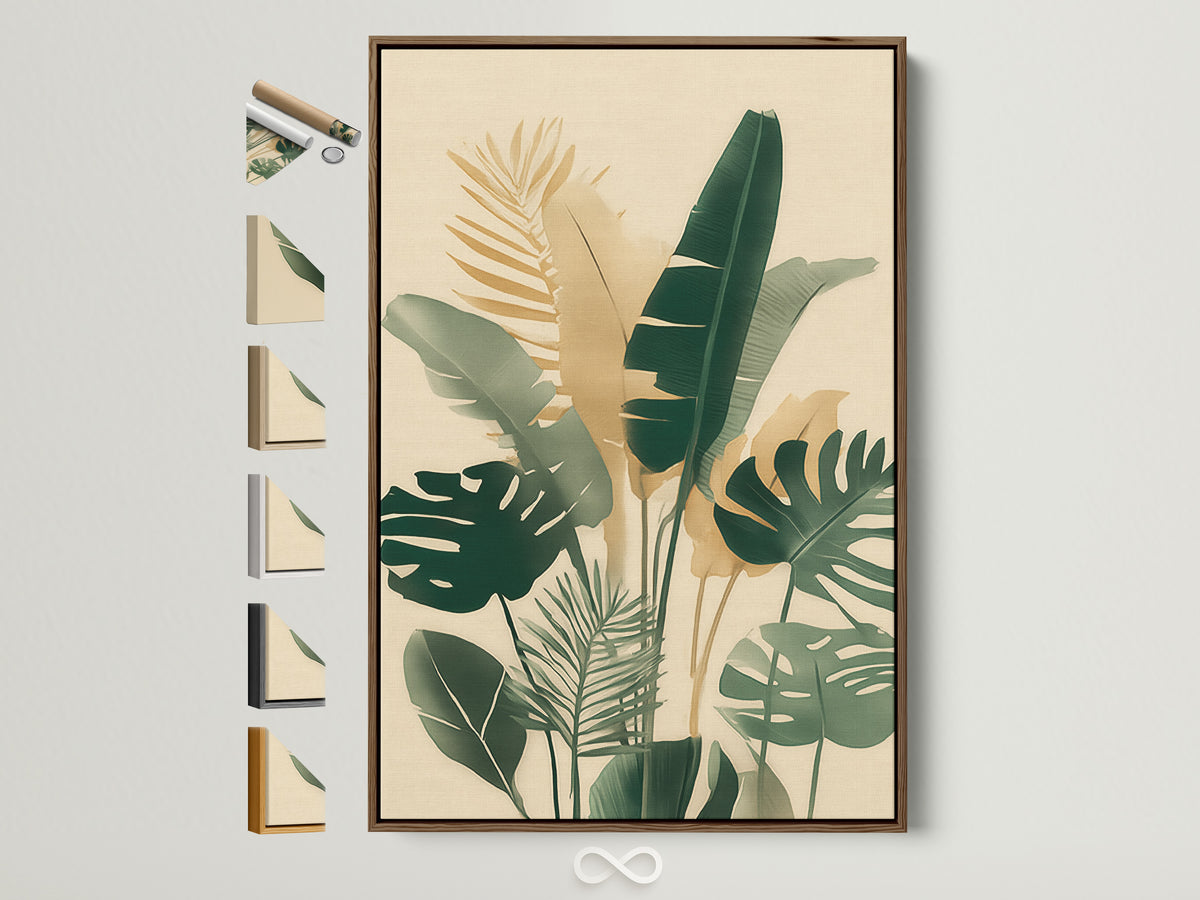
For Japandi offices, choose art that whispers: botanical abstracts, leaf studies, minimal florals, and soft geometrics. Subjects with visible brush texture on matte canvas feel handcrafted and add depth without visual clutter. Avoid hyper‑saturated neons or busy collages unless you limit them to a single accent piece.
- Leaf studies for focused zones (above a monitor or writing desk).
- Soft florals where you want warmth on camera (behind your chair).
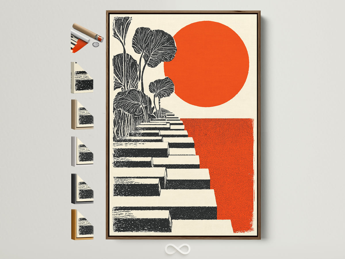
- Geobotanicals (stairs + sun, stems + shapes) to bridge natural and modern.
Scale & the 57″ hanging rule (that actually works)
As a baseline, center single artworks around 57″ (145 cm) from the floor—roughly museum eye‑level—and step up to 60″ for tall households. Above desks or sofas, keep the bottom edge about 8–10″ above the furniture. For gallery walls, treat the whole grouping as one rectangle and center that at ~57″; keep gaps a tight 2–3″ so the grid reads as a unit.
Avoid hanging in direct sun or high humidity to protect pigments; matte finishes and UV‑filtered light help reduce fading.
| Wall width | Ideal artwork width | Gap above desk/sofa |
|---|---|---|
| 36–48″ | 24–32″ (single) · 2× 16–20″ (pair) | 8–10″ |
| 60–72″ | 40–48″ (single) · 3× 16–20″ (triptych) | 8–10″ |
| 80–96″ | 54–64″ (single) · 4× 18–24″ (grid) | 10–12″ |
Layouts that always work
One calm hero
Pick an XL sage‑green abstract with visible texture. Center at ~57″ on the wall opposite your window to balance light on calls.
Quiet diptych
Two medium leaf studies, aligned by centerlines, 2–3″ apart. Perfect behind a 60″ desk to keep sightlines airy.
Triptych for long walls
Use three pieces with shared palette (sage + warm white + soft black). Keep outer margins equal to internal gaps for harmony.
Shop focal‑piece options
Materials, frames & finishes
Choose matte canvas for a tactile, low‑glare surface and consider floating frames in oak (warm), white (crisp), or black (graphic). Japandi loves honest materials—linen notice boards, stone pen cups, wool throws—so let your art echo that with visible weave and soft edges.
Oak frame for warmth · White frame for lift · Black frame to punctuate neutrals.
Build your Japandi palette
Try the 60/30/10 rule: 60% warm whites & light woods, 30% sage‑green & beige textiles, 10% soft black accents. Repeat the same green in art + a single plant pot or cushion so the space reads continuous on camera.
The biophilic productivity boost
Nature imagery + real plants are more than pretty—studies link biophilic environments with improved well‑being, focus, and creativity. In offices, greenery and natural textures correlate with measurable productivity gains. Pair your botanical art with a low‑maintenance plant (ZZ plant, snake plant) and warm daylight to lean into the effect.
Shop soft botanicals
Ergonomics, light & glare
Place your hero artwork opposite or adjacent to windows so indirect light washes it evenly. Overhead lighting around 3000–4000K keeps color true and skin tones flattering on calls. If you get hot spots on glass, switch to a matte canvas or float frame.
Avoid: above radiators/fireplaces (heat), bathrooms (steam), or in hard sun without UV mitigation.
Style your camera zones
Zoom background
One calm canvas + a small plant + a neutral lamp. Keep the composition off‑center for a relaxed, editorial look.
Desk vista
A compact leaf study 8–10″ above the monitor keeps your horizon steady and reduces visual clutter at eye line.
Break nook
A soft floral next to a reading chair gives your brain a micro‑escape between tasks.
Smart budget moves (and more art to love)
Quick styling recipes (copy‑paste these looks)
Calm focus wall
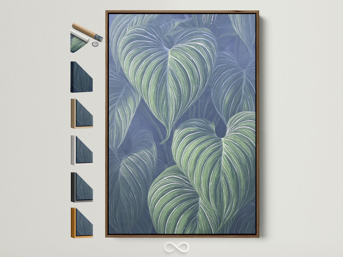
Sage Green Abstract centered at 57″ + oak floating shelf + linen pinboard.
Geobotanical statement
Orange & Black Steps over desk (2/3 width) + black task lamp.
Soft on camera
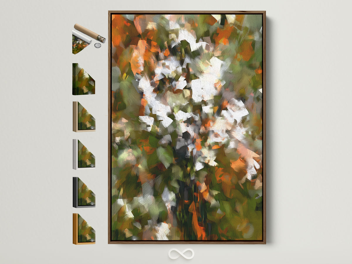
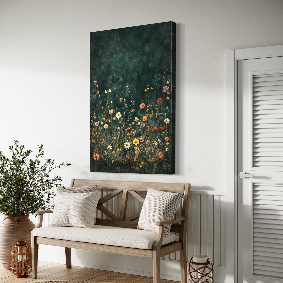
Wildflower Field behind chair + neutral throw + small ZZ plant.
Care & placement
- Keep canvases away from steam/heat; dust gently with a soft, dry cloth.
- If glare appears on camera, angle your art slightly or switch bulbs to 3000–3500K.
- Moving soon? Picture ledges and Command‑style hardware keep walls rental‑friendly.
Frequently asked questions
What sizes work best above a 60″ desk?
One 40–48″ wide canvas, or a diptych of 2× 20–24″. Keep the bottom edge 8–10″ above the desktop.
Is sage green too “soft” for an office?
No—sage is calming without putting you to sleep, especially paired with tactile neutrals and a few soft black accents.
How high should I hang my art?
Center at ~57″ from the floor for single pieces. For gallery walls, center the whole grouping around that height and keep 2–3″ between frames.
Canvas, framed print, or floating frame?
Canvas = matte and low‑glare; framed print = crisp edges; floating frame = gallery‑level presence. All three work in Japandi rooms; keep finishes consistent.
How do I avoid glare on calls?
Use matte canvases, warm‑white bulbs (3000–3500K), and avoid placing art directly opposite harsh light sources.
What subjects are most “Japandi”?
Leaf studies, minimal florals, and geometric botanicals—simple forms, natural colors, visible texture.
What if my wall is narrow?
Stack a slim pair (e.g., 16×24″ each) or use one 24–32″ piece; keep sightlines open by leaving at least 6″ clear space at the sides.
Can I mix black frames with oak?
Yes—use black sparingly (10% accent) to ground the palette. Oak + soft black is a classic Japandi pairing.
Watch: Minimalist Japandi Home Office Setup
References
- The Spruce — How High to Hang Pictures: Design Expert Rules
- Houzz — Decorating with Sage Green
- Gensler — Why Biophilic Design Matters at Work
- Scientific Reports — Biophilic workplace design & well‑being
- Home Depot — How to Hang a Picture
- Artoholica — Neutral Botanical Abstracts for Japandi Living Rooms

0件のコメント