Abstract Alcohol Ink Canvas Print — Blue, Green & Orange
View Product Abstract & Geometric Wall Art
Headline & Hook
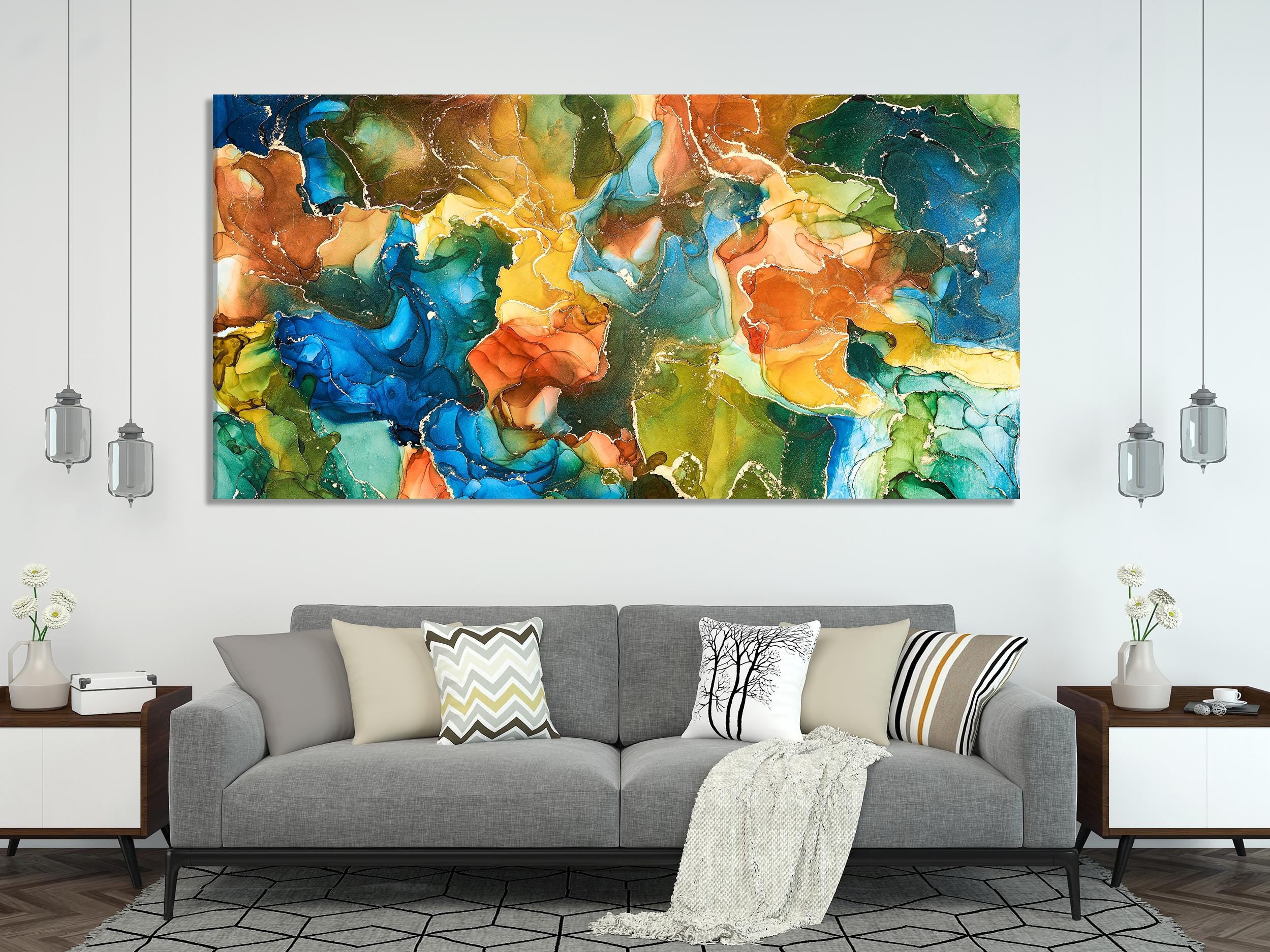
Luminous veils of blue and green drift across the surface while a refined splash of orange adds warmth and energy. This fluid art canvas centers a room without overwhelming it—ideal for modern living rooms, restful bedrooms, and focus-friendly home offices. Gallery-wrapped and available in oversized formats, it’s the kind of statement piece that calms the space and sharpens the palette.
Meet the Artwork
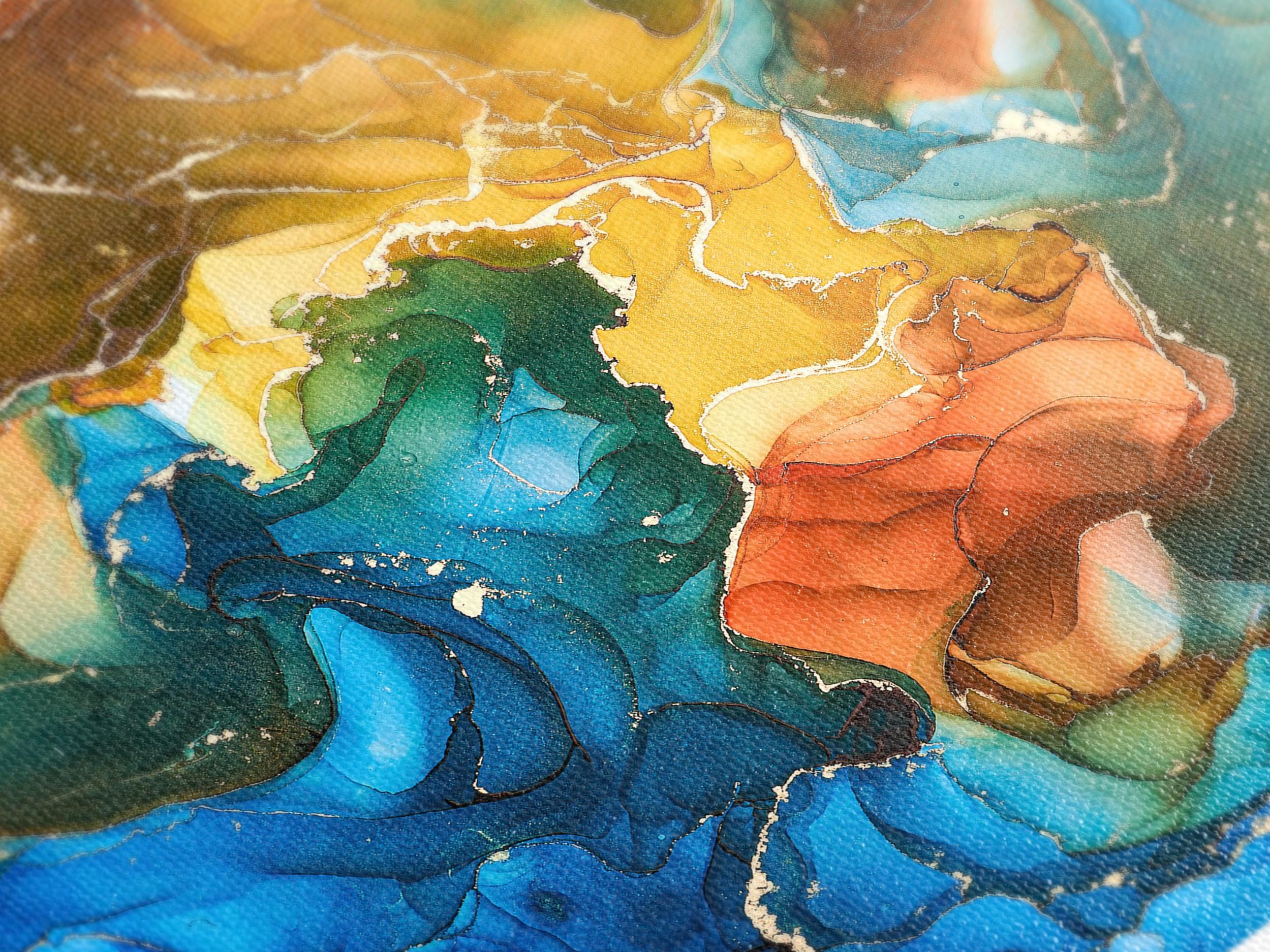
This blue abstract canvas print captures the hallmarks of alcohol-ink art: feathered gradients, delicate marbling, and organic bloom effects. The palette leans deep oceanic—indigos and emeralds—balanced by amber and soft orange notes that read like late-day sunlight. Printed on museum-grade cotton canvas with archival giclée pigment inks, the piece delivers exceptional clarity and tonal depth at any size.
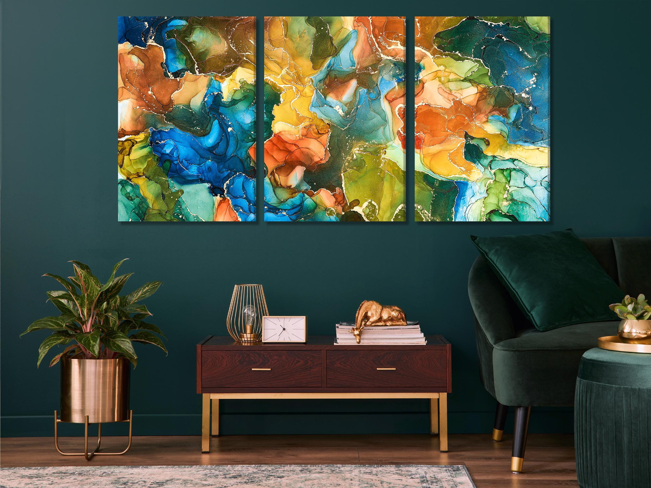
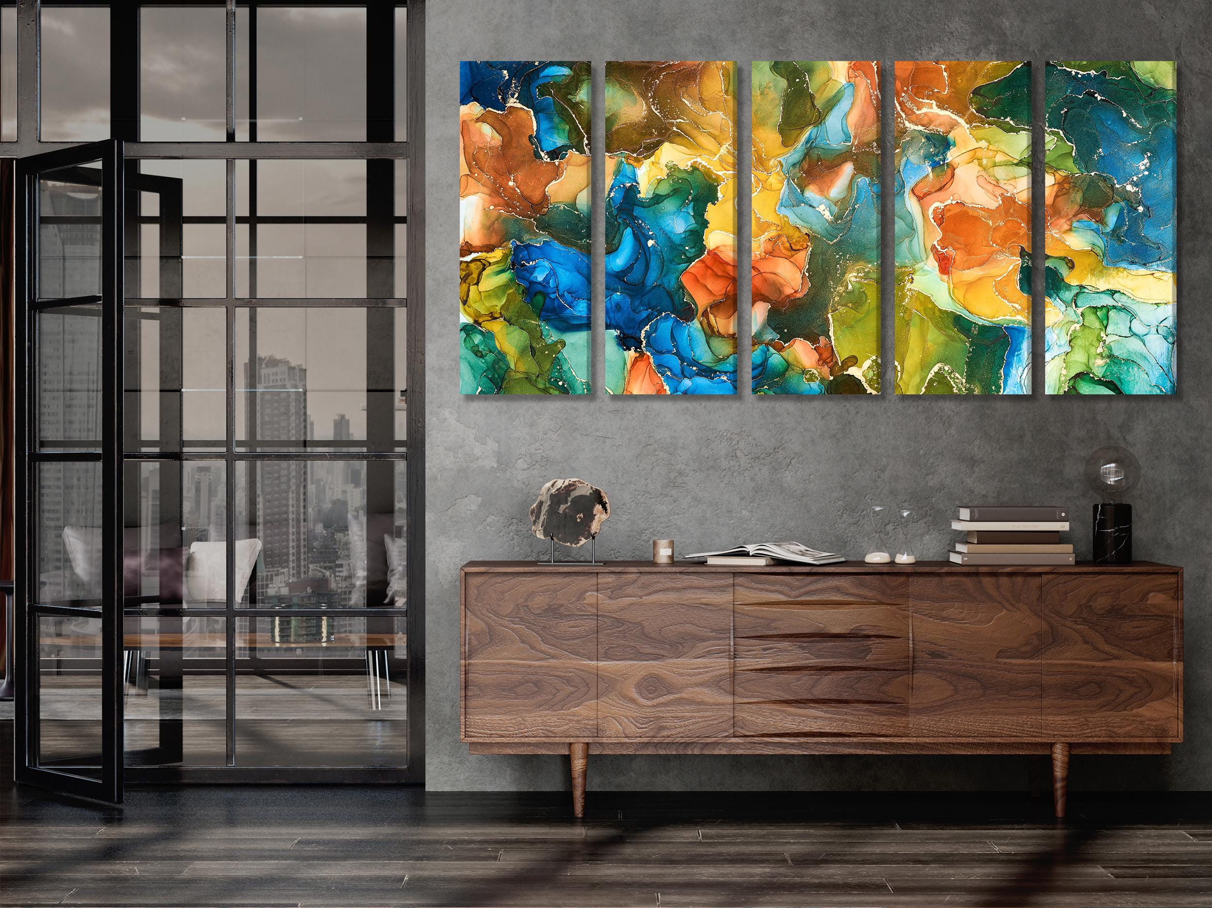
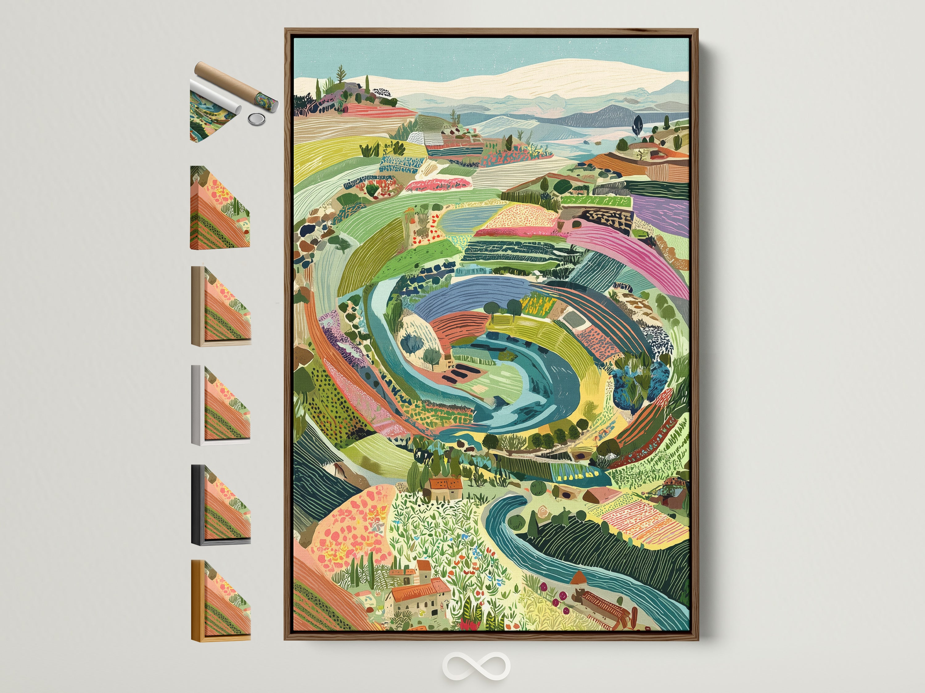
Choose the finish that fits your space: gallery-wrapped ready to hang wall art, a sleek floating frame wall art presentation (brown, oak, white, black, or gold), or a premium poster for DIY framing. Prefer a multi-panel look? Opt for triptych or 5-panel layouts that expand the composition without losing the fluid rhythm.
Why Alcohol Ink Reads Luxe in Interiors
The alcohol ink technique suspends richly colored pigments in fast-evaporating alcohol, creating translucent layers, soft edges, and shimmering depth that scale beautifully to oversized abstract art. On canvas, those glassy gradients and cells translate as refined texture—elevating minimalist, coastal-modern, and contemporary schemes alike. The medium’s fluid motion also complements curved furniture, rounded ceramics, and ribbed textiles.
Color Psychology: Blue & Green Calm, Orange Spark
Designers reach for blue and green when a room needs serenity, focus, and a biophilic connection; both hues are associated with calm, clarity, and restorative attention—great for living rooms, bedrooms, and workspaces. A measured orange accent introduces sociable energy and warmth, keeping the palette lively without raising visual noise. The result is a balanced composition that supports relaxation while encouraging conversation and creativity.
Sizing Guide: Single, Triptych, or 5-Panel?
Above-sofa anchor: a simple rule of thumb is to choose artwork around two-thirds the width of the furniture below. Center the piece and hang the midpoint roughly 57–60 inches from the floor for comfortable viewing.
Triptych spacing: keep 1.5–2 inches (4–5 cm) between panels; align midlines exactly. For a five-panel layout, use the same spacing and keep the total width to that ~⅔ guideline.
Eye-level adjustments: taller ceilings or taller household members can justify edging toward the 60-inch midpoint; compact rooms often look best near 57 inches.
Styling Ideas by Room
Living Room
Lean into modern living room wall decor with a neutral base (stone, oatmeal, fog grey) and blue/green cushions or a denim throw. If you crave definition, add a slim oak or black floating frame; brass table lamps echo the orange accent without oversaturating the palette.
Home Office
Keep visual noise low for focus—matte-black task lighting, a pale rug, and closed storage. Pair the canvas with one sculptural object (ceramic, travertine, or glass) to riff on the artwork’s fluid forms. The calming scheme supports deep work, while the orange notes energize brainstorming sessions.
Bedroom
Use soft textiles (bouclé, washed linen) and warm woods to balance the cool blues. A framed version in oak or brown keeps things cozy; dimmable sconces at either side of the piece add a boutique-hotel finish.
Materials & Craft
Canvas: premium 100% cotton, museum grade.
Inks: archival giclée pigment for long-lasting color.
Finish: UV-protective coating for durability.
Profile: gallery-wrapped canvas on kiln-dried pine (approx. 1.4–1.5").
Framing: floating frames in brown, oak, white, black, or gold.
Hardware: arrives ready to hang with pre-installed fittings.
Curated Complements from Artoholica
Blend across palettes while staying in the same modern language.
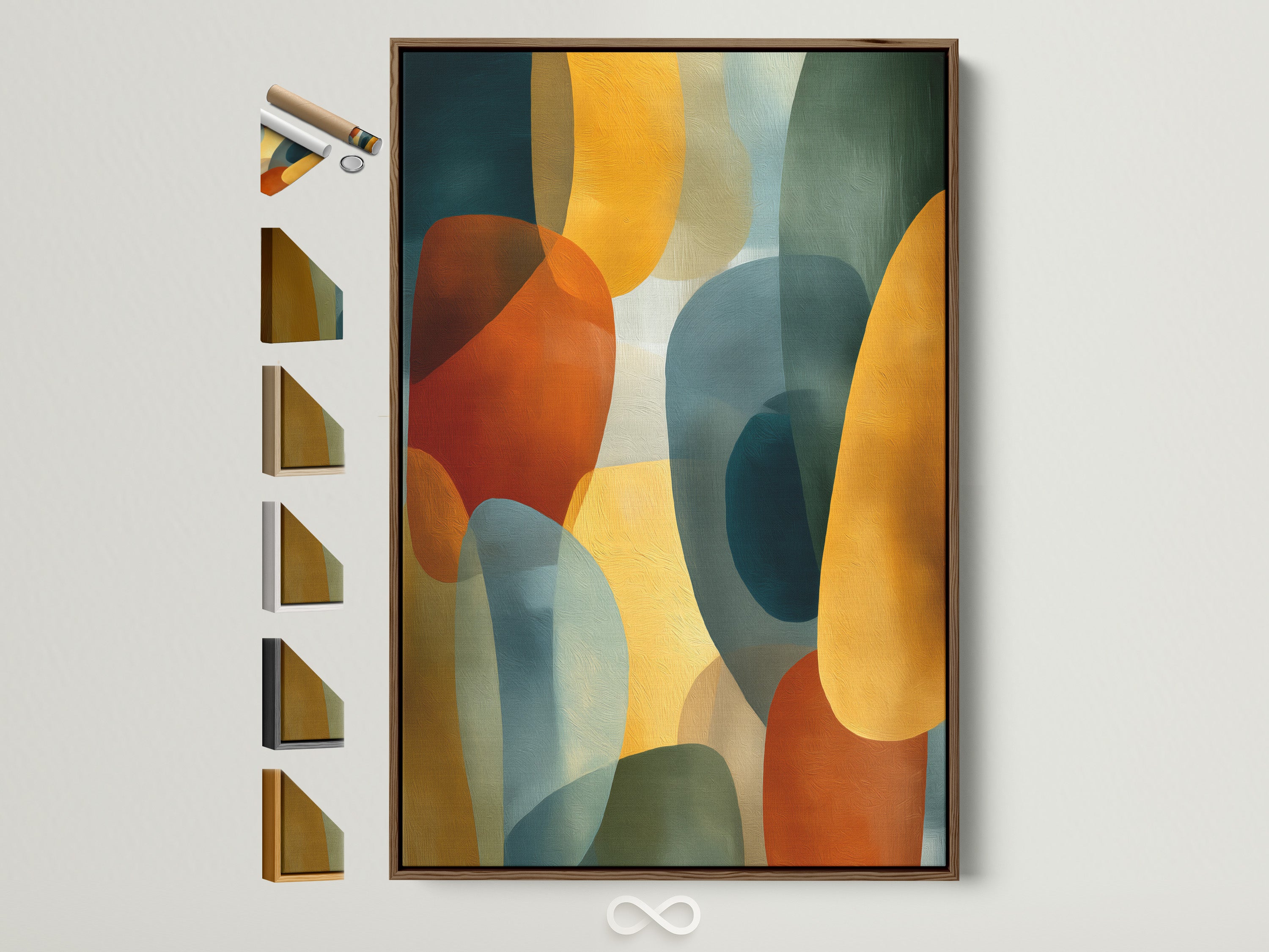
Abstract Geometric — Burnt Orange, Teal & Mustard
Add to an entryway for a warm welcome.
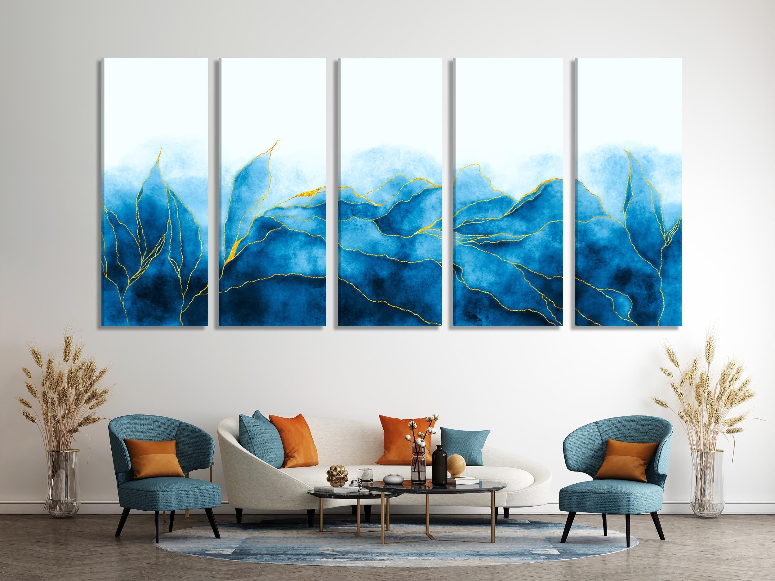
Blue Abstract — Watercolor Wave
Perfect over a curved sofa or sectional.
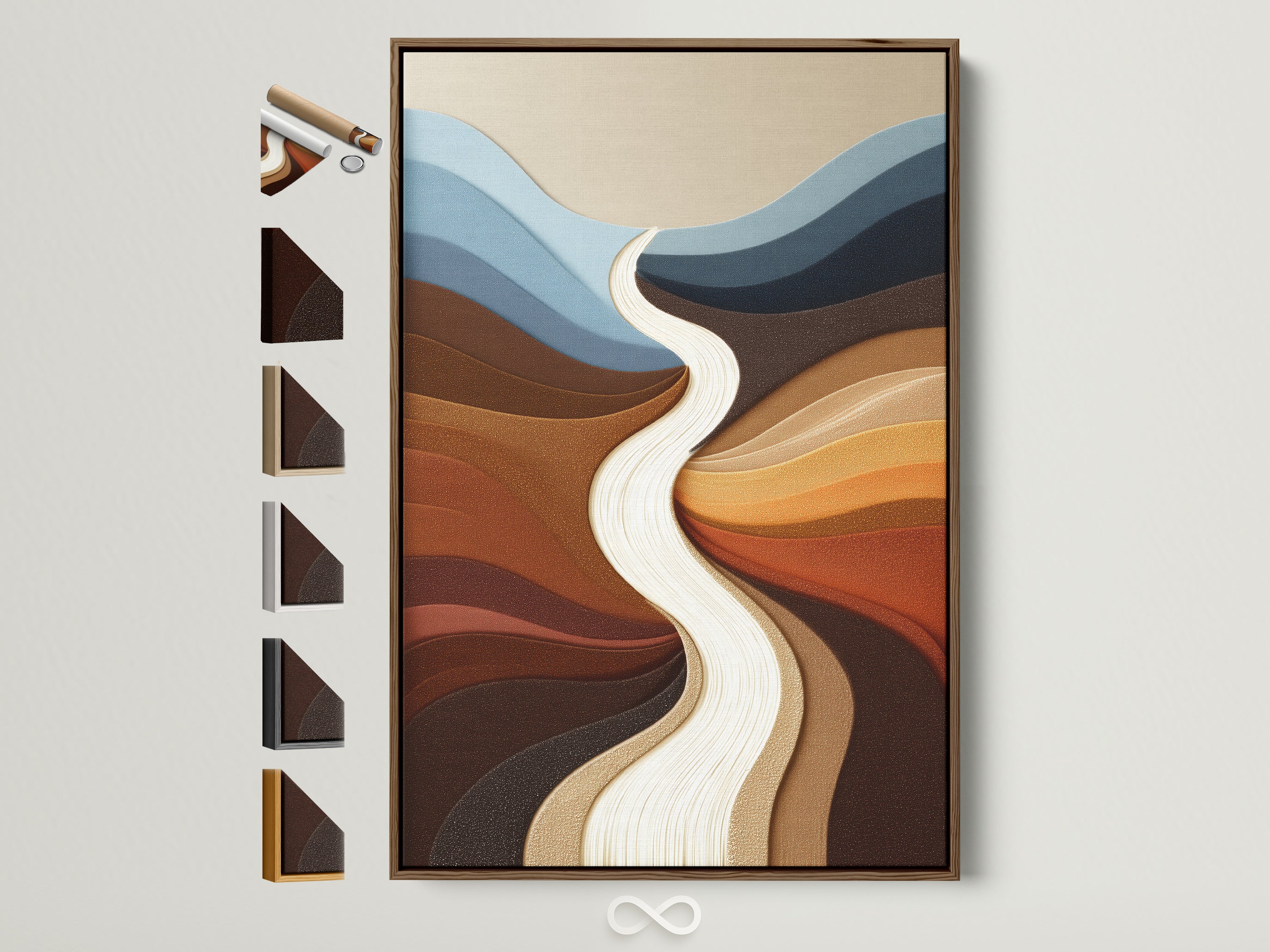
Earth-Tone Landscape — “River Flow”
Ground a reading nook with cozy neutrals.
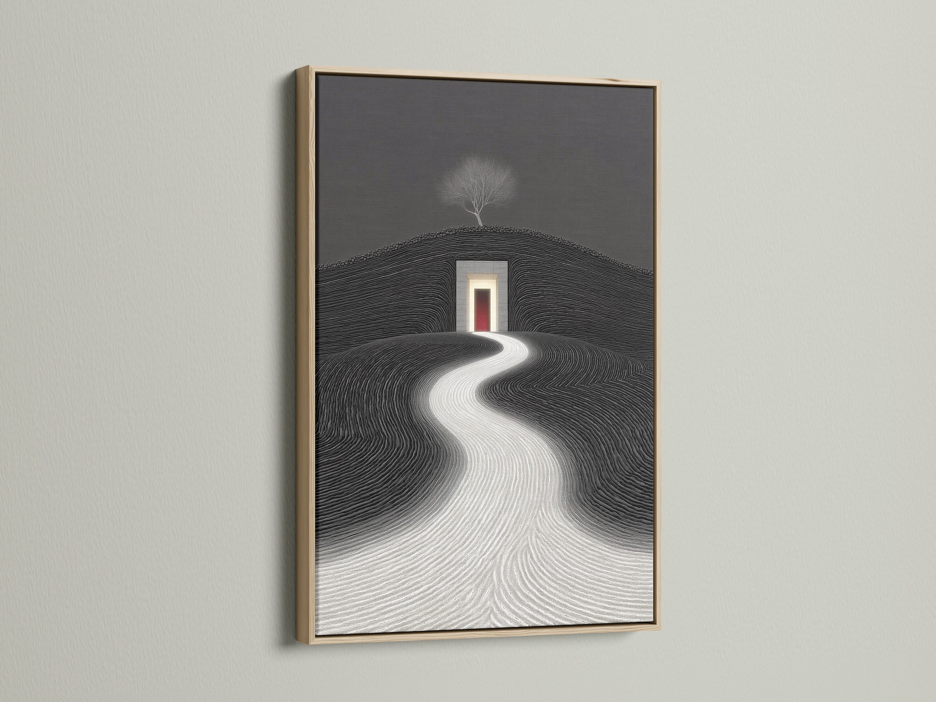
Minimalist Zen Architecture — Surreal Path
Contrast beautifully with the ink piece’s color story.
Whimsical Landscape — Pastel Countryside
Soft counterpoint for nursery or breakfast nook.
Quick Buy Guide
- Pick size: aim for ~⅔ of the furniture width (or size up for a true statement).
- Choose finish: poster for DIY framing; gallery wrapped canvas for depth; floating frame for crisp definition.
- Decide layout: single for calm focus; triptych or 5-panel for wider rooms and long sofas.
- Plan install: center ~57–60" to midpoint; keep panels 1.5–2" apart; check for level before final tightening.
- Enjoy: unbox → hang → step back and let the palette do the work.
Care & Longevity
Dust with a soft, dry cloth. Avoid direct, prolonged sunlight and high-steam zones. Handle with clean hands and never use chemical cleaners. When moving, wrap corners and avoid laying the artwork face down to protect the coated surface.
Designer Tip
To echo the artwork’s movement, layer a rounded ottoman or curved side table; the shapes repeat the fluid lines without competing for attention.
Good to Know
Archival pigment inks on cotton canvas offer superior fade resistance versus dye-based prints.
Framing Insight
A slim black frame sharpens contrast; oak warms the palette; white keeps things airy.