De Stijl vs Constructivism: A Student’s Side‑by‑Side Guide (with Bauhaus Typography Examples & a “Black Square” Context)

Born within a decade of each other, De Stijl (Netherlands, 1917–1930s) and Russian Constructivism (c. 1913–1930s) both embraced geometric abstraction—but to different ends. De Stijl sought universal harmony through orthogonal grids and primary colors (often called Neo‑Plasticism), while Constructivism turned similar forms toward social use in posters, textiles, exhibition systems, and architecture. This primer sets up de stijl vs constructivism side by side: where they came from, what they wanted, how to spot them, and where to see key works. You’ll also get quick Bauhaus typography examples that translate Constructivist ideas into print, plus a concise Black Square analysis for context.
Further reading as you go: Stedelijk’s De Stijl overview, the Guggenheim movement page, MoMA on Constructivism, The Met’s Bauhaus essay, and Tate’s “Five ways to look at Black Square.”
TL;DR: De Stijl vs Constructivism at a glance
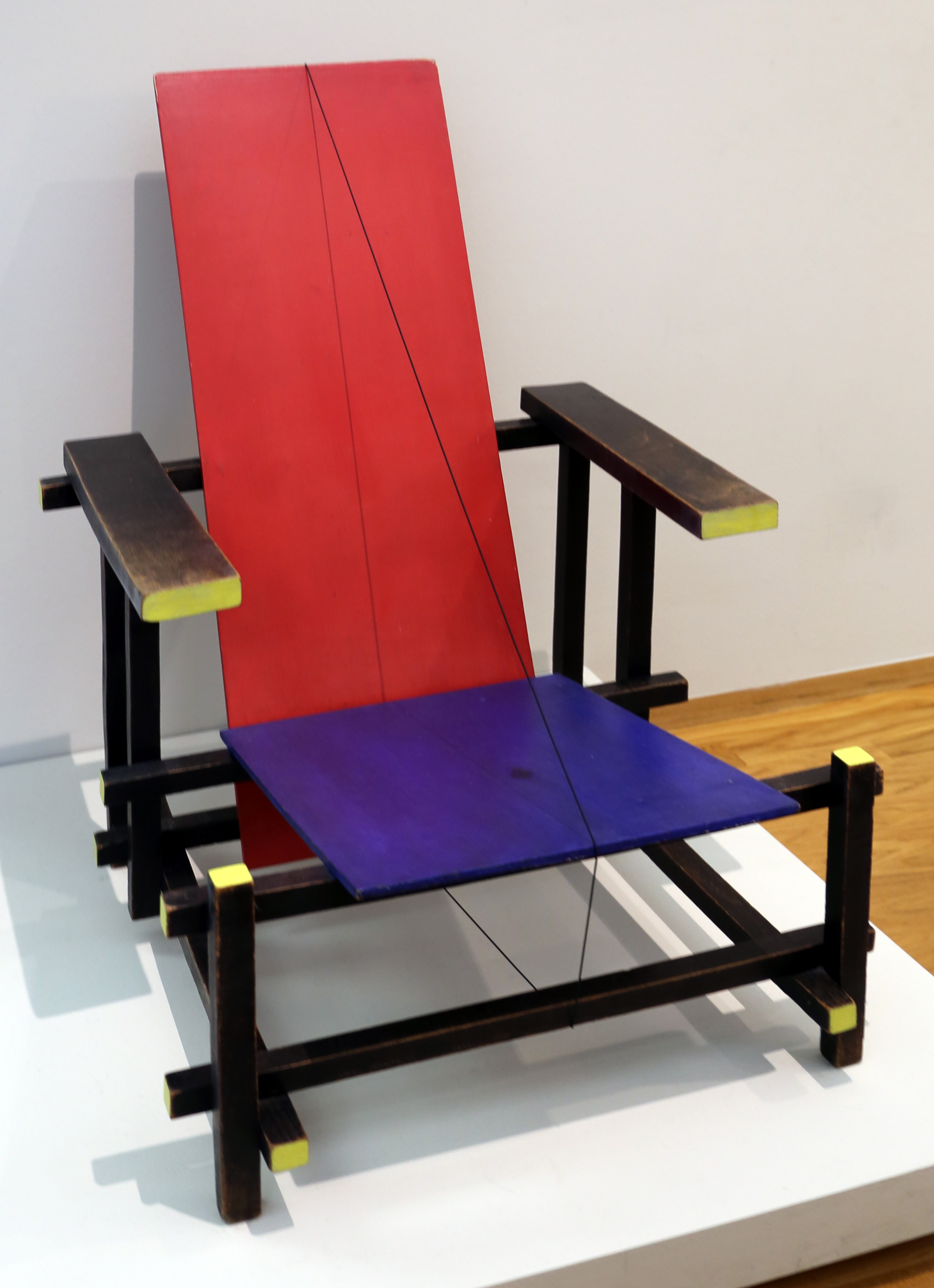
De Stijl (Netherlands, 1917–) A movement theorized by Piet Mondrian and Theo van Doesburg aiming at universal harmony via vertical/horizontal lines, primary colors, and right angles. It flows from painting into furniture and architecture (think Rietveld’s chair and Schröder House). Stedelijk Museum overview.
- Goal: Reduce and balance—“a new plastic art” for clarity.
- Typical media: painting, furniture, interiors, architecture.
- Palette/geometry: primaries + black/white; orthogonal grids.
Constructivism (Russia, late 1910s–) A use‑oriented avant‑garde turning abstraction into tools for society—posters, photomontage, books, exhibition architecture, textiles; often taught through VKhUTEMAS workshops. MoMA movement page.
- Goal: Productivism—art aligned with engineering and utility.
- Typical media: graphics, photomontage, typography, stage/exhibition systems.
- Palette/geometry: dynamic diagonals, wedges/circles; bold contrasts.
Scroll for the comparison table, origin stories, two case studies, Bauhaus typography examples, and a “Black Square” context note.
Origins & Ideas
What is De Stijl?
De Stijl (Neoplasticism) launched with a journal in 1917; its core idea was to reduce visual language to vertical and horizontal lines, right angles, and a limited palette of primary colors plus black/white to express universal harmony. Key figures include Piet Mondrian, Theo van Doesburg, and Gerrit Rietveld, with ideas moving from canvas into furniture and architecture. See the Stedelijk Museum’s overview and exhibitions on De Stijl’s aims and reach, and the Guggenheim movement page for a concise timeline.
For a student‑friendly deep dive into De Stijl’s grid logic, visit our primer: De Stijl (Neoplasticism).
De Stijl characteristics (cheat sheet)
- Orthogonal grids; right angles dominate.
- Primary colors plus black/white/gray planes.
- Asymmetrical balance; large quiet fields offset by small accents.
- Translation into objects/buildings (Rietveld’s furniture; Schröder House).
What is Constructivism?
From Tatlin’s 1913 relief “constructions” to the post‑1917 push for useful design, Constructivism redirected abstraction toward social production—posters, books, textiles, stage sets, product design, and exhibition architecture. Figures include Vladimir Tatlin, El Lissitzky, Aleksandr Rodchenko, Varvara Stepanova, and Lyubov Popova, with pedagogy centered in the VKhUTEMAS workshops. For basics, start with MoMA’s Constructivism page. Where Suprematism pursued spiritual “non‑objective” art, Constructivists emphasized task, material, and public communication.
Extended overview with examples: From studio experiment to street design.

Side‑by‑Side Comparison Table
A condensed neoplasticism vs constructivism view. Sources for quick facts: De Stijl at the Stedelijk and Guggenheim; Constructivism at MoMA.
| Category | De Stijl | Constructivism |
|---|---|---|
| Goal | Universal harmony; “a new plastic art” of balance and clarity. | Utility and social purpose; align design with production (productivism). |
| Geometry & Color | Orthogonal grids; primaries + black/white; static equilibrium. | Dynamic diagonals; wedges/circles; red/black/white contrasts; sense of motion. |
| Mediums | Painting, furniture, interiors, architecture. | Posters, books, textiles, stage/exhibition systems, product design. |
| Type & Graphics | Spare geometry; modular letterforms in some applications. | Sans‑serif type as structure; photomontage; angled layouts. |
| Architecture | Rietveld Schröder House—sliding planes; color accents articulate space. | Tatlin’s Tower (unbuilt) as symbol; exhibition architecture channels flow. |
| Politics & Society | Utopian order through reduction; broadly humanist. | Instrumental design for mass communication and modern life. |
| Iconic Works | Mondrian’s Composition series; Rietveld’s Red and Blue Chair; Schröder House. | Lissitzky’s Red Wedge; Rodchenko’s book/ad campaigns; photomontage suites. |
Two Case Studies
De Stijl in Space: Rietveld Schröder House (1924)
Often described as a three‑dimensional manifesto, the Schröder House translates De Stijl’s grammar into livable space—floating planes, open corners, sliding partitions, and primary color accents that clarify structure. It shows how Dutch modernism could scale from painting to everyday life while keeping the grid’s discipline visible. For background on De Stijl’s architectural thread, see the Stedelijk’s overviews of the movement’s legacy.
What to notice
- Interlocking planes: walls, balconies, and rails read like layered Mondrian fields.
- Movable partitions: rooms reconfigure—function doesn’t break the formal logic.
- Accents as syntax: small red/blue/yellow notes clarify joints and thresholds.
Constructivism as Civic Machine: Tatlin’s Tower & the poster city
Tatlin’s unbuilt Monument to the Third International (1919–20) compressed the movement’s ambition: a tilted steel spiral with revolving glass volumes for assembly, administration, and broadcast—engineered symbolism for a new society. While the tower remained a model, its energy flowed into books, displays, and photomontage campaigns where russian avant‑garde design met mass literacy. MoMA’s Constructivism resources outline this use‑orientation in graphics and exhibition design.
Think Rodchenko’s “Books!” (1924) ad—type as megaphone—and Lissitzky’s Proun/exhibition graphics which stage movement through space. The poster city emerges: diagonal sightlines, vector‑like wedges, photos fused with slogans.
Mini‑Module: bauhaus typography examples
At the Bauhaus, typography crystallized the clarity ethos. László Moholy‑Nagy coined typophoto—integrating photography and type—to replace ornate layouts with crisp, functional communication; Herbert Bayer experimented with an all‑lowercase “Universal” alphabet to reduce redundancy and increase legibility. For context, see The Met’s Bauhaus essay, and explore our own primer’s section on type.
- Moholy‑Nagy’s typophoto: images and letters co‑compose; hierarchy via scale/weight, not ornament.
- Herbert Bayer’s “Universal”: simplified, geometric letterforms; a laboratory for modern signage.
- Joost Schmidt’s 1923 poster: an early synthesis—geometric profile + modular type and grids.
Learn more in our overview: Bauhaus: The Short‑Lived School that Rewired Modern Life.

Break‑out Analysis: Why Black Square matters to this story (black square analysis)
Kazimir Malevich’s Black Square (1915) marked a radical leap to “non‑objective” art—reducing image to a zero‑point field. Tate’s short guide offers multiple entry points for students, and technical studies deepen the picture: surface scanning and imaging reveal underlayers and a debated inscription beneath the black, reminding us that this icon carries history and argument in its material life. See Tate’s “Five ways to look at Black Square”, the Factum Foundation technical digitisation, and a scholarly conversation on the X‑ray inscription in Third Text (PDF).

Related Movement Sidebar: Precisionism—short timeline for students
Precisionism (U.S., c. 1915–1940) distilled factories, bridges, and skylines into crisp geometry—akin to De Stijl’s reduction and Constructivism’s industry focus, but rooted in American subjects (Sheeler, Demuth, O’Keeffe). For quick context, see museum timelines and exhibition overviews on the theme.
Timeline for students
- 1915: Early photographs/paintings point to a “machine‑age” clarity (Paul Strand; Sheeler).
- 1920s: Peak years—factories, grain elevators, and skyscrapers rendered as clean planes.
- Key artists: Charles Sheeler, Charles Demuth, Georgia O’Keeffe, Ralston Crawford.
- Subjects: industrial plants, bridges, city canyons; later still lifes and rural silos.
- Links: overlaps De Stijl’s geometric reduction; shares Constructivism’s interest in industry without its political program.
- Legacy: advertising layouts and later photorealism borrow its “crisp” look.
Where to See Them
- MoMA (New York) — De Stijl paintings, Rietveld furniture, and Russian avant‑garde design; see the Constructivism term page for context.
- Tate (London) — Suprematism/Constructivism holdings and interpretation; start with Black Square: five ways to look.
- Stedelijk Museum (Amsterdam) — A historic hub for De Stijl; browse De Stijl at the Stedelijk.
- Guggenheim (New York) — Concise De Stijl movement primer and related works.
- Design history online — The Met’s Bauhaus essay on workshops and type: The Bauhaus, 1919–1933.
Conclusion
Put simply, de stijl vs constructivism is a debate between universal harmony and designed utility. De Stijl narrows forms to a calm grid of primaries to promise order at any scale; Constructivism harnesses comparable geometry for messages, movement, and modern production. When you compare a Mondrian grid to a Lissitzky poster, note the axes: grid vs diagonal, pure planes vs photomontage, timeless balance vs time‑bound tasks. Both shaped how we read space and print today.
If the language of pure geometry speaks to you, explore our curated Abstract & Geometric Wall Art—prints that echo the formal clarity of De Stijl and the graphic punch of Constructivism—organized so classroom examples are easy to find: Abstract & Geometric Wall Art.
Frequently Asked Questions
- What are the main differences between De Stijl and Constructivism?
- De Stijl sought universal harmony through orthogonal grids and primary colors; Constructivism redirected similar geometries to utilitarian outcomes—posters, textiles, exhibition systems, and architecture tied to social production. Think ideal order vs designed utility.
- Is De Stijl part of Constructivism?
- No. They share modernist roots and some formal overlaps, but they arose in different places with different goals and publications (De Stijl journal vs Russian productivist circles).
- How did De Stijl influence architecture?
- Rietveld’s Schröder House translates the palette and plane logic into sliding partitions and interlocking volumes—often cited as a manifesto of the group’s ideals.
- What’s a classic Constructivist poster?
- El Lissitzky’s Beat the Whites with the Red Wedge (1919)—diagonal energy, geometry as argument.
- What are some bauhaus typography examples to know?
- Joost Schmidt’s 1923 exhibition poster, Moholy‑Nagy’s typophoto pages, and Herbert Bayer’s “Universal” experiments in all‑lowercase geometric letters.
- Why is Malevich’s Black Square discussed with these movements?
- It marked a leap to non‑objective art; later technical studies (IR/X‑ray) reveal underlayers and a debated inscription—useful background when contrasting spiritual abstraction (Suprematism/De Stijl affinities) with Constructivist utility.
- Where can students see quick timelines?
- Movement pages at the Guggenheim (De Stijl) and museum glossaries (MoMA/Tate) summarize milestones; for Precisionism, check standard museum overviews.
Sources & further study
- Stedelijk Museum: De Stijl overview
- Guggenheim: De Stijl (movement)
- MoMA: Constructivism
- The Met: The Bauhaus, 1919–1933
- Tate: Five ways to look at Black Square
- Factum Foundation: technical digitisation of Black Square
- Third Text (PDF): X‑ray inscription discussion
- Public Domain Review: “Black Squares Before Malevich”
댓글 0개