Black & White Architecture Canvas Prints for Minimalist Entryway Decor
The fastest way to make a foyer feel finished? One striking architectural print hung at the right height, with clean framing and calm lighting. This guide walks through scale, placement, framing, and light—plus three shoppable mini‑collections of architecture and cityscape art curated for modern, minimalist entryways.
Pro tip: Keep your entry palette tight—two neutrals + one material (e.g., black & white + oak). That discipline makes even small foyers feel intentional.
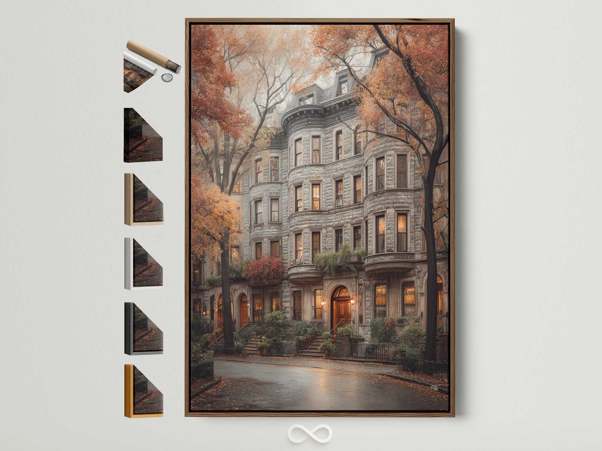
Why black & white architecture works in entryways
Entryways are transition zones. We move through them quickly, so the art has to read from a distance and feel calm up close. Black‑and‑white architecture prints excel here: strong geometry anchors the space while the palette stays neutral enough to play nice with flooring, doors, and whatever seasonal decor comes and goes.
Monochrome also compresses the visual noise of busy city scenes into graphic shape and light. As Tate’s primer on monochrome notes, removing color shifts our attention to composition, tone, and texture—exactly what makes architecture sing.
“Good foyers behave like deep breaths.” Let the first thing you see be simple, structural, and beautifully scaled.
Want to browse broadly before you choose? Explore our Black & White Wall Art, Architecture & Urban, and Cityscapes & Skylines collections.

Sizing & height: get the proportions right
If you do one thing, do scale right. Over small art makes big walls feel bigger; properly scaled art makes them feel designed. Use these rules:
The 57–60″ rule
Center of artwork at 57–60 inches from the floor. It’s the museum/gallery convention and a foolproof starting point—see Framebridge’s how‑high guide and this quick video.
Console math
Art width ≈ 2/3 of the console width (e.g., 60″ console → 36–42″ art). Hanging over a bench? Similar math applies.
Hallway clearance
In narrow halls, keep frames under 1.5″ deep and hang pieces so edges sit at least 4″ from door swing.
For a clean minimalist entry, one large canvas (24×36″ or 30×40″) beats a cluster of small pieces. If the wall is truly expansive, consider a diptych—two equal pieces with a 2–3″ gap—to keep the rhythm calm.
Frames, mats & finishes for minimalist rooms
Minimalist entries rely on contrast and material to create interest without clutter. Black frames outline architecture crisply; white frames blend with pale walls; oak adds warmth. Want more negative space? Float‑mount on a white mat for a quiet gallery feel. If glare is an issue by the door, choose matte canvas or low‑glare acrylic.
Quick picks: black frame for graphic skylines; white or oak for softer streetscapes. If you rent, lean a framed print on the console with two small rubber bumpers behind the bottom corners—no holes required.
Light it well: glare, CRI & placement
Great lighting is half the artwork. Use a dimmable sconce or a slim track head aimed at 30° to minimize glare. For accurate tones, choose bulbs with CRI 90+ (color rendering index)—see the Illuminating Engineering Society’s definition. In bright entries, matte canvas or low‑glare glazing keeps reflections controlled.
Avoid placing art where the door swings open against it. If your foyer has side light flooding the wall, shift the piece 3–6″ toward the hinge side to dodge direct reflection.
One, two, grid: composing sets
Minimalist doesn’t mean minimal options. Pick one of these composition styles:
- Solo statement: One large architectural facade or bridge. Calm and graphic.
- Diptych: Two equal canvases (2–3″ gap). Works over long consoles and benches.
- Grid of 4 or 6: Smaller architectural studies in identical frames. Keep 2″ spacing throughout for a tailored look. (Use painter’s tape and a level; more in the FAQ.)
Want deeper reading on proportions and psychology of black‑and‑white images? Smithsonian Magazine breaks down why the palette feels timeless.
Style pairings: Scandi, Japandi & Urban Modern
Scandi calm
Pair light oak frames with a pale runner and a bowl in raw ceramic. Keep lines crisp and let the architecture print add structure.
Japandi warmth
Choose black frames over warm plaster walls, with a single wooden stool for balance. If you love this vibe, you’ll also enjoy our Japandi neutrals feature.
Urban modern
Matte black hardware, a ribbed console, and one big city print keep things unapologetically graphic.
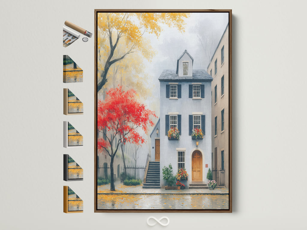
Styling the console: the 3‑thing formula
Every great entry console has three zones: height (lamp or branch), function (tray for keys), and softness (bowl, book stack, or candle). Keep your art the star—let accessories sit below the bottom frame edge. For layout and inspiration, see Architectural Digest’s entryway ideas.
Your 20‑minute entryway plan
- Measure the console width and pick art ≈ two‑thirds of that width.
- Mark a small piece of painter’s tape at 57–60″ from floor (center height of the art).
- Hang the piece; if using two, keep a 2–3″ gap.
- Add lamp (height), tray (function), and a soft element (bowl/books).
- Swap in a seasonal branch or runner; your monochrome architecture will play nice with everything.
Want more options after this roundup? Keep browsing our full Architecture & Urban and Cityscapes & Skylines collections.
Watch: Hang art at the right height
Prefer to see it done? This short explainer shows the designer‑favorite 57″ rule in action.
More console styling ideas on YouTube: Console table looks, designer styling tips.
FAQs
As a rule, choose art that’s ~⅔ the width of your console or bench. For single walls without furniture, 24×36″ to 30×40″ reads well from the door.
Center the artwork at 57–60″ from the floor. If household eye levels vary, split the difference around 58–59″.
Both work. Canvas is low‑glare and clean; framed paper with a white mat adds breathing room and a gallery vibe.
Black for graphic definition, white for airy walls, oak for warmth. Keep consistency across pieces in the same zone.
Use identical frames and mats; maintain 2″ gaps. Hang the grid center at ~58″. A 2×2 or 3×2 layout is easiest.
Use dimmable bulbs with CRI 90+ and aim fixtures at ~30°. Matte canvas or low‑glare acrylic helps in bright entries.
Not if you add warm materials—oak frames, woven rugs, textured ceramics—so the palette stays calm but welcoming.
Lean framed prints on the console and use removable picture‑hanging strips rated for your frame’s weight.
Leave 4″ clearance from door swing; choose tempered glass/acrylic for framed pieces; or use canvas for low‑risk hallways.


0 reacties