Terracotta & Sage Botanical Wall Art for Boho Kitchen Decor
A warm–cool palette that calms the morning rush and flatters natural textures—plus size charts, layout tricks, and ready‑to‑hang art.

Why terracotta + sage works in a kitchen
Terracotta adds appetite‑friendly warmth (think baked clay, sunset spice), while sage green reads restful and organic—great for early‑morning coffee and late‑night tea. Designers often pair boho textures (linen, rattan, raw woods) with these hues for a calm, lived‑in feel without going beige all the way.
Pro tip: If your kitchen leans cool (stainless, white quartz), bring warmth with terracotta art + oak frames. If it’s already warm (wood cabinets, brass), use sage botanicals in white frames for contrast.
Palette & material map
Use terracotta as the “spice,” sage as the “herb,” and neutrals as the base grain.
| Element | Best choices | Why |
|---|---|---|
| Primary wall art colors | Terracotta, rust, sienna; sage, eucalyptus | Warm–cool balance feels both cozy and fresh. |
| Frames | Oak or white (primary); black (accent) | Oak keeps it boho; white/black adds crispness. |
| Materials | Canvas, matte paper, non‑glare glazing | Resists reflections from under‑cabinet lights. |
| Textures | Rattan, jute, linen, clay | Echoes the palette and softens metals. |
Try this trio: terracotta runner, sage plant (pothos or herb pots), and a botanical canvas set. Instant “calm café” mood.

Kitchen art zones (and what actually survives)
- Coffee corner: small–medium verticals; composite a hero canvas + tiny plant + scoop jar.
- Open shelves: lean a framed print behind bowls; rotate seasonally like… soup recipes.
- Breakfast nook: go bigger (60–75% width of table).
- Splash zones: pick canvas or glass‑fronted frames set away from steam/grease.
Rule of thumb: Leave 6–8" from counters and 10–14" above a bench/banquette so elbows and lattes coexist peacefully.
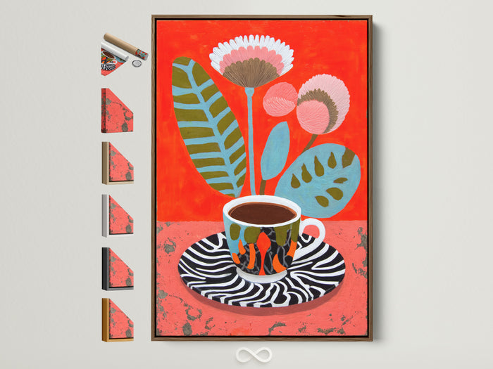
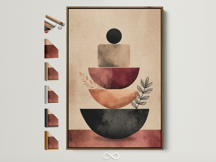
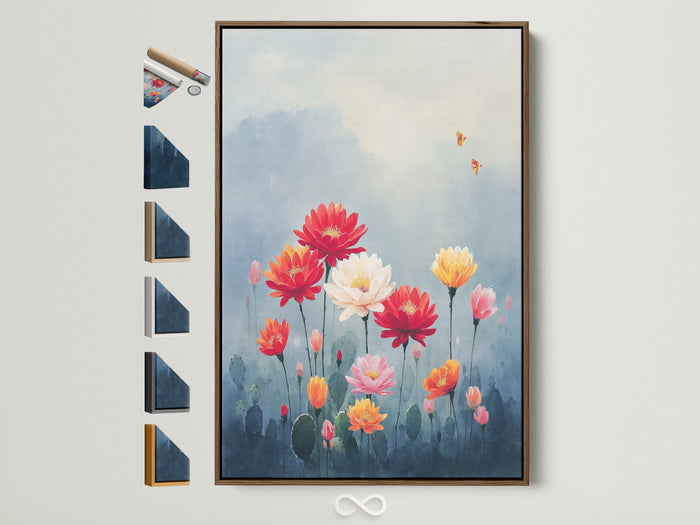
Curated picks: Warm & Leafy
Finishes: canvas vs. framed prints
Canvas softens glare and hides tiny splashes. Choose a low‑gloss coating in bright kitchens. Framed prints (matte paper + non‑glare acrylic) look crisp on white walls and make menus, herbs, and line drawings pop.
Pro tip: Floating frames add ~1" of breathing space—nice definition against pale tile.
Sizing & placement cheat sheet
| Spot | Recommended width | Height off surface | Notes |
|---|---|---|---|
| Above console/bench | ~60–75% of width | 10–14" | Larger rooms can handle 48–60"+. |
| Breakfast nook | 32–48" (single) | Center at ~57–60" | Hang center at eye level; go bigger for vaulted ceilings. |
| Open shelf lean | 12–18" | — | Lean and layer with jars, herb pots. |
| Gallery wall | Mixed frames 8–24" | Center mass ~58–60" | Keep 2–3" gaps for rhythm. |
Hanging rule: Most art centers between 57–60" off the floor; scale up in open‑plan spaces.
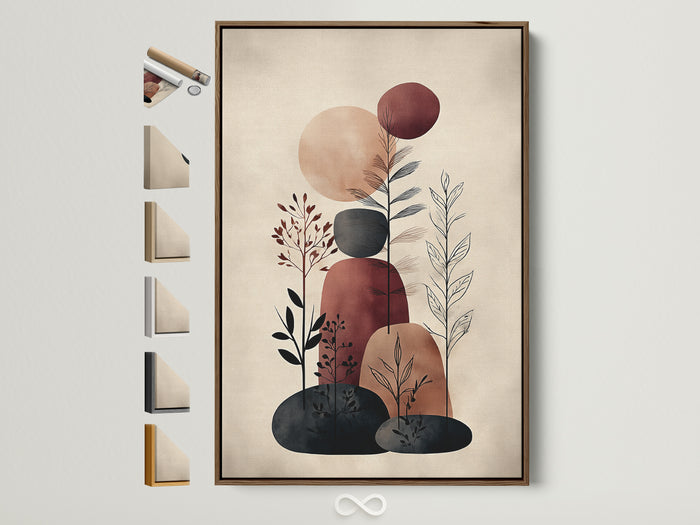
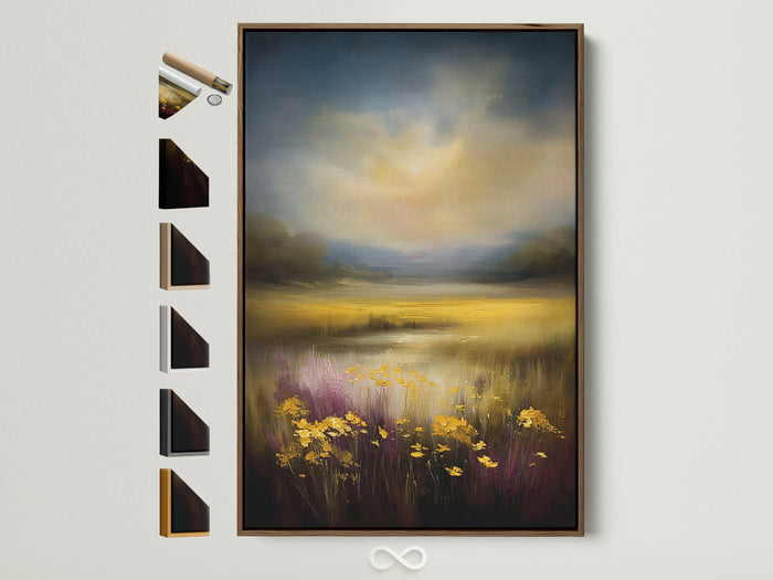
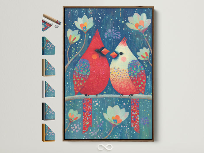
Curated picks: Earth tones that pop

Vignettes, shelves & plant layering
- Rule of three: art + plant + texture (basket/linen).
- Mixed heights: use a riser for small framed prints.
- Echo shapes: pair round plates with sun‑disc art.
Pro tip: Dry herbs (bay, sage) in a tiny bundle hung from a hook—design + dinner backup.
Lighting without glare
Under‑cabinet LEDs, pendants, and windows can wash out glossy prints. Keep art legible with matte canvas or non‑glare glazing and angle picture lights ~30° from the wall.
Quick win: Swap a high‑gloss frame facing a window for a canvas in a floating oak frame—color stays saturated even at noon.
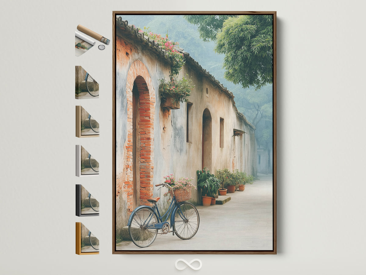
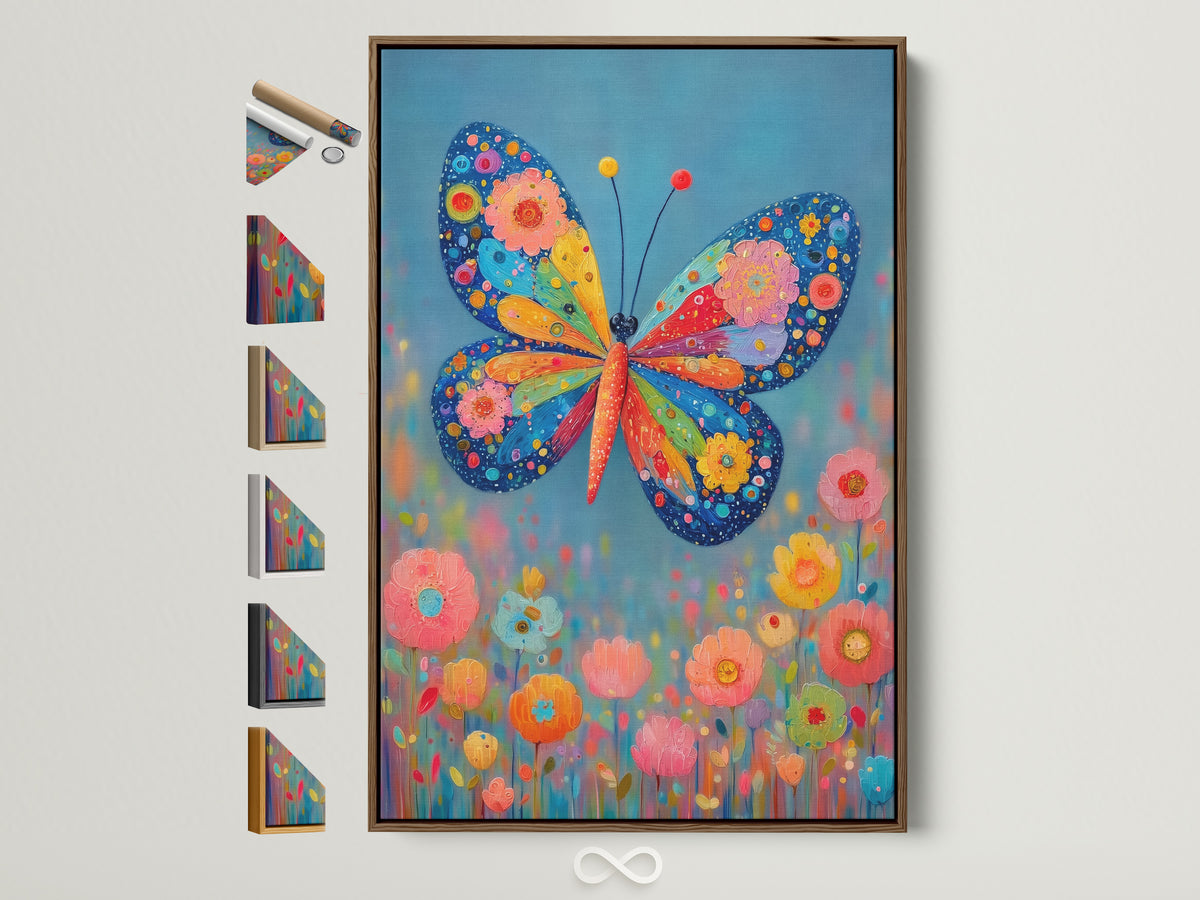
Curated picks: Soft & whimsical
Renter‑friendly hanging
- Use picture ledges for easy swaps; anchors once, styles forever.
- Command‑style strips for light frames; follow weight ratings.
- Lean framed prints on counters (away from splash zones).
“If a nail makes your deposit nervous, let gravity do the gallery.”
Quick color add‑ons
Echo terracotta with clay utensil holders and burnt‑sienna tea towels. Bring sage through potted herbs, a runner, or seat cushions. Keep stainless calm with linen textures.
- 60–30–10 rule: base neutrals (60), terracotta/sage (30), accents (10).
- Accent partners: mustard, blush, and tiny shots of black.
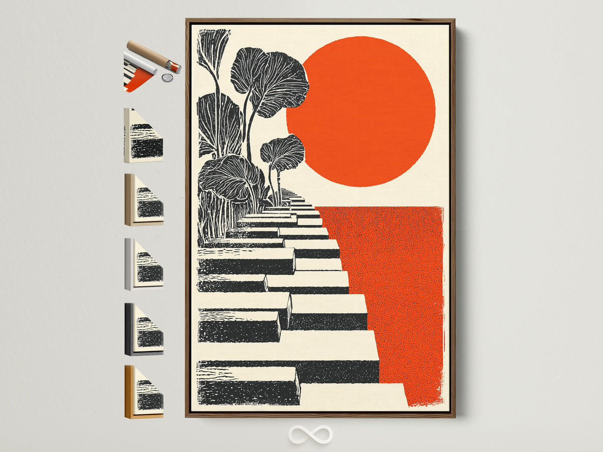
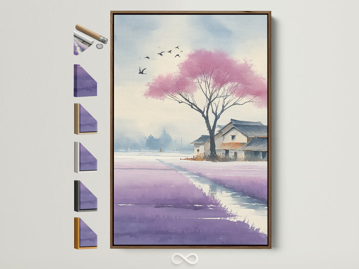
Curated picks: Graphic botanicals


Gallery wall blueprint for awkward kitchens
Use a centerline at ~58–60" and build outward with 2–3" spacing. Start with a terracotta anchor piece, then sprinkle sage botanicals and 1–2 black frames for rhythm. Keep art 6–8" from outlets/switches—no one wants a light switch in the bouquet.
Care & longevity
- Keep art away from constant steam and high heat.
- Dust with a soft, dry cloth; avoid chemical cleaners.
- Use non‑glare glazing if facing bright windows.
Good to know: Archival pigments and UV‑protective coatings help color stay rich over the long haul.
Bonus pick: A playful pop for the bar cart
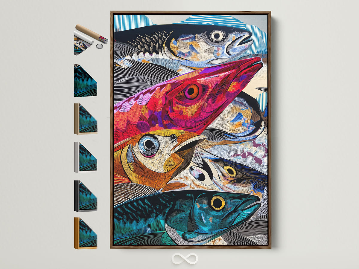
Earthy kitchens love one playful piece. This abstract fish canvas amplifies terracotta and sage with oceanic blues—great across from the dining table so conversations keep swimming.
People also ask (and we answer quickly)
- What art looks good in a kitchen? Botanicals, food & drink prints, and small abstracts with matte finishes.
- Does terracotta go with green? Yes—especially muted greens like sage/eucalyptus.
- Best frame color for sage walls? Oak or white for softness; black for punch.
- How high do you hang art over a banquette? 10–14" above the backrest.
- Is art safe near the stove? Keep it out of steam/grease zones or use glass‑fronted frames with non‑glare acrylic.
- What size art for a breakfast nook? 32–48" wide single, or a pair of 18–24".
- How do I build a boho gallery wall? Mix frames (oak/white/black), keep gaps 2–3", add plants and woven pieces.
- Can I hang art in a rental? Yes—use picture ledges or removable strips.
References
- House Beautiful — Terracotta color ideas
- The Spruce — What is Bohemian style?
- The Spruce — Sage green kitchen ideas
- MasterClass — Terracotta color explained
- Apartment Therapy — How high to hang art
- Architectural Digest — ’70s kitchen tones are back
- Artoholica — Coffee Cup Canvas Spotlight
- Artoholica — Butterfly Meadow Spotlight
- Artoholica — Rooster Art for Kitchens
FAQ
What frames pair best with terracotta & sage palettes?
Oak for warmth, white for airiness, and a little black for contrast. Brass looks great with terracotta, chrome with sage.
Canvas or framed print for kitchens?
Canvas resists glare and is easy to dust; framed prints with non‑glare acrylic are ideal for tighter splash zones.
How do I keep art safe from humidity?
Keep pieces out of direct steam/grease, use low‑glare coatings, and wipe with a dry, soft cloth—no chemicals.
How big should art be over a small breakfast table?
Typically 32–40" wide; aim for ~60–75% of the table width for balance.
Can I mix botanical prints with abstract art?
Yes. Use color as the glue—repeat terracotta/sage across both styles and keep spacing 2–3".
Do I need a picture light?
Not required, but a 30° angle keeps light off reflective surfaces. Task lighting should never glare across glass.
What’s the easiest renter‑friendly install?
Picture ledges. One set of anchors and you can rearrange endlessly (plus seasonal swaps are instant).
What’s a safe “eye‑level” height?
Center most art around 57–60" from the floor. Raise slightly in rooms with high ceilings.
0 reacties