Coastal Decor Playbook: Light, Salt & Sea — A Friendly Guide to Breezy, Durable Rooms
Designing a “coastal” home isn’t about scattering anchors or painting every surface ocean blue. It’s about air, light, and materials that feel easy—and stand up to sun, humidity, and the occasional splash. This guide translates seaside wisdom into simple, livable moves you can make today.
What “coastal” really means (and what it’s not)
Real coastal style is calm and low‑contrast—think warm whites and sand tones punctuated by a single accent (navy, sea‑green, or brass). It relies on breathable finishes, natural textures, and glare‑soft lighting rather than literal motifs. Nautical decor leans on symbols (anchors, signal flags), while coastal interior design leads with light, texture, and comfort.
Rule of thumb: keep 70–80% of the room in pale neutrals, 15–20% in mid‑tones, and reserve one strong accent for rhythm.
Palette you can live with
Start with a base of warm white, chalk, sand, and oyster. Layer soft blues and sea‑green the way water shifts in daylight. If you want “blue,” think sea glass and oxidized copper rather than primary cobalt. Stripes, if used, should be wide and quiet—cabana without the costume.
To keep the look cohesive, repeat one accent across textiles, artwork, and a small hardware detail. This is where coastal artwork earns its keep: a seascape sets the mood and calibrates blues and greens for the rest of the room.
Want cozy with clean lines? Borrow from Warm Minimalism—its soft neutrals and natural textures dovetail perfectly with coastal calm.

Materials made for salt, sun & humidity
Walls & ceilings
Prefer mineral or limewash paints: they’re breathable, matte, and age beautifully. They minimize glare and help walls dry if humidity sneaks in. See our field guide to limewash & mineral paint for application tips.
Floors
White oak, wide‑plank engineered wood with matte finish; sealed limestone; terrazzo; or durable porcelain. Add seagrass or sisal rugs for texture—layer a cotton flatweave on top for softness underfoot.
Upholstery
Linen or cotton slipcovers (washable). Performance linens handle sun better; rotate cushions seasonally to even fade.
Hardware & metals
Powder‑coated aluminum, stainless 316, unlacquered brass/bronze. Avoid untreated steel near sea spray; corrosion climbs fast in coastal air.
Moisture management
Design for bulk water first: tight shells, flashing, and drainage planes (rain control basics). In warm‑humid zones, plan supplemental dehumidification to keep indoor RH near 40–50%—your finishes and lungs will thank you (guidance here).
Ground level & baths
Choose flood‑tolerant assemblies and easy‑to‑wash surfaces where relevant. Raise outlets a tad and use materials that dry quickly (Designing for Floods).
Like textures with substance? Our Soft Brutalism playbook covers warm, honest materials that pair beautifully with coastal calm.
Light like a sailor—without the glare
Sunlight near the water is strong. Use layered lighting that diffuses and bounces: linen shades, frosted glass, and low‑glare reflectors. Avoid cold, harsh LEDs; aim for 2700–3000K in living areas and use dimmers. For beautifully even light at eye level, study Poul Henningsen’s approach to layered shades and indirect glow in our glare‑free lighting guide.
Coastal artwork to anchor your palette
Art is the fastest way to “set the sea.” A large seascape calibrates the entire palette and gives the room a horizon line—instant calm. For drama, think American seascapes; for movement, Impressionist surf studies. (If you love a story steeped in salt and spray, see The Met’s short read on Winslow Homer’s ocean paintings.) Winslow Homer at The Met.
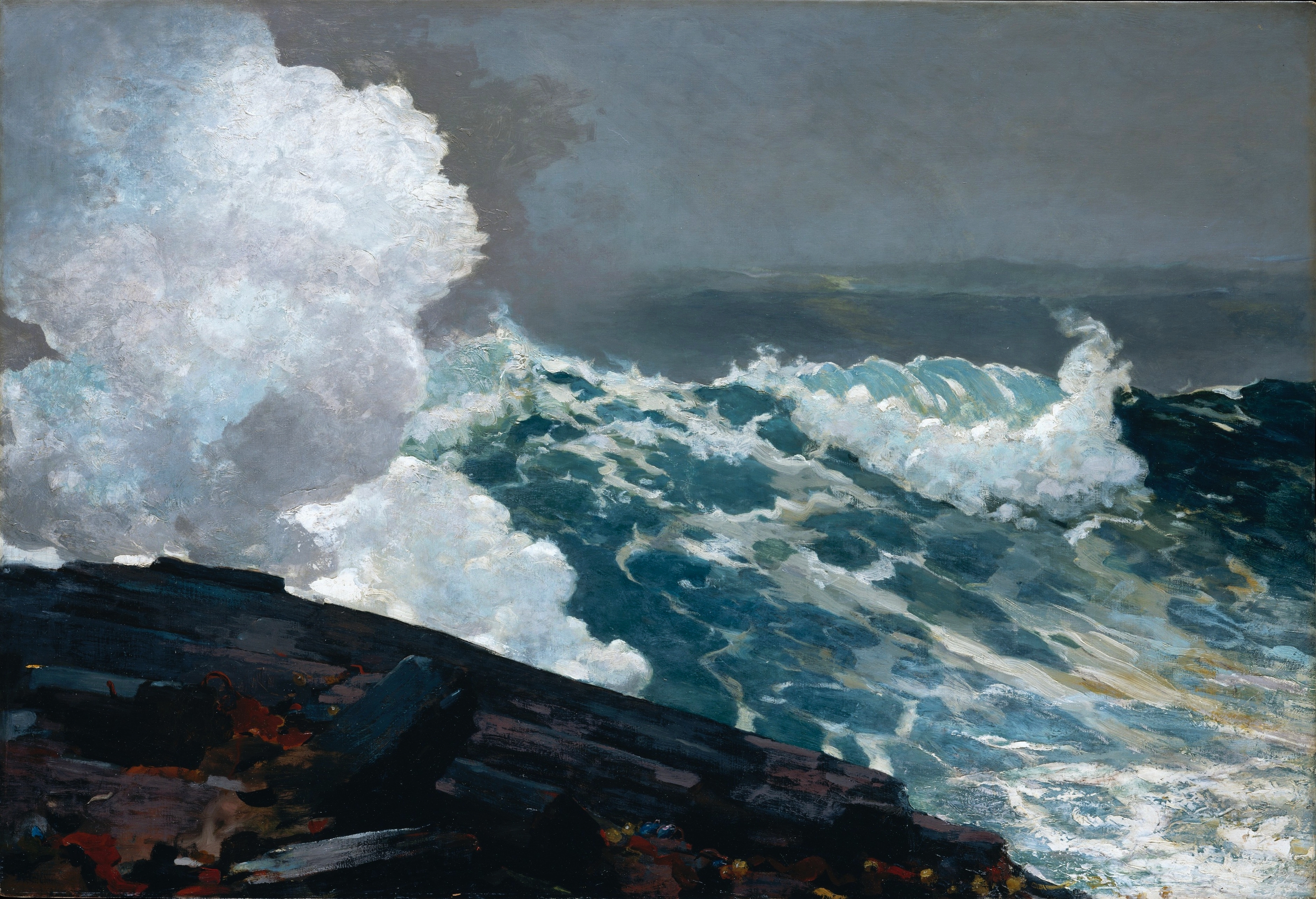


Sizing tip: Over a sofa or sideboard, 80–120 cm (32–48") makes a clear focal point; for wide spans, use a diptych to carry the shoreline without clutter.
Room‑by‑room coastal playbook
Entry
- Paint: warm white matte or mineral finish (low glare).
- Rug: seagrass runner (mud‑tolerant), coir doormat.
- Storage: woven baskets, slim wall hooks in brass/blackened bronze.
- Pro move: install a picture light over a small seascape to set tone immediately.
Living room
- Seating: linen slipcovered sofa, rattan lounge chair.
- Windows: woven shades + sheer linen panels (filters glare, keeps view).
- Lighting: layered: shaded floor lamp (ambient), table lamp (task), picture lights (accent).
- Pro move: hang art opposite windows on matte surfaces to avoid reflections.
Kitchen
- Cabinets: warm white or pale putty; oak slab or shaker in island.
- Counter: honed quartzite or porcelain with soft movement.
- Breezy details: beadboard end panels, unlacquered brass pulls that patinate naturally.
- Pro move: use ribbed glass pendants with diffusers—coastal light without glare.
Bath
- Surfaces: porcelain/terrazzos, microcement, or sealed lime plaster for texture.
- Hardware: brass or stainless 316 near sea air.
- Ventilation: quiet, high‑efficiency fan; consider a small dehumidifier in windowless rooms.
- Pro move: one small piece of ocean art in non‑splash zones—keeps the mood.
Bedroom
- Palette: shell, oatmeal, sea‑green accents.
- Textiles: linen duvet, cotton matelassé, woven bench at foot of bed.
- Lighting: shaded bedside sconces, dim to 20% at night.
- Pro move: hang drapery a touch wider than the window to keep views clear—like opening a horizon.
Quick wins for renters & weekend refreshes
- Swap in linen slipcovers; add a seagrass rug and woven tray.
- One large seascape print beats a collage of tiny frames.
- Change bright white bulbs to warm 2700–3000K; add dimmers.
- Hang a rattan or wicker pendant with a diffuser for soft ambient light.
- Add a brass lamp or hooks to echo sunrise tones.
- Greenery: olive branches, eucalyptus, or a coastal grass in a terracotta pot.
- Use rope or leather pulls on a dresser for a subtle nautical nod.
Coastal clichés to avoid
- Over‑the‑top anchor motifs or “beach house” text art.
- Glossy paints in living spaces—glare city.
- All‑blue everything; let neutrals lead and blue accent.
- Fake weathering on every surface; mix a few honest, time‑softened textures with clean finishes.
- Harsh, cold LEDs; pick warm, dimmable, low‑glare fixtures.
- Tiny art scattered everywhere—choose scale and give it breathing room.
Finish the story with art
Ready to give your room its horizon line? Explore our curated Nautical & Coastal Wall Art—from serene palms to abstract tides—in sizes that fit everything from an entry niche to a great room.

Why white & blue works (and how to do it fresh)
Cycladic islands made the duo iconic—white reflects fierce sun, blue nods to sea and sky. Keep it current by softening both: warm white walls, weathered oak, and a single blue carried in art and textiles. Curious about the backstory? Read concise takes on Cycladic architecture and Santorini’s whitewashed houses (context here and here), plus a historical aside on the islands’ white‑and‑blue identity here.
FAQ
What’s the difference between coastal and nautical decor?
Coastal leads with light, breathable textures, and a calm palette. Nautical adds literal maritime symbols (anchors, flags). You can nod to nautical with one graphic moment, but let coastal materials and light do the heavy lifting.
How do I get a coastal look without it feeling kitschy?
Pick one accent (navy, sea‑green, or brass), keep patterns wide and simple, and invest in one large seascape instead of multiple small trinkets. Use matte, low‑glare finishes and woven textures.
What paint finishes and colors suit coastal interiors?
Matte or mineral/limestone paints in warm whites and soft stone tones. For color, think sea glass and oxidized copper. Save higher sheen for kitchens/baths where wipeability matters.
Which materials hold up best near the ocean?
Powder‑coated aluminum, brass/bronze, stainless 316; oak with matte finish; linen slipcovers; porcelain and terrazzo. Manage bulk water and humidity first for long‑term durability.
How should I light a coastal living room to avoid glare?
Layer light: shaded floor lamp (ambient), table lamps (task), and wall picture lights (accent). Choose 2700–3000K bulbs and diffusers; avoid bare, high‑output sources.