Law Office Decor: The Calm, Credible & Client‑Friendly Playbook
A practical, design‑forward guide to reception flow, glare‑free lighting, acoustic privacy, durable materials and smart art—so your firm feels confident the second a client walks in.
Great law office decor isn’t flashy—it’s quietly convincing. Clients scan for order, warmth and clarity in seconds; staff need focus and comfort for hours. The most effective spaces are simple to understand and effortless to use: soft light where you speak face‑to‑face, honest materials that age with dignity, and art that sets a composed tone.
Below is a room‑by‑room guide shaped by proven lighting frameworks, healthy‑building cues and timeless materials. It’s intentionally light on jargon and heavy on moves you can act on this month.
First Impressions: Reception That Lowers Shoulders
Reception is your opening statement. Aim for clear sightlines: from the entry, clients should immediately see where to check in, where to sit and where restrooms are. Keep pathways straight and edges soft; a rounded desk corner is both safer and more welcoming.
Color & materials that calm
Choose a base of warm whites, gentle grays and natural timber; add one restrained brand accent (a deep navy panel, a terracotta plinth) instead of spreading color everywhere. Prefer matte textures over glossy—matte hides scuffs, photographs better on camera and keeps text legible on paper.
Want depth without shine? Consider breathable, low‑sheen mineral finishes that handle light beautifully. Here’s a designer‑friendly explainer on limewash and mineral paint for soft texture across large planes.
Front‑of‑desk checklist
- Clear, contrasting edge to the counter for easy visibility.
- Bag shelf or drawer with a low front lip.
- Cable‑free surfaces—use an under‑counter grommet and power strip.
- Coat hooks and an umbrella stand to reduce clutter on seats.
- Basic accessibility clearances at the desk (knee/toe room; reach ranges). See current ADA Standards.
Lighting That Works Like a Good Argument
Light is evidence: if your space is evenly bright with no glare, clients feel you’ve thought about details. Use a simple three‑part framework and you’ll be 80% there.
Ambient / task / accent—where to use each
- Ambient creates a base level of light. In reception and corridors, use diffuse linear runs or shaded pendants—never naked bulbs at eye level. This is the core of layered lighting.
- Task targets documents and keyboards. Angle desk lamps so the shade hides the source from the client’s view.
- Accent adds focus—wall‑washing an artwork, a soft halo behind signage, or a small sparkle over a materials display.

Healthy light cues clients don’t notice—but feel
Keep client‑facing rooms on the warm side of neutral and design for glare control near screens or signature desks. For evidence‑based guidance, skim the WELL Building Standard’s Light concept and glare recommendations (WELL v2, Light) and use IES as your professional North Star (IES standards hub).
Quiet Confidence: Acoustics & Privacy
Clients read privacy in two ways: visually (frosted glass, doors that close) and acoustically (the sound of voices carrying—or not). Use all three levers:
- Absorb with fabric seating, upholstered panels, a soft rug in reception, and book‑lined walls in conference rooms.
- Block where it matters—full‑height walls for consultation rooms; door sweeps and seals on meeting doors.
- Mask with a low, even sound in open areas if needed (not the “rushing air” of a loud HVAC).
Healthy‑building research bundles acoustics with light, air and comfort; if you want a concise primer, bookmark Harvard’s 9 Foundations of a Healthy Building.
Material Palette That Ages Well
Trust grows when materials feel honest. Combine a porous stone or dense porcelain at floors, oak or walnut at the touch points, wool upholstery for acoustic help, and a matte wall system to reduce glare on documents. Rounded millwork corners prevent bag snags and bruises, and soft close hardware keeps meetings quiet.
Prefer the less‑but‑better look? Our primer on Warm Minimalism shows how to layer texture so rooms feel soft, not sparse.
Rooms, Solved: A Practical Playbook
Reception & Intake
- Seat clients facing daylight or art, not other clients.
- Provide a side table for forms, water and a bag.
- Keep printer/scanner out of sight (and sound) of the seating area.
Conference Room
- Place the camera beside—not behind—the screen to preserve eye contact.
- Use shaded pendants or a soft ceiling wash above the table; add wall‑washers to keep faces evenly lit without glare.
- Hide power/data in table boxes; label neatly.
- Put absorptive panels behind the camera and on the wall opposite the door.
Attorney Office
- Face the desk toward the door and, if possible, a view—clients feel acknowledged the instant they enter.
- Use a shaded task lamp and a warm wall sconce near the guest chair.
- One quiet art piece; closed storage for the rest.
Library / War Room
- High CRI linear task light for reading; robust wheels on tables for re‑configuring.
- Durable carpet tiles allow quick rerouting and spill swaps.
Breakout Nooks
- Plug‑and‑play spots with a small round table, two upholstered chairs, and a plant in real light.
- Warm light (2700–3000 K) and one conversational art piece—human but not personal.
Art Strategy: Quiet Symbols, Clear Stories
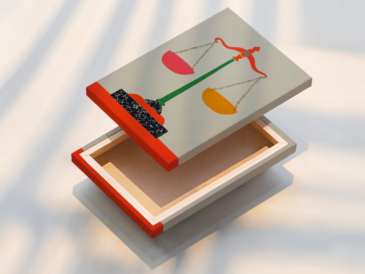
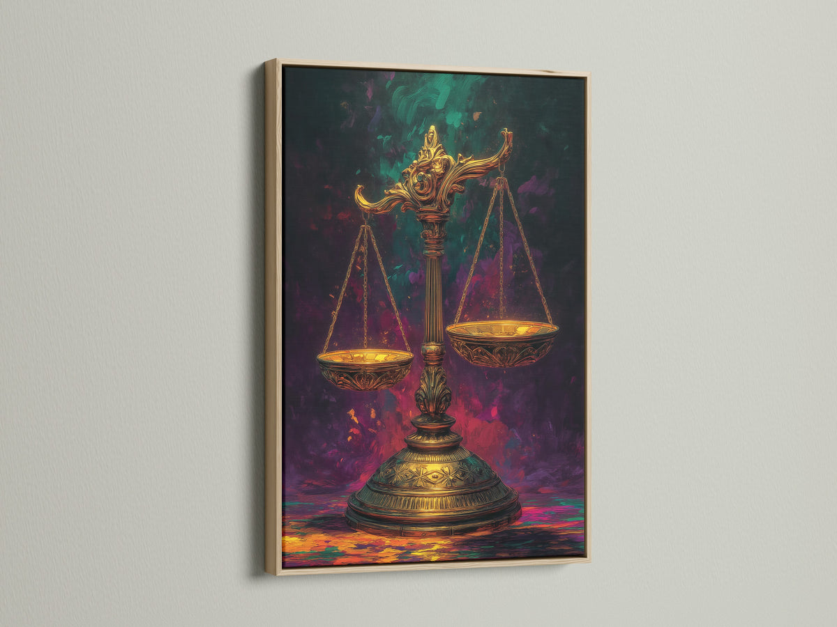
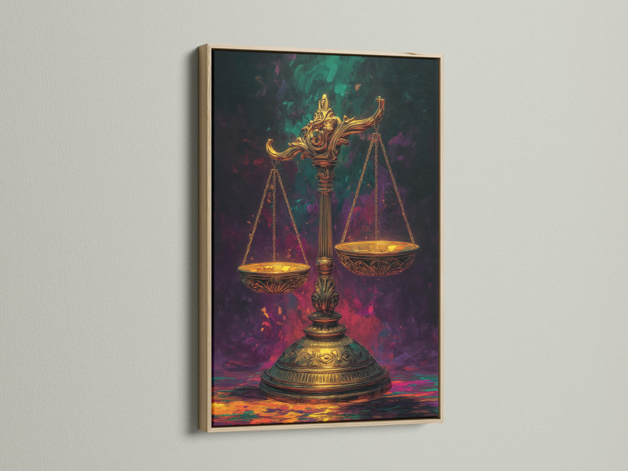
Art in a legal interior should read like a good signature: simple, confident and consistent. Black‑and‑white photography and architectural abstracts signal order without picking sides. Symbolic pieces—scales, balanced forms—belong where a client first forms an opinion: reception, corridors near conference rooms, the settlement table.


Tip: keep frames consistent across a floor—black or oak—to avoid a “gallery of one‑offs.” If glare is a concern in bright rooms, choose matte glazing.
Wayfinding, Typography & Little Signals
Clients should never have to ask which door to choose. Use large, high‑contrast room numbers and a clear sans‑serif for wayfinding. Push signs to eye height and add a gentle wall‑wash so letters pop. Want inspiration from real offices? Browse case studies at Office Snapshots and workplace trend roundups at Work Design Magazine.
Phasing & Budget: Smart Wins First
In a week (low effort)
- Swap harsh bulbs for warm‑white, high‑CRI lamps in client areas.
- Place a shaded task lamp at every signing table and guest chair.
- Re‑hang art at eye height (center ~57–60″/145–152 cm).
- Edit visual clutter—consolidate notices on one clean board.
In six weeks (medium lift)
- Repaint to a matte, low‑glare palette; add one brand accent wall.
- Introduce acoustic panels behind reception and in conference rooms.
- Upgrade conference lighting to shaded pendants + wall wash.
- Standardize frames and mats for a cohesive, professional read.
In six months (bigger impact)
- Re‑plan intake flow; design a desk with rounded front and hidden power.
- Improve door seals and add thresholds where sound transmission is high.
- Rethink storage—closed casework with one visible shelf for brand books.
Shop the Look
For a safe, timeless palette that suits most legal interiors, start with our curated Black & White Wall Art—graphic photography and abstract forms that read organized, calm and camera‑ready in reception, corridors and conference rooms.
Sources & Further Reading
- WELL Building Standard v2 — Light (glare control and visual comfort)
- Illuminating Engineering Society — Standards (professional lighting references)
- ADA Standards for Accessible Design (clearances, reach ranges)
- Harvard: 9 Foundations of a Healthy Building (acoustics & light are health factors)
- Work Design Magazine (law‑firm workplace trends & case studies)
- Office Snapshots (visual library of office case studies)
- Gensler Research Institute (focus, collaboration & meeting behaviors)
FAQ
- What colors are best for a law office?
- Warm whites, soft gray, beige and natural timber read calm and credible. Add one brand accent—navy, forest or oxblood—rather than many small pops. Prefer matte finishes to minimize glare on documents and screens.
- How do I make a small law office look professional?
- Clear sightlines, a single focal artwork, and one consistent frame color create order. Use wall‑washing and shaded lamps for depth, keep storage closed, and limit décor to a few substantial pieces rather than many small items.
- What lighting is best for client rooms?
- Shaded pendants or diffuse linear light for ambient, a table lamp for task, and a gentle wall‑wash behind the client. Avoid naked bulbs in sightlines. Review glare guidance in WELL v2 (Light) and use IES for detailed performance criteria.
- How can we reduce noise without a renovation?
- Add fabric seating and a rug in reception, a pinboard or bookshelf on hard walls, door sweeps on meeting rooms, and soft ceiling tiles in corridors. If needed, consider low‑level sound masking in open areas.
- What kind of art is appropriate for a law office?
- Architectural photography, balanced abstracts and modest legal symbols (like scales) feel composed and neutral. Keep frames consistent and use matte glazing in bright rooms.
- Where should we start if budget is tight?
- Swap bulbs to warm, high‑CRI lamps; add task lights at every client‑facing seat; repaint to a matte, low‑glare palette; re‑hang art at eye height; and edit clutter. Then plan conference lighting and acoustic panels as phase two.