Soft Brutalism at Home: Warm Materials, Calm Geometry, Good Light
Soft Brutalism keeps the honesty of concrete and bold forms—but adds texture, curves and layered light so your rooms feel grounded and welcoming.
What Brutalism is—and what makes it “soft”
Brutalism began as an architectural language of clarity and material truth—think expressive structure and raw concrete (béton brut). Museums and institutes define it by its honesty of materials and blocky, sculptural forms—ideas that still guide designers today. MoMA and the RIBA both describe Brutalism as a post‑war movement that foregrounds construction, texture and mass.
Soft Brutalism keeps those bones, then edits the experience: warmer finishes, tactile textiles, rounded details, and lighting that flatters surfaces. A widely shared Paris apartment shows the mix—gritty structure, refined materials, and a restful light balance. See Architectural Digest’s example.
The Soft‑Brutalist palette (materials & finishes)
Build from a small kit of parts:
- Microcement or a concrete render for monolithic planes; satin or matte sealer.
- Limewash/mineral paint for depth and soft shadow—excellent on feature walls and bedrooms.
- Oak or walnut for joinery; travertine or honed limestone for tops.
- Textiles: wool, bouclé, heavy linen; one thick rug grounds the room.
- Warm metals: unlacquered brass, burnished bronze; smoked or ribbed glass.
- Curves: bullnosed edges, arches, rounded corners to break hard lines.
Want a paint that naturally “reads” as stone? Try a mineral finish. Our field guide to limewash & mineral paint explains where it shines and how to apply it cleanly.

Light like a designer (the real softener)
In Soft Brutalism, lighting does the heavy lifting. Think in three layers: ambient (overall glow), task (work or reading), and accent (shape and shadow). Balance them and the room gets depth without glare. Quick refresher on the three layers.
Comfort & glare
Glare fatigue is real—especially around screens. For desk zones, place task lights slightly forward and off‑axis, and keep luminaires out of your direct sightline. The latest guidance for home work areas aligns with office standards on visual comfort and appropriate task lighting levels; consult the CIBSE LG7 home‑office section for fundamentals.
- Color temperature: 2700–3000K for living/sleeping; cooler only where focus is the goal.
- Beam aim: wash walls and joinery; avoid overhead “hot spots.”
- Dimming: scenes for day, evening and late night = instant mood shift.
Shape grammar—using curves & grids
Brutalism speaks in grids and strong lines. The “soft” version adds counter‑curves: arches, bullnosed thresholds, radius corners on shelves. Curves keep mass but reduce visual aggression.
See how arches add rhythm without fuss in our feature on a neutral, architectural canvas—Beige Architecture (Arches).
Room‑by‑room playbook
Living rooms
- Anchor with one heavy element (stone plinth or low blocky sofa) and one oversized rug.
- Two light sources minimum: a floor lamp + a wall wash or table lamp.
Kitchens & dining
- Flat fronts in oak or walnut, honed stone, and matte pulls; minimal gloss.
- Pendant set 28–34" over table; layer with a dimmable cove or under‑cabinet strip.
Bedrooms
- Smaller palette, thicker textiles (wool blanket, linen drapes), and two soft task lights.
Home office
- Task light with a shielded source; add a wall wash behind the monitor to reduce eye strain.
- Invite a little nostalgia to counter the tech. Inspiration: mid‑century office wall art.
Baths
- Microcement or a limewash‑look plaster + rounded ledges and niches.
- Vertical sconce pairs with diffusers to soften mirror glare.
Color & art — keep it quiet, not flat
Neutrals carry most of the weight: bone, sand, taupe, stone, ink, walnut. Use one narrative artwork to humanize the space (a city in rain, a single figure), and one geometric piece to establish rhythm.
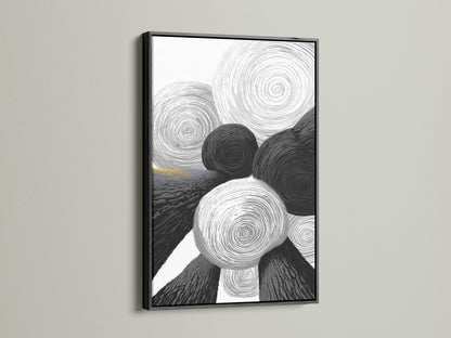
- Geometric calm: Monochrome Rings
- Human‑scale story: Turquoise Bloom or a muted cityscape

Shop the look — Gentle Geometry (Editor’s picks)
Monochrome Rings — Canvas Art
Circle motif that softens sharp architecture.
Taupe Cityscape — Canvas Art
Atmospheric neutral for entries and hallways.
Neutral Stone — Canvas Art
Mineral warmth to pair with concrete.
Minimalist Zen — Canvas Art
Quiet contrast; great near work zones.
Beige Stone Landscape — Canvas Art
Soft gradients that love oak and travertine.
Images © Artoholica. Pair any of these with oak joinery and limewashed walls for an easy Soft‑Brutalist start.
Two quick style recipes
Urban loft, softer
- Microcement floor + linen sofa + travertine side table.
- Curved edge coffee table; one circular artwork; two dimming scenes.
Small rental, softer
- Mineral paint feature wall + thick wool throw + one tall floor lamp.
- Limit colors to bone, taupe, ink; let one narrative artwork lead.
Common mistakes to avoid
- All downlights, no wash: the room will feel harsh and small.
- Too many hard lines: add at least one curve in plan or elevation.
- Cold temperature overload: keep most domestic zones warm (2700–3000K).
- Everything heavy: offset mass with fabric, ribbed wood or a single glass piece.
Field notes from the studio
Designers often describe Soft Brutalism as “emotional support minimalism”—textured, quiet, and human. For more color‑and‑texture tweaks, these reads are short and useful: The Shelfist and Whispering Bold.
Warm Neutrals & Calm Geometry — more picks
Related reads on our blog
Bring the look home
Browse pared‑back graphics, architectural motifs and neutral palettes curated for this style in our collection.
FAQ
- What is Soft Brutalism?
- A livable take on Brutalism that keeps honest materials and simple massing, then adds warmth—texture, curves and layered light—to feel calm rather than severe.
- How do I warm up concrete interiors quickly?
- Add one tactile textile (thick wool or linen), one curved element (arch or round table), and a wall wash. Warm metal accents help too.
- Which colors work best?
- Bone, taupe, stone grey, walnut, and graphite. Use black sparingly to sharpen edges; keep accent colors muted and earthy.
- What lighting works for this style?
- Layer ambient + task + accent. Aim light at walls and joinery, not eyes. Use warm color temperatures in living and sleep zones.
- Is brutalist interior design comfortable?
- Yes—if you balance hard with soft: stone or concrete with wood, thick textiles, rounded forms and glare‑free light.